 Web Front-end
 CSS Tutorial
 Enhancing Form User Experience with CSS: Real-Time Feedback Techniques for Better User Interaction
Enhancing Form User Experience with CSS: Real-Time Feedback Techniques for Better User Interaction
Real-Time Form Feedback with CSS Pseudo-classes: A User-Friendly Approach
Tired of clunky form validation messages? Let's elevate the user experience with CSS pseudo-classes for instant, intuitive feedback. This article demonstrates how to create more responsive and user-friendly forms using CSS.
Getting Started: Prerequisites
This tutorial requires a basic understanding of HTML and CSS. That's all you need!
CSS Pseudo-classes for Dynamic Validation
We'll illustrate real-time feedback using simple HTML form elements and CSS.
Initial HTML Structure (Simplified):
<div>
  <label for="name">Name</label>
  <input type="text" id="name" required>
  </div>
  <div>
  <label for="email">Email</label>
  <input type="email" id="email" required>
  </div>
  <button type="submit">Submit</button>
</div>
Initial CSS Styling (Simplified):
form {
    padding: 1rem;
    width: 50%;
    div {
        display: flex;
        flex-direction: column;
        margin-bottom: 1rem;
        label {
            font-weight: bold;
            margin-bottom: 5px;
        }
        input {
            padding: 10px;
            border-radius: 5px;
            outline: 2px solid black;
        }
    }
    button {
        padding: 10px 1rem;
        border-radius: 5px;
        cursor: pointer;
    }
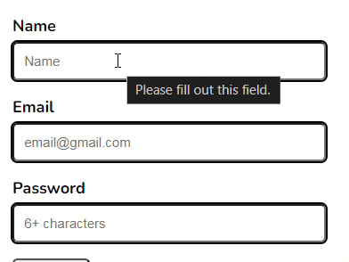
}Initial Appearance:
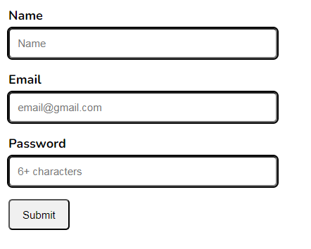
Now, let's add the magic of CSS pseudo-classes:
:validand:invalid: These provide immediate feedback based on whether the input is valid according to the HTML5 constraints (e.g.,required,type="email").
input:valid {
  outline-color: lightgreen;
}

input:invalid {
  outline-color: red;
}:valid and :invalid in Action:
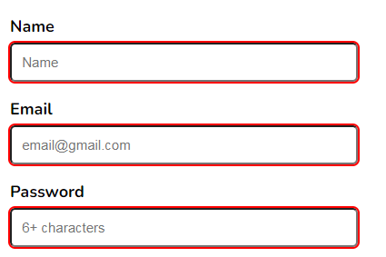
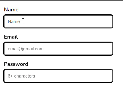
:user-validand:user-invalid: These provide feedback based on user interaction, even before the browser's built-in validation kicks in. Note: Browser support for these is not yet universal.
input:user-valid {
  outline-color: lightgreen;
}

input:user-invalid {
  outline-color: red;
}:user-valid and :user-invalid (Illustrative - Check Browser Compatibility):
:placeholder-shown: This targets input fields while the placeholder text is visible. Combined with:validand:not(), we can provide feedback only after the user starts typing.
input:not(:placeholder-shown):valid {
  outline-color: lightgreen;
}

input:not(:placeholder-shown):invalid {
  outline-color: red;
}:placeholder-shown in Action:
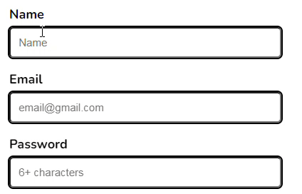
:focus: To refine feedback during the typing process and avoid immediate:invalidhighlighting before the user has fully entered data, use:focus:invalid.
<div>
  <label for="name">Name</label>
  <input type="text" id="name" required>
  </div>
  <div>
  <label for="email">Email</label>
  <input type="email" id="email" required>
  </div>
  <button type="submit">Submit</button>
</div>
:focus:invalid for a More Refined Experience:
Conclusion
By strategically using CSS pseudo-classes, you can create forms that provide clear, immediate feedback, significantly enhancing the user experience. Experiment with these techniques to build more intuitive and user-friendly interfaces. Share your thoughts and other CSS pseudo-class ideas in the comments below!
The above is the detailed content of Enhancing Form User Experience with CSS: Real-Time Feedback Techniques for Better User Interaction. For more information, please follow other related articles on the PHP Chinese website!

Hot AI Tools

Undresser.AI Undress
AI-powered app for creating realistic nude photos

AI Clothes Remover
Online AI tool for removing clothes from photos.

Undress AI Tool
Undress images for free

Clothoff.io
AI clothes remover

AI Hentai Generator
Generate AI Hentai for free.

Hot Article

Hot Tools

Notepad++7.3.1
Easy-to-use and free code editor

SublimeText3 Chinese version
Chinese version, very easy to use

Zend Studio 13.0.1
Powerful PHP integrated development environment

Dreamweaver CS6
Visual web development tools

SublimeText3 Mac version
God-level code editing software (SublimeText3)

Hot Topics
 1377
1377
 52
52
 Working With GraphQL Caching
Mar 19, 2025 am 09:36 AM
If you’ve recently started working with GraphQL, or reviewed its pros and cons, you’ve no doubt heard things like “GraphQL doesn’t support caching” or
 Making Your First Custom Svelte Transition
Mar 15, 2025 am 11:08 AM
The Svelte transition API provides a way to animate components when they enter or leave the document, including custom Svelte transitions.
 Show, Don't Tell
Mar 16, 2025 am 11:49 AM
How much time do you spend designing the content presentation for your websites? When you write a new blog post or create a new page, are you thinking about
 Building an Ethereum app using Redwood.js and Fauna
Mar 28, 2025 am 09:18 AM
With the recent climb of Bitcoin’s price over 20k $USD, and to it recently breaking 30k, I thought it’s worth taking a deep dive back into creating Ethereum
 How do you use CSS to create text effects, such as text shadows and gradients?
Mar 14, 2025 am 11:10 AM
The article discusses using CSS for text effects like shadows and gradients, optimizing them for performance, and enhancing user experience. It also lists resources for beginners.(159 characters)
 Creating Your Own Bragdoc With Eleventy
Mar 18, 2025 am 11:23 AM
No matter what stage you’re at as a developer, the tasks we complete—whether big or small—make a huge impact in our personal and professional growth.
 What the Heck Are npm Commands?
Mar 15, 2025 am 11:36 AM
npm commands run various tasks for you, either as a one-off or a continuously running process for things like starting a server or compiling code.
 Let's use (X, X, X, X) for talking about specificity
Mar 24, 2025 am 10:37 AM
I was just chatting with Eric Meyer the other day and I remembered an Eric Meyer story from my formative years. I wrote a blog post about CSS specificity, and


