Effortless React Animation: A Guide to Framer Motion

TL;DR: This blog post provides a comprehensive guide using Framer Motion, a React animation library. It covers key concepts like motion components, variants, and transitions and provides practical examples of creating fading button, slide-in sidebar, draggable modal, and card flip animations.
Our first priority as front-end developers is to create web applications that keep users engaged. This is possible by creating interactive pages and providing a better user experience.
Animations make your pages interactive; they guide users and make interactions interesting. Small visual motions on the page, such as user interaction or events or page navigation, give a feel of liveliness, like we are interacting with a living thing responding to our actions.
Animation, in simple terms, is a way of visually changing the elements by updating their properties or dimensions over time on interactions or certain events. For example, a loading indicator that shows that your action is in progress.
There are two ways to animate an element on the webpage (two ways to change the element properties).
- Through CSS, libraries like Animate.css provide a set of animation classes that can be added to HTML elements.
- Through JavaScript, libraries like Framer Motion manipulate the DOM element’s properties at runtime through code.
In this article, we will explore Framer Motion, one of the most popular libraries for animation. It provides simplicity and flexibility and is designed to work with modern frontend frameworks like React.
Why Framer Motion?
Framer Motion is a production-ready animation library for React that creates simple animations like transitions and complex, gesture-based interactions through its declarative syntax. It features:
- Ease of use: Framer Motion is extremely simple and easy to use, thanks to its intuitive APIs and methods.
- Flexibility: It can be used to create complex animations like pan, drag, pinch, or simple animations like fading, transitioning.
- Performance: Motion components are optimized for performance, as they are rendered outside the React lifecycle to run smoothly and ensure a seamless user experience.
- Community and Support: Extensive documents, large sets of examples, and great adoption by the community make it easier to get started.
Getting started with Framer Motion
Add the Framer Motion library to your project using the npm or yarn package manager.
npm install framer-motion
Or
npm install framer-motion
Once the dependency is loaded you can include this in your project to create interactive animations.
yarn add framer-motion
Basic concepts
Motion components:
Framer Motion comes with a list of motion components to create 120fps animations. It provides gesture support that contains all the HTML elements (like motion.div) and common SVG elements (like motion.square) that are special React components that can be used.
// On Client side
import { motion } from "motion/react"

// On Server-side
import * as motion from "motion/react-client"
Props & APIs:
Framer Motion provides a list of APIs as props, such as initial, animate, and exit that define the animation behavior.
<motion.div className="card" />
Initial prop is fired on the component mount, animate is fired when the component updates, and the exit prop is fired when the component unmounts. Refer to the complete Framer Motion animation guide for more details.
Motion components are independent of the Reacts lifecycle or render cycle for improved performance. Thus, we should rely on the React state for the animation, rather than using the motion values that will update the styles without triggering re-renders.
<motion.button
  initial={{opacity: 0}}
  animate={{opacity: 1}}
  transition={{duration: 1}}
  exit={{opacity: 0}}
>
  Click Me
</motion.button>
Variants includes:
- listVariants: Defines the animation behavior for the entire list, we pass the variants values on the props that will access the properties on its firing. initial=”hidden” and animate=”visible”. staggerChildren ensures that the child elements animate in sequence.
- itemVariants: Defines the animation behavior for the list items.
- The motion.ul and motion.li components inherit the variants to create a coordinated animation.
Custom components: Any React component can be converted to a motion component by passing it through the motion.create() function.
import { motion, useMotionValue } from "framer-motion";

const MotionState = () => {
  const xPosition = useMotionValue(0);

  useEffect(() => {
    // It won’t trigger a re-render on the component
    const interval = setInterval(() => {
    xPosition.set(xPosition.get() + 100);
    }, 1000);

    return () => clearInterval(interval);
  }, []);

  return (
    <motion.div
   >


<p>In the previous example, the <strong>motion.div</strong> element will be translated by 100px on the x position (horizontally, translateX(100px)) at an interval of 1s.</p>

<p><strong>Variants:</strong> framer-motion provides support for the variants, which allows the reuse of animation configurations across multiple elements.<br>
</p>

<pre class="brush:php;toolbar:false">const AnimatedList = () => {
  const listVariants = {
    hidden: { opacity: 0, y: 20 },
    visible: {
       opacity: 1,
       y: 0,
       transition: {
           staggerChildren: 0.2,
      },
    },
  };

  const itemVariants = {
      visible: { opacity: 1 },
    hidden: { opacity: 0 },
  };

  return (
    <motion.ul initial="hidden" animate="visible" variants={listVariants}>
    {[1, 2, 3].map((item) => (
        <motion.li key={item} variants={itemVariants}>
        Item {item}
        </motion.li>
    ))}
    </motion.ul>
  );
};
By default, all the motion props will be filtered out while passing it to the React component. The animation will be applied to the component, but you cannot access the props in the React.
To access the motion props, pass the flag forwardMotionProps: true while creating the motion component.
const ReactComponent = (props) => {
  return <button {...props}>ClickMe>/button>;
};

const MotionComponent = motion.create(ReactComponent);

const FadingButton2 = () => {
  return (
    <MotionComponent
    initial={{ opacity: 0 }}
    animate={{ opacity: 1 }}
    exit={{ opacity: 0 }}
    transition={{ duration: 3 }}
    >
    Click Me
    </MotionComponent>
  );
};
The motion.create() function also accepts a string that will create the motion component of a custom DOM element.
const MotionComponent = motion.create(ReactComponent, {
  forwardMotionProps: true,
});
Note: Avoid using the motion.create() in the React lifecycle methods like (useEffect), as this will create a new component every time the lifecycle method is fired.
Now that you have a good idea of how Framer Motion works and its APIs, let’s see some examples of how you can use it for common animation.
Examples
A fading button
npm install framer-motion
- initial: Sets the initial state of the button opacity:0, when the element is not the viewport.
- animate: Sets the state of the button to opacity:1 when the element is in the viewport.
- transition: Configures the animation transition; the button will take one second to go from opacity:0 to opacity:1
- exit: Sets the state of the button when the element is getting out of the viewport.
The exit property takes effect only when wrapped in the AnimatePresence component.
yarn add framer-motion
AnimatePresence affects the direct children, which are motion components that are being removed from the React component tree.
This can be when the component is updating on the lifecycle change (mount, update, unmount)
// On Client side
import { motion } from "motion/react"

// On Server-side
import * as motion from "motion/react-client"
Its key changes
<motion.div className="card" />
Children are added or removed from the list.
<motion.button
  initial={{opacity: 0}}
  animate={{opacity: 1}}
  transition={{duration: 1}}
  exit={{opacity: 0}}
>
  Click Me
</motion.button>
Slide-in sidebar
import { motion, useMotionValue } from "framer-motion";

const MotionState = () => {
  const xPosition = useMotionValue(0);

  useEffect(() => {
    // It won’t trigger a re-render on the component
    const interval = setInterval(() => {
    xPosition.set(xPosition.get() + 100);
    }, 1000);

    return () => clearInterval(interval);
  }, []);

  return (
    <motion.div
   >


<p>In the previous example, the <strong>motion.div</strong> element will be translated by 100px on the x position (horizontally, translateX(100px)) at an interval of 1s.</p>

<p><strong>Variants:</strong> framer-motion provides support for the variants, which allows the reuse of animation configurations across multiple elements.<br>
</p>

<pre class="brush:php;toolbar:false">const AnimatedList = () => {
  const listVariants = {
    hidden: { opacity: 0, y: 20 },
    visible: {
       opacity: 1,
       y: 0,
       transition: {
           staggerChildren: 0.2,
      },
    },
  };

  const itemVariants = {
      visible: { opacity: 1 },
    hidden: { opacity: 0 },
  };

  return (
    <motion.ul initial="hidden" animate="visible" variants={listVariants}>
    {[1, 2, 3].map((item) => (
        <motion.li key={item} variants={itemVariants}>
        Item {item}
        </motion.li>
    ))}
    </motion.ul>
  );
};
Transition props play a crucial role in animation. They control how animations progress over time. Framer Motion supports multiple properties for smooth animation.
- duration: Length of the animation (in seconds)
- delay: Delays the start of the animation (in seconds)
- ease: A set of easing functions that advocates how the animation will progress (‘ease’, ‘easeIn’, ‘easeInOut’)
Draggable Modal
Framer motion also supports interactive animations with gestures like hover, tap, and drag.
const ReactComponent = (props) => {
  return <button {...props}>ClickMe>/button>;
};

const MotionComponent = motion.create(ReactComponent);

const FadingButton2 = () => {
  return (
    <MotionComponent
    initial={{ opacity: 0 }}
    animate={{ opacity: 1 }}
    exit={{ opacity: 0 }}
    transition={{ duration: 3 }}
    >
    Click Me
    </MotionComponent>
  );
};
- Page: Wraps the child component with the motion animation.
- Initial, animate, & exit: Handles the appearance and disappearance of the component on the page navigation.
Conclusion
Thanks for reading! Framer Motion is a powerful animation library that makes it easier to add stunning animations to React components. It helps you create a simple animation to handle complex, gesture-based interactions. There are endless possibilities with Framer Motion to add interactions to your React applications.
The new version of Essential Studio® is available for existing customers on the License and Downloads page. If you’re new, sign up for our 30-day free trial to explore our features.
Feel free to contact us through our support forum, support portal, or feedback portal. We’re always here to assist you!
Related Blogs
- Top 5 React PDF Viewers for Smooth Document Handling
- Top 5 React Chart Libraries for 2025
- Vite.js: Build Faster Frontends
- RxJS for React: Unlocking Reactive States
The above is the detailed content of Effortless React Animation: A Guide to Framer Motion. For more information, please follow other related articles on the PHP Chinese website!

Hot AI Tools

Undresser.AI Undress
AI-powered app for creating realistic nude photos

AI Clothes Remover
Online AI tool for removing clothes from photos.

Undress AI Tool
Undress images for free

Clothoff.io
AI clothes remover

Video Face Swap
Swap faces in any video effortlessly with our completely free AI face swap tool!

Hot Article

Hot Tools

Notepad++7.3.1
Easy-to-use and free code editor

SublimeText3 Chinese version
Chinese version, very easy to use

Zend Studio 13.0.1
Powerful PHP integrated development environment

Dreamweaver CS6
Visual web development tools

SublimeText3 Mac version
God-level code editing software (SublimeText3)

Hot Topics
 1664
1664
 14
14
 1421
1421
 52
52
 1315
1315
 25
25
 1266
1266
 29
29
 1239
1239
 24
24
 Demystifying JavaScript: What It Does and Why It Matters
Apr 09, 2025 am 12:07 AM
JavaScript is the cornerstone of modern web development, and its main functions include event-driven programming, dynamic content generation and asynchronous programming. 1) Event-driven programming allows web pages to change dynamically according to user operations. 2) Dynamic content generation allows page content to be adjusted according to conditions. 3) Asynchronous programming ensures that the user interface is not blocked. JavaScript is widely used in web interaction, single-page application and server-side development, greatly improving the flexibility of user experience and cross-platform development.
 The Evolution of JavaScript: Current Trends and Future Prospects
Apr 10, 2025 am 09:33 AM
The latest trends in JavaScript include the rise of TypeScript, the popularity of modern frameworks and libraries, and the application of WebAssembly. Future prospects cover more powerful type systems, the development of server-side JavaScript, the expansion of artificial intelligence and machine learning, and the potential of IoT and edge computing.
 JavaScript Engines: Comparing Implementations
Apr 13, 2025 am 12:05 AM
Different JavaScript engines have different effects when parsing and executing JavaScript code, because the implementation principles and optimization strategies of each engine differ. 1. Lexical analysis: convert source code into lexical unit. 2. Grammar analysis: Generate an abstract syntax tree. 3. Optimization and compilation: Generate machine code through the JIT compiler. 4. Execute: Run the machine code. V8 engine optimizes through instant compilation and hidden class, SpiderMonkey uses a type inference system, resulting in different performance performance on the same code.
 Python vs. JavaScript: The Learning Curve and Ease of Use
Apr 16, 2025 am 12:12 AM
Python is more suitable for beginners, with a smooth learning curve and concise syntax; JavaScript is suitable for front-end development, with a steep learning curve and flexible syntax. 1. Python syntax is intuitive and suitable for data science and back-end development. 2. JavaScript is flexible and widely used in front-end and server-side programming.
 JavaScript: Exploring the Versatility of a Web Language
Apr 11, 2025 am 12:01 AM
JavaScript is the core language of modern web development and is widely used for its diversity and flexibility. 1) Front-end development: build dynamic web pages and single-page applications through DOM operations and modern frameworks (such as React, Vue.js, Angular). 2) Server-side development: Node.js uses a non-blocking I/O model to handle high concurrency and real-time applications. 3) Mobile and desktop application development: cross-platform development is realized through ReactNative and Electron to improve development efficiency.
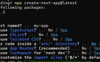 How to Build a Multi-Tenant SaaS Application with Next.js (Frontend Integration)
Apr 11, 2025 am 08:22 AM
This article demonstrates frontend integration with a backend secured by Permit, building a functional EdTech SaaS application using Next.js. The frontend fetches user permissions to control UI visibility and ensures API requests adhere to role-base
 From C/C to JavaScript: How It All Works
Apr 14, 2025 am 12:05 AM
The shift from C/C to JavaScript requires adapting to dynamic typing, garbage collection and asynchronous programming. 1) C/C is a statically typed language that requires manual memory management, while JavaScript is dynamically typed and garbage collection is automatically processed. 2) C/C needs to be compiled into machine code, while JavaScript is an interpreted language. 3) JavaScript introduces concepts such as closures, prototype chains and Promise, which enhances flexibility and asynchronous programming capabilities.
 Building a Multi-Tenant SaaS Application with Next.js (Backend Integration)
Apr 11, 2025 am 08:23 AM
I built a functional multi-tenant SaaS application (an EdTech app) with your everyday tech tool and you can do the same. First, what’s a multi-tenant SaaS application? Multi-tenant SaaS applications let you serve multiple customers from a sing


