
 Software Tutorial
Office Software
I Always Use Excel to Create Heat Maps: Here's How You Can Too
Software Tutorial
Office Software
I Always Use Excel to Create Heat Maps: Here's How You Can Too
I Always Use Excel to Create Heat Maps: Here's How You Can Too

Quick Links
- What Is a Heat Map and What Are They Used For?
- Create Your Data Set
- Apply Conditional Formatting
- Remove Visible Values and Gridlines (Optional)
Excel is known as a complex number cruncher that only experts can use, but, in my view, labeling the program with such a sweeping generalization undermines its ability to make life easier. And in no scenario is this truer than in its wish to help you visualize data more efficiently.
That brings me to heat maps, which you can easily create in Excel to represent values relative to each other using colors.
What Is a Heat Map and What Are They Used For?
In today's fast-paced world, where everyone seems to be in a rush, displaying data in a way that can be easily interpreted and analyzed—such as in a heat map—is essential. Excel lets you automatically color code figures to demonstrate their relationship with one another, using darker colors for higher numbers and lighter colors for lower numbers, for example. This means you can see trends and anomalies at a glance.

But this Excel tool isn't exclusively reserved for corporate finances or complicated data analysis. Indeed, you can use Excel to create heat maps for pretty much anything, from displaying your sports team's on-field strengths to showing how climate change is impacting temperatures over time.

The colors in the examples above are automatically generated using numerical data (which has been hidden—we'll look into this later) and conditional formatting. Let's explore in more detail how this can be done.
Excel has a separate tool for creating geographical heat maps (for example, if you wanted to color each country based on GDP per capita or millimeters of rainfall per year). However, in this article, we're going to explore how to create all other types of heat maps manually.
Create Your Data Set
The first step is to create your statistical data in its simplest form. If you're starting with a blank worksheet, type your column and row parameters, and insert your data. If you wish, you can format your Excel table so that it's easier to add more data later on. If you already have your completed data set, make sure it's presented in a way that lends itself to creating a heat map in the next step (such as removing empty rows and columns in a table).
To generate the two sample heat maps shown above, we started with this (details of the number of bonuses each employee received each month):

And this (how many goals were scored from a certain location on a soccer pitch):

To create the soccer pitch in Excel, I inserted it as a PNG image, meaning the cells underneath the graphic remained visible. You can do the same with any image outline to create a heat map in Excel.
Apply Conditional Formatting
The next step is to apply the color scales to your data. First, select all the cells that will form the heat map. In the example below, I've selected all the cells on the soccer pitch, so that any data I might add later on will also be picked up by the color rules I set.
If you are applying the conditional formatting to cells underneath an image, you'll need to use your arrow keys to navigate to the correct cell, as you can't select a cell underneath a graphic using your mouse. Then, hold Shift while using your arrow keys to select the relevant cells.

Next, click "Conditional Formatting" in the Home tab on the ribbon, and hover over "Color Scales." From there, you can choose the color scale that works best with how you want to display your data.

In my case, I'll choose the "Green To Yellow" scale.

If none of the preset options pique your fancy, click "More Rules" instead. This will launch the New Formatting Rule dialog box, where you can switch to a three-color scale (rather than the default two colors), with more specific rules about how the values affect the colors to be displayed.

To change or remove the color scale after you have applied it, select the cells again, click "Conditional Formatting," and select either "Manage Rules" or "Clear Rules."
Remove Visible Values and Gridlines (Optional)
The final step in optimizing your heat map involves hiding the figures and removing the gridlines, if doing so will improve your data visualization.
To hide the figures, select the cells to which you applied the conditional formatting in the previous step. Then, in the Home tab, click the "Number Format" icon in the bottom corner of the Number group.

Then, click "Custom" in the Category menu, and type ;;; (three semicolons) into the field box.

When you click "OK," the numbers will disappear from the cells, though you can still see them in the formula bar when you select the relevant cells.

Removing the gridlines is much more straightforward. In the View tab on the ribbon, uncheck "Gridlines" in the Show group.

Heat maps are just one of the many ways to visualize data in Excel, and which method you choose depends on the type of data you have, and how you want to present it. For example, you can create dynamic charts with dropdown lists, insert a combo chart that combines a column and line graph into a single chart, and use pivot tables to analyze your data more comprehensively.
The above is the detailed content of I Always Use Excel to Create Heat Maps: Here's How You Can Too. For more information, please follow other related articles on the PHP Chinese website!

Hot AI Tools

Undresser.AI Undress
AI-powered app for creating realistic nude photos

AI Clothes Remover
Online AI tool for removing clothes from photos.

Undress AI Tool
Undress images for free

Clothoff.io
AI clothes remover

Video Face Swap
Swap faces in any video effortlessly with our completely free AI face swap tool!

Hot Article
Hot Tools

Notepad++7.3.1
Easy-to-use and free code editor

SublimeText3 Chinese version
Chinese version, very easy to use

Zend Studio 13.0.1
Powerful PHP integrated development environment

Dreamweaver CS6
Visual web development tools

SublimeText3 Mac version
God-level code editing software (SublimeText3)
Hot Topics


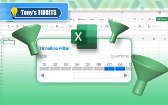 How to Create a Timeline Filter in Excel
Apr 03, 2025 am 03:51 AM
How to Create a Timeline Filter in Excel
Apr 03, 2025 am 03:51 AM
In Excel, using the timeline filter can display data by time period more efficiently, which is more convenient than using the filter button. The Timeline is a dynamic filtering option that allows you to quickly display data for a single date, month, quarter, or year. Step 1: Convert data to pivot table First, convert the original Excel data into a pivot table. Select any cell in the data table (formatted or not) and click PivotTable on the Insert tab of the ribbon. Related: How to Create Pivot Tables in Microsoft Excel Don't be intimidated by the pivot table! We will teach you basic skills that you can master in minutes. Related Articles In the dialog box, make sure the entire data range is selected (
 You Need to Know What the Hash Sign Does in Excel Formulas
Apr 08, 2025 am 12:55 AM
You Need to Know What the Hash Sign Does in Excel Formulas
Apr 08, 2025 am 12:55 AM
Excel Overflow Range Operator (#) enables formulas to be automatically adjusted to accommodate changes in overflow range size. This feature is only available for Microsoft 365 Excel for Windows or Mac. Common functions such as UNIQUE, COUNTIF, and SORTBY can be used in conjunction with overflow range operators to generate dynamic sortable lists. The pound sign (#) in the Excel formula is also called the overflow range operator, which instructs the program to consider all results in the overflow range. Therefore, even if the overflow range increases or decreases, the formula containing # will automatically reflect this change. How to list and sort unique values in Microsoft Excel
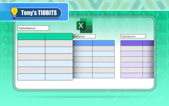 If You Don't Rename Tables in Excel, Today's the Day to Start
Apr 15, 2025 am 12:58 AM
If You Don't Rename Tables in Excel, Today's the Day to Start
Apr 15, 2025 am 12:58 AM
Quick link Why should tables be named in Excel How to name a table in Excel Excel table naming rules and techniques By default, tables in Excel are named Table1, Table2, Table3, and so on. However, you don't have to stick to these tags. In fact, it would be better if you don't! In this quick guide, I will explain why you should always rename tables in Excel and show you how to do this. Why should tables be named in Excel While it may take some time to develop the habit of naming tables in Excel (if you don't usually do this), the following reasons illustrate today
 How to Format a Spilled Array in Excel
Apr 10, 2025 pm 12:01 PM
How to Format a Spilled Array in Excel
Apr 10, 2025 pm 12:01 PM
Use formula conditional formatting to handle overflow arrays in Excel Direct formatting of overflow arrays in Excel can cause problems, especially when the data shape or size changes. Formula-based conditional formatting rules allow automatic formatting to be adjusted when data parameters change. Adding a dollar sign ($) before a column reference applies a rule to all rows in the data. In Excel, you can apply direct formatting to the values or background of a cell to make the spreadsheet easier to read. However, when an Excel formula returns a set of values (called overflow arrays), applying direct formatting will cause problems if the size or shape of the data changes. Suppose you have this spreadsheet with overflow results from the PIVOTBY formula,

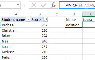 Excel MATCH function with formula examples
Apr 15, 2025 am 11:21 AM
Excel MATCH function with formula examples
Apr 15, 2025 am 11:21 AM
This tutorial explains how to use MATCH function in Excel with formula examples. It also shows how to improve your lookup formulas by a making dynamic formula with VLOOKUP and MATCH. In Microsoft Excel, there are many different lookup/ref
 How to Use Excel's AGGREGATE Function to Refine Calculations
Apr 12, 2025 am 12:54 AM
How to Use Excel's AGGREGATE Function to Refine Calculations
Apr 12, 2025 am 12:54 AM
Quick Links The AGGREGATE Syntax
 How to change Excel table styles and remove table formatting
Apr 19, 2025 am 11:45 AM
How to change Excel table styles and remove table formatting
Apr 19, 2025 am 11:45 AM
This tutorial shows you how to quickly apply, modify, and remove Excel table styles while preserving all table functionalities. Want to make your Excel tables look exactly how you want? Read on! After creating an Excel table, the first step is usual
