


In this article, we’ll review some of the best React UI component libraries and explain how to choose the right one for you. The article is written primarily for beginner React developers, but you’ll need some familiarity with React’s specific terms.
React powers the user interfaces (UI) of more than 10 million websites around the world. While the base library of React is solid, there are multiple component libraries filled with valuable design elements for your React app or web development project.
Let’s look at the most popular React UI libraries on GitHub to help you find the best React UI library for your current project. We’ll analyze their application in development, bring examples, and look at their popularity among developers based on usage statistics from GitHub and npm.
Let’s start with why you should be thinking about using a React UI library in the first place. But If you want to get started with the list right away, jump here.
Each React component library has pros and cons, which we’ll discuss in more detail below. But in general, using any component library can have many benefits that will help you when working on your React project:
Despite these many upsides, even the best React UI component libraries have some downsides that you should consider before you commit to one:
Since you now understand the pros and cons of using React UI component libraries, let’s take a look at the most popular libraries based on GitHub statistics. We’ve listed the libraries based on their number of active projects on GitHub, starting with the most popular.
By the end of this post, you will be able to decide what is the best UI library for React projects.
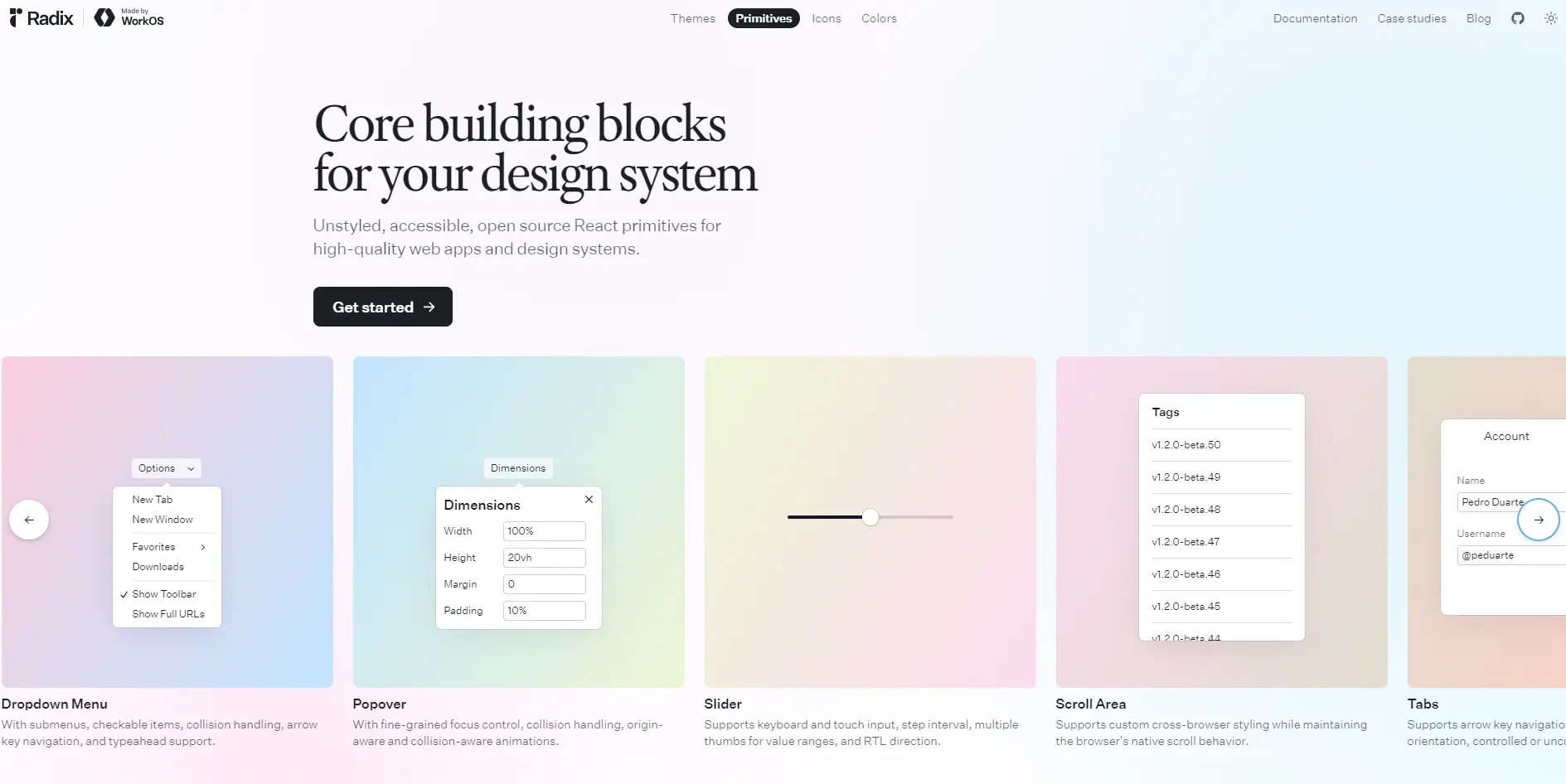


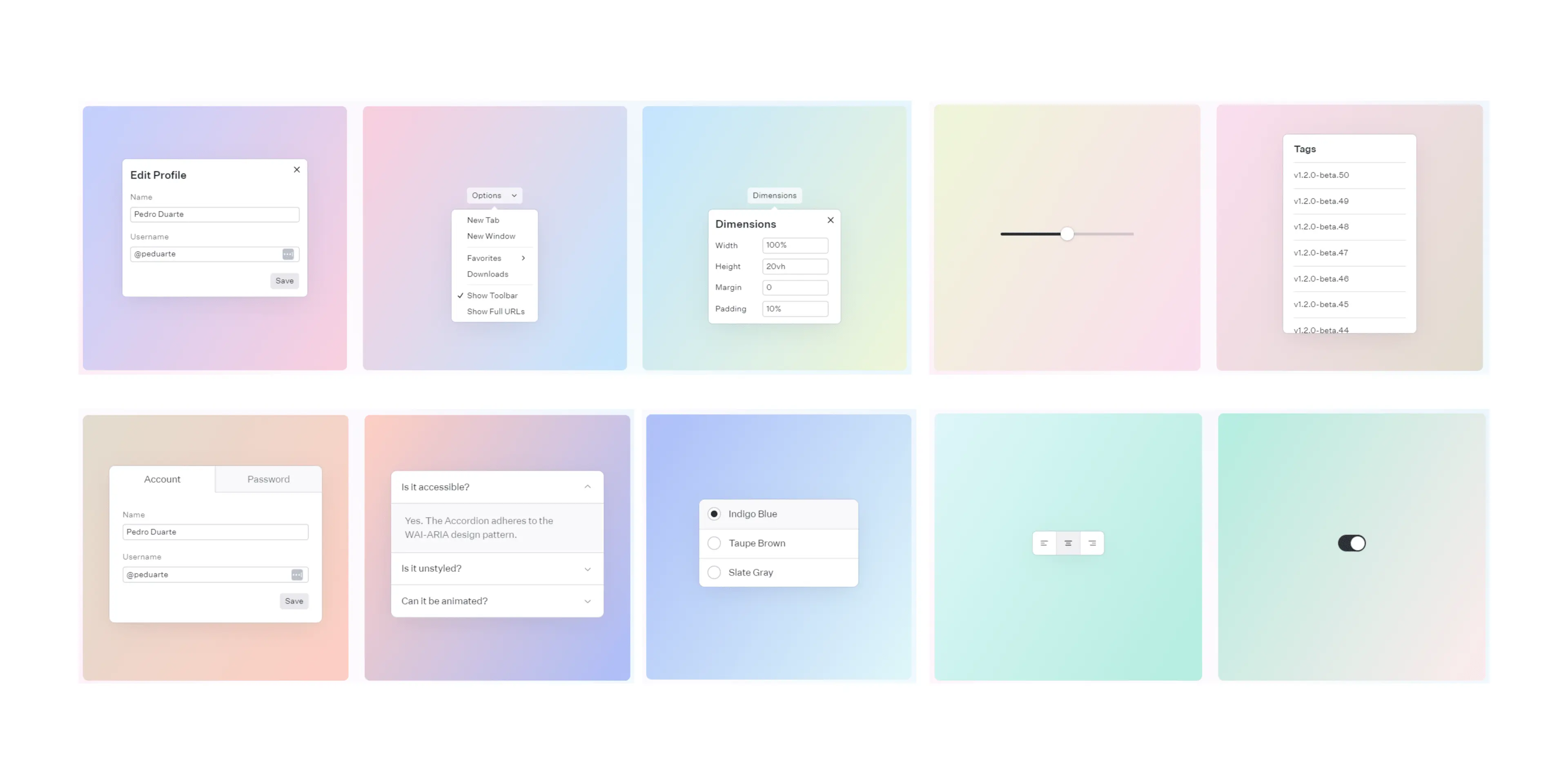
Radix UI is a modern component library with a large number of unstyled, accessible React components. Unlike many other component libraries, Radix UI focuses on delivering primitives that allow developers to design from scratch. Radix UI offers four main libraries to facilitate UI development:
Radix Primitives is the main part of this collection, which provides low-level building blocks to create custom UIs while ensuring accessibility, interactivity, and keyboard support. Radix Primitives is almost built using TypeScript and has more than 8.9 million weekly NPM downloads.
With Radix Primitives, you can focus on creating unique designs without sacrificing accessibility or performance. The picture below shows some commonly used primitives like dialogs, dropdown menus, and sliders:
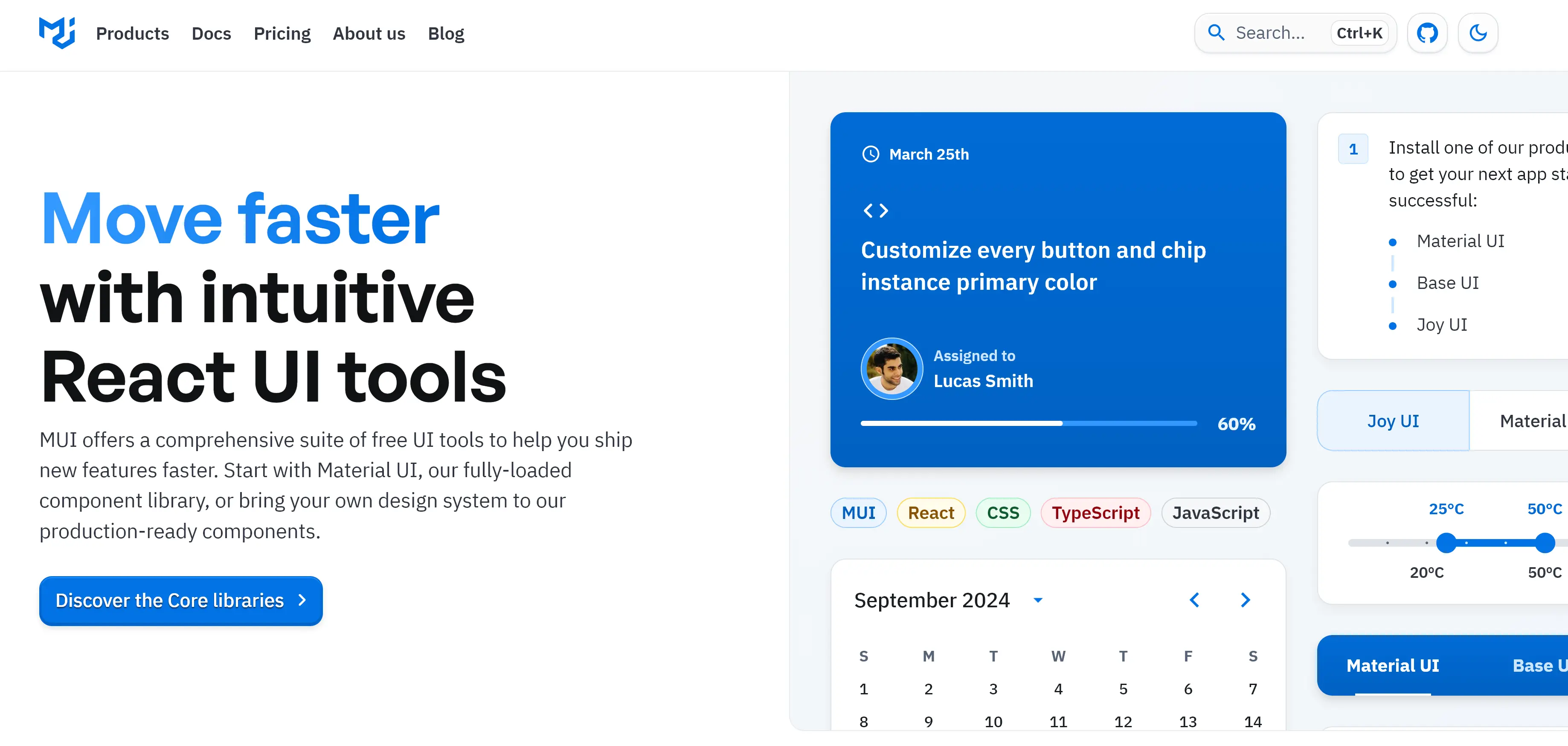


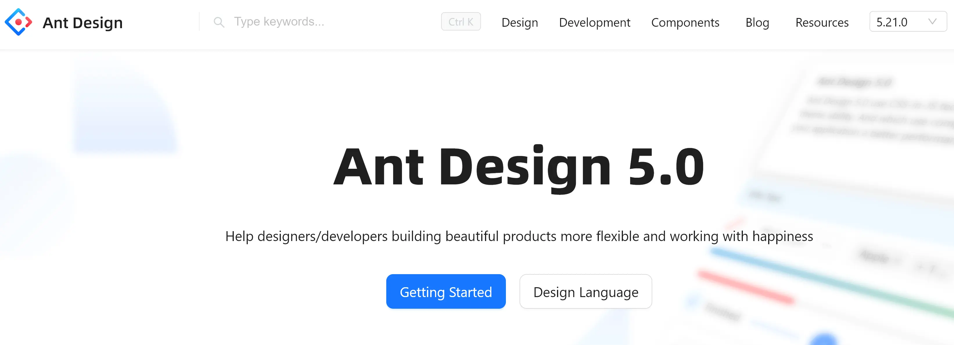
MUI is a straightforward and customizable React components library based on Google’s Material Design. It is used by more than 4.1 million weekly NPM downloads and is built on 55.8% TypeScript and 44% JavaScript. MUI is not simply a component library but an entire design system. It features a wholesome system of guidelines, design principles, and best practices of UI design.
However, the customization options of this library are limited, and your app might end up looking like it is associated with Google. Still, seeing how much MUI is used and how many GitHub stars it has, it’s one of the best UI library for React projects.
MUI is used by medium.com, Scale AI, and UNIQLO, among others. If you’d like to consider an alternative, try Enlite Prime, which is covered in our guide to the best Material UI themes, is also a good option.
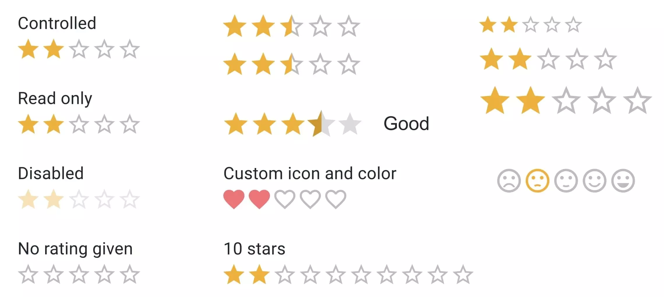
The picture below shows an example of MUI rating variants.
You can install the MUI components library using npm or Yarn:
// npm
npm install @mui/material @emotion/react @emotion/styled

// yarn
yarn add @mui/material @emotion/react @emotion/styled


Ant Design is another popular React UI library created by Alibaba, and it has over 1.6 million weekly NPM downloads. It describes itself as a design system for enterprise-level users. Ant Design offers a large set of high-quality components for building entire UI frameworks quickly — or you can just use individual components. The library is built on 99.2% TypeScript and 0.8% unspecified code.
In addition to Alibaba, Ant Design is also used by the likes of Lenovo and Toyota, showing it’s a great choice for high-level business projects. It also has more stars on GitHub than React Bootstrap, which proves its greatness.
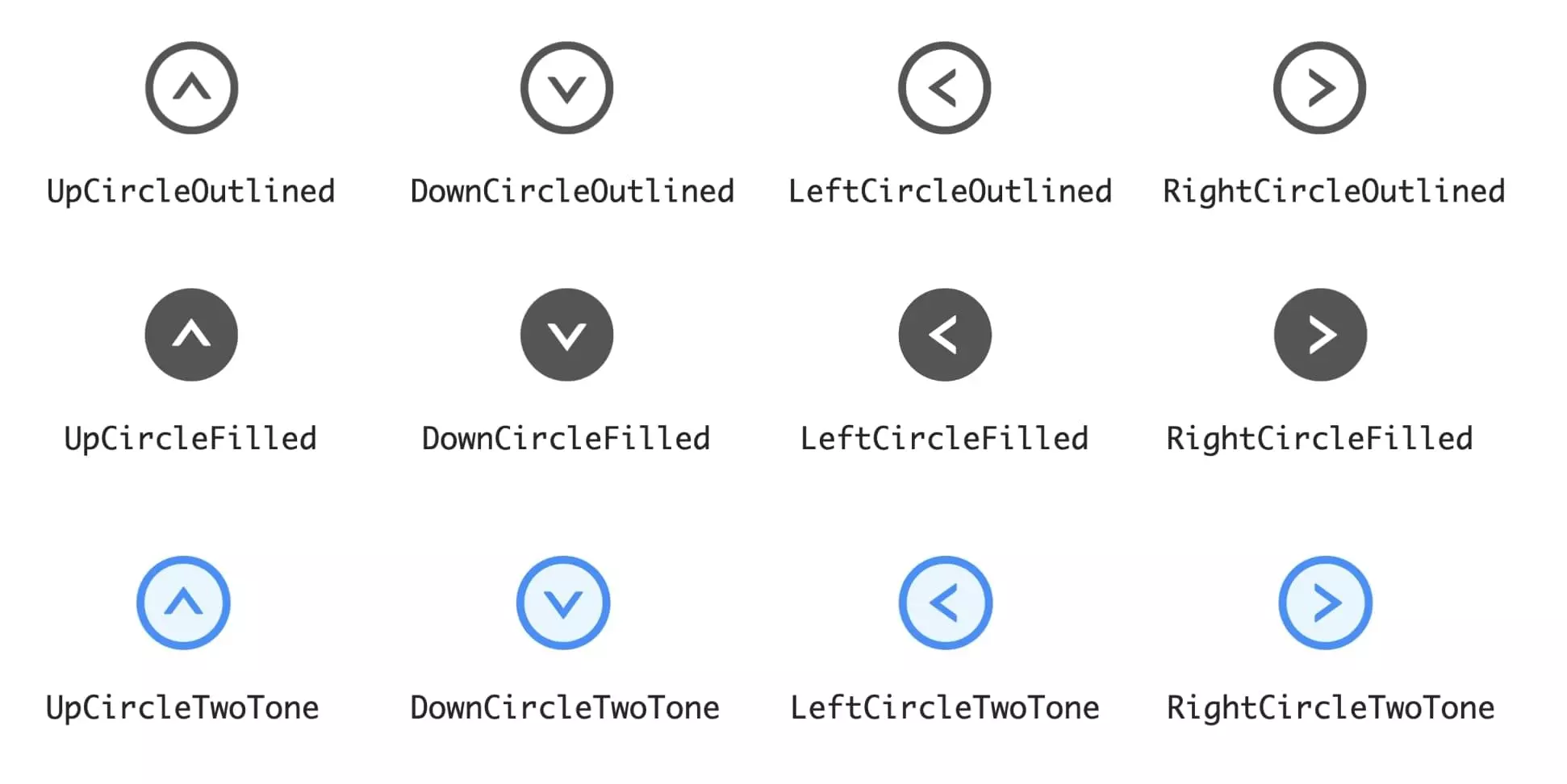
The image below shows an example of icon variants in Ant Design.
You can install Ant Design components using npm or Yarn:
// npm
npm install @mui/material @emotion/react @emotion/styled

// yarn
yarn add @mui/material @emotion/react @emotion/styled
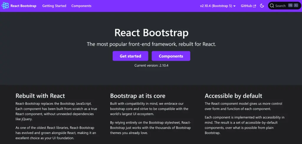


React-Bootstrap is one of the oldest React UI component libraries in GitHub, and it has more than 1.2 million weekly NPM downloads. It’s a rebuild of the popular frontend framework Bootstrap using React. The library is mainly built on 65.3% TypeScript and 22% JavaScript. The latest release of React-Bootstrap is compatible with the most recent Bootstrap version, 5.3.
On the downside, if you’re familiar with Bootstrap and decide to choose React-Bootstrap for your project, you’ll have to learn a new API. Moreover, compared to other libraries, like MUI or Ant Design, React-Bootstrap has a smaller set of components.
However, React-Bootstrap’s popularity is a clear sign that it’s a great choice for a wide variety of development projects. And if you’re already familiar with Bootstrap, it can feel natural to use React-Bootstrap, too.
The image below shows an example of React-Bootstrap’s button variants.

You can install React Bootstrap using npm or yarn:
// npm
npm install @mui/material @emotion/react @emotion/styled

// yarn
yarn add @mui/material @emotion/react @emotion/styled
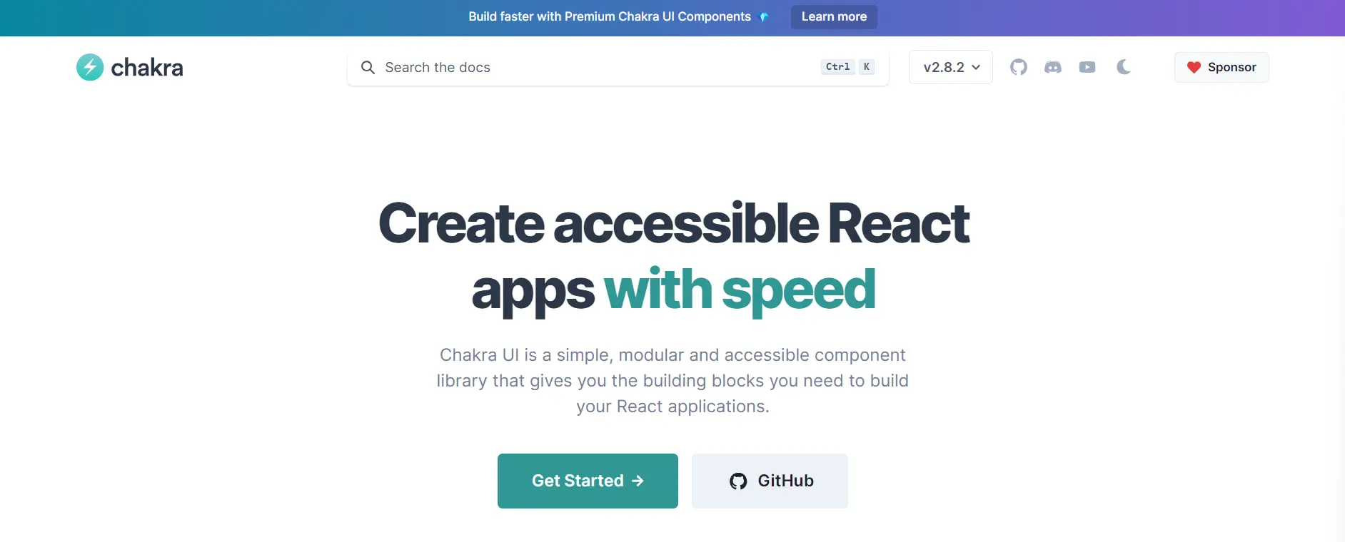


With over 586,000 weekly NPM downloads, Chakra UI offers straightforward, modular, and customizable React components for web development. Chakra UI codebase comprises 62.1% MDX, 34.8% TypeScript, and 3.1% JavaScript.
However, Chakra UI still lacks some features and components compared to libraries like React Bootstrap. So, it is best used for small to medium-sized development projects requiring only a few components or advanced features.
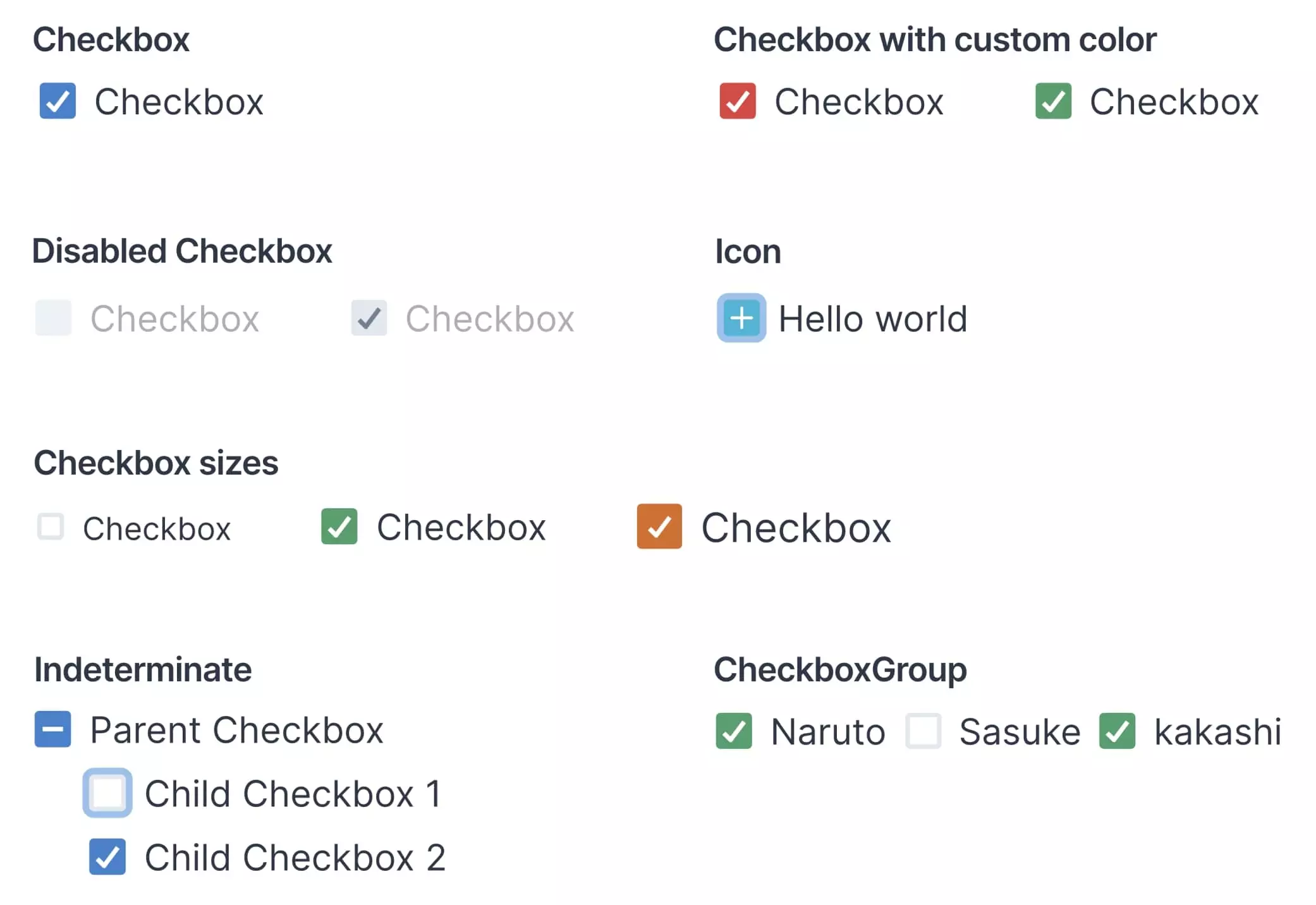
The image below shows an example of checkbox variants in Chakra UI.
You can install Chakra UI and its components using npm or Yarn:
// npm
npm install antd

// yarn
yarn add antd
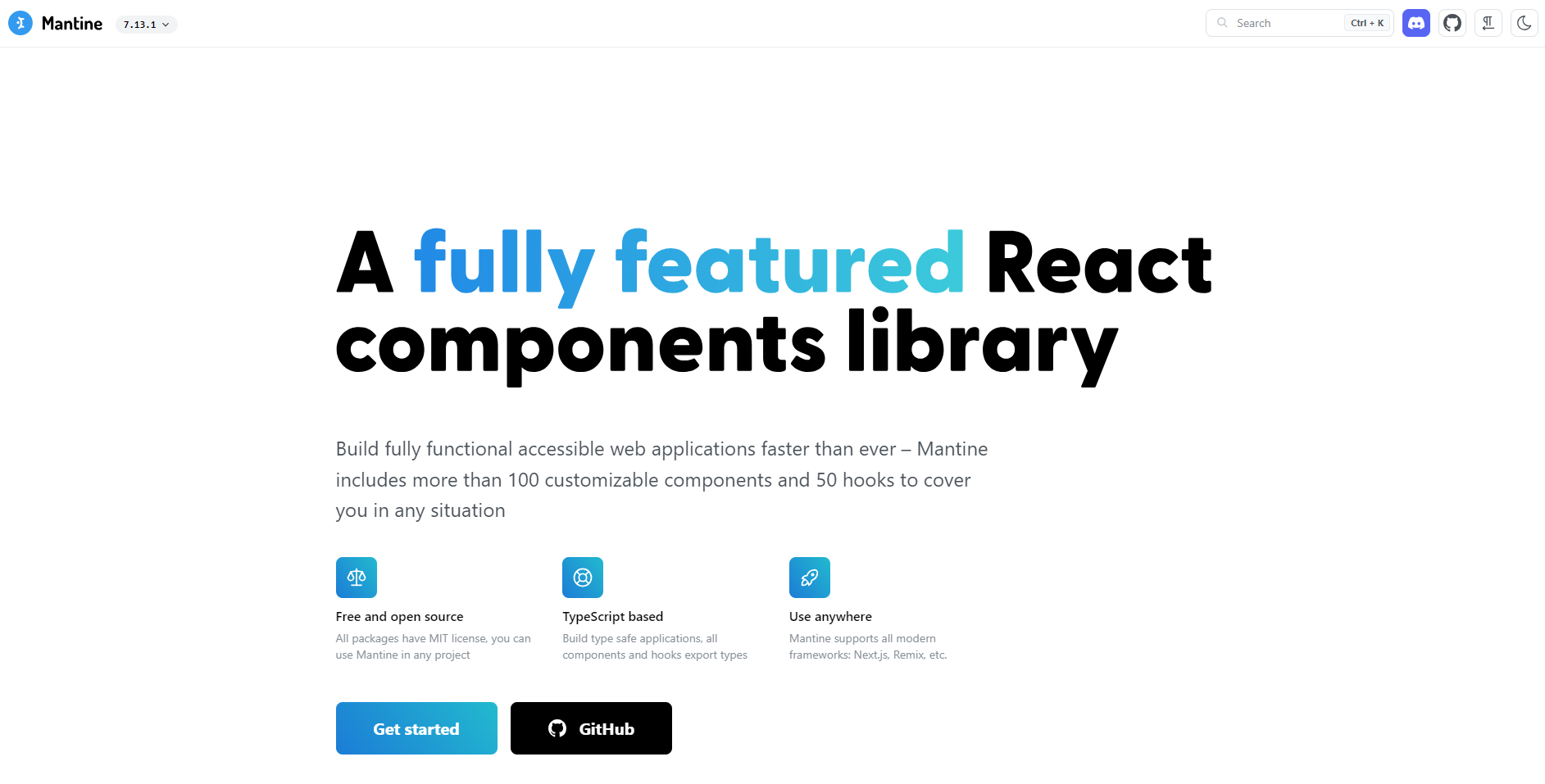


Mantine is another popular React component library with more than 500,000 weekly NPM downloads. It provides over 100 customizable and accessible components, hooks, and utilities for building modern web applications. Mantine supports TypeScript out of the box and works well with popular CSS-in-JS libraries. Mantine codebase comprises 79.9% TypeScript, 15.1 MDX and 4.9% CSS.
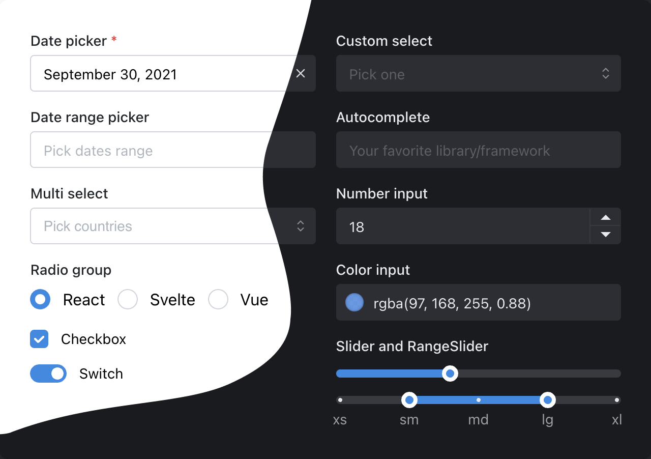
Mantine has over 200 contributors and is rapidly growing in popularity, making it a strong choice for modern React development. The below image shows some popular Mantine components:
You can install Mantine using npm or Yarn:
// npm
npm install @mui/material @emotion/react @emotion/styled

// yarn
yarn add @mui/material @emotion/react @emotion/styled
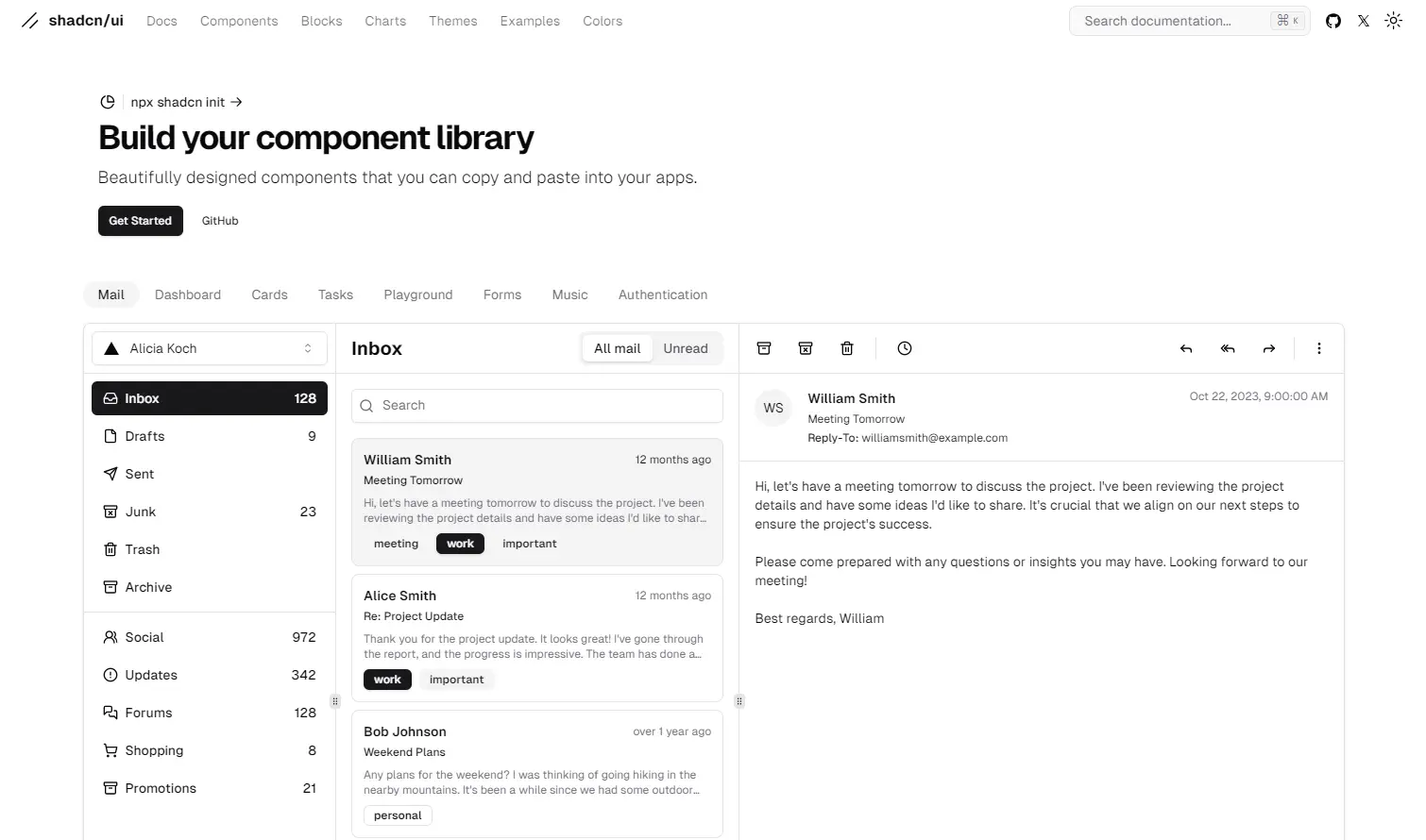


Shadcn is one of the latest React components libraries in the market. Although it has been only a year since Shadcn was introduced, it already has more than 84,000 weekly NPM downloads. Shadcn is built on top of Radix Primitives. Hence, all the components are unstyled and accessibility-focused, allowing developers to style their components based on unique requirements. Shadcn is built on 91.4% TypeScript, 7% MDX, and 1.1% CSS.
Shadcn is ideal for developers who want to build accessible, flexible, and high-performance UIs with full control over styling and theming. The below image shows an example of Shadcn mail components:
You can get started with Shadcn using npm or Yarn:
// npm
npm install @mui/material @emotion/react @emotion/styled

// yarn
yarn add @mui/material @emotion/react @emotion/styled


With more than 484,000 weekly NPM downloads, Reactstrap offers straightforward and self-contained components for Bootstrap 5.1. Its’ UI elements are responsive, simple in design, and applicable to a variety of projects. Reactstrap codebase comprises 82.4% JavaScript, 16.5% TypeScript, and 1.1% unspecified code.
All in all, Reactstrap is similar to React-Bootstrap, with a few small differences. If you like working with Bootstrap, you can easily choose either for your project.
But, as Reactstrap is a relatively new React component library compared to other mentions on this list, it has a small collection of components. Then again, this can be a good thing if you’re aiming for a simple design. The official Reactstrap documentation is thorough but mainly consists of code and only has a few explanations.
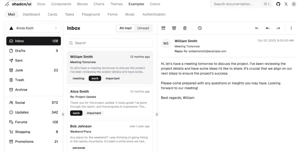
The image below shows an example of button dropdown variants in Reactstrap.
To use Reactstrap, you first need to install Bootstrap:
// npm
npm install antd

// yarn
yarn add antd
Then you can install Reactstrap using npm or Yarn:
// npm
npm install @mui/material @emotion/react @emotion/styled

// yarn
yarn add @mui/material @emotion/react @emotion/styled
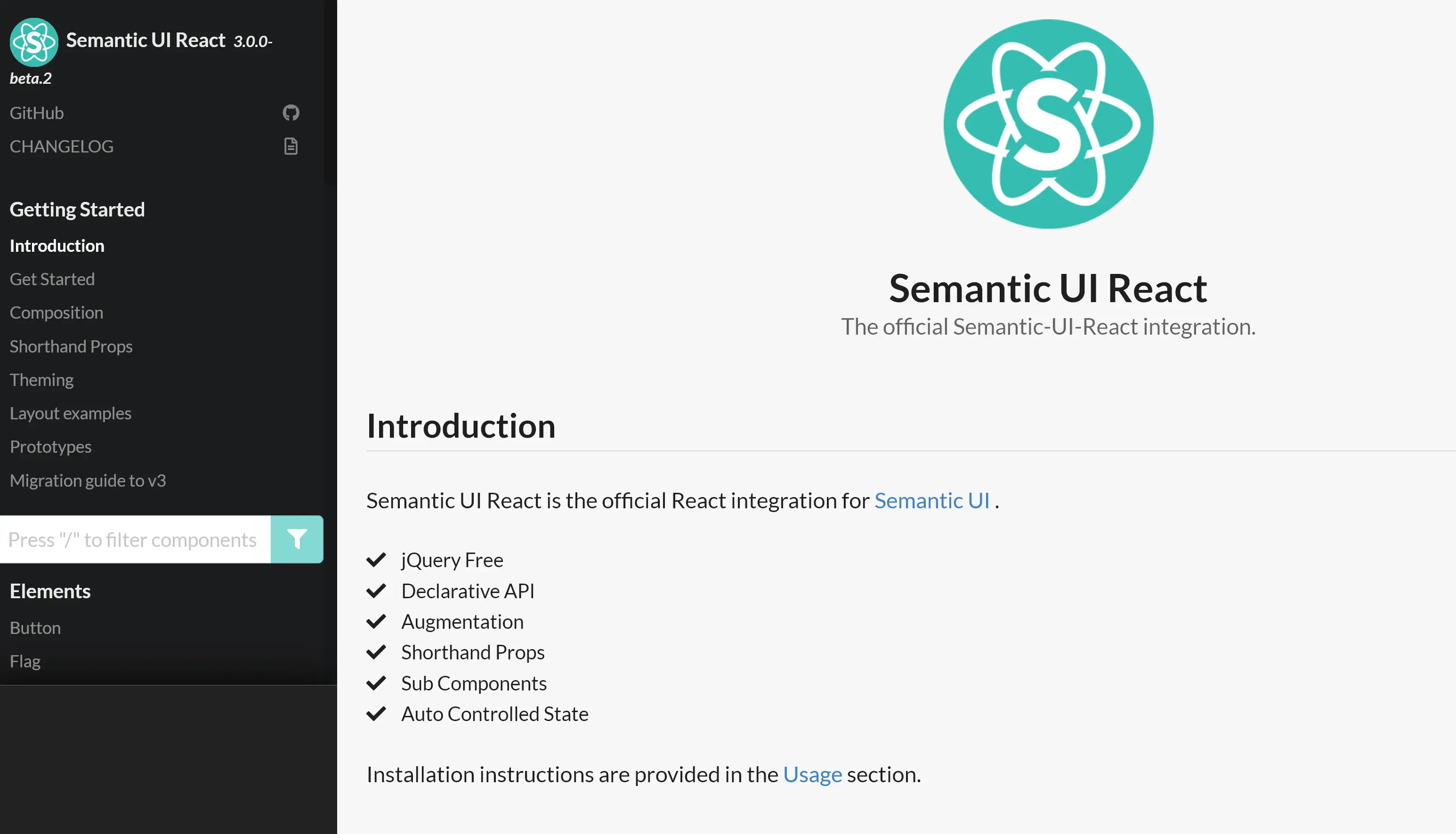


Used by more than 266,000 weekly NPM downloads, Semantic UI React is a frontend component library for ready-made, mobile-responsive solutions. As the name suggests, it’s the official React integration of the Semantic UI development framework, known for its responsive, human-friendly HTML code. It is built on 99.9% JavaScript and 0.1% TypeScript.
However, the original Semantic UI framework is no longer maintained, and not all the components are fully accessible by default.
Nevertheless, Semantic UI React is going strong and is a good choice for beginners looking to build responsive web apps. It has human-friendly code, great documentation with plenty of examples, and a code sandbox for each component.
The image below shows an example of label components in Semantic UI React.

YYou can install Semantic UI React components using npm or Yarn:
// npm
npm install antd

// yarn
yarn add antd
After install, import the minified CSS file in your app’s entry file:
// npm
npm install @mui/material @emotion/react @emotion/styled

// yarn
yarn add @mui/material @emotion/react @emotion/styled


With more than 181,000 weekly NPM downloads, Blueprint features over 40 modern-day components in its library. The main focus of Blueprint is building a React UI for complex data-dense desktop applications; therefore, it’s not fully mobile-responsive. Blueprint is built on 89.1% TypeScript, 7.6% SCSS, 2.7% JavaScript, 0.3% Shell, and 0.2% HTML.
Blueprint is probably the best React component library for you if you want to build a data-dense desktop application with beautiful pre-made components. But, like Theme UI and Rebass, the community isn’t very large yet, so finding help could be challenging. And, of course, it’s not very suitable for mobile apps.
The image below shows an example of icon variants in Blueprint.
You can get started with Blueprint’s core components and install them using npm or Yarn:
// npm
npm install antd

// yarn
yarn add antd
Building an application can be much more straightforward using ready-made React UI components. By customizing the components to your specific needs, you won’t have to start from scratch and can create a unique design quickly.
Here’s a quick summary of the suitable use cases of the libraries covered in this post:
We recommend you explore the most popular React UI component libraries covered in this post. They’ll help kickstart your React app or web development project.
Which React component libraries have you used and which one from the list would you use for your next project? Share your thoughts on Twitter and tag @sitepointdotcom.
A React UI component library is a collection of pre-designed, reusable user interface elements (components) for building web applications using React. These libraries provide a consistent and efficient way to create a user interface with React.
Using a UI component library saves time and effort in UI development by providing ready-made, well-tested components that follow best practices. It ensures a consistent look and feel throughout your application and can improve development speed.
Popular React component libraries include MUI, Ant Design, Radix Primitives, Mantine, Shadcn, React-Bootstrap, and Chakra UI, among others.
Yes, React UI component libraries are compatible with various state management solutions. You can integrate them into your application regardless of the state management library you choose.
Yes, most React component libraries are designed to be responsive, ensuring that the components adapt well to different screen sizes, including mobile devices and tablets.
Material-UI is a popular open-source library that provides a set of customizable, high-quality React components following the Material Design guidelines. It allows you to create visually appealing and responsive user interfaces quickly.
To get started, you can install Material-UI using npm or yarn. Then, you can import and use Material-UI components in your React application.
Material-UI provides extensive theming support. You can create a custom theme using the createTheme function and override theme variables to match your app’s design. For newer versions, consider using the sx prop or the styled API for more advanced styling options.
Yes, you can integrate Material-UI components with your custom CSS styles. Material-UI components allow you to pass className and style props, so you can apply your own styling alongside Material-UI’s styling.
Yes, you can use multiple React component libraries within the same project. However, it’s important to be mindful of potential styling conflicts, differences in design principles, and increased bundle size.
Both React-Bootstrap and Reactstrap offer components based on Bootstrap. React-Bootstrap is a more mature library with a larger community where as Reactstrap is a bit more lightweight and flexible.
Yes, most React UI component libraries allow for some level of theme customization. For example, libraries like MUI, Ant Design, Mantine, Chakra UI, Radix Primitives, and Shadcn offer extensive theming capabilities and tools for customizing components.
The above is the detailed content of Best React UI Component Libraries. For more information, please follow other related articles on the PHP Chinese website!


![[Web front-end] Node.js quick start](https://img.php.cn/upload/course/000/000/067/662b5d34ba7c0227.png)


