

5 Core Elements for Building Award-Winning One-Page Websites


This article was created by our content partner BAW Media. Thank you for supporting the partners who made SitePoint possible.
Is your next project a one-page website? You might think designing it is a simple task compared to multi-page website design. You will be shocked.
Making a single page website that is both visually attractive and user-friendly is harder than you think. The design work alone may be ten times as much as you normally invest in a multi-page website. This is one of the challenges facing designing a single page website. For example, you need to stuff a lot of valuable information into a smaller space in a way that won’t make the user disgusted.
Key Points
- Determining the website’s goals and building designs around it is a key first step in creating a successful one-page website. Design should guide the user’s journey towards a single goal, whether it’s selling products, announcing events or displaying portfolios.
- Keeping text to a minimum and making it easy to read is essential for a single page website. The information should be streamlined to key points, using bold titles, bulleted lists, and short paragraphs. Pages should be divided into easy-to-understand sections, using visual effects and text.
- Integrating user-friendly navigation is crucial. This can be done through a sidebar menu, a horizontal sticky menu, or an automatic scrolling navigation link. The goal is to enable users to easily click to jump to the section of interest. Highlighted call to action (CTA) that aligns with the website’s goals should also be highlighted.
5 Key Elements to Award-winning Design
This guide revolves around 5 key elements you need to consider. It will help your single page website succeed. They are somewhat similar to fire, earth, water, air and spirit, which are the 5 basic elements of nature. But for your purpose, they are more important.
Point 1 Goal: First - Determine the website's goals and strive to achieve it
If you haven't determined what you want to achieve, it doesn't make sense to start the design phase. That's the first step.
The second step is to understand your goal and plan the entire website structure around it.
It is also worth noting that for single page websites, you need to lead your user journey to a single goal.
What is this goal? It may be:
- Recommended or sold goods
- Announcement of Event
- Introduce and present your portfolio
- or for any other single reason.
Now, you can start. Once you do this, you need to constantly ask yourself what factors may drive visitors away and how to avoid this.
Any design method that reduces page loading speed may make users disgusted. For example, use parallax effect:
Bistro Agency
 The interactive effects of this website are located above the visible area of the page and do not slow down the page loading speed.
Be Moving 3
 The static images in this BeTheme pre-made single page website look dynamic. Therefore, it does not affect the page loading speed.
Think Pixel Lab
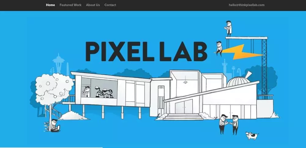 In this example, tiny animation items make this page more vivid without slowing down any speed.
Be Product 2
 The fresh appearance of this page is a selling point in itself.
Sheerlink
 This Sheerlink page illustrates the important role that large images and sliding panels can play in attracting users.
Be App 4
 When a truly cool demo contains bright colors, you don't need to rely on lengthy technical arguments to promote your application.
Point 2 Text: Keep it to a minimum and make it easy to read
Including lengthy descriptive blocks of text in a one-page website is not advisable. This will certainly send visitors elsewhere. You need to streamline the information to the minimum required to deliver it. You can do this by using bold titles, bulleted lists, and short paragraphs.
A good way is to divide the page into easy-to-understand sections. Use visuals and text together in one section – just like in these examples:
Dangerous Robot

The layout of this single page website is very interesting and you will want to browse each section – at least once.
Be Tea 3
 Nequipped and ordered. That's all.
Hello Alfred
 All core information is located above the visible area of the page, and bulleted lists are used to make the message concise and clear.
Be Cakes
 A great example of how large attractive images combined with concise descriptive text can help sell.
Mercedes-Benz
 When a vehicle has the status of a Mercedes-Benz, high-quality images plus minimal text are usually enough.
Point 3 Visual Effects: Identify the correct pattern and use negative space wisely
People read text in F-shaped patterns and scan visual effects in Z-shaped patterns. Keep this in mind when mixing text and images. It will help you keep the process of guiding users to access critical content. This is where empty space can come into play. Use it to make text easier to read, separate parts, and keep people engaged and curious.
Chris Connolly
 An excellent example of how empty space can be used to create a sense of order.
WeShootBottles.com
 Using blank space as a canvas, the website designer has created extremely creative results.
Be Dietician 2
 The use of blank space on this prefabricated website creates a sense of order and makes the different parts stand out.
Dribble’s Year in Review
 Use all kinds of design principles to create amazing visual effects, such as those shown in this example, without any problem.
Nasal Drops
 When was the last time you found the page promoting nose drip exciting? This single page website breaks the norm thanks to the clever use of slideshows, blank spaces and animations.
Point 4 Navigation: Make it easy to navigate and make scrolling fun
We tend to think about navigation in purely mechanical terms. This makes it quite easy to create a system that not only doesn’t help people, it will kick them out of the page.
The key to attracting visitors is to use the sidebar menu. Alternatively, you can use the horizontal sticky menu as an alternative. The goal should be to enable people to easily click and jump to the section of interest.
Automatically scrolling navigation links is another alternative. It works and may even be fun.
The following are some examples of user-friendly navigation:
Sergio Pedercini
 The designer's website effectively uses 3 auto-scrolling links.
Be Game
 Be Game provides its visitors with an interesting way to experience their navigation.
Be Landing 2
 This prefabricated website has three highlights: its color scheme and layout structure, and how to scan the page with 3 mouse times.
Brainflop
 The menus on the top and left help to quickly browse this site.
Point 5 Call to Action: Determine the right CTA and don't be afraid to use it
This design element is closely related to point 1 (determine the website’s goals). Once you know what you want your website to achieve, you shouldn't be hesitant to use the CTA button. This is especially easy for a single page website, as you usually direct people to a single operation. Of course, there may be exceptions.
Be Hairdresser
The CTA button for this prefabricated website is located above the visible area of the page. There is also one in the menu.
The Art of Texture
 The two CTA buttons placed above the visible area of the page allow users to select what they want to view.
Pyrismic
 Pyrismic uses simple join forms and eye-catching CTA buttons.
Reneza
 Reneza doesn't waste time using the CTA button, but they carefully choose the color and text size.
Summary
You have now learned about 5 key elements of one-page website design. You need to use them until you master the skills to use them.
They may look simple. You will find it difficult to effectively combine them in long, one-page websites.
The good news is that you can use a pre-made website. They have included these 5 elements in their design. An excellent prefabricated website resource is Be Theme, which has a huge library of over 60 single page sites and over 400 prefabricated websites of various types. You can customize any of them to suit your needs.
FAQs about building award-winning one-page websites
What are the key elements to consider when designing a one-page website?
Key elements to consider when designing a one-page website include clear and concise information, intuitive navigation, engaging visuals, compelling call to action, and responsive design. These elements ensure that your website is user-friendly, visually appealing and can effectively achieve its purpose.
How to make my single page website more visually appealing?
To make your single page website more visually appealing, you can use high-quality images, videos, and infographics. You can also use consistent color schemes and typesettings that match your brand identity. Additionally, you can use blank space efficiently to make your content easier to read and highlight important elements on the page.
How to make sure my single page website is user-friendly?
To ensure that your single page website is user-friendly, you can use intuitive navigation to make it easy for users to find the information they need. You can also use responsive design to make sure your website looks good and functioning on all devices. In addition, you can use clear and concise content to effectively convey your message.
What is a compelling call to action and how do I create one for my single page website?
Striking Call to Action (CTA) is a tip that encourages users to take specific actions, such as signing up for newsletters, downloading resources, or making purchases. To create a compelling CTA for your single page website, you can use persuasive language, clear value propositions, and eye-catching visual design.
How to optimize my single page website for search engines?
To optimize your single page website for search engines, you can use SEO best practices, such as using relevant keywords in your content, meta tags, and alternative text. You can also use a clean and clean URL structure and ensure your website loads quickly. Additionally, you can use high-quality backlinks to improve the authority and visibility of your website in search engine results.
What are the benefits of using a single page website?
Single-page websites have several advantages, including simplicity, ease of navigation, and the ability to focus on a single product, service or philosophy. They are also easier to maintain and update than multi-page websites.
How to measure the success of my single page website?
You can use analytics tools to track metrics such as traffic, bounce rates, conversion rates, and user engagement to measure the success of your single page website. These metrics can provide insights on how users interact with your website and whether it is achieving its goals.
Can I use a single page website for e-commerce?
Yes, you can use a single page website for e-commerce. However, it is important to make sure that your website design facilitates easy and secure transactions and that it provides all necessary information about your product or service.
What common mistakes should be avoided when designing a single-page website?
Some common mistakes that should be avoided when designing a single-page website include: excessive page information, confusing navigation, not optimizing for mobile devices, and not including clear call to action.
How to make my single page website stand out from the competition?
To make your single page website stand out from the competition, you can use unique and engaging visuals, compelling content and innovative design elements. You can also offer a unique value proposition and ensure your website provides a seamless user experience.
The above is the detailed content of 5 Core Elements for Building Award-Winning One-Page Websites. For more information, please follow other related articles on the PHP Chinese website!

Hot AI Tools

Undresser.AI Undress
AI-powered app for creating realistic nude photos

AI Clothes Remover
Online AI tool for removing clothes from photos.

Undress AI Tool
Undress images for free

Clothoff.io
AI clothes remover

Video Face Swap
Swap faces in any video effortlessly with our completely free AI face swap tool!
Hot Article
Hot Tools

Notepad++7.3.1
Easy-to-use and free code editor

SublimeText3 Chinese version
Chinese version, very easy to use

Zend Studio 13.0.1
Powerful PHP integrated development environment

Dreamweaver CS6
Visual web development tools

SublimeText3 Mac version
God-level code editing software (SublimeText3)
Hot Topics


 How To Begin A WordPress Blog: A Step-By-Step Guide For Beginners
Apr 17, 2025 am 08:25 AM
How To Begin A WordPress Blog: A Step-By-Step Guide For Beginners
Apr 17, 2025 am 08:25 AM
Blogs are the ideal platform for people to express their opinions, opinions and opinions online. Many newbies are eager to build their own website but are hesitant to worry about technical barriers or cost issues. However, as the platform continues to evolve to meet the capabilities and needs of beginners, it is now starting to become easier than ever. This article will guide you step by step how to build a WordPress blog, from theme selection to using plugins to improve security and performance, helping you create your own website easily. Choose a blog topic and direction Before purchasing a domain name or registering a host, it is best to identify the topics you plan to cover. Personal websites can revolve around travel, cooking, product reviews, music or any hobby that sparks your interests. Focusing on areas you are truly interested in can encourage continuous writing
 How to adjust the wordpress article list
Apr 20, 2025 am 10:48 AM
How to adjust the wordpress article list
Apr 20, 2025 am 10:48 AM
There are four ways to adjust the WordPress article list: use theme options, use plugins (such as Post Types Order, WP Post List, Boxy Stuff), use code (add settings in the functions.php file), or modify the WordPress database directly.
 How to display child categories on archive page of parent categories
Apr 19, 2025 pm 11:54 PM
How to display child categories on archive page of parent categories
Apr 19, 2025 pm 11:54 PM
Do you want to know how to display child categories on the parent category archive page? When you customize a classification archive page, you may need to do this to make it more useful to your visitors. In this article, we will show you how to easily display child categories on the parent category archive page. Why do subcategories appear on parent category archive page? By displaying all child categories on the parent category archive page, you can make them less generic and more useful to visitors. For example, if you run a WordPress blog about books and have a taxonomy called "Theme", you can add sub-taxonomy such as "novel", "non-fiction" so that your readers can
 How to get logged in user information in WordPress for personalized results
Apr 19, 2025 pm 11:57 PM
How to get logged in user information in WordPress for personalized results
Apr 19, 2025 pm 11:57 PM
Recently, we showed you how to create a personalized experience for users by allowing users to save their favorite posts in a personalized library. You can take personalized results to another level by using their names in some places (i.e., welcome screens). Fortunately, WordPress makes it very easy to get information about logged in users. In this article, we will show you how to retrieve information related to the currently logged in user. We will use the get_currentuserinfo(); function. This can be used anywhere in the theme (header, footer, sidebar, page template, etc.). In order for it to work, the user must be logged in. So we need to use
 Is WordPress easy for beginners?
Apr 03, 2025 am 12:02 AM
Is WordPress easy for beginners?
Apr 03, 2025 am 12:02 AM
WordPress is easy for beginners to get started. 1. After logging into the background, the user interface is intuitive and the simple dashboard provides all the necessary function links. 2. Basic operations include creating and editing content. The WYSIWYG editor simplifies content creation. 3. Beginners can expand website functions through plug-ins and themes, and the learning curve exists but can be mastered through practice.
 How to sort posts by post expiration date in WordPress
Apr 19, 2025 pm 11:48 PM
How to sort posts by post expiration date in WordPress
Apr 19, 2025 pm 11:48 PM
In the past, we have shared how to use the PostExpirator plugin to expire posts in WordPress. Well, when creating the activity list website, we found this plugin to be very useful. We can easily delete expired activity lists. Secondly, thanks to this plugin, it is also very easy to sort posts by post expiration date. In this article, we will show you how to sort posts by post expiration date in WordPress. Updated code to reflect changes in the plugin to change the custom field name. Thanks Tajim for letting us know in the comments. In our specific project, we use events as custom post types. Now
 How to display query count and page loading time in WordPress
Apr 19, 2025 pm 11:51 PM
How to display query count and page loading time in WordPress
Apr 19, 2025 pm 11:51 PM
One of our users asked other websites how to display the number of queries and page loading time in the footer. You often see this in the footer of your website, and it may display something like: "64 queries in 1.248 seconds". In this article, we will show you how to display the number of queries and page loading time in WordPress. Just paste the following code anywhere you like in the theme file (e.g. footer.php). queriesin
 How to Automate WordPress and Social Media with IFTTT (and more)
Apr 18, 2025 am 11:27 AM
How to Automate WordPress and Social Media with IFTTT (and more)
Apr 18, 2025 am 11:27 AM
Are you looking for ways to automate your WordPress website and social media accounts? With automation, you will be able to automatically share your WordPress blog posts or updates on Facebook, Twitter, LinkedIn, Instagram and more. In this article, we will show you how to easily automate WordPress and social media using IFTTT, Zapier, and Uncanny Automator. Why Automate WordPress and Social Media? Automate your WordPre
