

This tutorial guides you through integrating ShadCn, a versatile React component library, into your projects. We'll cover setup, configuration, and customization, suitable for both beginners and experienced developers. The complete source code is available on GitHub.

Understanding ShadCn
ShadCn offers a rich collection of pre-built components and utilities, streamlining React development. Built upon Tailwind CSS and Radix UI, it provides high customizability and a seamless integration with Tailwind's utility-first approach.
Prerequisites
Before you begin, ensure you have a solid grasp of JavaScript and React.js, with Node.js installed. Familiarity with CSS, HTML, and Tailwind CSS is beneficial.
Creating a New React Application
Start by creating a new React project using Vite:
npm create vite@latest
Choose a project name and select TypeScript (recommended for optimal ShadCn compatibility). After project creation, navigate to the project directory and run:
npm install
npm run dev


Integrating Tailwind CSS
ShadCn leverages Tailwind CSS for styling. Install it using:
npm install -D tailwindcss postcss autoprefixer
npx tailwindcss init -p
Import Tailwind directives into your index.css:
@import "tailwindcss/base";
@import "tailwindcss/components";
@import "tailwindcss/utilities";
Configure path aliases in tsconfig.json:
/* Path resolution */
"baseUrl": ".",
"paths": {
  "@/*": ["./src/*"]
}Install Node types and update vite.config.ts:
npm i -D @types/node
import path from "path"
import react from "@vitejs/plugin-react"
import { defineConfig } from "vite"

export default defineConfig({
  plugins: [react()],
  resolve: {
    alias: {
      "@": path.resolve(__dirname, "./src"),
    },
  },
})Installing and Configuring ShadCn
Install ShadCn:
npx shadcn-ui@latest init
Select your preferred options during the installation process.

Using ShadCn Components
Let's use the hover-card component as an example. Add it using:
npx shadcn-ui@latest add hover-card
Import and use it in your React component:
import { HoverCard, HoverCardContent, HoverCardTrigger } from "@/components/ui/hover-card";

// ... your component ...
Customizing ShadCn Components
Use Tailwind CSS classes to customize ShadCn components:
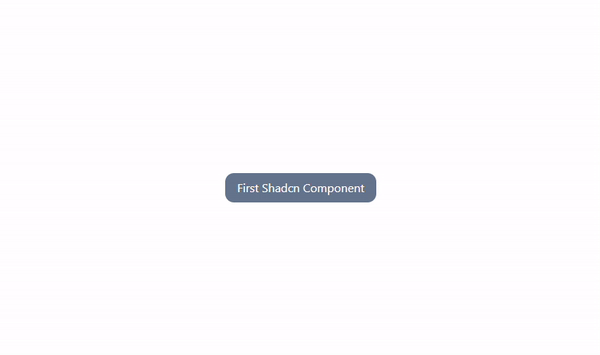
<HoverCard>
  <HoverCardTrigger className="rounded-xl text-white py-2 px-4 bg-slate-500">First Shadcn Component</HoverCardTrigger>
  <HoverCardContent className="font-bold text-slate-500 w-max">My first of many components</HoverCardContent>
</HoverCard>
Conclusion
Integrating ShadCn into your React workflow is straightforward. With the steps outlined above, you can leverage its powerful components and utilities to build efficient and user-friendly applications. Explore the ShadCn documentation and consider using pre-built React boilerplates for a quicker start.
The above is the detailed content of Enhance Your React Apps with ShadCn Utilities and Components. For more information, please follow other related articles on the PHP Chinese website!


![[Web front-end] Node.js quick start](https://img.php.cn/upload/course/000/000/067/662b5d34ba7c0227.png)


