

This article explores the intricacies of web typography and offers practical strategies for creating visually appealing and user-friendly websites. Setting up typography can be a complex process, but a well-defined design system simplifies the task considerably. This allows designers to focus on high-level decisions rather than getting bogged down in minute details.
A crucial starting point is determining the body font size. While 16px was once the standard, modern trends favor larger sizes (18-21px) for text-heavy sites and slightly smaller sizes (14-16px) for sites with busier UIs. The following table showcases body font sizes used by prominent websites:
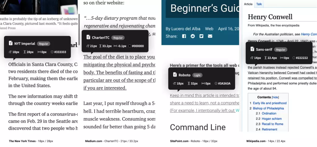
Remember that these established sites conduct extensive user testing. Consider your application's context when selecting your base size and thoroughly test on various devices.
Type Scaling for Consistent Typography
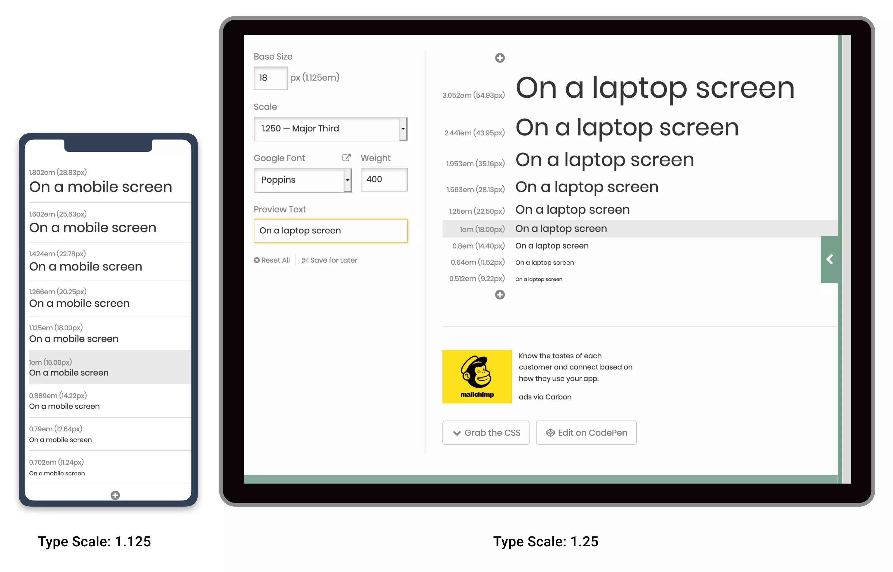
Once the base size is set, type scaling (or modular scaling) provides a mathematical approach to defining heading sizes, ensuring visual harmony. A simple ratio (e.g., 1.25) is applied to generate all font sizes. For example, with an 18px base:
<code>body { font-size: 18px; }
h5 { font-size: 1.25em; } /* 22.5px */
h4 { font-size: 1.563em; } /* 28.13px */
// and so on...</code>Tools like Type-scale.com ([link to Type-scale.com]) streamline this process, allowing real-time adjustments and CSS generation.

Responsive Scaling and Vertical Baseline Rhythm
While a single type scale might work for some designs, it's often necessary to adjust for different screen sizes using CSS media queries. Smaller screens generally require shallower type scales. Consider the difference between a newspaper and a novel's typography:

A vertical baseline rhythm, a grid-based approach to aligning typography, enhances visual harmony. Tools like Gridlover.net ([link to Gridlover.net]) and Archetype ([link to Archetype]) assist in implementing this, generating CSS that adheres to the chosen rhythm.


Remember that the baseline rhythm is a guideline, not a rigid rule. Flexibility is key to achieving a balanced design.
Frequently Asked Questions
This section answers common questions on web typography, covering topics such as font selection, white space usage, visual hierarchy, responsive typography, readability, serif vs. sans-serif fonts, font pairings, kerning, and brand reflection through typography. These FAQs provide a comprehensive overview of best practices in web typography.
The above is the detailed content of Web Typography: Establishing a Strong Typographic System. For more information, please follow other related articles on the PHP Chinese website!


![[Web front-end] Node.js quick start](https://img.php.cn/upload/course/000/000/067/662b5d34ba7c0227.png)


