

Prototype Mobile Apps Easily with Ratchet

Ratchet: Streamlining Mobile App Prototyping with HTML, CSS, and JavaScript
Ratchet, a framework from the Bootstrap team, simplifies mobile app prototyping using familiar web technologies. It lets developers quickly create prototypes that closely mimic native mobile app experiences, offering themes that accurately reflect iOS and Android app behavior.
Unlike responsive web design frameworks like Bootstrap and Foundation, Ratchet's key advantage lies in its support for push.js, enabling the creation of single-page applications (SPAs) with AJAX-powered page loading. It also boasts specialized iOS and Android icons and robust title bar support, crucial for realistic mobile prototyping.
Getting Started with Ratchet
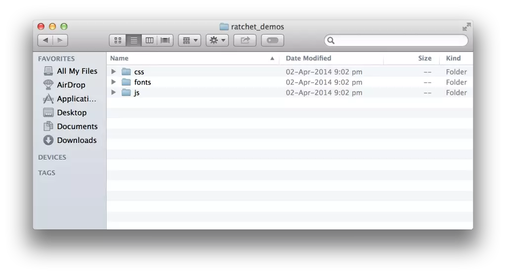
To begin, download the Ratchet package, extract its contents (css, js, and fonts folders), and integrate them into your project.
Ratchet's CSS files (including platform-specific themes: ratchet-theme-android.* and ratchet-theme-ios.*) provide pre-designed components customizable with CSS. However, it primarily focuses on static prototyping, not interactive functionality. While powerful for UI design, it lacks the advanced features of dedicated prototyping tools and requires basic HTML, CSS, and JavaScript knowledge.
Why Choose Ratchet Over Other Frameworks?
Ratchet offers several advantages over frameworks like Bootstrap and Foundation:
- Native Look and Feel: Ratchet creates prototypes closely resembling native mobile apps, unlike responsive designs that adapt web layouts.
- Platform-Specific Themes: Built-in themes replicate iOS and Android app behavior, simplifying cross-platform prototyping.
- Single-Page Application Support: Push.js integration allows for SPA development with AJAX page loading.
- Mobile-Specific Icons: Provides dedicated icons for iOS and Android, enhancing prototype fidelity.
- Native Title Bar Support: Offers accurate title bar emulation for a more realistic user experience.
- Lightweight Prototypes: Generally results in faster loading times on mobile devices compared to responsive web apps.
A Simple Ratchet Prototype
A basic Ratchet HTML structure follows this pattern:
<!DOCTYPE html>
<html>
<head>
  <meta charset="utf-8">
  <title>Ratchet Template</title>
  <meta name="viewport" content="initial-scale=1, maximum-scale=1, user-scalable=no, minimal-ui">
  <meta name="apple-mobile-web-app-capable" content="yes">
  <meta name="apple-mobile-web-app-status-bar-style" content="black">
  <meta name="mobile-web-app-capable" content="yes">
  <link rel="stylesheet" href="ratchet.css">
</head>
<body>
  <div class="content">
    <h1 id="Ratchet">Ratchet</h1>
    <p>Hello World!</p>
  </div>
</body>
</html>The meta tags are crucial for achieving a native-like appearance in mobile browsers. The <div class="content"> element houses the main content, ensuring proper scrolling.
Running and Deploying Ratchet Prototypes
Ratchet prototypes are web apps, deployable via several methods:
- Localhost (Mac): Use Python's SimpleHTTPServer (
python -m SimpleHTTPServer) and access via your device's IP address (e.g.,http://[YOUR_IP_ADDRESS]:8000).
- Localhost (Windows): Use WAMP or XAMPP and access via
http://localhost/[project_name]or your machine's IP address. - Live Server: Upload to your web server and access via your domain name.
- Chrome Emulation: Utilize Chrome's emulation mode for desktop testing.


Adding Components and Customization
Ratchet provides various pre-built components. For example, to add a navigation bar with a back button:
<!DOCTYPE html>
<html>
<head>
  <meta charset="utf-8">
  <title>Ratchet Template</title>
  <meta name="viewport" content="initial-scale=1, maximum-scale=1, user-scalable=no, minimal-ui">
  <meta name="apple-mobile-web-app-capable" content="yes">
  <meta name="apple-mobile-web-app-status-bar-style" content="black">
  <meta name="mobile-web-app-capable" content="yes">
  <link rel="stylesheet" href="ratchet.css">
</head>
<body>
  <div class="content">
    <h1 id="Ratchet">Ratchet</h1>
    <p>Hello World!</p>
  </div>
</body>
</html>
Further customization involves adding CSS to modify component styles. Refer to the official Ratchet documentation for a complete list of components and their usage.
Switching Themes
To apply a platform-specific theme, include the appropriate CSS file after the main ratchet.css:
- iOS:
<link href="css/ratchet-theme-ios.css" rel="stylesheet"> - Android:
<link href="css/ratchet-theme-android.css" rel="stylesheet">
Conclusion
Ratchet is a valuable tool for rapid mobile app prototyping, offering a blend of simplicity and functionality. Its open-source nature and reliance on common web technologies make it accessible to a wide range of developers. While not a full-fledged app development framework, it excels at creating realistic and efficient UI prototypes.
Frequently Asked Questions (FAQ)
The provided FAQ section is already well-structured and comprehensive. No changes are needed.
The above is the detailed content of Prototype Mobile Apps Easily with Ratchet. For more information, please follow other related articles on the PHP Chinese website!

Hot AI Tools

Undresser.AI Undress
AI-powered app for creating realistic nude photos

AI Clothes Remover
Online AI tool for removing clothes from photos.

Undress AI Tool
Undress images for free

Clothoff.io
AI clothes remover

Video Face Swap
Swap faces in any video effortlessly with our completely free AI face swap tool!

Hot Article
Hot Tools

Notepad++7.3.1
Easy-to-use and free code editor

SublimeText3 Chinese version
Chinese version, very easy to use

Zend Studio 13.0.1
Powerful PHP integrated development environment

Dreamweaver CS6
Visual web development tools

SublimeText3 Mac version
God-level code editing software (SublimeText3)
Hot Topics


 What should I do if I encounter garbled code printing for front-end thermal paper receipts?
Apr 04, 2025 pm 02:42 PM
What should I do if I encounter garbled code printing for front-end thermal paper receipts?
Apr 04, 2025 pm 02:42 PM
Frequently Asked Questions and Solutions for Front-end Thermal Paper Ticket Printing In Front-end Development, Ticket Printing is a common requirement. However, many developers are implementing...
 Who gets paid more Python or JavaScript?
Apr 04, 2025 am 12:09 AM
Who gets paid more Python or JavaScript?
Apr 04, 2025 am 12:09 AM
There is no absolute salary for Python and JavaScript developers, depending on skills and industry needs. 1. Python may be paid more in data science and machine learning. 2. JavaScript has great demand in front-end and full-stack development, and its salary is also considerable. 3. Influencing factors include experience, geographical location, company size and specific skills.
 Demystifying JavaScript: What It Does and Why It Matters
Apr 09, 2025 am 12:07 AM
Demystifying JavaScript: What It Does and Why It Matters
Apr 09, 2025 am 12:07 AM
JavaScript is the cornerstone of modern web development, and its main functions include event-driven programming, dynamic content generation and asynchronous programming. 1) Event-driven programming allows web pages to change dynamically according to user operations. 2) Dynamic content generation allows page content to be adjusted according to conditions. 3) Asynchronous programming ensures that the user interface is not blocked. JavaScript is widely used in web interaction, single-page application and server-side development, greatly improving the flexibility of user experience and cross-platform development.
 How to merge array elements with the same ID into one object using JavaScript?
Apr 04, 2025 pm 05:09 PM
How to merge array elements with the same ID into one object using JavaScript?
Apr 04, 2025 pm 05:09 PM
How to merge array elements with the same ID into one object in JavaScript? When processing data, we often encounter the need to have the same ID...
 Is JavaScript hard to learn?
Apr 03, 2025 am 12:20 AM
Is JavaScript hard to learn?
Apr 03, 2025 am 12:20 AM
Learning JavaScript is not difficult, but it is challenging. 1) Understand basic concepts such as variables, data types, functions, etc. 2) Master asynchronous programming and implement it through event loops. 3) Use DOM operations and Promise to handle asynchronous requests. 4) Avoid common mistakes and use debugging techniques. 5) Optimize performance and follow best practices.
 How to achieve parallax scrolling and element animation effects, like Shiseido's official website?
or:
How can we achieve the animation effect accompanied by page scrolling like Shiseido's official website?
Apr 04, 2025 pm 05:36 PM
How to achieve parallax scrolling and element animation effects, like Shiseido's official website?
or:
How can we achieve the animation effect accompanied by page scrolling like Shiseido's official website?
Apr 04, 2025 pm 05:36 PM
Discussion on the realization of parallax scrolling and element animation effects in this article will explore how to achieve similar to Shiseido official website (https://www.shiseido.co.jp/sb/wonderland/)...
 The difference in console.log output result: Why are the two calls different?
Apr 04, 2025 pm 05:12 PM
The difference in console.log output result: Why are the two calls different?
Apr 04, 2025 pm 05:12 PM
In-depth discussion of the root causes of the difference in console.log output. This article will analyze the differences in the output results of console.log function in a piece of code and explain the reasons behind it. �...
 The Evolution of JavaScript: Current Trends and Future Prospects
Apr 10, 2025 am 09:33 AM
The Evolution of JavaScript: Current Trends and Future Prospects
Apr 10, 2025 am 09:33 AM
The latest trends in JavaScript include the rise of TypeScript, the popularity of modern frameworks and libraries, and the application of WebAssembly. Future prospects cover more powerful type systems, the development of server-side JavaScript, the expansion of artificial intelligence and machine learning, and the potential of IoT and edge computing.
