

Using Modern CSS to Build a Responsive Image Grid

This article explores techniques for mastering the spacing between columns in responsive grid layouts, using a responsive image gallery as a practical example.
For further insights into responsive layouts, view our screencast: Creating Multiple Column Layouts in Flexbox.
Key Takeaways:
- Custom responsive layouts are achievable by precisely controlling inter-column spacing, as demonstrated with the responsive image gallery.
- The
display: inline-blockmethod creates responsive image galleries; setting the parent's font size to zero removes default inline-block spacing. - Flexbox efficiently solves common layout issues, creating equal-height columns across all screen sizes, simplifying inter-column spacing control in responsive image grids.
- Media queries and CSS Grid layouts enable responsive image grids, applying different CSS rules based on device characteristics (screen size).
Building a Responsive Layout:
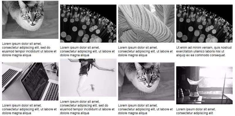
On larger screens, the gallery resembles this:

On smaller screens:

The simple markup:
<div>
  <a href="https://www.php.cn/link/14d2bc475177e1dde633b4ca1972d53c">
    <img src="/static/imghw/default1.png"  data-src="https://img.php.cn/"  class="lazy" alt="Using Modern CSS to Build a Responsive Image Grid " />
  </a>
  <!-- ...more images... -->
</div>Several layout methods achieve this. Before exploring two, let's reiterate the requirements:
- Two-column layout on medium and smaller screens.
- 8px inter-column spacing.
Using inline-block:
The display: inline-block method builds the gallery. Consider this CSS:
div {
  font-size: 0;
}

a {
  font-size: 16px;
  display: inline-block;
  margin-bottom: 8px;
  width: calc(50% - 4px);
  margin-right: 8px;
}

a:nth-of-type(2n) {
  margin-right: 0;
}

@media screen and (min-width: 50em) {
  a {
    width: calc(25% - 6px);
  }

  a:nth-of-type(2n) {
    margin-right: 8px;
  }

  a:nth-of-type(4n) {
    margin-right: 0;
  }
}Explanation:
Default inline-block spacing is overridden by setting the parent's font size to zero. Child element font sizes may need resetting (not here).
Small screens have a two-column layout with 8px spacing. Column width calculation:
- Total inter-column space per row: 1 * 8px = 8px (8px, not 16px, because the right margin is removed from every second column).
- Column width:
calc(50% - 4px)(4px = 8px / 2).

Large screens have a four-column layout with 8px spacing. Column width calculation:
- Total inter-column space per row: 3 * 8px = 24px (24px, not 32px, because the right margin is removed from every fourth column).
- Column width:
calc(25% - 6px)(6px = 24px / 4).

See the CodePen demo for the inline-block method.
Using Flexbox:
The inline-block solution has drawbacks. Adding captions demonstrates one:
Updated markup:
<div>
  <a href="https://www.php.cn/link/14d2bc475177e1dde633b4ca1972d53c">
    <img src="/static/imghw/default1.png"  data-src="https://img.php.cn/"  class="lazy" alt="Using Modern CSS to Build a Responsive Image Grid " />
  </a>
  <!-- ...more images... -->
</div>Large screen gallery with captions:
Unequal heights are resolved with Flexbox. Update the parent element's CSS:
div {
  font-size: 0;
}

a {
  font-size: 16px;
  display: inline-block;
  margin-bottom: 8px;
  width: calc(50% - 4px);
  margin-right: 8px;
}

a:nth-of-type(2n) {
  margin-right: 0;
}

@media screen and (min-width: 50em) {
  a {
    width: calc(25% - 6px);
  }

  a:nth-of-type(2n) {
    margin-right: 8px;
  }

  a:nth-of-type(4n) {
    margin-right: 0;
  }
}The result is equal-height columns across all screens. Large screen example:

See the CodePen demo using Flexbox with improved captions.
Flexbox's justify-content property doesn't directly create this layout. space-between and space-around result in awkward distribution on the last row. CSS:
<div>
  <a href="https://www.php.cn/link/14d2bc475177e1dde633b4ca1972d53c">
    <img src="/static/imghw/default1.png"  data-src="https://img.php.cn/"  class="lazy" alt="Using Modern CSS to Build a Responsive Image Grid " />
    <figcaption>Some text here</figcaption>
  </a>
  <!-- ...more images... -->
</div>No margin-right is needed; justify-content handles item distribution.
See the CodePen demo using the justify-content property.
Conclusion:
This post details techniques for controlling inter-column spacing in responsive image grids. While inline-block suffices, Flexbox is easier and more convenient, especially with calc().
Learn more about Flexbox layouts in our screencast: Creating Multiple Column Layouts in Flexbox.
(FAQs section omitted for brevity, as it's a repetition of common responsive design questions.)
The above is the detailed content of Using Modern CSS to Build a Responsive Image Grid. For more information, please follow other related articles on the PHP Chinese website!

Hot AI Tools

Undresser.AI Undress
AI-powered app for creating realistic nude photos

AI Clothes Remover
Online AI tool for removing clothes from photos.

Undress AI Tool
Undress images for free

Clothoff.io
AI clothes remover

AI Hentai Generator
Generate AI Hentai for free.

Hot Article
Hot Tools

Notepad++7.3.1
Easy-to-use and free code editor

SublimeText3 Chinese version
Chinese version, very easy to use

Zend Studio 13.0.1
Powerful PHP integrated development environment

Dreamweaver CS6
Visual web development tools

SublimeText3 Mac version
God-level code editing software (SublimeText3)
Hot Topics
 1374
1374
 52
52

 Working With GraphQL Caching
Mar 19, 2025 am 09:36 AM
Working With GraphQL Caching
Mar 19, 2025 am 09:36 AM
If you’ve recently started working with GraphQL, or reviewed its pros and cons, you’ve no doubt heard things like “GraphQL doesn’t support caching” or
 Classy and Cool Custom CSS Scrollbars: A Showcase
Mar 10, 2025 am 11:37 AM
Classy and Cool Custom CSS Scrollbars: A Showcase
Mar 10, 2025 am 11:37 AM
In this article we will be diving into the world of scrollbars. I know, it doesn’t sound too glamorous, but trust me, a well-designed page goes hand-in-hand
 Making Your First Custom Svelte Transition
Mar 15, 2025 am 11:08 AM
Making Your First Custom Svelte Transition
Mar 15, 2025 am 11:08 AM
The Svelte transition API provides a way to animate components when they enter or leave the document, including custom Svelte transitions.
 Show, Don't Tell
Mar 16, 2025 am 11:49 AM
Show, Don't Tell
Mar 16, 2025 am 11:49 AM
How much time do you spend designing the content presentation for your websites? When you write a new blog post or create a new page, are you thinking about
 Building an Ethereum app using Redwood.js and Fauna
Mar 28, 2025 am 09:18 AM
Building an Ethereum app using Redwood.js and Fauna
Mar 28, 2025 am 09:18 AM
With the recent climb of Bitcoin’s price over 20k $USD, and to it recently breaking 30k, I thought it’s worth taking a deep dive back into creating Ethereum
 What the Heck Are npm Commands?
Mar 15, 2025 am 11:36 AM
What the Heck Are npm Commands?
Mar 15, 2025 am 11:36 AM
npm commands run various tasks for you, either as a one-off or a continuously running process for things like starting a server or compiling code.
 Let's use (X, X, X, X) for talking about specificity
Mar 24, 2025 am 10:37 AM
Let's use (X, X, X, X) for talking about specificity
Mar 24, 2025 am 10:37 AM
I was just chatting with Eric Meyer the other day and I remembered an Eric Meyer story from my formative years. I wrote a blog post about CSS specificity, and
 How do you use CSS to create text effects, such as text shadows and gradients?
Mar 14, 2025 am 11:10 AM
How do you use CSS to create text effects, such as text shadows and gradients?
Mar 14, 2025 am 11:10 AM
The article discusses using CSS for text effects like shadows and gradients, optimizing them for performance, and enhancing user experience. It also lists resources for beginners.(159 characters)
