

Understanding Block Formatting Contexts in CSS

Key Takeaways
- A Block Formatting Context (BFC) is a part of the visual CSS rendering of a webpage where block boxes are laid out. It can be created by adding specific CSS conditions like ‘overflow: scroll’, ‘display: flex’, ‘float: left’, etc.
- BFCs can cause margins to collapse, which means the vertical distance between two sibling boxes is not the sum of their individual margins. However, creating a new BFC can prevent this margin collapse.
- BFCs can be used to contain floats. In scenarios where a container has floated elements, defining a BFC can help contain these elements and maintain the normal flow of the page.
- BFCs can prevent text wrapping around a floated object. By establishing a new BFC for a paragraph element, it no longer touches the left edge of the container block, preventing text from wrapping around a floated element.
- BFCs can also be useful in multi-column layouts. By establishing a new BFC in a column of the layout, it will always take the remaining space left after the previous columns have filled, preventing the last column from dropping to the next line in some browsers.
A Block Formatting Context is part of the visual CSS rendering of a web page in which block boxes are laid out. The positioning scheme to which it belongs is normal flow. According to W3C:
Floats, absolutely positioned elements, inline-blocks, table-cells, table-captions, and elements with ‘overflow’ other than ‘visible’ (except when that value has been propagated to the viewport) establish new block formatting contexts.
The above quote pretty much sums up how a block formatting context is formed. But lets redefine it in a way that is easier to understand. A block formatting context is an HTML box that satisfies at least one of the following conditions:
- The value of float is not none
- The value of position is neither static nor relative
- The value of display is table-cell, table-caption, inline-block, flex, or inline-flex
- The value of overflow is not visible.
Creating a Block Formatting Context
A block formatting context can be explicitly triggered. So if we want to create a new block formatting context, we just need to add any one of the above mentioned CSS conditions to it.
For example, look at the following HTML:
<span><span><span><div</span> class<span>="container"</span>></span>
</span>  Some Content here
<span><span><span></div</span>></span></span>
A new block formatting context can be created by adding any one of the necessary CSS conditions like overflow: scroll, overflow: hidden, display: flex, float: left, or display: table to the container. Though any of the above mentioned conditions can create a block formatting context, there will also be some other effects like:
- display: table may create problems in responsiveness
- overflow: scroll may show unwanted scrollbars
- float: left will push the element to the left, with other elements wrapping around it
- overflow: hidden will clip elements that overflow
So whenever we are creating a new block formatting context, we choose the best condition based on our requirements. For uniformity, I have used overflow: hidden in all the examples given in this article.
<span><span><span><div</span> class<span>="container"</span>></span>
</span>  Some Content here
<span><span><span></div</span>></span></span>
You are free to play with declarations other than overflow: hidden.
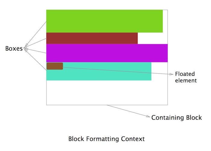
Alignment of Boxes in a Block Formatting Context
The W3C spec states:
In a block formatting context, each box’s left outer edge touches the left edge of the containing block (for right-to-left formatting, right edges touch). This is true even in the presence of floats (although a box’s line boxes may shrink due to the floats), unless the box establishes a new block formatting context (in which case the box itself may become narrower due to the floats).
In simpler words, as we can see in the above diagram, all the boxes that belong to a block formatting context are aligned left (for left-to-right formatting) and their left outer edge touches the left edge of the containing block. In the last box we can see that even though there is a floated element (brown) on the left, the other element (green) still touches the left margin of the containing block. The principles about why this happens will be discussed below in the section on text wrapping.
A Block Formatting Context Causes Collapsing Margins
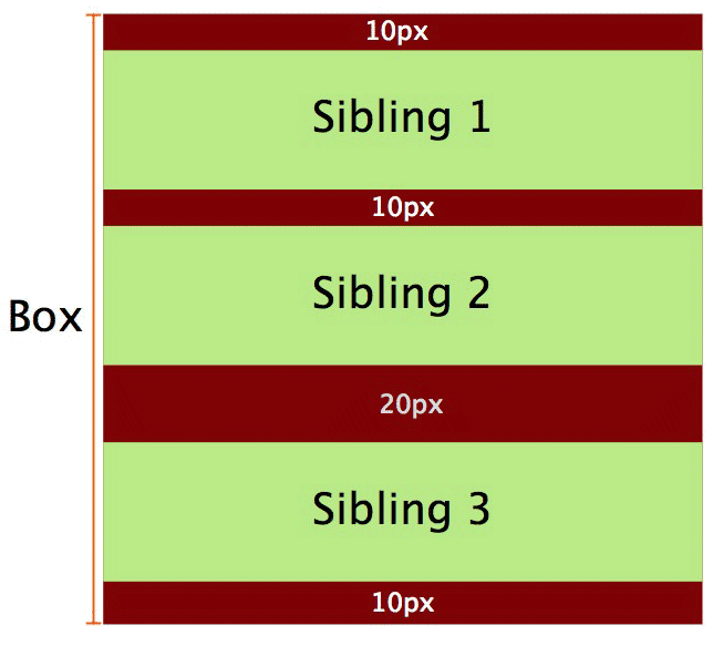
In normal flow, the boxes are laid vertically one after another starting from the top of the containing block. The vertical distance between two sibling boxes is determined by the individual margins of both siblings, but it’s not the sum of the two margins.
Lets consider an example, in order to understand this.

In the above diagram we consider a block formatting context having been created where the red box (a div) contains the two green siblings (p elements).
<span><span>.container</span> {
</span>  <span>overflow: hidden;
</span><span>}</span>And the corresponding CSS is:
<span><span><span><div</span> class<span>="container"</span>></span>
</span>  <span><span><span><p</span>></span>Sibling 1<span><span></p</span>></span>
</span>  <span><span><span><p</span>></span>Sibling 2<span><span></p</span>></span>
</span><span><span><span></div</span>></span></span>
Ideally the margin between the two siblings should have been the sum of the margins of both elements (20px) but it’s actually 10px. This is known as collapsing margins. In a case where the margins of the siblings are different, then the higher margin will prevail.
See the Pen OVzrer by SitePoint (@SitePoint) on CodePen.
Using a Block Formatting Context to Prevent Margin Collapse
This may sound a bit confusing at first since we discussed above that block formatting contexts cause margin collapse. But one thing that we must keep in mind is that vertical margins between adjacent block boxes (siblings) collapse only if they are in the same block formatting context. If they belong to different block formatting contexts then the margins between them won’t collapse. So by creating a new block formatting context we can prevent margin collapse.
Lets add a third sibling in the earlier example, so the HTML becomes:
<span><span><span><div</span> class<span>="container"</span>></span>
</span>  Some Content here
<span><span><span></div</span>></span></span>
With the corresponding CSS being:
<span><span>.container</span> {
</span>  <span>overflow: hidden;
</span><span>}</span>The result will be same as above, i.e. there will be a collapse and the three siblings will be separated by a vertical distance of 10px. This happens because all three p tags are the part of the same block formatting context.
Now lets modify the third sibling so that it’s part of a new block formatting context. Then the HTML becomes:
<span><span><span><div</span> class<span>="container"</span>></span>
</span>  <span><span><span><p</span>></span>Sibling 1<span><span></p</span>></span>
</span>  <span><span><span><p</span>></span>Sibling 2<span><span></p</span>></span>
</span><span><span><span></div</span>></span></span>
And the CSS:
<span><span>.container</span> {
</span>  <span>background-color: red;
</span>  <span>overflow: hidden; /* creates a block formatting context */
</span><span>}
</span>
<span>p {
</span>  <span>background-color: lightgreen;
</span>  <span>margin: 10px 0;
</span><span>}</span>Now there will be a difference in the output:
Since the second and third siblings belong to different formatting contexts, there won’t be any margin collapse between them, as evident in the following demo.
See the Pen XbVOXp by SitePoint (@SitePoint) on CodePen.
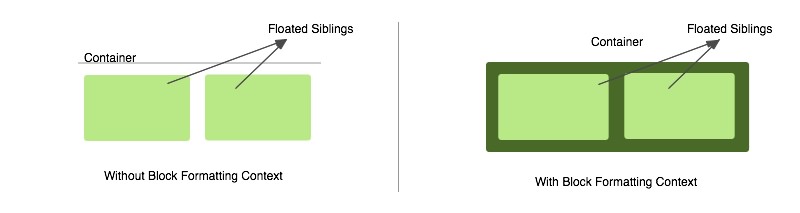
Using a Block Formatting Context to Contain Floats
A block formatting context can contain floats. Many times we will encounter a situation where a container has floated elements. In that case the container element has no height and its floated children are outside of the normal flow of the page. We generally use a clear fix to solve this problem, with the most popular method being the use of a “cleared” pseudo-element. But we can also accomplish this by defining a block formatting context.
Lets look at an example:
<span><span><span><div</span> class<span>="container"</span>></span>
</span>  <span><span><span><p</span>></span>Sibling 1<span><span></p</span>></span>
</span>  <span><span><span><p</span>></span>Sibling 2<span><span></p</span>></span>
</span>  <span><span><span><p</span>></span>Sibling 3<span><span></p</span>></span>
</span><span><span><span></div</span>></span></span>
With the CSS:
<span><span>.container</span> {
</span>  <span>background-color: red;
</span>  <span>overflow: hidden; /* creates a block formatting context */
</span><span>}
</span>
<span>p {
</span>  <span>background-color: lightgreen;
</span>  <span>margin: 10px 0;
</span><span>}</span>In the above case the container won’t have any height and it won’t contain the floated children. To solve this problem we establish a new block formatting context inside the container by adding overflow: hidden. The modified CSS becomes:
<span><span><span><div</span> class<span>="container"</span>></span>
</span>  <span><span><span><p</span>></span>Sibling 1<span><span></p</span>></span>
</span>  <span><span><span><p</span>></span>Sibling 2<span><span></p</span>></span>
</span>  <span><span><span><div</span> class<span>="newBFC"</span>></span>
</span>    <span><span><span><p</span>></span>Sibling 3<span><span></p</span>></span>
</span>  <span><span><span></div</span>></span>
</span><span><span><span></div</span>></span></span>
Now the container will contain the floated siblings and its height will expand to contain its children, with the elements back in the normal flow of the page within this formatting context.
See the Pen Floats With and Without a Block Formatting Context by SitePoint (@SitePoint) on CodePen.
Using Block Formatting Contexts to Prevent Text Wrapping
Sometimes the text around a floated div wraps around it (as in Figure 1 in the image below) but in some cases this is not desirable and we want an appearance like in Figure 2. To solve this, we might use margins, but we can also solve this with a block formatting context.

First let us understand why the text wraps. For this we have to understand how the box model works when an element is floated. This is the part I left earlier while discussing the alignment in a block formatting context. Let us understand what is happening in Figure 1 in the diagram below:

The HTML for the diagram could be assumed as:
<span><span><span><div</span> class<span>="container"</span>></span>
</span>  Some Content here
<span><span><span></div</span>></span></span>
The whole black area in the above diagram denotes the p element. As we can see, the p element doesn’t shift but it goes under the floated element. The line boxes of the p element (referring to the lines of text) undergo a shift. Hence the line boxes narrow horizontally to make space for the floated element.
As the text increases, it will eventually wrap under the floated element because the line boxes no longer need to shift and hence a condition like Figure 1 appears. This explains how the paragraphs touch the left edge of the containing box even when a floated element is present and how the line boxes narrow to accommodate the floated element.
If we are able to shift the entire p element, then this wrapping problem will be solved.
Before going to the solution, let us recall again what the W3C spec says:
In a block formatting context, each box’s left outer edge touches the left edge of the containing block (for right-to-left formatting, right edges touch). This is true even in the presence of floats (although a box’s line boxes may shrink due to the floats), unless the box establishes a new block formatting context (in which case the box itself may become narrower due to the floats).
According to this, if the p element establishes a new block formatting context then it will no longer touch the left edge of the container block. This can be achieved by simply adding overflow: hidden to the p element. This way creating a new block formatting context solves the problem of text wrapping around a floated object.
See the Pen A Block Formatting Context Preventing Text Wrap by SitePoint (@SitePoint) on CodePen.
Using Block Formatting Contexts in Multi-column Layouts
If we are creating a multi-column layout spanning the full width of the container, the last column will sometimes drop to the next line in some browsers. This might happen because the browser is rounding off the column’s width and the total width becomes more than that of the container. If, however, we establish a new block formatting context in a column of the layout, it will always take the remaining space left after the previous columns have filled.
Let’s use an example of a multi-column layout with 3 columns:
Here’s the HTML:
<span><span><span><div</span> class<span>="container"</span>></span>
</span>  Some Content here
<span><span><span></div</span>></span></span>
And the CSS:
<span><span>.container</span> {
</span>  <span>overflow: hidden;
</span><span>}</span>The result is in the CodePen demo:
See the Pen Using a Block Formatting Context to make a Final Column “fit” by SitePoint (@SitePoint) on CodePen.
Now even if the width of the container changes slightly, the layout will not break. Of course, this is not necessarily a good option for multi-column layouts, but it is one way to prevent the problem of the final column dropping. Flexbox would likely be a better solution in a case like this, but this should serve to illustrate how elements behave under these circumstances.
Conclusion
I hope this post has shown you the relevance of block formatting contexts and how they affect the visual positioning of elements on a page. The examples showing their use in practical cases should make them a little more clear.
If you have anything to add, please let us know in the comments. And be sure to review the W3C’s more detailed discussion of the topic if you want to go deeper.
Frequently Asked Questions (FAQs) about Block Formatting Contexts in CSS
What is the significance of Block Formatting Context in CSS?
Block Formatting Context (BFC) is a fundamental concept in CSS that controls the layout of elements on a webpage. It plays a crucial role in the positioning and styling of elements, especially in complex layouts. BFCs help to isolate sections of the document, containing floats, inline-blocks, and tables, which can prevent unexpected overlap of elements. Understanding BFCs can help developers create more robust and predictable designs.
How does Block Formatting Context affect the layout of floating elements?
In a BFC, floating elements are contained within the context, which means they do not affect the layout of elements outside the BFC. This is particularly useful when you want to prevent text or other elements from wrapping around a floated element. By creating a new BFC, you can ensure that the floated element does not interfere with the positioning of other elements.
How can I create a new Block Formatting Context?
There are several ways to establish a new BFC in CSS. Some of the most common methods include setting the CSS property ‘display’ to ‘flow-root’, ‘flex’, or ‘grid’, or setting ‘overflow’ to anything other than ‘visible’. Other properties that create a new BFC include ‘contain’ if its value is ‘layout’, ‘paint’, or a composite value including either of them, and ‘column-count’ or ‘column-width’ if they have a value other than ‘auto’.
What is the impact of Block Formatting Context on margins?
One of the key features of BFCs is that they prevent margin collapse. In CSS, adjacent vertical margins can sometimes collapse into a single margin, which is the maximum of the individual margins. However, in a BFC, the top margin of the first child and the bottom margin of the last child do not collapse with the margins of the BFC itself. This can be useful in controlling the spacing of elements.
How does Block Formatting Context handle overflow?
When an element’s content overflows its box, BFC can help to manage this overflow. If an element creates a new BFC, then any overflow will be clipped to the BFC, rather than spilling out. This can be controlled using the ‘overflow’ property, with values such as ‘auto’, ‘scroll’, or ‘hidden’.
How does Block Formatting Context affect the ‘clear’ property?
The ‘clear’ property in CSS is used to control the flow of floated elements. In a BFC, the ‘clear’ property only affects elements within the same BFC. This means that an element with ‘clear’ set will not move below floats in a parent BFC, only floats within its own BFC.
Can Block Formatting Contexts be nested?
Yes, BFCs can be nested within each other. Each BFC operates independently of its parent and sibling BFCs. This means that floats, margins, and other layout features are contained within each BFC, and do not affect elements in other BFCs.
How does Block Formatting Context interact with flex and grid layouts?
Flex and grid layouts in CSS automatically create new BFCs. This means that they contain their floats, and prevent margin collapse and overflow in the same way as other BFCs. Understanding BFCs can therefore be helpful in understanding the behavior of flex and grid layouts.
What is the relationship between Block Formatting Context and stacking context?
BFC and stacking context are two separate concepts in CSS, but they can interact in certain situations. For example, a new stacking context can be created by an element with a ‘position’ value of ‘relative’ or ‘absolute’ and a ‘z-index’ value other than ‘auto’. This can affect the rendering of elements in a BFC, particularly in relation to floats and overlap.
Are there any browser compatibility issues with Block Formatting Context?
Most modern browsers handle BFCs correctly and consistently. However, there may be some differences in older browsers, particularly Internet Explorer. It’s always a good idea to test your layouts in multiple browsers to ensure they behave as expected.
The above is the detailed content of Understanding Block Formatting Contexts in CSS. For more information, please follow other related articles on the PHP Chinese website!

Hot AI Tools

Undresser.AI Undress
AI-powered app for creating realistic nude photos

AI Clothes Remover
Online AI tool for removing clothes from photos.

Undress AI Tool
Undress images for free

Clothoff.io
AI clothes remover

AI Hentai Generator
Generate AI Hentai for free.

Hot Article
Hot Tools

Notepad++7.3.1
Easy-to-use and free code editor

SublimeText3 Chinese version
Chinese version, very easy to use

Zend Studio 13.0.1
Powerful PHP integrated development environment

Dreamweaver CS6
Visual web development tools

SublimeText3 Mac version
God-level code editing software (SublimeText3)
Hot Topics
 1359
1359
 52
52

 Demystifying Screen Readers: Accessible Forms & Best Practices
Mar 08, 2025 am 09:45 AM
Demystifying Screen Readers: Accessible Forms & Best Practices
Mar 08, 2025 am 09:45 AM
This is the 3rd post in a small series we did on form accessibility. If you missed the second post, check out "Managing User Focus with :focus-visible". In
 Adding Box Shadows to WordPress Blocks and Elements
Mar 09, 2025 pm 12:53 PM
Adding Box Shadows to WordPress Blocks and Elements
Mar 09, 2025 pm 12:53 PM
The CSS box-shadow and outline properties gained theme.json support in WordPress 6.1. Let's look at a few examples of how it works in real themes, and what options we have to apply these styles to WordPress blocks and elements.
 Working With GraphQL Caching
Mar 19, 2025 am 09:36 AM
Working With GraphQL Caching
Mar 19, 2025 am 09:36 AM
If you’ve recently started working with GraphQL, or reviewed its pros and cons, you’ve no doubt heard things like “GraphQL doesn’t support caching” or
 Making Your First Custom Svelte Transition
Mar 15, 2025 am 11:08 AM
Making Your First Custom Svelte Transition
Mar 15, 2025 am 11:08 AM
The Svelte transition API provides a way to animate components when they enter or leave the document, including custom Svelte transitions.
 Classy and Cool Custom CSS Scrollbars: A Showcase
Mar 10, 2025 am 11:37 AM
Classy and Cool Custom CSS Scrollbars: A Showcase
Mar 10, 2025 am 11:37 AM
In this article we will be diving into the world of scrollbars. I know, it doesn’t sound too glamorous, but trust me, a well-designed page goes hand-in-hand
 Show, Don't Tell
Mar 16, 2025 am 11:49 AM
Show, Don't Tell
Mar 16, 2025 am 11:49 AM
How much time do you spend designing the content presentation for your websites? When you write a new blog post or create a new page, are you thinking about
 Building an Ethereum app using Redwood.js and Fauna
Mar 28, 2025 am 09:18 AM
Building an Ethereum app using Redwood.js and Fauna
Mar 28, 2025 am 09:18 AM
With the recent climb of Bitcoin’s price over 20k $USD, and to it recently breaking 30k, I thought it’s worth taking a deep dive back into creating Ethereum
 What the Heck Are npm Commands?
Mar 15, 2025 am 11:36 AM
What the Heck Are npm Commands?
Mar 15, 2025 am 11:36 AM
npm commands run various tasks for you, either as a one-off or a continuously running process for things like starting a server or compiling code.
