
 Software Tutorial
Office Software
How to Reduce the Gaps Between Bars and Columns in Excel Charts (And Why You Should)
Software Tutorial
Office Software
How to Reduce the Gaps Between Bars and Columns in Excel Charts (And Why You Should)
How to Reduce the Gaps Between Bars and Columns in Excel Charts (And Why You Should)

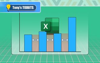
Enhance Your Excel Charts: Reducing Gaps Between Bars and Columns
Presenting data visually in charts significantly improves spreadsheet readability. Excel excels at chart creation, but its extensive menus can obscure simple yet powerful features, such as adjusting the spacing between bars and columns. This guide shows you how to optimize your charts for better data comparison.
Why Minimize Column/Bar Gaps?
Excel defines the space between data points as a percentage of the data point's width. A 50% gap width means the space between columns is half their width.

Optimal spacing aids in effortless data comparison. Wide gaps hinder comparison, particularly when gridlines are removed. Excessively large gaps create an unnatural visual separation, suggesting unrelated data points.

Many Excel versions default to a gap width exceeding 200%, making gaps significantly larger than the columns themselves. Adjusting this to around 100% (gap width equal to column width) often improves visual uniformity and clarity.
How to Adjust Gap Width
This adjustment applies to charts with individually plotted data points, such as bar and column charts. Line charts, with their connected data points, don't have adjustable gaps.
- Select your chart: Ensure your data is displayed in a suitable chart type (bar or column).
- Right-click a data point: Right-click any bar or column.
- Access formatting: Select "Format Data Series."
- Adjust gap width: In the "Format Chart" pane, locate the gap width setting (usually represented by an icon and a slider or a numerical input field). Enter your desired percentage or use the slider to adjust.

Note: Older Excel versions might use a "Series Options" menu instead. The process remains similar; locate the gap width adjustment within this menu.
The chart updates dynamically as you change the gap width. Experiment until you achieve the desired visual effect. Maintain consistency across your charts by recording your preferred gap width setting.
Beyond the Basics: Exploring Excel's Chart Variety
While common chart types are widely understood, Excel offers a range of less-familiar options, including sunburst, waterfall, and funnel charts. Consider using images or icons as chart columns for a more engaging and distinctive presentation.
The above is the detailed content of How to Reduce the Gaps Between Bars and Columns in Excel Charts (And Why You Should). For more information, please follow other related articles on the PHP Chinese website!

Hot AI Tools

Undresser.AI Undress
AI-powered app for creating realistic nude photos

AI Clothes Remover
Online AI tool for removing clothes from photos.

Undress AI Tool
Undress images for free

Clothoff.io
AI clothes remover

AI Hentai Generator
Generate AI Hentai for free.

Hot Article
Hot Tools

Notepad++7.3.1
Easy-to-use and free code editor

SublimeText3 Chinese version
Chinese version, very easy to use

Zend Studio 13.0.1
Powerful PHP integrated development environment

Dreamweaver CS6
Visual web development tools

SublimeText3 Mac version
God-level code editing software (SublimeText3)
Hot Topics
 1359
1359
 52
52

 How to Reduce the Gaps Between Bars and Columns in Excel Charts (And Why You Should)
Mar 08, 2025 am 03:01 AM
How to Reduce the Gaps Between Bars and Columns in Excel Charts (And Why You Should)
Mar 08, 2025 am 03:01 AM
Enhance Your Excel Charts: Reducing Gaps Between Bars and Columns Presenting data visually in charts significantly improves spreadsheet readability. Excel excels at chart creation, but its extensive menus can obscure simple yet powerful features, suc
 5 Things You Can Do in Excel for the Web Today That You Couldn't 12 Months Ago
Mar 22, 2025 am 03:03 AM
5 Things You Can Do in Excel for the Web Today That You Couldn't 12 Months Ago
Mar 22, 2025 am 03:03 AM
Excel web version features enhancements to improve efficiency! While Excel desktop version is more powerful, the web version has also been significantly improved over the past year. This article will focus on five key improvements: Easily insert rows and columns: In Excel web, just hover over the row or column header and click the " " sign that appears to insert a new row or column. There is no need to use the confusing right-click menu "insert" function anymore. This method is faster, and newly inserted rows or columns inherit the format of adjacent cells. Export as CSV files: Excel now supports exporting worksheets as CSV files for easy data transfer and compatibility with other software. Click "File" > "Export"
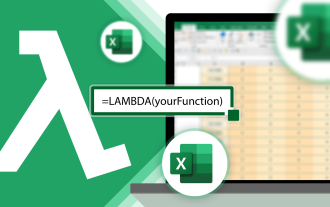 How to Use LAMBDA in Excel to Create Your Own Functions
Mar 21, 2025 am 03:08 AM
How to Use LAMBDA in Excel to Create Your Own Functions
Mar 21, 2025 am 03:08 AM
Excel's LAMBDA Functions: An easy guide to creating custom functions Before Excel introduced the LAMBDA function, creating a custom function requires VBA or macro. Now, with LAMBDA, you can easily implement it using the familiar Excel syntax. This guide will guide you step by step how to use the LAMBDA function. It is recommended that you read the parts of this guide in order, first understand the grammar and simple examples, and then learn practical applications. The LAMBDA function is available for Microsoft 365 (Windows and Mac), Excel 2024 (Windows and Mac), and Excel for the web. E
 If You Don't Use Excel's Hidden Camera Tool, You're Missing a Trick
Mar 25, 2025 am 02:48 AM
If You Don't Use Excel's Hidden Camera Tool, You're Missing a Trick
Mar 25, 2025 am 02:48 AM
Quick Links Why Use the Camera Tool?
 Microsoft Excel Keyboard Shortcuts: Printable Cheat Sheet
Mar 14, 2025 am 12:06 AM
Microsoft Excel Keyboard Shortcuts: Printable Cheat Sheet
Mar 14, 2025 am 12:06 AM
Master Microsoft Excel with these essential keyboard shortcuts! This cheat sheet provides quick access to the most frequently used commands, saving you valuable time and effort. It covers essential key combinations, Paste Special functions, workboo
 Use the PERCENTOF Function to Simplify Percentage Calculations in Excel
Mar 27, 2025 am 03:03 AM
Use the PERCENTOF Function to Simplify Percentage Calculations in Excel
Mar 27, 2025 am 03:03 AM
Excel's PERCENTOF function: Easily calculate the proportion of data subsets Excel's PERCENTOF function can quickly calculate the proportion of data subsets in the entire data set, avoiding the hassle of creating complex formulas. PERCENTOF function syntax The PERCENTOF function has two parameters: =PERCENTOF(a,b) in: a (required) is a subset of data that forms part of the entire data set; b (required) is the entire dataset. In other words, the PERCENTOF function calculates the percentage of the subset a to the total dataset b. Calculate the proportion of individual values using PERCENTOF The easiest way to use the PERCENTOF function is to calculate the single
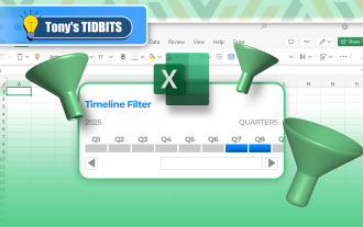 How to Create a Timeline Filter in Excel
Apr 03, 2025 am 03:51 AM
How to Create a Timeline Filter in Excel
Apr 03, 2025 am 03:51 AM
In Excel, using the timeline filter can display data by time period more efficiently, which is more convenient than using the filter button. The Timeline is a dynamic filtering option that allows you to quickly display data for a single date, month, quarter, or year. Step 1: Convert data to pivot table First, convert the original Excel data into a pivot table. Select any cell in the data table (formatted or not) and click PivotTable on the Insert tab of the ribbon. Related: How to Create Pivot Tables in Microsoft Excel Don't be intimidated by the pivot table! We will teach you basic skills that you can master in minutes. Related Articles In the dialog box, make sure the entire data range is selected (
 How to Use the GROUPBY Function in Excel
Apr 02, 2025 am 03:51 AM
How to Use the GROUPBY Function in Excel
Apr 02, 2025 am 03:51 AM
Excel's GROUPBY function: Powerful data grouping and aggregation tools Excel's GROUPBY function allows you to group and aggregate data based on specific fields in a data table. It also provides parameters that allow you to sort and filter the data so that you can customize the output to your specific needs. GROUPBY function syntax The GROUPBY function contains eight parameters: =GROUPBY(a,b,c,d,e,f,g,h) Parameters a to c are required: a (row field): A range (one column or multiple columns) containing the value or category to which the data is grouped. b (value): The range of values containing aggregated data (one column or multiple columns).
