

how to label data point on line graph in excel

How to Label Data Points on a Line Graph in Excel
Adding data point labels to your Excel line graph enhances readability and allows for quick data interpretation. There are several methods to achieve this, ranging from simple manual labeling to automated solutions. The most straightforward approach involves directly adding labels to the chart.
1. Manual Labeling:
This is the simplest method, suitable for graphs with a small number of data points.
- Select the data point: Click on the specific data point on your line graph that you want to label.
- Add a text box: Go to the "Insert" tab on the Excel ribbon and select "Text Box". Draw a text box near the chosen data point.
- Enter the label: Type the desired label (e.g., the data value or a descriptive text) into the text box.
- Format the label: Right-click on the text box and select "Format Shape" to customize the font, size, color, and other text properties. You can also adjust the text box's position and transparency.
- Repeat: Repeat this process for each data point you want to label.
This method offers complete control over individual labels but can be time-consuming for graphs with numerous data points.
2. Using Data Labels Feature (Semi-Automated):
Excel's built-in data labels feature offers a more efficient way to label multiple data points.
- Select the chart: Click on the line graph itself.
- Add data labels: Go to the "Chart Design" tab (it appears when you select the chart). In the "Chart Layouts" group, select a layout that includes data labels, or click on "Add Chart Element" and choose "Data Labels".
- Customize data labels: Once the labels are added, you can right-click on them and select "Format Data Labels" to customize their position (e.g., above, below, left, right, center), content (value, percentage, name, category name, etc.), and appearance (font, color, etc.). You can even choose to show labels only for specific data points by selecting the individual labels and adjusting their visibility.
How can I add labels to specific data points in my Excel line graph?
You can add labels to specific data points using both manual labeling and the data labels feature described above. For the data labels feature, you have several options to achieve this selectivity:
- Select specific data points before adding labels: Before adding data labels, you can select individual data points on the chart. Then, when you add data labels, only the selected points will receive labels.
- Filter data labels after adding them: Add data labels to all points. Then, right-click on individual labels you don't want and select "Format Data Labels". You can adjust their fill color to "No Fill" and/or their font color to "No Fill" to effectively hide them without deleting the labels entirely.
- Use a helper column in your data: Add a column to your data table indicating which points should have labels (e.g., using "Yes" or "No"). Then, when formatting data labels, you can use a formula within the "Label Options" to only display labels for rows where the helper column indicates "Yes". This provides a more robust and easily modifiable method for selective labeling.
What are the different ways to customize the appearance of data point labels in an Excel line graph?
Once you've added data labels, you have extensive control over their appearance through the "Format Data Labels" dialog box. Customization options include:
- Text: Font, font size, color, bold, italic, and underline. You can also choose to display the data value, percentage, category name, series name, or a custom formula.
- Position: Above, below, left, right, center, inside end, outside end, best fit.
- Layout: You can control the separation and alignment of the labels.
- Fill and border: Choose colors and styles for the label background and border.
- Leader lines: Add lines connecting the labels to the data points. Customize their length, color, and style.
- Number formatting: Control decimal places, thousands separators, currency symbols, etc., for numerical data labels.
Is it possible to automatically generate data point labels based on the data values in my Excel line graph?
Yes, automatic generation of data point labels is possible, primarily through the "Data Labels" feature and its "Value From Cells" option. While you cannot directly make it automatically select which data points are labeled, you can automatically display the data values for all points:
- Add Data Labels: As described above, add data labels to your chart.
- Select "Value From Cells": In the "Format Data Labels" dialog box, look for the "Label Options" or similar section. You should find a setting to select the data source for the labels. Choose the option that allows you to select cells from your worksheet.
- Select Data Range: Select the range of cells containing the data values you want displayed as labels. This range should correspond to the data used in your chart.
This method ensures all data points are labeled with their corresponding values without manual input for each point. You can then use the filtering techniques mentioned earlier to selectively hide labels as needed. Remember that using a helper column to determine label visibility remains the most flexible approach for automated, selective labeling.
The above is the detailed content of how to label data point on line graph in excel. For more information, please follow other related articles on the PHP Chinese website!

Hot AI Tools

Undresser.AI Undress
AI-powered app for creating realistic nude photos

AI Clothes Remover
Online AI tool for removing clothes from photos.

Undress AI Tool
Undress images for free

Clothoff.io
AI clothes remover

Video Face Swap
Swap faces in any video effortlessly with our completely free AI face swap tool!

Hot Article
Hot Tools

Notepad++7.3.1
Easy-to-use and free code editor

SublimeText3 Chinese version
Chinese version, very easy to use

Zend Studio 13.0.1
Powerful PHP integrated development environment

Dreamweaver CS6
Visual web development tools

SublimeText3 Mac version
God-level code editing software (SublimeText3)
Hot Topics


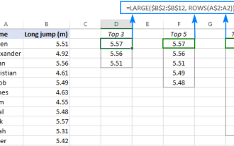 Excel formula to find top 3, 5, 10 values in column or row
Apr 01, 2025 am 05:09 AM
Excel formula to find top 3, 5, 10 values in column or row
Apr 01, 2025 am 05:09 AM
This tutorial demonstrates how to efficiently locate the top N values within a dataset and retrieve associated data using Excel formulas. Whether you need the highest, lowest, or those meeting specific criteria, this guide provides solutions. Findi
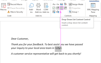 Add a dropdown list to Outlook email template
Apr 01, 2025 am 05:13 AM
Add a dropdown list to Outlook email template
Apr 01, 2025 am 05:13 AM
This tutorial shows you how to add dropdown lists to your Outlook email templates, including multiple selections and database population. While Outlook doesn't directly support dropdowns, this guide provides creative workarounds. Email templates sav
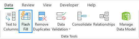 How to use Flash Fill in Excel with examples
Apr 05, 2025 am 09:15 AM
How to use Flash Fill in Excel with examples
Apr 05, 2025 am 09:15 AM
This tutorial provides a comprehensive guide to Excel's Flash Fill feature, a powerful tool for automating data entry tasks. It covers various aspects, from its definition and location to advanced usage and troubleshooting. Understanding Excel's Fla
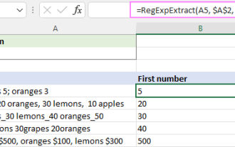 Regex to extract strings in Excel (one or all matches)
Mar 28, 2025 pm 12:19 PM
Regex to extract strings in Excel (one or all matches)
Mar 28, 2025 pm 12:19 PM
In this tutorial, you'll learn how to use regular expressions in Excel to find and extract substrings matching a given pattern. Microsoft Excel provides a number of functions to extract text from cells. Those functions can cope with most
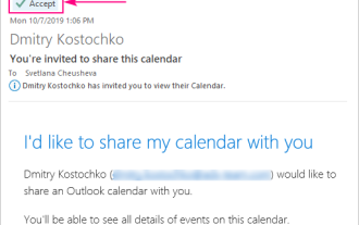 How to add calendar to Outlook: shared, Internet calendar, iCal file
Apr 03, 2025 am 09:06 AM
How to add calendar to Outlook: shared, Internet calendar, iCal file
Apr 03, 2025 am 09:06 AM
This article explains how to access and utilize shared calendars within the Outlook desktop application, including importing iCalendar files. Previously, we covered sharing your Outlook calendar. Now, let's explore how to view calendars shared with
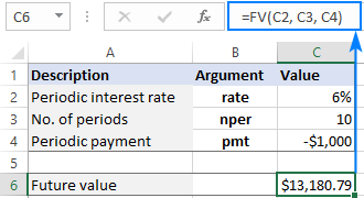 FV function in Excel to calculate future value
Apr 01, 2025 am 04:57 AM
FV function in Excel to calculate future value
Apr 01, 2025 am 04:57 AM
This tutorial explains how to use Excel's FV function to determine the future value of investments, encompassing both regular payments and lump-sum deposits. Effective financial planning hinges on understanding investment growth, and this guide prov
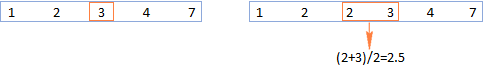 MEDIAN formula in Excel - practical examples
Apr 11, 2025 pm 12:08 PM
MEDIAN formula in Excel - practical examples
Apr 11, 2025 pm 12:08 PM
This tutorial explains how to calculate the median of numerical data in Excel using the MEDIAN function. The median, a key measure of central tendency, identifies the middle value in a dataset, offering a more robust representation of central tenden
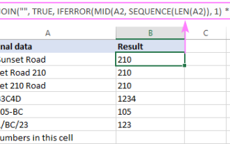 How to remove / split text and numbers in Excel cell
Apr 01, 2025 am 05:07 AM
How to remove / split text and numbers in Excel cell
Apr 01, 2025 am 05:07 AM
This tutorial demonstrates several methods for separating text and numbers within Excel cells, utilizing both built-in functions and custom VBA functions. You'll learn how to extract numbers while removing text, isolate text while discarding numbers
