

how to make pie chart in excel

How to Make Pie Chart in Excel
To create a pie chart in Excel, you can follow these straightforward steps:
- Prepare your data: Ensure that your data is organized in a clear and logical manner. For a pie chart, you typically need a single column or row of numeric data representing parts of a whole (e.g., sales figures for different products) and a corresponding column or row of labels (e.g., product names).
- Select your data: Click and drag to select the entire data set, including both the numeric values and the labels.
- Insert the pie chart: Go to the 'Insert' tab on the Excel ribbon. In the 'Charts' group, click on the 'Pie' or 'Doughnut' chart icon. From the dropdown, choose the basic '2-D Pie' chart.
- Chart placement: Decide where you want your chart to appear. You can either insert it in the same worksheet as your data or in a new worksheet by choosing 'New Sheet' from the dialog box that appears.
- Review your chart: Once inserted, your pie chart should display based on the selected data. You can adjust the chart's position by dragging it to a new location on the worksheet.
What are the Steps to Create a Pie Chart in Excel?
Creating a pie chart in Excel involves the same steps mentioned above: preparing your data, selecting it, inserting the pie chart from the 'Insert' tab, deciding on its placement, and reviewing the resulting chart. This process helps you visualize data distribution across different categories in a clear, graphical format.
How Can I Customize the Colors and Labels on My Excel Pie Chart?
Customizing your Excel pie chart can enhance its visual appeal and clarity. Here’s how you can do it:
- Change Colors: Click on the pie chart to select it, then click again on a specific segment to select it. Right-click and choose 'Fill' to change the color. You can also use the 'Format Data Point' pane for more options.
- Adjust Labels: To customize labels, right-click the pie chart and select 'Add Data Labels'. To modify them, click on a label to select it, then right-click and choose 'Format Data Labels'. Here, you can change the label position, format, and whether to show the category name, percentage, or value.
- Explode a Slice: To highlight a particular segment, you can 'explode' it by clicking on the pie chart, then clicking and dragging the desired slice outward.
- Chart Styles and Layouts: Use the 'Chart Styles' and 'Chart Layouts' options under the 'Chart Tools Design' tab to quickly change the overall look of your chart.
What Data Format Should I Use to Ensure My Pie Chart in Excel Displays Correctly?
For a pie chart in Excel to display correctly, your data should be formatted as follows:
- Data Type: Use numerical data for the values that you want to be represented in the pie chart. These values should be positive numbers since negative numbers and zero cannot be represented in a pie chart.
- Label Data: Use text labels to describe each slice of the pie. This should be a separate column or row adjacent to your numerical data.
-
Structure: Arrange your data in either columns or rows, ensuring that the labels and corresponding values are aligned. For example:
Product Sales Product A 150 Product B 200 Product C 100 - Consistency: Ensure that all data intended for the chart is consistently formatted (e.g., all numbers should be formatted as currency if representing sales figures).
By following these guidelines, your pie chart will accurately represent the data distribution, making it easier to interpret and analyze.
The above is the detailed content of how to make pie chart in excel. For more information, please follow other related articles on the PHP Chinese website!

Hot AI Tools

Undresser.AI Undress
AI-powered app for creating realistic nude photos

AI Clothes Remover
Online AI tool for removing clothes from photos.

Undress AI Tool
Undress images for free

Clothoff.io
AI clothes remover

AI Hentai Generator
Generate AI Hentai for free.

Hot Article
Hot Tools

Notepad++7.3.1
Easy-to-use and free code editor

SublimeText3 Chinese version
Chinese version, very easy to use

Zend Studio 13.0.1
Powerful PHP integrated development environment

Dreamweaver CS6
Visual web development tools

SublimeText3 Mac version
God-level code editing software (SublimeText3)
Hot Topics
 1377
1377
 52
52

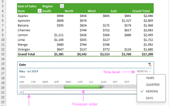 How to create timeline in Excel to filter pivot tables and charts
Mar 22, 2025 am 11:20 AM
How to create timeline in Excel to filter pivot tables and charts
Mar 22, 2025 am 11:20 AM
This article will guide you through the process of creating a timeline for Excel pivot tables and charts and demonstrate how you can use it to interact with your data in a dynamic and engaging way. You've got your data organized in a pivo
 how to sum a column in excel
Mar 14, 2025 pm 02:42 PM
how to sum a column in excel
Mar 14, 2025 pm 02:42 PM
The article discusses methods to sum columns in Excel using the SUM function, AutoSum feature, and how to sum specific cells.
 how to make a table in excel
Mar 14, 2025 pm 02:53 PM
how to make a table in excel
Mar 14, 2025 pm 02:53 PM
Article discusses creating, formatting, and customizing tables in Excel, and using functions like SUM, AVERAGE, and PivotTables for data analysis.
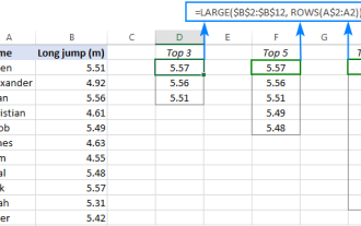 Excel formula to find top 3, 5, 10 values in column or row
Apr 01, 2025 am 05:09 AM
Excel formula to find top 3, 5, 10 values in column or row
Apr 01, 2025 am 05:09 AM
This tutorial demonstrates how to efficiently locate the top N values within a dataset and retrieve associated data using Excel formulas. Whether you need the highest, lowest, or those meeting specific criteria, this guide provides solutions. Findi
 how to make pie chart in excel
Mar 14, 2025 pm 03:32 PM
how to make pie chart in excel
Mar 14, 2025 pm 03:32 PM
The article details steps to create and customize pie charts in Excel, focusing on data preparation, chart insertion, and personalization options for enhanced visual analysis.
 how to calculate mean in excel
Mar 14, 2025 pm 03:33 PM
how to calculate mean in excel
Mar 14, 2025 pm 03:33 PM
Article discusses calculating mean in Excel using AVERAGE function. Main issue is how to efficiently use this function for different data sets.(158 characters)
 how to add drop down in excel
Mar 14, 2025 pm 02:51 PM
how to add drop down in excel
Mar 14, 2025 pm 02:51 PM
Article discusses creating, editing, and removing drop-down lists in Excel using data validation. Main issue: how to manage drop-down lists effectively.
 All you need to know to sort any data in Google Sheets
Mar 22, 2025 am 10:47 AM
All you need to know to sort any data in Google Sheets
Mar 22, 2025 am 10:47 AM
Mastering Google Sheets Sorting: A Comprehensive Guide Sorting data in Google Sheets needn't be complex. This guide covers various techniques, from sorting entire sheets to specific ranges, by color, date, and multiple columns. Whether you're a novi
