

Creating publication-quality figures and tables is crucial for effective academic research and data presentation. Python, with its rich ecosystem of libraries, provides powerful tools for generating high-quality, visually appealing, and customizable visuals for your research papers. This article explores how to leverage Python to create these elements, focusing on popular libraries like Matplotlib, Seaborn, Plotly, and Pandas. We'll also cover essential design principles and optimization techniques for publication.

Table of Contents
Overview of Libraries
1. Matplotlib: A fundamental Python visualization library offering granular control over every aspect of a figure, from dimensions and layout to color schemes and fonts. Researchers can tailor plots to meet specific publication requirements, ensuring consistency and clarity.
<code>* **Key Features:** Precise control over plot elements; extensive 2D plotting support; highly flexible styling options; export to publication-quality formats (PDF, PNG, SVG).</code>
2. Seaborn: Built upon Matplotlib, Seaborn provides a higher-level interface for creating statistically informative and visually appealing graphics. It simplifies the creation of complex visualizations (heatmaps, violin plots, regression plots) while automatically managing aesthetic elements like color palettes and axis labels.
<code>* **Key Features:** Predefined themes and color palettes ideal for publications; high-level functions for statistical plots; seamless Pandas integration.</code>
3. Plotly: An interactive visualization library generating dynamic, web-based plots. While primarily used for dashboards and web applications, Plotly's export capabilities produce high-quality static visualizations suitable for publications. It supports a wide array of chart types, including 3D plots and maps.
<code>* **Key Features:** Interactive visualizations (hover, zoom, click); publication-quality static exports (PNG, SVG, PDF); diverse chart types; easy customization.</code>
4. Pandas: Although primarily a data manipulation library, Pandas offers robust table creation and plotting functionalities. Its seamless integration with Matplotlib and Seaborn simplifies the conversion of DataFrames into plots and styled tables. Pandas allows exporting tables in various formats (HTML, LaTeX, Excel), beneficial for academic papers.
<code>* **Key Features:** Built-in plotting functions for quick DataFrame visualizations; table formatting options (column widths, alignment, borders); diverse export options.</code>
Generating Publication-Ready Figures
Key libraries include Matplotlib for versatile static and interactive plots, Seaborn for statistically-rich graphics, and Plotly for interactive visualizations with static export options.
General Guidelines:
Matplotlib Example: A Sine Wave Plot
import matplotlib.pyplot as plt
import numpy as np

x = np.linspace(0, 10, 100)
y = np.sin(x)

plt.figure(figsize=(6, 4), dpi=300)
plt.plot(x, y, label="Sine Wave", color='b', linewidth=2)
plt.xlabel("X-axis label", fontsize=14)
plt.ylabel("Y-axis label", fontsize=14)
plt.title("Sine Wave Example", fontsize=16)
plt.grid(True, which='both', linestyle='--', linewidth=0.5)
plt.legend(fontsize=12)
plt.savefig("sine_wave_figure.png", dpi=300, bbox_inches="tight")
plt.show()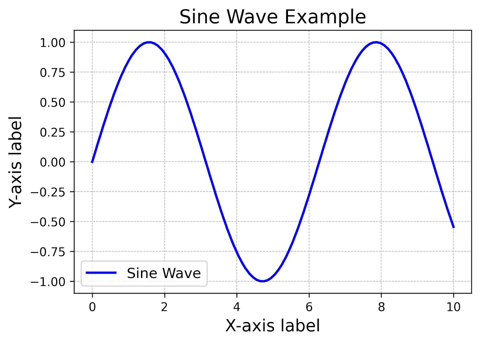
Seaborn Example: A Heatmap
import seaborn as sns
import numpy as np
import matplotlib.pyplot as plt

data = np.random.rand(10, 10)

plt.figure(figsize=(8, 6))
sns.heatmap(data, annot=True, cmap="coolwarm", fmt=".2f", linewidths=0.5)
plt.title("Correlation Heatmap", fontsize=16)
plt.xlabel("X-axis label", fontsize=14)
plt.ylabel("Y-axis label", fontsize=14)
plt.savefig("heatmap.png", dpi=300, bbox_inches="tight")
plt.show()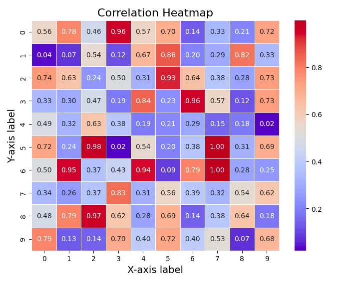
Plotly Example: Interactive Scatter Plot (requires kaleido installation: !pip install --upgrade kaleido)
import plotly.express as px
import pandas as pd
import numpy as np

df = pd.DataFrame({
    "X": np.random.randn(100),
    "Y": np.random.randn(100),
    "Category": np.random.choice(['A', 'B', 'C'], size=100)
})

fig = px.scatter(df, x="X", y="Y", color="Category", title="Interactive Scatter Plot")
fig.write_image("scatter_plot.png", width=800, height=600, scale=2)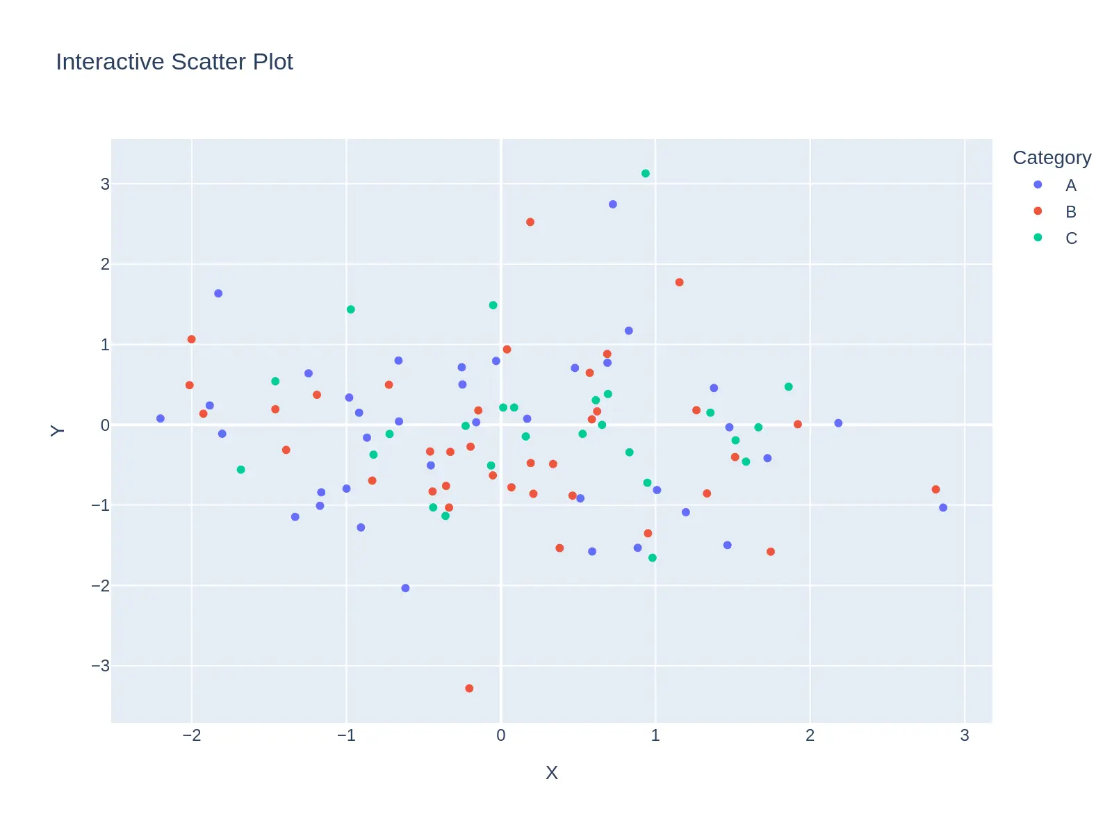
Creating Publication-Ready Tables with Pandas
Pandas simplifies table creation and formatting. Proper formatting includes clear headers, consistent number formatting, aligned data (numbers by decimal, text left-aligned), and the use of footnotes for explanations.
Example: (Simplified for brevity; a more complete example with image inclusion would be significantly longer)
import pandas as pd
data = {'Country': ['USA', 'Canada', 'Mexico'], 'Population': [330, 38, 120]}
df = pd.DataFrame(data)
print(df.to_string(index=False)) #Simple table outputConclusion
Python provides a comprehensive set of tools for generating publication-ready figures and tables. By selecting appropriate libraries (Matplotlib/Seaborn for static, Plotly for interactive), prioritizing clarity and consistency, and exporting at high resolution, researchers can significantly enhance the visual impact and professionalism of their research outputs.
Frequently Asked Questions
Q1: What constitutes a publication-ready figure/table? A: Publication-ready visuals are clear, aesthetically pleasing, and adhere to journal guidelines (resolution, font sizes, labeling, etc.).
Q2: How does Python aid in creating publication-ready figures? A: Python libraries (Matplotlib, Seaborn, Plotly) offer precise control over figure design, ensuring high quality and adherence to publication standards.
Q3: Can Python generate high-resolution figures? A: Yes, by specifying DPI when saving images (e.g., plt.savefig("figure.png", dpi=300)).
Q4: What are key characteristics of a publication-ready figure? A: Clarity, high resolution, appropriate color schemes, clear labeling, consistent styling, and adherence to journal guidelines.
The above is the detailed content of How to Create Publication-Ready Figures and Tables with Python?. For more information, please follow other related articles on the PHP Chinese website!


![[Web front-end] Node.js quick start](https://img.php.cn/upload/course/000/000/067/662b5d34ba7c0227.png)


