

how to make a graph in excel

How to make a graph in Excel
To create a graph in Excel, follow these detailed steps:
- Prepare Your Data: Ensure your data is organized in columns or rows with clear headers. Each column or row should represent a series of data you want to plot.
- Select Your Data: Click and drag to highlight the data you want to include in your graph. If you want to include headers, make sure to select those as well.
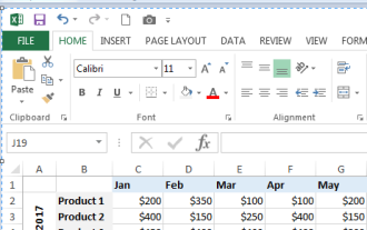
- Insert a Graph: Go to the "Insert" tab on the Excel ribbon. In the "Charts" group, you will see various chart types. Click on the chart type you want to use, such as "Column," "Line," or "Pie." A dropdown menu will appear with different subtypes. Click on the specific subtype you want.
- Choose a Chart Layout: Once the chart appears on your worksheet, you can customize its layout. Click on the chart, and you will see three additional tabs on the ribbon: "Design," "Layout," and "Format." Under the "Design" tab, you can choose from several predefined chart layouts.
- Add Chart Elements: You can add titles, legends, and data labels by clicking on the chart and using the "Chart Elements" button (the plus sign icon) that appears next to it. Check the elements you want to add.
- Position Your Chart: Click and drag the chart to position it where you want on the worksheet. You can also adjust its size by dragging the corners.
By following these steps, you will have successfully created a graph in Excel.
What types of graphs can I create in Excel?
Excel offers a variety of graph types to visualize data in different ways. Here are some of the main types of graphs you can create in Excel:
- Column Chart: Useful for comparing values across categories. Vertical bars represent data values.
- Bar Chart: Similar to column charts but with horizontal bars. Good for comparing large text categories.
- Line Chart: Ideal for displaying trends over time. Data points are connected with a line.
- Pie Chart: Useful for showing the proportion of each category to the whole. Each slice represents a category.
- Area Chart: Similar to a line chart but the area below the line is filled, emphasizing the magnitude of change.
- Scatter Plot: Used to show the relationship between two numerical values. Points are plotted without connecting lines.
- Bubble Chart: A variation of the scatter plot where the size of the bubbles represents a third variable.
- Stock Chart: Specifically designed for financial data, showing trends in stock prices over time.
- Surface Chart: Useful for finding optimal combinations between two sets of data. Colors and patterns indicate values.
- Doughnut Chart: Similar to a pie chart but can display multiple data series.
- Radar Chart: Useful for comparing multiple variables. Data points are plotted on axes starting from the same point.
Each type serves different purposes, allowing you to choose the most effective way to display your data.
How can I customize the appearance of my graph in Excel?
Customizing the appearance of your graph in Excel can help in making it more visually appealing and effective. Here are several ways to customize your graph:
- Change Chart Style: Under the "Design" tab, you can select from various chart styles and colors that change the overall look of your graph.
- Modify Chart Elements: Use the "Chart Elements" button (the plus sign icon) to add or remove elements such as titles, legends, and data labels. You can click on these elements to further customize them.
- Adjust Colors and Fonts: Click on any part of the graph, such as bars, lines, or text, and use the "Format" tab to change colors, fonts, and other styling options.
- Change Axis Options: Click on an axis to customize its scale, labels, and formatting. You can do this under the "Format Axis" pane.
- Add Data Labels: Right-click on a data series and select "Add Data Labels" to show the values on the graph. You can then format these labels for clarity.
- Use the "Format" Tab: This tab allows detailed customization of selected elements. For instance, you can adjust the fill and border of bars, change line styles, and more.
- Create a Chart Template: If you frequently use a specific style, you can save your customized chart as a template. Go to the "Design" tab, click "Save as Template," and use it for future graphs.
By using these customization options, you can tailor your graph to meet your specific needs and preferences.
What are the steps to update data in an existing Excel graph?
Updating data in an existing Excel graph is straightforward. Here are the steps:
- Locate Your Data: Identify the source data range that is currently linked to your graph. This is usually the data you selected when you initially created the graph.
- Modify Your Data: Change the data in the cells directly. You can add, remove, or edit values as needed.
- Refresh the Graph: As you change the data, the graph should update automatically. If it doesn't, you might need to manually refresh it by right-clicking on the graph, selecting "Select Data," and ensuring the correct data range is selected.
- Adjust Data Range: If you've added new rows or columns that you want to include in your graph, click on the graph, go to the "Design" tab, and click "Select Data." In the "Select Data Source" dialog box, you can adjust the data range to include the new data.
- Check for Errors: After updating, review your graph to ensure it accurately represents the new data. Check for any formatting issues or data labels that may need to be adjusted.
- Save Your Changes: Finally, save your Excel file to preserve the updated graph and data.
By following these steps, you can easily keep your Excel graphs up to date with the latest data.
The above is the detailed content of how to make a graph in excel. For more information, please follow other related articles on the PHP Chinese website!

Hot AI Tools

Undresser.AI Undress
AI-powered app for creating realistic nude photos

AI Clothes Remover
Online AI tool for removing clothes from photos.

Undress AI Tool
Undress images for free

Clothoff.io
AI clothes remover

Video Face Swap
Swap faces in any video effortlessly with our completely free AI face swap tool!

Hot Article
Hot Tools

Notepad++7.3.1
Easy-to-use and free code editor

SublimeText3 Chinese version
Chinese version, very easy to use

Zend Studio 13.0.1
Powerful PHP integrated development environment

Dreamweaver CS6
Visual web development tools

SublimeText3 Mac version
God-level code editing software (SublimeText3)
Hot Topics
 1664
1664
 14
1421
52
1315
25
1266
29
1239
24
14
1421
52
1315
25
1266
29
1239
24

 MEDIAN formula in Excel - practical examples
Apr 11, 2025 pm 12:08 PM
MEDIAN formula in Excel - practical examples
Apr 11, 2025 pm 12:08 PM
This tutorial explains how to calculate the median of numerical data in Excel using the MEDIAN function. The median, a key measure of central tendency, identifies the middle value in a dataset, offering a more robust representation of central tenden
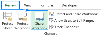 Excel shared workbook: How to share Excel file for multiple users
Apr 11, 2025 am 11:58 AM
Excel shared workbook: How to share Excel file for multiple users
Apr 11, 2025 am 11:58 AM
This tutorial provides a comprehensive guide to sharing Excel workbooks, covering various methods, access control, and conflict resolution. Modern Excel versions (2010, 2013, 2016, and later) simplify collaborative editing, eliminating the need to m
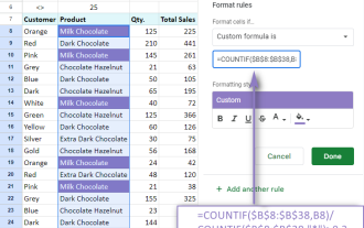 Google Spreadsheet COUNTIF function with formula examples
Apr 11, 2025 pm 12:03 PM
Google Spreadsheet COUNTIF function with formula examples
Apr 11, 2025 pm 12:03 PM
Master Google Sheets COUNTIF: A Comprehensive Guide This guide explores the versatile COUNTIF function in Google Sheets, demonstrating its applications beyond simple cell counting. We'll cover various scenarios, from exact and partial matches to han
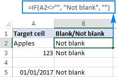 Excel: If cell contains formula examples
Apr 09, 2025 am 09:04 AM
Excel: If cell contains formula examples
Apr 09, 2025 am 09:04 AM
This tutorial demonstrates various Excel formulas to check if a cell contains specific values, including text, numbers, or parts of strings. It covers scenarios using IF, ISTEXT, ISNUMBER, SEARCH, FIND, COUNTIF, EXACT, SUMPRODUCT, VLOOKUP, and neste
 How to convert Excel to JPG - save .xls or .xlsx as image file
Apr 11, 2025 am 11:31 AM
How to convert Excel to JPG - save .xls or .xlsx as image file
Apr 11, 2025 am 11:31 AM
This tutorial explores various methods for converting .xls files to .jpg images, encompassing both built-in Windows tools and free online converters. Need to create a presentation, share spreadsheet data securely, or design a document? Converting yo
 Google sheets chart tutorial: how to create charts in google sheets
Apr 11, 2025 am 09:06 AM
Google sheets chart tutorial: how to create charts in google sheets
Apr 11, 2025 am 09:06 AM
This tutorial shows you how to create various charts in Google Sheets, choosing the right chart type for different data scenarios. You'll also learn how to create 3D and Gantt charts, and how to edit, copy, and delete charts. Visualizing data is cru
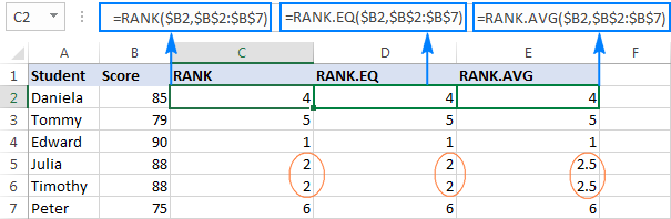 Excel RANK function and other ways to calculate rank
Apr 09, 2025 am 11:35 AM
Excel RANK function and other ways to calculate rank
Apr 09, 2025 am 11:35 AM
This Excel tutorial details the nuances of the RANK functions and demonstrates how to rank data in Excel based on multiple criteria, group data, calculate percentile rank, and more. Determining the relative position of a number within a list is easi
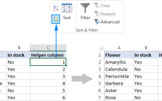 How to flip data in Excel columns and rows (vertically and horizontally)
Apr 11, 2025 am 09:05 AM
How to flip data in Excel columns and rows (vertically and horizontally)
Apr 11, 2025 am 09:05 AM
This tutorial demonstrates several efficient methods for vertically and horizontally flipping tables in Excel, preserving original formatting and formulas. While Excel lacks a direct "flip" function, several workarounds exist. Flipping Dat
