

Add vertical line to Excel chart: scatter plot, bar and line graph

This tutorial demonstrates how to add vertical lines to Excel charts, including scatter plots, bar charts, and line graphs. You'll also learn to create an interactive vertical line controlled by a scroll bar. While Excel easily adds horizontal lines, vertical lines require a workaround.
- Adding Vertical Lines to Scatter Charts
- Inserting Vertical Lines into Bar Charts
- Adding Vertical Lines to Line Charts
- Creating an Interactive Vertical Line with a Scroll Bar
Adding a Vertical Line to a Scatter Plot
To highlight a data point on a scatter chart, create a vertical line marking its x-axis (or x and y axes) position. The line will dynamically adjust to data changes.

Here's how:
- Create a scatter plot from your data.
- In separate cells, calculate the vertical line's data. For an average line, use the
AVERAGEfunction for x and y values (example shown below):

- Right-click the chart and select "Select Data...".
- Click "Add" under "Legend Entries (Series)".
- In "Edit Series," name the series (e.g., "Average"), select the x-value and y-value cells for your data point. Click "OK" twice.

- Select the new data point and add percentage error bars ("Chart Elements" > "Error Bars" > "Percentage").
- Right-click the vertical error bar, select "Format Error Bars...", set "Percentage" to 100, and choose the direction ("Both," "Minus," etc.).

- Adjust the horizontal error bar (set percentage to 0 to hide, or 100 to show).
- Customize the line's color, dash type, and width ("Fill & Line" tab).
The resulting vertical line will appear as configured.
Adding a Vertical Line to a Bar Chart
To compare values against an average or target, add a vertical line to a bar chart:

Follow these steps:
- Create a bar chart from your data.
- In empty cells, input data for the vertical line (example below, using
AVERAGEfor the x-value):
| X | Y |
| =AVERAGE($B$2:$B$7) | 0 |
| =AVERAGE($B$2:$B$7) | 1 |

- Right-click the chart, select "Select Data...", and click "Add".
- Name the series, select the x-values, and click "OK" twice.
- Change the series chart type to "Combo" (Excel 2013 ) or "X Y (Scatter)" > "Scatter with Straight Lines" (Excel 2010 and earlier).
- Re-select data, edit the series, selecting both X and Y values.
- Format the secondary y-axis (set maximum to 1, hide labels).
Adding a Vertical Line to a Line Chart
Use either method above to add a vertical line to a line chart.
Creating an Interactive Vertical Line with a Scroll Bar
To make the vertical line interactive, use a scroll bar:

- Enable the Developer tab.
- Insert a scroll bar ("Developer" > "Insert" > "Scroll Bar").
- Format the scroll bar, linking it to a cell (e.g., D5), setting the maximum value to the number of data points.
- Update the x-value cells for the vertical line to reference the scroll bar's linked cell (
=$D$5). Optionally, use=IFERROR(INDEX($A$2:$A$7, $D$5, 1), "")to display the corresponding data label.
Download the sample workbook for hands-on practice.
The above is the detailed content of Add vertical line to Excel chart: scatter plot, bar and line graph. For more information, please follow other related articles on the PHP Chinese website!

Hot AI Tools

Undresser.AI Undress
AI-powered app for creating realistic nude photos

AI Clothes Remover
Online AI tool for removing clothes from photos.

Undress AI Tool
Undress images for free

Clothoff.io
AI clothes remover

AI Hentai Generator
Generate AI Hentai for free.

Hot Article
Hot Tools

Notepad++7.3.1
Easy-to-use and free code editor

SublimeText3 Chinese version
Chinese version, very easy to use

Zend Studio 13.0.1
Powerful PHP integrated development environment

Dreamweaver CS6
Visual web development tools

SublimeText3 Mac version
God-level code editing software (SublimeText3)
Hot Topics
 1376
1376
 52
52

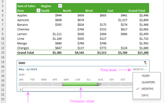 How to create timeline in Excel to filter pivot tables and charts
Mar 22, 2025 am 11:20 AM
How to create timeline in Excel to filter pivot tables and charts
Mar 22, 2025 am 11:20 AM
This article will guide you through the process of creating a timeline for Excel pivot tables and charts and demonstrate how you can use it to interact with your data in a dynamic and engaging way. You've got your data organized in a pivo
 how to sum a column in excel
Mar 14, 2025 pm 02:42 PM
how to sum a column in excel
Mar 14, 2025 pm 02:42 PM
The article discusses methods to sum columns in Excel using the SUM function, AutoSum feature, and how to sum specific cells.
 how to do a drop down in excel
Mar 12, 2025 am 11:53 AM
how to do a drop down in excel
Mar 12, 2025 am 11:53 AM
This article explains how to create drop-down lists in Excel using data validation, including single and dependent lists. It details the process, offers solutions for common scenarios, and discusses limitations such as data entry restrictions and pe
 how to make pie chart in excel
Mar 14, 2025 pm 03:32 PM
how to make pie chart in excel
Mar 14, 2025 pm 03:32 PM
The article details steps to create and customize pie charts in Excel, focusing on data preparation, chart insertion, and personalization options for enhanced visual analysis.
 how to calculate mean in excel
Mar 14, 2025 pm 03:33 PM
how to calculate mean in excel
Mar 14, 2025 pm 03:33 PM
Article discusses calculating mean in Excel using AVERAGE function. Main issue is how to efficiently use this function for different data sets.(158 characters)
 how to make a table in excel
Mar 14, 2025 pm 02:53 PM
how to make a table in excel
Mar 14, 2025 pm 02:53 PM
Article discusses creating, formatting, and customizing tables in Excel, and using functions like SUM, AVERAGE, and PivotTables for data analysis.
 how to add drop down in excel
Mar 14, 2025 pm 02:51 PM
how to add drop down in excel
Mar 14, 2025 pm 02:51 PM
Article discusses creating, editing, and removing drop-down lists in Excel using data validation. Main issue: how to manage drop-down lists effectively.
 All you need to know to sort any data in Google Sheets
Mar 22, 2025 am 10:47 AM
All you need to know to sort any data in Google Sheets
Mar 22, 2025 am 10:47 AM
Mastering Google Sheets Sorting: A Comprehensive Guide Sorting data in Google Sheets needn't be complex. This guide covers various techniques, from sorting entire sheets to specific ranges, by color, date, and multiple columns. Whether you're a novi
