

How to make a line graph in Excel

This tutorial provides a comprehensive guide to creating and customizing line graphs in Excel. Learn how to leverage this versatile chart type to effectively visualize trends and data relationships.
Line graphs, while simple, are powerful tools for displaying data trends. They are particularly useful in statistics and science due to their clarity and ease of interpretation. This tutorial covers creating both single and multiple line graphs, exploring various chart types and customization options to enhance visual appeal and data understanding.

When to Use a Line Graph:
Line graphs excel at:
- Clearly illustrating trends and changes over time.
- Providing a simple, intuitive way to visualize data, even large datasets.
- Revealing relationships between multiple datasets when used as a multiple line graph.
When NOT to Use a Line Graph:
Line graphs are less suitable for:
- Extremely large datasets (over 50 values).
- Discrete data; bar graphs are more appropriate.
- Percentages and proportions; pie charts or stacked columns are better choices.
- Project schedules; Gantt charts offer superior visualization for this purpose.
Creating a Line Graph:
-
Prepare your data: Organize your data into columns, with independent variables (e.g., time) in the leftmost column and dependent variables in subsequent columns.

-
Select your data: Highlight the data you wish to include in the graph, ensuring column headers are selected.
-
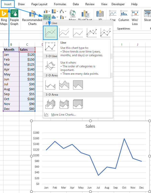
Insert the graph: Navigate to the "Insert" tab, click "Insert Line or Area Chart," and select the desired line graph type (e.g., 2-D Line).

Multiple Line Graphs:
Follow the same steps as for single line graphs, but use a data table with at least three columns: one for independent variables and at least two for dependent variables. Each column of dependent variables will generate a separate line.


Excel Line Graph Types:
Excel offers several line graph variations:
- Line: The standard 2-D line graph.
- Stacked Line: Shows how parts of a whole change over time.
- 100% Stacked Line: Similar to stacked line, but displays percentages.
- Line with Markers: Adds data point markers to the line.
- 3-D Line: A three-dimensional representation.


Customizing Your Line Graph:
Enhance your graph's visual appeal and clarity through customization:
-
Show/Hide Lines: Hide or delete lines using chart filters or by hiding columns in the data sheet. Dynamically show/hide lines using checkboxes (see advanced techniques).
-
Change Data Markers: Modify marker type and size in the "Format Data Series" pane.
-
Change Line Color and Appearance: Adjust line color, style, and transparency in the "Format Data Series" pane.
-
Smooth Line Angles: Enable "Smoothed line" in the "Format Data Series" pane for a smoother curve.
-
Fade Gridlines: Adjust gridline transparency for a less obtrusive appearance.
-
Sparklines: Create miniature line graphs within individual cells using Excel's Sparkline feature.


Mastering these techniques will allow you to create clear, informative, and visually appealing line graphs in Excel, effectively communicating your data insights.
The above is the detailed content of How to make a line graph in Excel. For more information, please follow other related articles on the PHP Chinese website!

Hot AI Tools

Undresser.AI Undress
AI-powered app for creating realistic nude photos

AI Clothes Remover
Online AI tool for removing clothes from photos.

Undress AI Tool
Undress images for free

Clothoff.io
AI clothes remover

Video Face Swap
Swap faces in any video effortlessly with our completely free AI face swap tool!

Hot Article
Hot Tools

Notepad++7.3.1
Easy-to-use and free code editor

SublimeText3 Chinese version
Chinese version, very easy to use

Zend Studio 13.0.1
Powerful PHP integrated development environment

Dreamweaver CS6
Visual web development tools

SublimeText3 Mac version
God-level code editing software (SublimeText3)
Hot Topics


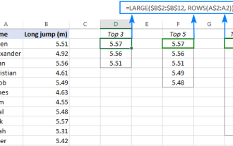 Excel formula to find top 3, 5, 10 values in column or row
Apr 01, 2025 am 05:09 AM
Excel formula to find top 3, 5, 10 values in column or row
Apr 01, 2025 am 05:09 AM
This tutorial demonstrates how to efficiently locate the top N values within a dataset and retrieve associated data using Excel formulas. Whether you need the highest, lowest, or those meeting specific criteria, this guide provides solutions. Findi
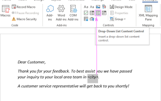 Add a dropdown list to Outlook email template
Apr 01, 2025 am 05:13 AM
Add a dropdown list to Outlook email template
Apr 01, 2025 am 05:13 AM
This tutorial shows you how to add dropdown lists to your Outlook email templates, including multiple selections and database population. While Outlook doesn't directly support dropdowns, this guide provides creative workarounds. Email templates sav
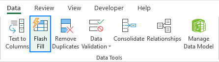 How to use Flash Fill in Excel with examples
Apr 05, 2025 am 09:15 AM
How to use Flash Fill in Excel with examples
Apr 05, 2025 am 09:15 AM
This tutorial provides a comprehensive guide to Excel's Flash Fill feature, a powerful tool for automating data entry tasks. It covers various aspects, from its definition and location to advanced usage and troubleshooting. Understanding Excel's Fla
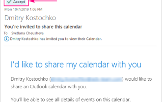 How to add calendar to Outlook: shared, Internet calendar, iCal file
Apr 03, 2025 am 09:06 AM
How to add calendar to Outlook: shared, Internet calendar, iCal file
Apr 03, 2025 am 09:06 AM
This article explains how to access and utilize shared calendars within the Outlook desktop application, including importing iCalendar files. Previously, we covered sharing your Outlook calendar. Now, let's explore how to view calendars shared with
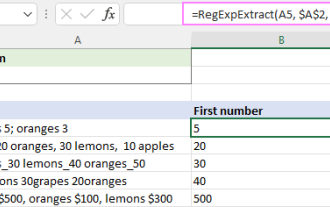 Regex to extract strings in Excel (one or all matches)
Mar 28, 2025 pm 12:19 PM
Regex to extract strings in Excel (one or all matches)
Mar 28, 2025 pm 12:19 PM
In this tutorial, you'll learn how to use regular expressions in Excel to find and extract substrings matching a given pattern. Microsoft Excel provides a number of functions to extract text from cells. Those functions can cope with most
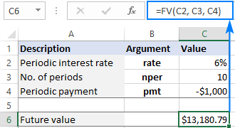 FV function in Excel to calculate future value
Apr 01, 2025 am 04:57 AM
FV function in Excel to calculate future value
Apr 01, 2025 am 04:57 AM
This tutorial explains how to use Excel's FV function to determine the future value of investments, encompassing both regular payments and lump-sum deposits. Effective financial planning hinges on understanding investment growth, and this guide prov
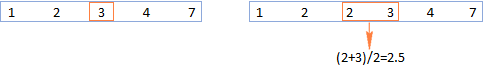 MEDIAN formula in Excel - practical examples
Apr 11, 2025 pm 12:08 PM
MEDIAN formula in Excel - practical examples
Apr 11, 2025 pm 12:08 PM
This tutorial explains how to calculate the median of numerical data in Excel using the MEDIAN function. The median, a key measure of central tendency, identifies the middle value in a dataset, offering a more robust representation of central tenden
 How to remove / split text and numbers in Excel cell
Apr 01, 2025 am 05:07 AM
How to remove / split text and numbers in Excel cell
Apr 01, 2025 am 05:07 AM
This tutorial demonstrates several methods for separating text and numbers within Excel cells, utilizing both built-in functions and custom VBA functions. You'll learn how to extract numbers while removing text, isolate text while discarding numbers
