

How to add a line in Excel graph: average line, benchmark, etc.

This short tutorial will walk you through adding a line in Excel graph such as an average line, benchmark, trend line, etc.
In the last week's tutorial, we were looking at how to make a line graph in Excel. In some situations, however, you may want to draw a horizontal line in another chart to compare the actual values with the target you wish to achieve.
The task can be performed by plotting two different types of data points in the same graph. In earlier Excel versions, combining two chart types in one was a tedious multi-step operation. Microsoft Excel 2013, Excel 2016 and Excel 2019 provide a special Combo chart type, which makes the process so amazingly simple that you might wonder, "Wow, why hadn't they done it before?".
How to draw an average line in Excel graph
This quick example will teach you how to add an average line to a column graph. To have it done, perform these 4 simple steps:
- Calculate the average by using the AVERAGE function.
In our case, insert the below formula in C2 and copy it down the column:
=AVERAGE($B$2:$B$7)
- Select the source data, including the Average column (A1:C7).
- Go to the Insert tab > Charts group and click Recommended Charts.
- Switch to the All Charts tab, select the Clustered Column - Line template, and click OK:


Done! A horizontal line is plotted in the graph and you can now see what the average value looks like relative to your data set:

In a similar fashion, you can draw an average line in a line graph. The steps are totally the same, you just choose the Line or Line with Markers type for the Actual data series:

Tips:
- The same technique can be used to plot a median For this, use the MEDIAN function instead of AVERAGE.
- Adding a target line or benchmark line in your graph is even simpler. Instead of a formula, enter your target values in the last column and insert the Clustered Column - Line combo chart as shown in this example.
- If none of the predefined combo charts suits your needs, select the Custom Combination type (the last template with the pen icon), and choose the desired type for each data series.
How to add a line to an existing Excel graph
Adding a line to an existing graph requires a few more steps, therefore in many situations it would be much faster to create a new combo chart from scratch as explained above.
But if you've already invested quite a lot of time in designing you graph, you wouldn't want to do the same job twice. In this case, please follow the below guidelines to add a line in your graph. The process may look a bit complicated on paper, but in your Excel, you will be done in a couple of minutes.
- Insert a new column beside your source data. If you wish to draw an average line, fill the newly added column with an Average formula discussed in the previous example. If you are adding a benchmark line or target line, put your target values in the new column like shown in the screenshot below:
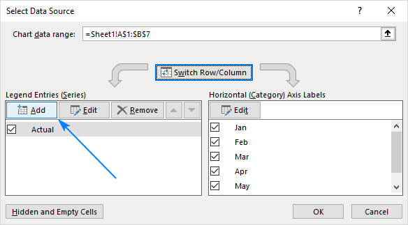
- Right-click the existing graph, and choose Select Data… from the context menu:
- In the Select Data Source dialog box, click the Add button in the Legend Entries (Series)
- In the Edit Series dialog window, do the following:
- In the Series namebox, type the desired name, say "Target line".
- Click in the Series value box and select your target values without the column header.
- Click OK twice to close both dialog boxes.
- The target line series is added to the graph (orange bars in the screenshot below). Right-click it, and choose Change Series Chart Type… in the context menu:
- In the Change Chart Type dialog box, make sure Combo > Custom Combination template is selected, which should be by default. For the Target line series, pick Linefrom the Chart Type drop-down box, and click OK.


Done! A horizontal target line is added to your graph:

How to plot a target line with different values
In situations when you want to compare the actual values with the estimated or target values that are different for each row, the method described above is not very effective. The line does not allow you to pin point the target values exactly, as the result you may misinterpret the information in the graph:

To visualize the target values more clearly, you can display them in this way:

To achieve this effect, add a line to your chart as explained in the previous examples, and then do the following customizations:
- In your graph, double-click the target line. This will select the line and open the Format Data Series pane on the right side of your Excel window.
- On the Format Data Series pane, go to Fill & Line tab > Line section, and select No line.
- Switch to the Marker section, expand Marker Options, change it to Built-in, select the horizontal bar in the Type box, and set the Size corresponding to the width of your bars (24 in our example):
- Set the marker Fill to Solid fill or Pattern fill and select the color of your choosing.
- Set the marker Border to Solid line and also choose the desired color.


The screenshot below shows my settings:

Tips to customize the line
To make your graph look even more beautiful, you can change the chart title, legend, axes, gridlines and other elements as described in this tutorial: How to customize a graph in Excel. And below you will find a few tips relating directly to the line's customization.
Display the average / benchmark value on the line
In some situations, for example when you set relatively big intervals for the vertical y-axis, it may be hard for your users to determine the exact point where the line crosses the bars. No problem, just show that value in your graph. Here's how you can do this:
- Click on the line to select it:
- With the whole line selected, click on the last data point. This will unselect all other data points so that only the last one remains selected:
- Right-click the selected data point and pick Add Data Label in the context menu:


The label will appear at the end of the line giving more information to your chart viewers:

Add a text label for the line
To improve your graph further, you may wish to add a text label to the line to indicate what it actually is. Here are the steps for this set up:
- Select the last data point on the line and add a data label to it as discussed in the previous tip.
- Click on the label to select it, then click inside the label box, delete the existing value and type your text:
- Hover over the label box until your mouse pointer changes to a four-sided arrow, and then drag the label slightly above the line:
- Right-click the label and choose Font… from the context menu.
- Customize the font style, size and color as you wish:


When finished, remove the chart legend because it is now superfluous, and enjoy a nicer and clearer look of your chart:

Change the line type
If the solid line added by default does not look quite attractive to you, you can easily change the line type. Here's how:
- Double-click the line.
- On the Format Data Series pane, go Fill & Line > Line, open the Dash type drop-down box and select the desired type.
For example, you can choose Square Dot:

And your Average Line graph will look similar to this:

Extend the line to the edges of the chart area
As you can notice, a horizontal line always starts and ends in the middle of the bars. But what if you want it to stretch to the right and left edges of the chart?
Here is a quick solution: double-click the on the horizontal axis to open the Format Axis pane, switch to Axis Options and choose to position the axis On tick marks:

However, this simple method has one drawback - it makes the leftmost and rightmost bars half as thin as the other bars, which does not look nice.
As a workaround, you can fiddle with your source data instead of fiddling with the graph settings:
- Insert a new row before the first and after the last row with your data.
- Copy the average/benchmark/target value in the new rows and leave the cells in the first two columns empty, as shown in the screenshot below.
- Select the whole table with the empty cells and insert a Column - Line chart.
Now, our graph clearly shows how far the first and last bars are from the average:

Tip. If you want to draw a vertical line in a scatter plot, bar chart or line graph, you'll find the detailed guidance in this tutorial: How to insert vertical line in Excel chart.
That's how you add a line in Excel graph. I thank you for reading and hope to see you on our blog next week!
The above is the detailed content of How to add a line in Excel graph: average line, benchmark, etc.. For more information, please follow other related articles on the PHP Chinese website!

Hot AI Tools

Undresser.AI Undress
AI-powered app for creating realistic nude photos

AI Clothes Remover
Online AI tool for removing clothes from photos.

Undress AI Tool
Undress images for free

Clothoff.io
AI clothes remover

AI Hentai Generator
Generate AI Hentai for free.

Hot Article
Hot Tools

Notepad++7.3.1
Easy-to-use and free code editor

SublimeText3 Chinese version
Chinese version, very easy to use

Zend Studio 13.0.1
Powerful PHP integrated development environment

Dreamweaver CS6
Visual web development tools

SublimeText3 Mac version
God-level code editing software (SublimeText3)
Hot Topics
 1359
1359
 52
52

 How to create timeline in Excel to filter pivot tables and charts
Mar 22, 2025 am 11:20 AM
How to create timeline in Excel to filter pivot tables and charts
Mar 22, 2025 am 11:20 AM
This article will guide you through the process of creating a timeline for Excel pivot tables and charts and demonstrate how you can use it to interact with your data in a dynamic and engaging way. You've got your data organized in a pivo
 how to do a drop down in excel
Mar 12, 2025 am 11:53 AM
how to do a drop down in excel
Mar 12, 2025 am 11:53 AM
This article explains how to create drop-down lists in Excel using data validation, including single and dependent lists. It details the process, offers solutions for common scenarios, and discusses limitations such as data entry restrictions and pe
 how to sum a column in excel
Mar 14, 2025 pm 02:42 PM
how to sum a column in excel
Mar 14, 2025 pm 02:42 PM
The article discusses methods to sum columns in Excel using the SUM function, AutoSum feature, and how to sum specific cells.
 how to make pie chart in excel
Mar 14, 2025 pm 03:32 PM
how to make pie chart in excel
Mar 14, 2025 pm 03:32 PM
The article details steps to create and customize pie charts in Excel, focusing on data preparation, chart insertion, and personalization options for enhanced visual analysis.
 how to make a table in excel
Mar 14, 2025 pm 02:53 PM
how to make a table in excel
Mar 14, 2025 pm 02:53 PM
Article discusses creating, formatting, and customizing tables in Excel, and using functions like SUM, AVERAGE, and PivotTables for data analysis.
 how to calculate mean in excel
Mar 14, 2025 pm 03:33 PM
how to calculate mean in excel
Mar 14, 2025 pm 03:33 PM
Article discusses calculating mean in Excel using AVERAGE function. Main issue is how to efficiently use this function for different data sets.(158 characters)
 how to add drop down in excel
Mar 14, 2025 pm 02:51 PM
how to add drop down in excel
Mar 14, 2025 pm 02:51 PM
Article discusses creating, editing, and removing drop-down lists in Excel using data validation. Main issue: how to manage drop-down lists effectively.
 All you need to know to sort any data in Google Sheets
Mar 22, 2025 am 10:47 AM
All you need to know to sort any data in Google Sheets
Mar 22, 2025 am 10:47 AM
Mastering Google Sheets Sorting: A Comprehensive Guide Sorting data in Google Sheets needn't be complex. This guide covers various techniques, from sorting entire sheets to specific ranges, by color, date, and multiple columns. Whether you're a novi
