

Violin Plots: A Tool for Visualizing Data Distributions

Violin Plots: A Powerful Data Visualization Tool
This article delves into violin plots, a compelling data visualization technique merging box plots and density plots. We'll explore how these plots unveil data patterns, making them invaluable for data scientists and machine learning professionals. This guide offers practical techniques and Python examples to empower informed decisions and effective communication of complex datasets.
Key Learning Outcomes:
- Understand the core components and characteristics of violin plots.
- Differentiate violin plots from box plots and density plots.
- Explore the applications of violin plots in machine learning and data analysis.
- Gain hands-on experience creating and comparing these plots using Python code.
- Recognize the importance of violin plots in exploratory data analysis (EDA) and model assessment.
Table of Contents:
- Introduction
- Understanding Violin Plots
- Applications in Data Analysis and Machine Learning
- Comparing Violin, Box, and Density Plots
- Conclusion
- Frequently Asked Questions
Deciphering Violin Plots:
Violin plots offer a sophisticated way to visualize data by combining box plots and density plots. The foundation lies in kernel density estimation (KDE), a non-parametric method for estimating the probability density function (PDF) of a random variable. KDE smooths data points, providing a continuous representation of the data distribution.
Key KDE concepts include:
- Kernel Function: A function that smooths data points by assigning weights based on distance from a target point. Gaussian kernels are common, but others (linear, Epanechnikov) exist.
- Bandwidth: Controls the smoothness of the KDE. A large bandwidth over-smooths, while a small bandwidth overfits.
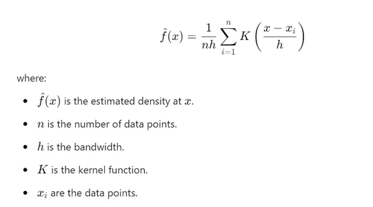
- Estimation: KDE involves placing a kernel on each data point and summing them for the overall density estimate. The mathematical representation is shown below:
A violin plot mirrors the KDE on both sides of a central box plot, creating the violin shape. The key components are:
- Central Box Plot: Shows the median and interquartile range (IQR).
- Density Plot: Illustrates data probability density, highlighting high-concentration areas.
- Axes: The x-axis represents categories/groups, and the y-axis shows the data distribution.
Violin plots excel with complex distributions, revealing multi-modality and outliers. However, their complexity might reduce intuitiveness for those unfamiliar with data visualization.
Applications in Data Science and Machine Learning:
Violin plots find use in various scenarios:
- Feature Analysis: Understanding feature distributions, identifying outliers, and comparing distributions across categories.
- Model Evaluation: Comparing predicted and actual values to detect bias and variance.
- Hyperparameter Tuning: Comparing model performance across different hyperparameter settings.
Comparing Visualization Methods:
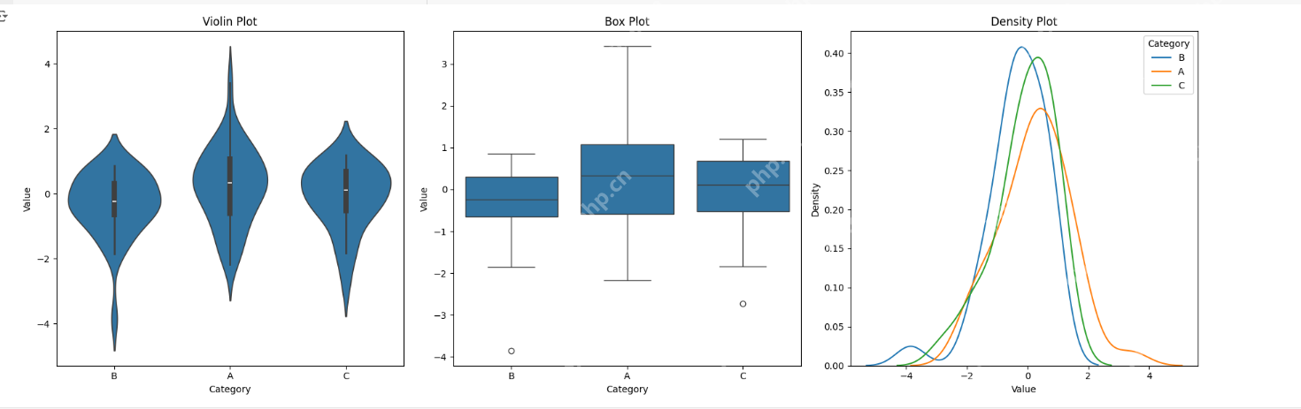
Let's compare violin, box, and density plots using Seaborn, a popular Python library.
Step 1: Install Libraries
1 2 3 4 5 6 7 |
|
Step 2: Generate Synthetic Data
1 2 3 4 5 |
|
Step 3: Data Summary
1 2 3 4 |
|
Step 4: Generate Plots
1 2 3 4 5 6 7 8 9 10 11 |
|
Output:
Conclusion:
Effective data visualization is crucial in machine learning. Violin plots offer a powerful combination of detail and summary statistics, enhancing feature engineering and selection. Their versatility allows analysis of various data types, revealing hidden patterns and anomalies for improved decision-making and communication.
Key Takeaways:
- Violin plots combine density plot detail and box plot summary statistics.
- They are versatile, working with various data types.
- They assist in feature analysis, model evaluation, and hyperparameter optimization.
- Libraries like Seaborn simplify their creation in Python.
- They effectively communicate complex data distributions.
Frequently Asked Questions:
Q1: How do violin plots aid in feature analysis? A1: They reveal data distribution shapes, highlighting trends and outliers, facilitating feature selection by comparing distributions.
Q2: Can they handle large datasets? A2: Yes, but adjust KDE bandwidth to maintain clarity.
Q3: How to interpret multiple peaks? A3: Multiple peaks indicate distinct data clusters or modes, suggesting subgroups.
Q4: How to customize appearance in Python? A4: Seaborn and Matplotlib offer parameters for color, width, and KDE bandwidth.
(Note: The image used in this article is not owned by [Your Name/Organization] and is used with the author's permission.)
The above is the detailed content of Violin Plots: A Tool for Visualizing Data Distributions. For more information, please follow other related articles on the PHP Chinese website!

Hot AI Tools

Undresser.AI Undress
AI-powered app for creating realistic nude photos

AI Clothes Remover
Online AI tool for removing clothes from photos.

Undress AI Tool
Undress images for free

Clothoff.io
AI clothes remover

Video Face Swap
Swap faces in any video effortlessly with our completely free AI face swap tool!
Hot Article
Hot Tools

Notepad++7.3.1
Easy-to-use and free code editor

SublimeText3 Chinese version
Chinese version, very easy to use

Zend Studio 13.0.1
Powerful PHP integrated development environment

Dreamweaver CS6
Visual web development tools

SublimeText3 Mac version
God-level code editing software (SublimeText3)
Hot Topics


 Getting Started With Meta Llama 3.2 - Analytics Vidhya
Apr 11, 2025 pm 12:04 PM
Getting Started With Meta Llama 3.2 - Analytics Vidhya
Apr 11, 2025 pm 12:04 PM
Meta's Llama 3.2: A Leap Forward in Multimodal and Mobile AI Meta recently unveiled Llama 3.2, a significant advancement in AI featuring powerful vision capabilities and lightweight text models optimized for mobile devices. Building on the success o
 10 Generative AI Coding Extensions in VS Code You Must Explore
Apr 13, 2025 am 01:14 AM
10 Generative AI Coding Extensions in VS Code You Must Explore
Apr 13, 2025 am 01:14 AM
Hey there, Coding ninja! What coding-related tasks do you have planned for the day? Before you dive further into this blog, I want you to think about all your coding-related woes—better list those down. Done? – Let’
 AV Bytes: Meta's Llama 3.2, Google's Gemini 1.5, and More
Apr 11, 2025 pm 12:01 PM
AV Bytes: Meta's Llama 3.2, Google's Gemini 1.5, and More
Apr 11, 2025 pm 12:01 PM
This week's AI landscape: A whirlwind of advancements, ethical considerations, and regulatory debates. Major players like OpenAI, Google, Meta, and Microsoft have unleashed a torrent of updates, from groundbreaking new models to crucial shifts in le
 Selling AI Strategy To Employees: Shopify CEO's Manifesto
Apr 10, 2025 am 11:19 AM
Selling AI Strategy To Employees: Shopify CEO's Manifesto
Apr 10, 2025 am 11:19 AM
Shopify CEO Tobi Lütke's recent memo boldly declares AI proficiency a fundamental expectation for every employee, marking a significant cultural shift within the company. This isn't a fleeting trend; it's a new operational paradigm integrated into p
 A Comprehensive Guide to Vision Language Models (VLMs)
Apr 12, 2025 am 11:58 AM
A Comprehensive Guide to Vision Language Models (VLMs)
Apr 12, 2025 am 11:58 AM
Introduction Imagine walking through an art gallery, surrounded by vivid paintings and sculptures. Now, what if you could ask each piece a question and get a meaningful answer? You might ask, “What story are you telling?
 GPT-4o vs OpenAI o1: Is the New OpenAI Model Worth the Hype?
Apr 13, 2025 am 10:18 AM
GPT-4o vs OpenAI o1: Is the New OpenAI Model Worth the Hype?
Apr 13, 2025 am 10:18 AM
Introduction OpenAI has released its new model based on the much-anticipated “strawberry” architecture. This innovative model, known as o1, enhances reasoning capabilities, allowing it to think through problems mor
 Reading The AI Index 2025: Is AI Your Friend, Foe, Or Co-Pilot?
Apr 11, 2025 pm 12:13 PM
Reading The AI Index 2025: Is AI Your Friend, Foe, Or Co-Pilot?
Apr 11, 2025 pm 12:13 PM
The 2025 Artificial Intelligence Index Report released by the Stanford University Institute for Human-Oriented Artificial Intelligence provides a good overview of the ongoing artificial intelligence revolution. Let’s interpret it in four simple concepts: cognition (understand what is happening), appreciation (seeing benefits), acceptance (face challenges), and responsibility (find our responsibilities). Cognition: Artificial intelligence is everywhere and is developing rapidly We need to be keenly aware of how quickly artificial intelligence is developing and spreading. Artificial intelligence systems are constantly improving, achieving excellent results in math and complex thinking tests, and just a year ago they failed miserably in these tests. Imagine AI solving complex coding problems or graduate-level scientific problems – since 2023
 3 Methods to Run Llama 3.2 - Analytics Vidhya
Apr 11, 2025 am 11:56 AM
3 Methods to Run Llama 3.2 - Analytics Vidhya
Apr 11, 2025 am 11:56 AM
Meta's Llama 3.2: A Multimodal AI Powerhouse Meta's latest multimodal model, Llama 3.2, represents a significant advancement in AI, boasting enhanced language comprehension, improved accuracy, and superior text generation capabilities. Its ability t
