

Most Used 10 Power BI Charts - Analytics Vidhya

Harnessing the Power of Data Visualization with Microsoft Power BI Charts
In today's data-driven world, effectively communicating complex information to non-technical audiences is crucial. Data visualization bridges this gap, transforming raw data into readily understandable insights. Microsoft Power BI excels at this, offering a diverse range of charts for impactful business analytics. This article explores the most frequently used Power BI chart types.
Key Advantages of Power BI Charts:
- Clear Data Presentation: Power BI charts transform complex datasets into easily digestible visual formats.
- Trend & Pattern Identification: Quickly identify trends, patterns, and anomalies within your data.
- Comparative Analysis: Facilitate comparisons across different categories, time periods, or data series.
- Informed Decision-Making: Support data-driven decision-making based on clear, visual insights.
- Interactive Exploration: Engage with your data through interactive features like filtering and drill-downs.
- Effective Communication: Communicate complex findings clearly and concisely to stakeholders.
Popular Power BI Chart Types:
Let's delve into the most commonly employed Power BI charts:
1. Bar and Column Charts: These fundamental charts compare values across categories. Bar charts use horizontal bars, while column charts utilize vertical bars. Variations include stacked, clustered, and 100% stacked versions for enhanced analysis.
- Strengths: Simple, effective for comparisons, shows trends.
- Limitations: Can become cluttered with many categories, may not highlight minor variations.


2. Line Charts: Ideal for visualizing trends over time, line charts connect data points to reveal changes and patterns across continuous periods.
- Strengths: Excellent for showing trends, easily displays multiple series.
- Limitations: Overlapping lines can be confusing, dense data can clutter the chart.

3. Pie and Donut Charts: These charts represent parts of a whole. Pie charts show proportions in a single series, while donut charts allow for multiple series.
- Strengths: Simple, intuitive for showing proportions.
- Limitations: Not suitable for many categories, difficult to compare small slices precisely.

4. Area Charts: Similar to line charts but with filled areas under the lines, highlighting cumulative totals and comparisons.
- Strengths: Shows cumulative totals, emphasizes magnitude of change.
- Limitations: Overlapping areas can obscure data, less effective for precise values.

5. Scatter and Bubble Charts: These charts illustrate relationships between variables. Scatter plots show data points, while bubble charts add a third dimension using bubble size.
- Strengths: Identify correlations, detect outliers, handle multi-dimensional data.
- Limitations: Can be complex with many points, overlapping points can obscure information.


6. TreeMap: TreeMaps visualize hierarchical data as nested rectangles, with size representing data value.
- Strengths: Effective for hierarchical data, shows proportions clearly.
- Limitations: Can be cluttered with large datasets, small rectangles may be hard to read.

7. Waterfall Charts: These charts display the cumulative effect of sequential positive and negative values, useful for financial analysis.
- Strengths: Shows cumulative impact, highlights increases and decreases.
- Limitations: Best suited for specific use cases, can be complex with many steps.

8. Funnel Charts: Funnel charts illustrate stages in a process, revealing bottlenecks and drop-off points.
- Strengths: Visualizes process stages, identifies bottlenecks.
- Limitations: Limited detail on individual stages, fixed shape may not suit all processes.

9. Gauge Charts: Gauge charts (speedometer charts) display a single value within a range, ideal for KPIs.
- Strengths: Quick performance overview, shows progress towards a target.
- Limitations: Only shows a single value, can oversimplify complex data.

10. Maps: Power BI offers various map visualizations (filled, bubble, shape) for geographically displaying data.
- Strengths: Shows geographical patterns and trends.
- Limitations: Requires accurate geographic data, can be complex with large datasets.

Choosing the Right Chart:
Selecting the appropriate chart depends on your data type, analytical goals, and audience. Consider:
- Data Type: Categorical, time-series, hierarchical, geographical.
- Purpose: Comparison, trend analysis, distribution, proportion, relationship, hierarchy.
- Audience: Technical expertise and preferred visualization styles.
- Chart Features: Interactivity, scalability, customization options.
Conclusion:
Mastering Power BI's diverse chart options empowers you to transform raw data into compelling visual narratives. By selecting the right chart for your specific needs, you can effectively communicate insights, facilitate data-driven decisions, and unlock the full potential of your data.
The above is the detailed content of Most Used 10 Power BI Charts - Analytics Vidhya. For more information, please follow other related articles on the PHP Chinese website!

Hot AI Tools

Undresser.AI Undress
AI-powered app for creating realistic nude photos

AI Clothes Remover
Online AI tool for removing clothes from photos.

Undress AI Tool
Undress images for free

Clothoff.io
AI clothes remover

Video Face Swap
Swap faces in any video effortlessly with our completely free AI face swap tool!

Hot Article
Hot Tools

Notepad++7.3.1
Easy-to-use and free code editor

SublimeText3 Chinese version
Chinese version, very easy to use

Zend Studio 13.0.1
Powerful PHP integrated development environment

Dreamweaver CS6
Visual web development tools

SublimeText3 Mac version
God-level code editing software (SublimeText3)
Hot Topics


 Best AI Art Generators (Free & Paid) for Creative Projects
Apr 02, 2025 pm 06:10 PM
Best AI Art Generators (Free & Paid) for Creative Projects
Apr 02, 2025 pm 06:10 PM
The article reviews top AI art generators, discussing their features, suitability for creative projects, and value. It highlights Midjourney as the best value for professionals and recommends DALL-E 2 for high-quality, customizable art.
 Getting Started With Meta Llama 3.2 - Analytics Vidhya
Apr 11, 2025 pm 12:04 PM
Getting Started With Meta Llama 3.2 - Analytics Vidhya
Apr 11, 2025 pm 12:04 PM
Meta's Llama 3.2: A Leap Forward in Multimodal and Mobile AI Meta recently unveiled Llama 3.2, a significant advancement in AI featuring powerful vision capabilities and lightweight text models optimized for mobile devices. Building on the success o
 Best AI Chatbots Compared (ChatGPT, Gemini, Claude & More)
Apr 02, 2025 pm 06:09 PM
Best AI Chatbots Compared (ChatGPT, Gemini, Claude & More)
Apr 02, 2025 pm 06:09 PM
The article compares top AI chatbots like ChatGPT, Gemini, and Claude, focusing on their unique features, customization options, and performance in natural language processing and reliability.
 Is ChatGPT 4 O available?
Mar 28, 2025 pm 05:29 PM
Is ChatGPT 4 O available?
Mar 28, 2025 pm 05:29 PM
ChatGPT 4 is currently available and widely used, demonstrating significant improvements in understanding context and generating coherent responses compared to its predecessors like ChatGPT 3.5. Future developments may include more personalized interactions and real-time data processing capabilities, further enhancing its potential for various applications.
 Top AI Writing Assistants to Boost Your Content Creation
Apr 02, 2025 pm 06:11 PM
Top AI Writing Assistants to Boost Your Content Creation
Apr 02, 2025 pm 06:11 PM
The article discusses top AI writing assistants like Grammarly, Jasper, Copy.ai, Writesonic, and Rytr, focusing on their unique features for content creation. It argues that Jasper excels in SEO optimization, while AI tools help maintain tone consist
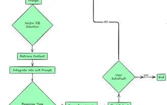 Top 7 Agentic RAG System to Build AI Agents
Mar 31, 2025 pm 04:25 PM
Top 7 Agentic RAG System to Build AI Agents
Mar 31, 2025 pm 04:25 PM
2024 witnessed a shift from simply using LLMs for content generation to understanding their inner workings. This exploration led to the discovery of AI Agents – autonomous systems handling tasks and decisions with minimal human intervention. Buildin
 AV Bytes: Meta's Llama 3.2, Google's Gemini 1.5, and More
Apr 11, 2025 pm 12:01 PM
AV Bytes: Meta's Llama 3.2, Google's Gemini 1.5, and More
Apr 11, 2025 pm 12:01 PM
This week's AI landscape: A whirlwind of advancements, ethical considerations, and regulatory debates. Major players like OpenAI, Google, Meta, and Microsoft have unleashed a torrent of updates, from groundbreaking new models to crucial shifts in le
 Selling AI Strategy To Employees: Shopify CEO's Manifesto
Apr 10, 2025 am 11:19 AM
Selling AI Strategy To Employees: Shopify CEO's Manifesto
Apr 10, 2025 am 11:19 AM
Shopify CEO Tobi Lütke's recent memo boldly declares AI proficiency a fundamental expectation for every employee, marking a significant cultural shift within the company. This isn't a fleeting trend; it's a new operational paradigm integrated into p
