
 Web Front-end
JS Tutorial
FusionCharts chart displays dual Y-axis dual (multiple) curves_javascript skills
Web Front-end
JS Tutorial
FusionCharts chart displays dual Y-axis dual (multiple) curves_javascript skills
FusionCharts chart displays dual Y-axis dual (multiple) curves_javascript skills

The FusionCharts chart needs to display dual Y-axes in the project. It seems that FCF_MSLine.swf cannot do this. It can only display one Y-axis and multiple lines.
After searching, it can be achieved with MSCombiDY2D.swf. The generated diagram is as follows:
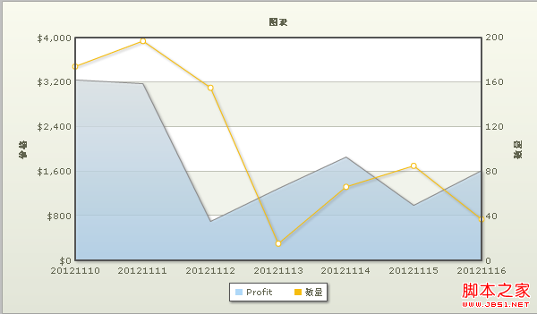
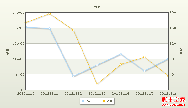
The data of the two charts are the same, but the settings are different. The corresponding XML text of
is as follows :
Now to change the area chart into a curve just change
to
Explanation:
parentYAxis='P' means the corresponding Y-axis on the left
parentYAxis='S' The corresponding representation is the Y-axis on the right
renderAs represents the shape, Area is the area chart, and Line is the curve chart
About parameter settings
Functional features
Animation Whether to animate the display of data, The default is 1 (True)
showNames whether to display the horizontal coordinate axis (x-axis) label name
rotateNames whether to rotate the display label, the default is 0 (False): horizontal display
showValues whether to display the corresponding data in the chart Value, default is 1 (True)
yAxisMinValue specifies the minimum value of the vertical axis (y-axis), number
yAxisMaxValue specifies the minimum value of the vertical axis (y-axis), number
showLimits whether to display the chart limits (y-axis) maximum, minimum value), default is 1 (True)
Chart title and axis name
caption Chart main title
subCaption Chart subtitle
xAxisName Horizontal coordinate axis (x-axis) Name
yAxisName vertical coordinate axis (y-axis) name
chart and canvas style
bgColor chart background color, 6-digit hexadecimal color value
canvasBgColor canvas background color, 6-digit hexadecimal color value
canvasBgAlpha canvas transparency, [0-100]
canvasBorderColor canvas border color, 6-digit hexadecimal color value
canvasBorderThickness canvas border thickness, [0-100]
shadowAlpha projection transparency, [0-100]
showLegend whether to display the series name, the default is 1 (True)
Font attribute
baseFont chart font style
baseFontSize chart font size
baseFontColor Chart font color, 6-digit hexadecimal color value
outCnvBaseFont Font style outside the chart canvas
outCnvBaseFontSize Font size outside the chart canvas
outCnvBaseFontColor Font color outside the chart canvas, 6-digit hexadecimal Color value
Division lines and grid
numDivLines Number of horizontal division lines inside the canvas, number
divLineColor Horizontal division line color, 6-digit hexadecimal color value
divLineThickness Horizontal division Line thickness, [1-5]
divLineAlpha horizontal partition line transparency, [0-100]
showAlternateHGridColor whether to alternate colors in the horizontal grid band, the default is 0 (False)
alternateHGridColor horizontal grid band Alternate color, 6-digit hexadecimal color value
alternateHGridAlpha Transparency of the horizontal grid strip, [0-100]
showDivLinues Whether to display the value of the Div row, default? ?
numVDivLines Number of vertical division lines inside the canvas, number
vDivLineColor vertical division line color, 6-digit hexadecimal color value
vDivLineThickness vertical division line thickness, [1-5]
vDivLineAlpha vertical division line transparency , [0-100]
showAlternateVGridColor Whether to alternate colors in the vertical grid, the default is 0 (False)
alternateVGridColor Alternate colors in the vertical grid, 6-digit hexadecimal color value
alternateVGridAlpha vertical Transparency of the grid band, [0-100]
Number format
numberPrefix increases the number prefix
numberSuffix increases the number suffix % to '%'
formatNumberScale whether to format the number, The default is 1 (True), which automatically adds K (thousands) or M (millions) to your number; if it is 0, then does not add K or M
decimalPrecision specifies the decimal places. Number of digits, [0-10] For example: ='0' Rounding
divLineDecimalPrecision specifies the number of decimal places for the value of the horizontal partition line, [0-10]
limitsDecimalPrecision specifies the decimal places for the maximum and minimum values of the y-axis The number of digits, [0-10]
formatNumber comma to separate numbers (thousands, millions), the default is 1 (True); if it is 0, no separator is added
decimalSeparator specifies decimal separation character, the default is '.'
thousandSeparator Specifies the thousandth separator, the default is ','
Tool-tip/Hover title
showhovercap Whether to display the hover description box, the default is 1 (True)
hoverCapBgColor The background color of the hover description box, a 6-digit hexadecimal color value
hoverCapBorderColor The border color of the hover description box, a 6-digit hexadecimal color value
hoverCapSepChar Specifies the value between the hover description box and the value Separator, default is ','
Parameters of the line chart
lineThickness Thickness of the polyline
anchorRadius Polyline node radius, number
anchorBgAlpha Polyline node transparency, [0-100]
anchorBgColor polyline node fill color, 6-digit hexadecimal color value
anchorBorderColor polyline node border color, 6-digit hexadecimal color value
Parameters used by Set tag
value Data value
color color
link link (this window opens [Url], a new window opens [n-Url], calls JS function [JavaScript: function])
name horizontal axis label name

Hot AI Tools

Undresser.AI Undress
AI-powered app for creating realistic nude photos

AI Clothes Remover
Online AI tool for removing clothes from photos.

Undress AI Tool
Undress images for free

Clothoff.io
AI clothes remover

AI Hentai Generator
Generate AI Hentai for free.

Hot Article
Hot Tools

Notepad++7.3.1
Easy-to-use and free code editor

SublimeText3 Chinese version
Chinese version, very easy to use

Zend Studio 13.0.1
Powerful PHP integrated development environment

Dreamweaver CS6
Visual web development tools

SublimeText3 Mac version
God-level code editing software (SublimeText3)
Hot Topics
 1385
1385
 52
52

 How to add labels to legend in Google Sheet
Feb 19, 2024 am 11:03 AM
How to add labels to legend in Google Sheet
Feb 19, 2024 am 11:03 AM
This article will demonstrate how to add labels to legends in Google Sheet that focus on a single thing, providing a name or identity. A legend explains a system or group of things, giving you relevant contextual information. How to Add Labels to a Legend in GoogleSheet Sometimes, when working with charts, we want to make them easier to understand. This can be achieved by adding appropriate labels and legends. Next, we’ll show you how to add labels to legends in Google Sheets to make your data clearer. Create the chart Edit the text of the legend label Let's get started. 1] Create a chart To label the legend, first, we have to create a chart: First, enter in the columns or rows of GoogleSheets
 How to use PHP arrays to generate and display charts and statistical graphs
Jul 15, 2023 pm 12:24 PM
How to use PHP arrays to generate and display charts and statistical graphs
Jul 15, 2023 pm 12:24 PM
How to use PHP arrays to generate and display charts and statistical graphs. PHP is a widely used server-side scripting language with powerful data processing and graphic generation capabilities. In web development, we often need to display charts and statistical graphs of data. Through PHP arrays, we can easily implement these functions. This article will introduce how to use PHP arrays to generate and display charts and statistical graphs, and provide relevant code examples. Introducing the necessary library files and style sheets Before starting, we need to introduce some necessary library files into the PHP file
 Implementation of linear and pie chart functions in Vue statistical charts
Aug 19, 2023 pm 06:13 PM
Implementation of linear and pie chart functions in Vue statistical charts
Aug 19, 2023 pm 06:13 PM
The linear and pie chart functions of Vue statistical charts are implemented in the field of data analysis and visualization. Statistical charts are a very commonly used tool. As a popular JavaScript framework, Vue provides convenient methods to implement various functions, including the display and interaction of statistical charts. This article will introduce how to use Vue to implement linear and pie chart functions, and provide corresponding code examples. Linear graph function implementation A linear graph is a type of chart used to display trends and changes in data. In Vue, we can use some excellent
 How to quickly build a statistical chart system under the Vue framework
Aug 21, 2023 pm 05:48 PM
How to quickly build a statistical chart system under the Vue framework
Aug 21, 2023 pm 05:48 PM
How to quickly build a statistical chart system under the Vue framework. In modern web applications, statistical charts are an essential component. As a popular front-end framework, Vue.js provides many convenient tools and components that can help us quickly build a statistical chart system. This article will introduce how to use the Vue framework and some plug-ins to build a simple statistical chart system. First, we need to prepare a Vue.js development environment, including installing Vue scaffolding and some related plug-ins. Execute the following command in the command line
 Learning Excel Charts: How to Make Charts Move Like Web Pages
Aug 16, 2022 am 10:30 AM
Learning Excel Charts: How to Make Charts Move Like Web Pages
Aug 16, 2022 am 10:30 AM
In the previous article "Excel chart learning through cases, let's talk about how to draw a graduated cylinder column chart", we learned about the method of drawing a graduated cylinder column chart. Today we will share another Excel chart tutorial and talk about a method to make Excel charts move like a web page. As long as you enter keywords, the table data and charts will automatically change. Especially when the company's data needs to be divided into departments, it is simply too confusing. Convenient!
 How to use PHP and Vue.js to implement data filtering and sorting functions on charts
Aug 27, 2023 am 11:51 AM
How to use PHP and Vue.js to implement data filtering and sorting functions on charts
Aug 27, 2023 am 11:51 AM
How to use PHP and Vue.js to implement data filtering and sorting functions on charts. In web development, charts are a very common way of displaying data. Using PHP and Vue.js, you can easily implement data filtering and sorting functions on charts, allowing users to customize the viewing of data on charts, improving data visualization and user experience. First, we need to prepare a set of data for the chart to use. Suppose we have a data table that contains three columns: name, age, and grades. The data is as follows: Name, Age, Grades Zhang San 1890 Li
 How to insert a chart in word
Mar 20, 2024 pm 03:41 PM
How to insert a chart in word
Mar 20, 2024 pm 03:41 PM
Sometimes in order to display the data more intuitively, we need to use charts to display it. But when it comes to charts, many people think that they can only be operated on Excel. In fact, this is not the case. Word can also directly insert charts. How to do it? Just take a look and you'll find out. 1. First we open a word document. 2. Next we find the "Chart" tool button in the "Insert" menu and click it. 3. Click the "Chart" button and select a suitable chart. Here we can select a chart type at will and click "OK". 4. After selecting the chart, the system will automatically open the excel chart, and inside The data has been entered, we just need to change the data. If you have already prepared the form here,
 Detailed explanation of the use of fusioncharts.js
Dec 08, 2023 pm 01:45 PM
Detailed explanation of the use of fusioncharts.js
Dec 08, 2023 pm 01:45 PM
fusioncharts.js provides rich chart types, data visualization and interactive functions to help developers create high-quality charts and instruments in web applications.
