
 Web Front-end
JS Tutorial
Text box input focus and defocus style implementation code_javascript skills
Web Front-end
JS Tutorial
Text box input focus and defocus style implementation code_javascript skills
Text box input focus and defocus style implementation code_javascript skills

First, use the css pseudo-class: focus can be changed.
The html code of the text box is assumed to be as follows:
- Name:
- Password :
- Textarea:
- < textarea>
css code is written like this:
input[type="text" ]:focus, input[type="password"]:focus, textarea:focus { border: 1px solid #f00; background: #ccc; }
The text box, password box, and paragraph box are listed respectively. The style of the three input boxes when they are focused. Add a red border and gray background.
Is it that simple to solve now? Use a browser (Firefox, Safari, IE7) to test, everything is ok, but IE6 is not supported.
If you want IE6 to have the same beautiful effect, you can only use js. Here I use jquery to make one for you. Effect.
$(document).ready(function(){
$("input[@type='text'], input[@type='password'], textarea").focus( function(){ $(this). css({background:"#ccc", border:"1px solid #f00"})} );
});
Isn’t it very simple to make jquery? It feels similar to the way of writing css!
This is just the focus state. The out-of-focus state of jquery requires you to give instructions. It is silly and naive. It will not change back by itself, so then add the out-of-focus state.
$(document).ready(function(){
$("input[@type='text'], input[@type='password'], textarea").focus(function(){$(this).css({background:"#ccc", border: "1px solid #f00"})}).blur(function(){$(this).css({background: “#FFF”, border: “1px solid #ccc”})});
})
After defocusing, the background edge becomes white and the border becomes gray.
Of course you can also use jquery's addClass and removeClass to simplify the code:
$(document).ready(function(){
$("input[@type='text'], input[@type='password'], textarea").focus (function(){$(this).addClass("focus")}).blur(function(){$(this).removeClass("focus")});
})
First give the input box a default style. When it is focused, use addClass to add css "focus". When it is out of focus, use removeClass to remove css "focus".
All done!

Hot AI Tools

Undresser.AI Undress
AI-powered app for creating realistic nude photos

AI Clothes Remover
Online AI tool for removing clothes from photos.

Undress AI Tool
Undress images for free

Clothoff.io
AI clothes remover

Video Face Swap
Swap faces in any video effortlessly with our completely free AI face swap tool!

Hot Article
Hot Tools

Notepad++7.3.1
Easy-to-use and free code editor

SublimeText3 Chinese version
Chinese version, very easy to use

Zend Studio 13.0.1
Powerful PHP integrated development environment

Dreamweaver CS6
Visual web development tools

SublimeText3 Mac version
God-level code editing software (SublimeText3)
Hot Topics
 1388
1388
 52
52

 How to Download Windows Spotlight Wallpaper Image on PC
Aug 23, 2023 pm 02:06 PM
How to Download Windows Spotlight Wallpaper Image on PC
Aug 23, 2023 pm 02:06 PM
Windows are never one to neglect aesthetics. From the bucolic green fields of XP to the blue swirling design of Windows 11, default desktop wallpapers have been a source of user delight for years. With Windows Spotlight, you now have direct access to beautiful, awe-inspiring images for your lock screen and desktop wallpaper every day. Unfortunately, these images don't hang out. If you have fallen in love with one of the Windows spotlight images, then you will want to know how to download them so that you can keep them as your background for a while. Here's everything you need to know. What is WindowsSpotlight? Window Spotlight is an automatic wallpaper updater available from Personalization > in the Settings app
 Beautiful pictures change every day! A complete guide to focusing on desktop and lock screen settings in Windows 11
Mar 25, 2024 am 09:01 AM
Beautiful pictures change every day! A complete guide to focusing on desktop and lock screen settings in Windows 11
Mar 25, 2024 am 09:01 AM
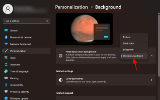
Windows 11’s Focus feature can automatically update your desktop wallpapers, themes, and lock screen interface, presenting you with a selection of beautiful pictures of landscapes, cities, animals, etc. every day. These images are all sourced from Bing search, which not only makes the user experience more personalized, but also occasionally displays practical suggestions and tips on the lock screen, bringing additional surprises and help to users. Method 1 to use Windows 11 Focus Desktop: Set Windows Focus Desktop Wallpaper 1 Press the Windows+I shortcut key to open "Settings" and select "Personalization" > "Background". 2 In the "Personalize background" drop-down list, select the "Windows Focus" option. Select Windows Spotlight Wallpaper
 How to encapsulate input components and unified form data in vue3
May 12, 2023 pm 03:58 PM
How to encapsulate input components and unified form data in vue3
May 12, 2023 pm 03:58 PM
Preparation Use vuecreateexample to create a project. The parameters are roughly as follows: use native input. Native input is mainly value and change. The data needs to be synchronized when changing. App.tsx is as follows: import{ref}from'vue';exportdefault{setup(){//username is the data constusername=ref('Zhang San');//When the input box changes, synchronize the data constonInput=;return( )=>({
 How to implement laravel input hidden field
Dec 12, 2022 am 10:07 AM
How to implement laravel input hidden field
Dec 12, 2022 am 10:07 AM
How to implement the laravel input hidden field: 1. Find and open the Blade template file; 2. Use the method_field method in the Blade template to create a hidden field. The creation syntax is "{{ method_field('DELETE') }}".
 What to do if there is no cursor when clicking on the input box
Nov 24, 2023 am 09:44 AM
What to do if there is no cursor when clicking on the input box
Nov 24, 2023 am 09:44 AM
Solutions for clicking the input box without a cursor: 1. Confirm the focus of the input box; 2. Clear the browser cache; 3. Update the browser; 4. Use JavaScript; 5. Check the hardware device; 6. Check the input box properties; 7. Debug JavaScript code; 8. Check other elements of the page; 9. Consider browser compatibility.
 Detailed explanation of input box binding events in Vue documents
Jun 21, 2023 am 08:12 AM
Detailed explanation of input box binding events in Vue documents
Jun 21, 2023 am 08:12 AM
Vue.js is a lightweight JavaScript framework that is easy to use, efficient and flexible. It is one of the most popular front-end frameworks currently. In Vue.js, input box binding events are a very common requirement. This article will introduce the input box binding events in the Vue document in detail. 1. Basic concepts In Vue.js, the input box binding event refers to binding the value of the input box to the data object of the Vue instance, thereby achieving two-way binding of input and response. In Vue.j
 How to use the input box carriage return event and verification function in the Vue document
Jun 20, 2023 am 09:13 AM
How to use the input box carriage return event and verification function in the Vue document
Jun 20, 2023 am 09:13 AM
Vue is a popular JavaScript front-end framework with a responsive data binding and component system at its core. In Vue applications, the input box is one of the most commonly used UI elements. When the user enters text, we hope to listen for the carriage return event and validate the input before submitting. This article will introduce the input box enter event and verification function usage in the Vue document. 1. The carriage return event of the input box in Vue. Monitoring the carriage return event of the input box in Vue is very simple.
 What does windows focus mean?
Feb 01, 2024 pm 09:27 PM
What does windows focus mean?
Feb 01, 2024 pm 09:27 PM
Windows Focus is a personalized lock screen theme setting function that allows you to freely change the background image in the lock screen view and provides users with relevant suggestions based on the settings. This feature is widely applicable to Windows 10 environments including all desktop versions. How to use windows focus function This feature introduced in Windows 10 is designed to allow users to no longer just enjoy static wallpapers, but to experience diverse and dynamic background screen changes during computer lockout. Background images are usually automatically downloaded and changed based on user preferences and habits. In addition, there are also situations where WindowsFocus will present multiple different background images on the frequency lock interface at the same time, and even give practical suggestions or information in specific scenarios. Note: in w
