 Web Front-end
 JS Tutorial
 Learn to use bootstarp basic controls (table, form, button)_javascript skills
Learn to use bootstarp basic controls (table, form, button)_javascript skills
Bootstrap defines simple and easy-to-use styles for us. We only need a few style specifications to complete a simple and elegant page display.
This article mainly introduces the following basic controls:
1. table
2. form
3. button
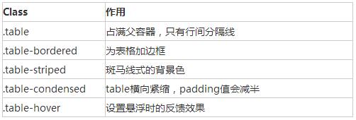
1. Table still uses
| . There are the following classes to control table attributes. By default, the table style will occupy the parent container
 <div class="container">
    <div class="row">
      <div class="col-md-8 col-md-offset-2">
        <table class="table table-bordered table-striped table-hover">
      <tr>
        <th>标题一</th>
        <th>标题二</th>
        <th>标题三</th>
      </tr>
      <tr>
        <td>1</td>
        <td>2</td>
        <td>3</td>
      </tr>
      <tr>
        <td>4</td>
        <td>5</td>
        <td>6</td>
      </tr>
    </table>
      </div>
    </div>
  </div>
Copy after login Wrap any .table in .table-responsive to create a responsive table that will scroll horizontally on small screen devices (less than 768px). When the screen is 768px wider, the horizontal scrollbar disappears. 2. Form, there are several style definitions
Lables and controls should be wrapped in divs of form-group type. The default form is as follows
 <div class="container">
    <form>
      <div class="form-group">
        <label for="exampleInputEmail1">Email address</label>
        <input type="email" class="form-control" id="exampleInputEmail1"
          placeholder="Enter email">
      </div>
      <div class="form-group">
        <label for="exampleInputPassword1">Password</label>
        <input type="password" class="form-control"
          id="exampleInputPassword1" placeholder="Password">
      </div>
      <div class="checkbox">
        <label> <input type="checkbox"> Check me out
        </label>
      </div>
      <button type="submit" class="btn btn-default">Submit</button>
    </form>
  </div>
Copy after login Inline form, Specify sr-only category for label, you can hide the label, but label must not be omitted.
  <div class="container">
    <form class="form-inline">
      <div class="form-group">
        <label for="exampleInputEmail1" class="sr-only">Email address</label>
        <input type="email" class="form-control" id="exampleInputEmail1"
          placeholder="Enter email">
      </div>
      <div class="form-group">
        <label for="exampleInputPassword1">Password</label>
        <input type="password" class="form-control"
          id="exampleInputPassword1" placeholder="Password">
      </div>
      <div class="checkbox">
        <label> <input type="checkbox"> Check me out
        </label>
      </div>
      <button type="submit" class="btn btn-default">Submit</button>
    </form>
  </div>
Copy after login Horizontal form requires specifying the length of the label and label group, and adopting a grid system layout. The label is aligned to the right and the label group is aligned to the left.
 <div class="container">
    <form class="form-horizontal">
      <div class="form-group">
          <label for="exampleInputEmail1" class="col-md-2 control-label">Email
            address</label>
        <div class="col-md-8">
          <input type="email" class="form-control" id="exampleInputEmail1"
            placeholder="Enter email">
        </div>
      </div>
      <div class="form-group" >
          <label for="exampleInputPassword1" class="col-md-2 control-label">Password</label>
        <div class="col-md-8">
          <input type="password" class="form-control"
            id="exampleInputPassword1" placeholder="Password">
        </div>
      </div>
      <div class="checkbox col-md-offset-2">
        <label> <input type="checkbox"> Check me out
        </label>
      </div>
      <button type="submit" class="btn btn-default col-md-offset-2">Submit</button>
    </form>
  </div>
Copy after login form form validation, bootstrap3 supports custom validation of forms. Adding req uired indicates that the form is required, node.setCustomValidity can set the custom validation of the form
<div class="container">
    <form class="form-horizontal">
      <div class="form-group">
        <label for="exampleInputEmail1" class="col-md-2 control-label">Email
          address</label>
        <div class="col-md-8">
          <input type="email" class="form-control" id="exampleInputEmail1"
            placeholder="Enter email" required>
        </div>
      </div>
      <div class="form-group">
        <label for="password1" class="col-md-2 control-label">Password</label>
        <div class="col-md-8">
          <input type="password" class="form-control"
            id="password1" placeholder="Password" required onchange="checkPassword()">
        </div>
      </div>
<div class="form-group">
        <label for="password2" class="col-md-2 control-label" onchange="checkPassword()"> Password2</label>
        <div class="col-md-8">
          <input type="password" class="form-control"
            id="password2" placeholder="Password2" required>
        </div>
      </div>
      <div class="checkbox col-md-offset-2">
        <label> <input type="checkbox"> Check me out
        </label>
      </div>
      <button type="submit" class="btn btn-default col-md-offset-2">Submit</button>
    </form>
  </div>

  <script>
    function checkPassword() {
      var pwd1 = $("#password1").val();
      var pwd2 = $("#password2").val();
      if (pwd1 != pwd2) {
        document.getElementById("password1").setCustomValidity("两次输入的密码不一致");
      } else {
        document.getElementById("password1").setCustomValidity("");
      }

    }
  </script>
Copy after login 3. button style
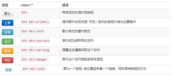
Use .btn-lg, .btn-sm, .btn-xs to get buttons of different sizes. Adding .btn-block to the button can make it fill 100% of the width of the parent node, and the button also becomes block level. (block) element, ,
  <div class="container">
    <button type="button" class="btn btn-default btn-block">Default</button>
    <button type="button" class="btn btn-primary btn-block">Primary</button>
    <button type="button" class="btn btn-success">Success</button>
    <button type="button" class="btn btn-info">Info</button>
    <button type="button" class="btn btn-warning">Warning</button>
    <button type="button" class="btn btn-danger">Danger</button>
    <button type="button" class="btn btn-link">链接</button>
    <a class="btn btn-default" href="#" role="button">Link</a>
    <button class="btn btn-default" type="submit">Button</button>
    <input class="btn btn-default" type="button" value="Input">
    <input class="btn btn-default" type="submit" value="Submit">
  </div>
Copy after login The above is the entire content of this article, I hope it will be helpful to everyone’s study. Statement of this Website
The content of this article is voluntarily contributed by netizens, and the copyright belongs to the original author. This site does not assume corresponding legal responsibility. If you find any content suspected of plagiarism or infringement, please contact admin@php.cn

Hot AI Tools
Undresser.AI UndressAI-powered app for creating realistic nude photos 
AI Clothes RemoverOnline AI tool for removing clothes from photos. 
Undress AI ToolUndress images for free 
Clothoff.ioAI clothes remover 
AI Hentai GeneratorGenerate AI Hentai for free. 
Hot Article
R.E.P.O. Energy Crystals Explained and What They Do (Yellow Crystal)
2 weeks ago
By 尊渡假赌尊渡假赌尊渡假赌
How Long Does It Take To Beat Split Fiction?
1 months ago
By DDD
R.E.P.O. Save File Location: Where Is It & How to Protect It?
1 months ago
By DDD
R.E.P.O. Best Graphic Settings
2 weeks ago
By 尊渡假赌尊渡假赌尊渡假赌
Assassin's Creed Shadows: Seashell Riddle Solution
1 weeks ago
By DDD

Hot Tools
Notepad++7.3.1Easy-to-use and free code editor 
SublimeText3 Chinese versionChinese version, very easy to use 
Zend Studio 13.0.1Powerful PHP integrated development environment 
Dreamweaver CS6Visual web development tools 
SublimeText3 Mac versionGod-level code editing software (SublimeText3) 
Hot Topics How to set button size and color in html
Mar 05, 2021 pm 05:16 PM
In HTML, you can use the width and height attributes to set the size of the button element, and use the background-color attribute to set the color of the button element. The specific syntax is "button{width: width value; height: height value; background-color: color value;}".  BinaryX is renamed FORM again, and the FOUR it gives to the community is about to soar?
Mar 04, 2025 pm 12:00 PM
BinaryX's token name change: from BNX to FOUR, and then to FORM, the deep meaning behind strategic adjustments BinaryX recently changed the token symbol from $FOUR to $FORM, which has attracted widespread attention from the industry. This is not the first time BinaryX has changed its name, and its token symbol has undergone a transition from BNX to FOUR. This article will explore in-depth the strategic intentions behind this series of name change. 1. Token name change process and strategic considerations BinaryX initially launched the $BNX token based on the BNB chain in 2021 to support its Play-to-Earn (P2E) gaming ecosystem. In early 2024, in order to optimize the economic model, BinaryX divided $BNX and gradually expanded to GameF  How to use vue3 table component
May 12, 2023 pm 09:40 PM
Basic table Before developing the table component, first think about what style of API to use. Because the author uses element in production work, the styles of the previous components are similar to element, but this time I do not plan to use the element style. , I plan to change it and display it directly: We expect users to use it like this: constdataList=[{id:1,name:'"JavaEE Enterprise Application Practice"',author:'dev1ce',price:'10.22',desc:&# 3  How to disable button rendering in react
Jan 19, 2023 pm 01:58 PM
How to disable button rendering in react: 1. Open the corresponding js code file; 2. Find "const flags = true; <Button disabled={flags}/>" and change the "true" value to "false". Button can be disabled.  Can there be multiple forms in html5?
Aug 01, 2022 pm 05:28 PM
There can be multiple forms in html5. The rules allow multiple form tags to be used in the same HTML page. However, in order to prevent the backend from not recognizing it when submitting, you need to add different IDs or classes to the form. The syntax is "<from action="url" id=" id value 1">Form element</from><from action="url" id="id value 2">Form element</from>.....".  What is the tag that defines the form in html5
Jul 26, 2022 pm 04:26 PM
The tag defining a form in HTML5 is "<form>". The form tag is used to create an HTML form (form field) for user input to collect and transfer user information. All content in the form will be submitted to the server; the syntax "<form action="Submit Address" method="Submit Method " name="form name">form control</form>". A form can contain one or more form elements, such as input, select, and textarea.  How to use button tags in html
Feb 24, 2021 pm 02:16 PM
In HTML, the button tag is used to define a button, and content can be placed inside the element, such as text or images; the syntax is "<button type="button" onclick="js code">Button</button>", The exchange effect can be achieved by combining the attributes of button tags with js code.  How to add a row to table in jquery
May 29, 2023 pm 01:24 PM
How to add a row to a table with jquery: 1. Create an html sample file and reference the jQuery file; 2. Use "table", "tr", "td" tags to create a table; 3. Create a button button and bind the onclick click event , and then execute the "addhang()" function; 4. Define a variable tr within the function to save the table rows that need to be added. The $ symbol obtains the table object, and the "append()" method is used to add a row to the table. 
|


