Learn to use bootstrap3 grid system_javascript skills
1. Setting up bootstrap development environment
1. Download bootstrap, http://www.bootcss.com/
2. Download jquery and access directly through IEhttp://code.jquery.com/jquery-2.0.3.min.js
3. Import the js and css files of bootstrap and jquery into the html page, and the tag of .viewport. This tag can modify the display on most mobile devices. Add if lt IE 9... etc. For compatibility below ie9.
The template is as follows
<!DOCTYPE html>
<html>
<head>
<meta charset="UTF-8">
<meta content="width=device-width, initial-scale=1.0" name="viewport" />
<title>Insert title here</title>
<link href="css/bootstrap.min.css" rel="stylesheet" media="screen">
<!--[if lt IE 9]>
   <script src="https://oss.maxcdn.com/libs/html5shiv/3.7.0/html5shiv.js"></script>
   <script src="https://oss.maxcdn.com/libs/respond.js/1.3.0/respond.min.js"></script>
  <![endif]-->
<script src="js/jquery-2.0.3.min.js"></script>
<script src="js/bootstrap.min.js"></script>
</head>
<body>
  <div class="container">

  </div>
</body>
</html>2. Grid system
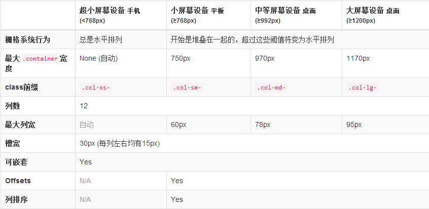
1. Boostrap divides the desktop into a table of 12 rows * n columns for layout. This is the core of boostrap.
2. .row performs row-level division and must be included under .container.
3. col-xx-* performs column-level division, as shown below

<div class="container">
    <div class="row">
      <div class="col-md-3">1</div>
      <div class="col-md-3">2</div>
      <div class="col-md-3">3</div>
      <div class="col-md-3">4</div>
    </div>
    <div class="row">
      <div class="col-md-3">5</div>
      <div class="col-md-3">6</div>
      <div class="col-md-3">7</div>
      <div class="col-md-3">8</div>
    </div>
</div>4. Column offset, is achieved through col-xx-offset-*
  <div class="container">
    <div class="row">
      <div class="col-md-3">1</div>
      <div class="col-md-3">2</div>
      <div class="col-md-3">3</div>
      <div class="col-md-3">4</div>
    </div>
    <div class="row">
      <div class="col-md-3">5</div>
      <div class="col-md-3">6</div>
      <div class="col-md-3 col-md-offset-3">7</div>
    </div>
</div>5. Column sorting, can achieve left or right sorting of columns through .col-xx-push-* and .col-xx-pull-*
  <div class="container">
    <div class="row">
      <div class="col-md-3">1</div>
      <div class="col-md-3">2</div>
      <div class="col-md-3 col-md-push-3">3</div>
    </div>
    <div class="row">
      <div class="col-md-3">5</div>
      <div class="col-md-3">6</div>
      <div class="col-md-3 col-md-pull-2">7</div>
    </div>
  </div>
6. Column nesting , row can be nested in col.
    <div class="row">
      <div class="col-md-3">1</div>
      <div class="col-md-3">2</div>
      <div class="col-md-3">3</div>
      <div class="col-md-3">
        <div class="row">
          <div class="col-md-1">5</div>
          <div class="col-md-1">6</div>
          <div class="col-md-1">7</div>
        </div>
      </div>
</div>The above is the entire content of this article, I hope it will be helpful to everyone’s study.

Hot AI Tools

Undresser.AI Undress
AI-powered app for creating realistic nude photos

AI Clothes Remover
Online AI tool for removing clothes from photos.

Undress AI Tool
Undress images for free

Clothoff.io
AI clothes remover

AI Hentai Generator
Generate AI Hentai for free.

Hot Article

Hot Tools

Notepad++7.3.1
Easy-to-use and free code editor

SublimeText3 Chinese version
Chinese version, very easy to use

Zend Studio 13.0.1
Powerful PHP integrated development environment

Dreamweaver CS6
Visual web development tools

SublimeText3 Mac version
God-level code editing software (SublimeText3)

Hot Topics
 Replace String Characters in JavaScript
Mar 11, 2025 am 12:07 AM
Detailed explanation of JavaScript string replacement method and FAQ This article will explore two ways to replace string characters in JavaScript: internal JavaScript code and internal HTML for web pages. Replace string inside JavaScript code The most direct way is to use the replace() method: str = str.replace("find","replace"); This method replaces only the first match. To replace all matches, use a regular expression and add the global flag g: str = str.replace(/fi
 Custom Google Search API Setup Tutorial
Mar 04, 2025 am 01:06 AM
This tutorial shows you how to integrate a custom Google Search API into your blog or website, offering a more refined search experience than standard WordPress theme search functions. It's surprisingly easy! You'll be able to restrict searches to y
 8 Stunning jQuery Page Layout Plugins
Mar 06, 2025 am 12:48 AM
Leverage jQuery for Effortless Web Page Layouts: 8 Essential Plugins jQuery simplifies web page layout significantly. This article highlights eight powerful jQuery plugins that streamline the process, particularly useful for manual website creation
 Build Your Own AJAX Web Applications
Mar 09, 2025 am 12:11 AM
So here you are, ready to learn all about this thing called AJAX. But, what exactly is it? The term AJAX refers to a loose grouping of technologies that are used to create dynamic, interactive web content. The term AJAX, originally coined by Jesse J
 What is 'this' in JavaScript?
Mar 04, 2025 am 01:15 AM
Core points This in JavaScript usually refers to an object that "owns" the method, but it depends on how the function is called. When there is no current object, this refers to the global object. In a web browser, it is represented by window. When calling a function, this maintains the global object; but when calling an object constructor or any of its methods, this refers to an instance of the object. You can change the context of this using methods such as call(), apply(), and bind(). These methods call the function using the given this value and parameters. JavaScript is an excellent programming language. A few years ago, this sentence was
 10 Mobile Cheat Sheets for Mobile Development
Mar 05, 2025 am 12:43 AM
This post compiles helpful cheat sheets, reference guides, quick recipes, and code snippets for Android, Blackberry, and iPhone app development. No developer should be without them! Touch Gesture Reference Guide (PDF) A valuable resource for desig
 Improve Your jQuery Knowledge with the Source Viewer
Mar 05, 2025 am 12:54 AM
jQuery is a great JavaScript framework. However, as with any library, sometimes it’s necessary to get under the hood to discover what’s going on. Perhaps it’s because you’re tracing a bug or are just curious about how jQuery achieves a particular UI
 How do I create and publish my own JavaScript libraries?
Mar 18, 2025 pm 03:12 PM
Article discusses creating, publishing, and maintaining JavaScript libraries, focusing on planning, development, testing, documentation, and promotion strategies.


