

js code about adaptive scaling of images_image special effects

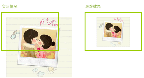
As shown below.
Having a quick look, centering can be achieved using text-align:center;. However, proportional scaling cannot be solved by using the width and height attributes of the default . Because the user picture may be very long or very wide. I thought about their relationship online and judged it according to the conditions:
if(actual width> preview maximum width) {
zoom width = preview maximum width
}
if(actual height>preview maximum height) {
zoom Height = preview maximum height
}
But there will be problems with this. For example, when both width and height are scaled, if the scaling is different, the image will not be scaled proportionally and will become very ugly. . In order to make it scale proportionally, various judgments need to be made. Then this goes against the principle of automating the program we want. Thinking about it again, although I don’t like mathematics, mathematics is still very useful, and there should be other ways. And since it is scaled proportionally, why not use the ratio between the actual image and the width of the preview area to calculate their relationship? hmmmm... It's really OK. In fact we only ever need to scale either width or height. Because the ratio is only for large and small species. Specifically, write a function to implement it:
/ **
* Image adaptive scaling
* @param img {Element} User uploaded image
* @param maxWidth {Number} Maximum width of the preview area
* @param maxHeight {Number} Preview The maximum height of the area
*/
var resizeImg = function(img, maxWidth, maxHeight){
var w = img.width,
h = img.height;
// No changes are made when the image is smaller than the preview area
if(w
// When the actual image ratio is greater than the preview area width and height ratio
// Scale the image width, and vice versa
w/h > maxWidth/maxHeight ? img.width = maxWidth : img.height = maxHeight;
};
Complete Test code:
.cnt{text-align:center;width:600px;height:350px;margin:0 auto;border:1px solid #ddd;}
> ;

View original image || Return to article: About adaptive scaling of images according to proportions»
<script> <BR>window.onload = function () { <BR>var img = document.getElementById('img'), <BR>/**<BR>* Image adaptive scaling <BR>* @param img {Element} User uploaded image <BR>* @param maxWidth {Number} Maximum width of the preview area <BR>* @param maxHeight {Number} Preview The maximum height of the area<BR>*/ <BR>resizeImg = function(img, maxWidth, maxHeight){ <BR>var w = img .width, <BR>h = img.height; <BR>// No changes will be made when the image is smaller than the preview area <BR>if(w < maxWidth && h < maxHeight) return; <BR>// When When the actual picture ratio is greater than the width and height ratio of the preview area <BR>// Scale the image width, otherwise scale the image width <BR>w/h > maxWidth/maxHeight ? img.width = maxWidth : img.height = maxHeight; <BR> }; <BR>resizeImg(img, 500, 300); <BR>} <BR></script>

Hot AI Tools

Undresser.AI Undress
AI-powered app for creating realistic nude photos

AI Clothes Remover
Online AI tool for removing clothes from photos.

Undress AI Tool
Undress images for free

Clothoff.io
AI clothes remover

Video Face Swap
Swap faces in any video effortlessly with our completely free AI face swap tool!

Hot Article
Hot Tools

Notepad++7.3.1
Easy-to-use and free code editor

SublimeText3 Chinese version
Chinese version, very easy to use

Zend Studio 13.0.1
Powerful PHP integrated development environment

Dreamweaver CS6
Visual web development tools

SublimeText3 Mac version
God-level code editing software (SublimeText3)
Hot Topics
 1392
1392
 52
52

 How to configure content adaptive brightness on Windows 11
Apr 14, 2023 pm 12:37 PM
How to configure content adaptive brightness on Windows 11
Apr 14, 2023 pm 12:37 PM
Adaptive brightness is a feature on Windows 11 computers that adjusts the brightness level of your screen based on the content being displayed or lighting conditions. Since some users are still getting used to Windows 11's new interface, Adaptive Brightness can't be easily found, and some even say the Adaptive Brightness feature is missing on Windows 11, so this tutorial will clear it all up. For example, if you're watching a YouTube video and the video suddenly shows a dark scene, Adaptive Brightness will make the screen brighter and increase the contrast level. This is different from auto-brightness, which is a screen setting that allows your computer, smartphone, or device to adjust brightness levels based on ambient lighting. There is a special one in the front camera
 Where to set ppt ratio
Mar 20, 2024 pm 01:19 PM
Where to set ppt ratio
Mar 20, 2024 pm 01:19 PM
PPT is produced and played through a computer screen or projector, so the display ratio will be set differently depending on the machine where it is delivered. For example, schools and other places require a 4:3 ratio size, which can be used when companies make brief reports. 16:9 ratio size, other widescreen ratios are also available. So where is the specific ppt ratio setting? Below, the editor will introduce to you the operation method of ppt ratio. 1. The setting of ppt scale is as follows: after opening the software, it will enter the start page by default, and you need to switch to design as shown. 2. On the upper right side of the design page, you can find the icon size adjustment button. Click to expand more ratios, and you can see the more commonly used four to three ratios. Click Custom to open the settings you need. 3. This will open the proportion adjustment
 How to build an adaptive mobile interface with Vue?
Jun 27, 2023 am 11:05 AM
How to build an adaptive mobile interface with Vue?
Jun 27, 2023 am 11:05 AM
With the popularity of mobile Internet, more and more websites and applications need to consider the mobile experience. As a popular front-end framework, Vue has responsive layout and adaptive capabilities, which can well help us build adaptive mobile interfaces. This article will introduce how to use Vue to build an adaptive mobile interface. Using rem instead of px as the unit and using px as the unit in the mobile interface may result in inconsistent display effects on different devices. Therefore, it is recommended to use rem instead of px as the unit. rem is relative
 How to implement adaptive image size using CSS Viewport units vmin and vw
Sep 13, 2023 am 08:18 AM
How to implement adaptive image size using CSS Viewport units vmin and vw
Sep 13, 2023 am 08:18 AM
How to use CSSViewport units vmin and vw to implement adaptive image size. In web design, we often encounter situations where images need to adapt to the screen size. To achieve this goal, CSS provides a powerful unit - the viewport unit. Among them, vmin represents the percentage of the smaller side of the viewport width, and vw represents the percentage of the viewport width. Therefore, we can use these two units to achieve the effect of adaptive image size. The specifics will be introduced below
 Can vue be adaptive?
Dec 30, 2022 pm 03:25 PM
Can vue be adaptive?
Dec 30, 2022 pm 03:25 PM
Vue can achieve self-adaptation. The methods to achieve self-adaptation are: 1. Install the "scale-box" component through the "npm install" or "yarn add" command, and use "scale-box" to achieve adaptive scaling; 2. Through Set the device pixel ratio to achieve self-adaptation; 3. Set the zoom attribute through JS to adjust the zoom ratio to achieve self-adaptation.
 CSS Viewport: How to use vmax and vw to implement adaptive text width
Sep 13, 2023 am 10:16 AM
CSS Viewport: How to use vmax and vw to implement adaptive text width
Sep 13, 2023 am 10:16 AM
CSSViewport: How to use vmax and vw to implement adaptive text width. With the popularity of mobile devices, responsive design has become an important concept in web design. Among them, adaptive text width to maintain consistent display effects under different screen sizes is an important technology. This article will introduce how to use CSSViewport units, especially vmax and vw units, to implement adaptive text width. In addition to theoretical explanations, we will also provide specific
 How to create a responsive website layout using HTML, CSS and jQuery
Oct 27, 2023 am 11:06 AM
How to create a responsive website layout using HTML, CSS and jQuery
Oct 27, 2023 am 11:06 AM
How to create an adaptive website layout using HTML, CSS, and jQuery In today’s Internet age, adaptive layout of websites has become an essential requirement. The adaptive layout of the website can enable the website to display a good user experience on different devices and adapt to devices of different screen sizes, such as computers, tablets, and mobile phones. This article will introduce how to use HTML, CSS and jQuery to create a responsive website layout, and provide specific code examples. Create website skeleton using HTML
 Adaptive Server in PHP8.0
May 14, 2023 pm 01:10 PM
Adaptive Server in PHP8.0
May 14, 2023 pm 01:10 PM
On November 26, 2020, the PHP team officially released the PHP 8.0 version. Compared with the previous version, PHP 8.0 brings many new features and improvements. One of the features worthy of attention is the adaptive server. This article will introduce the concept of adaptive server in PHP8.0 and its advantages. In previous PHP versions, developers could use PHP's own server (such as PHP-FPM, Apache) to run their own code. However, the disadvantages of these servers
