 Web Front-end
 JS Tutorial
 jQuery CSS realizes the liquid effect in the soda bottle that increases and decreases with the scroll bar_jquery
jQuery CSS realizes the liquid effect in the soda bottle that increases and decreases with the scroll bar_jquery
Very interesting. Xiaoxie followed and made a demo. There were no plug-ins and only jQuery was installed.
Demo demo page

Speaking of the website for drinking soda, it uses a picture of a bottle. It is divided into bottle mouth, bottle body, straw and bottle bottom. In these pictures, the inside of the bottle is transparent, so we can tile the picture of the liquid according to the x-axis on the bottom layer. Of course, remember to get the straw, and the straw is tiled according to the y-axis. Please see the comments in the code for other details.
Ah, by the way, the address of that company is here - http://janploch.de/

body {배경:#fff url(bg_site.png);margin:0;}
#juice, #juice .inner, #bottle, #bottle .footer, #bottle .content, #bottle .header, #mid .inner {margin:0 auto;}
/*
* #juice margin:0 auto;를 추가해도 상관없습니다.
* position:fixed; 그래서 margin:0 auto ; 당연히 실패합니다
* #bottle은 너비를 정확하게 설정할 수 없기 때문에 자연스럽게 margin:0 auto를 추가하는 것은 쓸모가 없습니다
* ㅋㅋㅋ 이게 다 Xiao Xie의 실수입니다
*
* #bottle .footer, #bottle .content, #bottle .header 이
*는 각각 병의 바닥, 몸체, 입의 사진입니다
* 그리고 나머지 #juice .inner 및 #mid .inner 각각
*는 x축을 기준으로 중앙에 타일링된 액체이고 y축을 기준으로 중앙에 타일링된 짚입니다.
*/
#monitor {
위치:고정
top: 10px;
left:10px;
color:#f0f0f0;
z-index:999;
}
/*
* #monitor는 프롬프트 텍스트 영역입니다. 왼쪽 상단에서 JS 주석 섹션을 구체적으로 확인하세요.
*/
#juice {
width:99%
position:fixed
top:2000px; 🎜>#juice .inner {
너비:1165px;
배경:url(juice.png) 반복-x;
높이:2000px;
/*
* # juice는 외부 레이어의 위치로 설정됩니다. width:99%;
* position:fixed; 브라우저 창을 기준으로 절대 위치가 지정된 요소를 의미합니다.
* #juice .inner는 margin:0으로 설정됩니다. auto; width:1165px in the inner layer ;
* 이런 식으로 잘 협력하면 스크롤 막대로 움직이지 않고 가운데에 맞춰지는 효과를 얻을 수 있습니다
*/
#bottle {
너비:99%;
텍스트 정렬:중심;
상위:0;
/*
* 위치:절대; ;
* 이는 병의 위치를 방해하는 절대적인 위치 지정 요소가 많기 때문에 수행됩니다.
* text-align:center;
#bottle .header {
background:url(bottle_top.png) no-repeat;
width:1175px
height:2648px; 🎜>배경:url(content_bg.png) 반복-y;
높이:500px;
폭:1186px
}
#bottle .footer {
배경:url(bg_footer.png ) no-repeat;
width:1184px;
height:567px;
}
/*
* 병의 세 부분을 분리하는 것은 매우 간단합니다. o(* ̄▽ ̄ *)ゞ
*/
#mid {
너비:99%;
위치:고정 ;
z-index:-999;
/*
* 여기서의 효과는 #juice와 동일합니다. z-index:-999; 하단에 배치한다는 의미입니다.
*/
#mid .inner {
width:92px; 2000px;
background:url(strohalm_mid.png) Repeat-y;
}
/*
* #mid .inner 는 빨대의 이미지 설정입니다
*/
< ;/style>
< div id="monitor" >scrollTop: 0

Hot AI Tools

Undresser.AI Undress
AI-powered app for creating realistic nude photos

AI Clothes Remover
Online AI tool for removing clothes from photos.

Undress AI Tool
Undress images for free

Clothoff.io
AI clothes remover

AI Hentai Generator
Generate AI Hentai for free.

Hot Article

Hot Tools

Notepad++7.3.1
Easy-to-use and free code editor

SublimeText3 Chinese version
Chinese version, very easy to use

Zend Studio 13.0.1
Powerful PHP integrated development environment

Dreamweaver CS6
Visual web development tools

SublimeText3 Mac version
God-level code editing software (SublimeText3)

Hot Topics
 Microsoft brings Windows 11's Fluent scrollbars to Google Chrome
Apr 14, 2023 am 10:52 AM
Unlike Windows 10, Windows 11 features new modern “fluid scrollbars” that change shape when users interact with them. Fluent scrollbars are dynamic in nature, they automatically scale in different form factors or when you change the window size, and it is currently used in apps like Settings, Media Players, and more. Google Chrome may soon have smooth scrollbar functionality, according to a new proposal from Microsoft. Microsoft says in a proposal that they want to modernize old scroll bars in Chrome
 How to hide scroll bar scrolling in react
Dec 21, 2022 pm 03:38 PM
How to hide scroll bar scrolling in react: 1. Open the corresponding "react-native" file; 2. Set horizontal scrolling through horizontal; 3. Hide the horizontal scroll bar by setting the value of "showsHorizontalScrollIndicator" to "false".
 How to set the scroll bar to always show on Mac system - How to set the scroll bar to always show
Mar 18, 2024 pm 06:22 PM
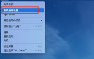
Recently, some friends have consulted the editor about how to set the scroll bar of the Mac system to always display. The following will bring you the method of setting the scroll bar of the Mac system to always display. Friends who need it can learn more. Step 1: In the system start menu, select the [System Preferences] option. Step 3: On the System Preferences page, select the [General] option. Step 3: On the general page, select [Always] to display scroll bars.
 How to write HTML scroll bar text box code
Feb 19, 2024 pm 07:38 PM
Title: How to write HTML text box code with scroll bar The text box in HTML is one of the commonly used user input controls. In some cases, when the text content is too long, the text box will be displayed incompletely. At this time, we can add a scroll bar to the text box to support scrolling. This article will introduce in detail how to write HTML text box code with scroll bar effect, and give specific code examples. 1. Use the textarea element to create a text box. In HTML, we use the textarea element to create a text box.
 How to make html scroll bar
Feb 22, 2024 pm 03:24 PM
How to make an HTML scroll bar requires specific code examples. In web design, the scroll bar is a common element that allows the web page to be easily scrolled when there is too much content. This article will introduce how to create scroll bars using HTML and provide specific code examples. First, we need to understand the basic principles of creating scroll bars in HTML. CSS styles can be used in HTML to control the appearance and behavior of scroll bars. Specifically, we can use CSS properties to set the scroll bar. Commonly used properties include o
 How to enable or disable scroll bars always showing in Windows 11?
Apr 24, 2023 pm 05:58 PM
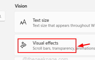
The Windows operating system allows users to specify whether scroll bars should be automatically hidden when they are inactive or not in use. Windows, on the other hand, enables scroll bars by default. If any user wants to enable or disable this feature on their system, please refer to this article to help them know how. How to enable or disable always-on scroll bars in Windows 11 1. Pressing and holding the Windows+U keys will open the Accessibility page on your system. 2. Select the visual effect by clicking on it, it is located at the top of the Accessibility page. 3. If you want to enable the Always Show Scroll Bars feature on your system, click the Always Show Scroll Bars toggle button to turn it on as shown below. 4. You can always show
 Chrome is coming to Windows 11-style overlapping scrollbars
Apr 23, 2023 pm 06:40 PM
As most of us know by now, the new Microsoft operating system Windows 11 features overlay scroll bars that change shape when we approach or use them. You might be interested to know that the same dynamic features are also being tested in Chromium browsers. This basically means that the upcoming Windows 11 experimental version of the Chrome browser may soon have overlay scrollbar functionality. Chrome will soon have Windows 11-style overlay scrollbars, which the Redmond-based tech company has been testing in its Chromium-based Edge web browser since August 2021.
 How to set html scroll bar style
Oct 11, 2023 am 10:08 AM
HTML scroll bar style setting can use scrollbar-width, scrollbar-color, ::-webkit-scrollbar, ::-webkit-scrollbar-thumb, ::-webkit-scrollbar-track, etc. Detailed introduction: 1. scrollbar-width, used to set the width of the scroll bar. You can use thin, auto or other specific width values to set it, etc.


