

Pure JAVASCRIPT chart animation plug-in Highcharts Examples_jquery

Highcharts is a charting library written in pure JavaScript, offering an easy way of adding interactive charts to your web site or web application. Highcharts currently supports line, spline, area, areaspline, column, bar, pie and scatter chart types.
Features

It works in all modern browsers including the iPhone/iPad and Internet Explorer from version 6. Standard browsers use SVG for the graphics rendering. In Internet Explorer graphics are drawn using VML.

.
Highcharts is solely based on native browser technologies and doesn't require client side plugins like Flash or Java. Furthermore you don't need to install anything on your server. No PHP or ASP.NET. Highcharts needs only two JS files to run: The highcharts.js core and either the jQuery or the MooTools framework. One of these frameworks is most likely already in use in your web page.
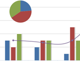
Highcharts supports line, spline, area, areaspline, column, bar, pie and scatter chart types. Any of these can be combined in one chart.
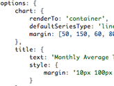
Setting the Highcharts configuration options requires no special programming skills. The options are given in a JavaScript object notation structure, which is basically a set of keys and values connected by colons, separated by commas and grouped by curly brackets.
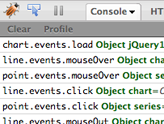
Through a full API you can add, remove and modify series, axes or points at any time after chart creation. Numerous events supply hooks for programming agains the chart. In combination with jQuery's or MooTools' Ajax API, this opens for solutions like live charts constantly updating with values from the server, user supplied data and more.
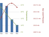
Sometimes you want to compare variables that are not the same scale - for example temperature versus rainfall and air pressure. Highcharts lets you assign an y axis for each series - or an x axis if you want to compare data sets of different categories. Each axis can be placed to the right or left, top or bottom of the chart. All options can be set individually, including reversing, styling and position.
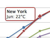
On hovering the chart Highcharts can display a tooltip text with information on each point and series. The tooltip follows as the user moves the mouse over the graph, and great efforts have been taken to make it stick to the nearest point as well as making it easy to read a point that is below another point.
75% of all charts with an X and Y axis have a date-time X axis. Therefore Highchart is very intelligent about time values. With milliseconds axis units, Highcharts determines where to place the ticks so that they always mark the start of the month or the week, midnight and midday, the full hour etc.
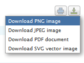
With the exporting module enabled, your users can export the chart to PNG, JPG, PDF or SVG format at the click of a button, or print the chart directly from the web page.
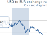
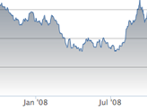
By zooming in on a chart you can examine an especially interesting part of the data more closely. Zooming can be in the X or Y dimension, or both.

Highcharts takes the data in a JavaScript array, which can be defined in the local configuration object, in a separate file or even on a different site. Furthermore, the data can be handled over to Highcharts in any form, and a callback function used to parse the data into an array.
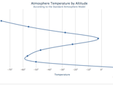
Sometimes you need to flip over your chart and make the X axis appear vertical, like for example in a bar chart. Reversing the axis, with the highest values appearing closest to origo, is also supported.
Do you want to use Highcharts for a personal website, a school site or a non-profit organisation? Then you don't need the author's permission, just go on and use Highcharts. For commercial websites and projects, see

Hot AI Tools

Undresser.AI Undress
AI-powered app for creating realistic nude photos

AI Clothes Remover
Online AI tool for removing clothes from photos.

Undress AI Tool
Undress images for free

Clothoff.io
AI clothes remover

Video Face Swap
Swap faces in any video effortlessly with our completely free AI face swap tool!

Hot Article
Hot Tools

Notepad++7.3.1
Easy-to-use and free code editor

SublimeText3 Chinese version
Chinese version, very easy to use

Zend Studio 13.0.1
Powerful PHP integrated development environment

Dreamweaver CS6
Visual web development tools

SublimeText3 Mac version
God-level code editing software (SublimeText3)
Hot Topics
 1390
1390
 52
52

 How to add labels to legend in Google Sheet
Feb 19, 2024 am 11:03 AM
How to add labels to legend in Google Sheet
Feb 19, 2024 am 11:03 AM
This article will demonstrate how to add labels to legends in Google Sheet that focus on a single thing, providing a name or identity. A legend explains a system or group of things, giving you relevant contextual information. How to Add Labels to a Legend in GoogleSheet Sometimes, when working with charts, we want to make them easier to understand. This can be achieved by adding appropriate labels and legends. Next, we’ll show you how to add labels to legends in Google Sheets to make your data clearer. Create the chart Edit the text of the legend label Let's get started. 1] Create a chart To label the legend, first, we have to create a chart: First, enter in the columns or rows of GoogleSheets
 How to use PHP arrays to generate and display charts and statistical graphs
Jul 15, 2023 pm 12:24 PM
How to use PHP arrays to generate and display charts and statistical graphs
Jul 15, 2023 pm 12:24 PM
How to use PHP arrays to generate and display charts and statistical graphs. PHP is a widely used server-side scripting language with powerful data processing and graphic generation capabilities. In web development, we often need to display charts and statistical graphs of data. Through PHP arrays, we can easily implement these functions. This article will introduce how to use PHP arrays to generate and display charts and statistical graphs, and provide relevant code examples. Introducing the necessary library files and style sheets Before starting, we need to introduce some necessary library files into the PHP file
 How to use Sankey chart to display data in Highcharts
Dec 17, 2023 pm 04:41 PM
How to use Sankey chart to display data in Highcharts
Dec 17, 2023 pm 04:41 PM
How to use Sankey diagram to display data in Highcharts Sankey diagram (SankeyDiagram) is a chart type used to visualize complex processes such as flow, energy, and funds. It can clearly display the relationship and flow between various nodes, and can help us better understand and analyze data. In this article, we will introduce how to use Highcharts to create and customize a Sankey chart, with specific code examples. First, we need to load the Highcharts library and Sank
 How to use dynamic data in Highcharts to display real-time data
Dec 17, 2023 pm 06:57 PM
How to use dynamic data in Highcharts to display real-time data
Dec 17, 2023 pm 06:57 PM
How to use dynamic data in Highcharts to display real-time data. With the advent of the big data era, the display of real-time data has become more and more important. Highcharts, as a popular charting library, provides rich functions and customizability, allowing us to flexibly display real-time data. This article will introduce how to use dynamic data in Highcharts to display real-time data, and give specific code examples. First, we need to prepare a data source that can provide real-time data. In this article, I
 How to create a Gantt chart using Highcharts
Dec 17, 2023 pm 07:23 PM
How to create a Gantt chart using Highcharts
Dec 17, 2023 pm 07:23 PM
How to use Highcharts to create a Gantt chart requires specific code examples. Introduction: The Gantt chart is a chart form commonly used to display project progress and time management. It can visually display the start time, end time and progress of the task. Highcharts is a powerful JavaScript chart library that provides rich chart types and flexible configuration options. This article will introduce how to use Highcharts to create a Gantt chart and give specific code examples. 1. Highchart
 Implementation of linear and pie chart functions in Vue statistical charts
Aug 19, 2023 pm 06:13 PM
Implementation of linear and pie chart functions in Vue statistical charts
Aug 19, 2023 pm 06:13 PM
The linear and pie chart functions of Vue statistical charts are implemented in the field of data analysis and visualization. Statistical charts are a very commonly used tool. As a popular JavaScript framework, Vue provides convenient methods to implement various functions, including the display and interaction of statistical charts. This article will introduce how to use Vue to implement linear and pie chart functions, and provide corresponding code examples. Linear graph function implementation A linear graph is a type of chart used to display trends and changes in data. In Vue, we can use some excellent
 How to use stacked charts to display data in Highcharts
Dec 18, 2023 pm 05:56 PM
How to use stacked charts to display data in Highcharts
Dec 18, 2023 pm 05:56 PM
How to use stacked charts to display data in Highcharts Stacked charts are a common way of visualizing data, which can display the sum of multiple data series at the same time and display the contribution of each data series in the form of a bar chart. Highcharts is a powerful JavaScript library that provides a rich variety of charts and flexible configuration options to meet various data visualization needs. In this article, we will introduce how to use Highcharts to create a stacked chart and provide
 How to quickly build a statistical chart system under the Vue framework
Aug 21, 2023 pm 05:48 PM
How to quickly build a statistical chart system under the Vue framework
Aug 21, 2023 pm 05:48 PM
How to quickly build a statistical chart system under the Vue framework. In modern web applications, statistical charts are an essential component. As a popular front-end framework, Vue.js provides many convenient tools and components that can help us quickly build a statistical chart system. This article will introduce how to use the Vue framework and some plug-ins to build a simple statistical chart system. First, we need to prepare a Vue.js development environment, including installing Vue scaffolding and some related plug-ins. Execute the following command in the command line
