Learning summary of Boostrap modal window_javascript skills
Bootstrap Modals are created using custom Jquery plugins. It can be used to create modal windows to enrich user experience, or to add practical functions to users. You can use Popovers and Tooltips in Modals.
1. What is a modal window?
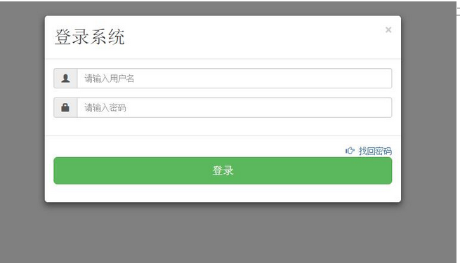
This is the effect:
2. Composition
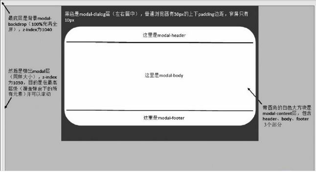
Header (including title and close button)
Middle (main content)
Bottom (mainly for placing operation buttons)
The corresponding layout in the html code is: use the div container element, use the modal, modal-dialog, and modal-cotent styles respectively, and use three header, body, and footer of the pop-up window in the modal-content. Style: modal-header, modal-body, modal-footer, as shown below:
3. Implementation code
<style>
.modal {//该样式是做背景容器的,100%充满全屏,还有当内容很多时,k可以在modal里进行滚动操作
position: fixed;//固定布局的
top: 0;
right: 0; //设置上下左右都为0,表示充满全屏
bottom: 0;
left: 0;
z-index: 1050;//提升z-index,防止其他元素溢出
display: none;//默认不显示
overflow: hidden;
-webkit-overflow-scrolling: touch;//支持移动设备上,触摸进行移动
outline: 0;//消除虚边框
}
.modal-dialog {
position: relative;//相对与Modal元素,进行相对定位
width: auto;//宽度自适应
margin: 10px;//外边距10像素
}
.modal-content {主要对弹窗进行边框,边距,背景色,阴影的处理
position: relative;//
background-color: #fff;
-webkit-background-clip: padding-box;//背景的裁剪区域设置从padding区域向外
background-clip: padding-box;
border: 1px solid #999;
border: 1px solid rgba(0, 0, 0, .2);//透明度设置
border-radius: 6px;
outline: 0;//取消轮廓显示
-webkit-box-shadow: 0 3px 9px rgba(0, 0, 0, .5);
box-shadow: 0 3px 9px rgba(0, 0, 0, .5);
}
.modal-header {//弹窗的头部设置
min-height: 16.42857143px;//最小高度设置
padding: 15px;
border-bottom: 1px solid #e5e5e5;//底部设细线,与modal-body区分
}
.modal-header .close {//关闭按钮
margin-top: -2px;
}
.modal-title {
margin: 0;
line-height: 1.42857143;//头部内部的标题样式
}
.modal-body {//中间内容区域
position: relative;
padding: 15px;
}
.modal-footer {//底部设置
padding: 15px;
text-align: right;//居右对齐,一般都是按钮
border-top: 1px solid #e5e5e5;
}
</style>
<body>
<!-- <button data-toggle="modal" data-target="#popucss" class="btn btn-success" >单击弹出模态窗口</button> --><!-- //触发元素(使用声明式语法)
//弹窗主要内容 --><!-- //下面写id的是js使用方法(使用声明式语法)
//弹窗主要内容 -->
<button id="dianji" class="btn btn-success">单击弹出模态窗口</button>
<!-- 弹窗主要内容 -->
<div class="modal" id="dianjiji"><!-- 第一部分 -->
<div class="modal-dialog"><!-- 第二部分 -->
<div class="modal-content"><!-- 第三部分,主要部分 -->
<div class="modal-header">
<button type="button" class="close" data-dismiss="modal">
<span aria-hidden="true">×</span> <span class="sr-only">Close</span>
</button>
<h2 class="modal-title">登录系统 </h2>
</div>
<div class="modal-body">
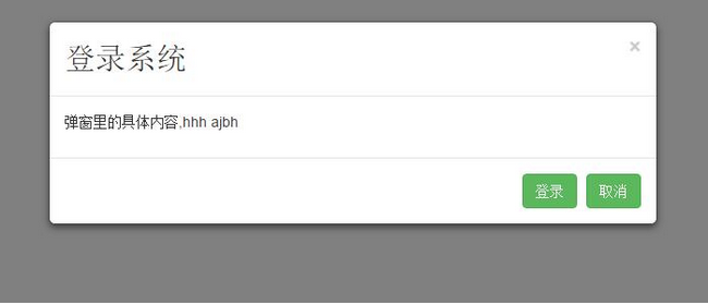
<p>弹窗里的具体内容,hhh ajbh </p>
</div>
<div class="modal-footer">
<button type="button"
id="login" class="btn btn-success ">登录</button>
<button type="button"
id="login" class="btn btn-success ">取消</button>
</div>
</div>
</div>
</div>
<script src="./bootstrap-3.3.5/dist/js/jquery.min.js"></script>
<script src="./bootstrap-3.3.5/dist/js/bootstrap.min.js"></script>
<script src="./bootstrap-3.3.5/dist/js/modal.js"></script>
<script>
$(function() {
$("#dianji").click(function() {
$("#dianjiji").modal("show");
});
})
Four. Usage in Js:
(1) Declarative syntax
data-toggle, data-target, set on the trigger element, the value of data-toggle must be modal, the value of dat-target is: css selector
(2) javascript usage:
1) Use attribute control: background Boolean value is true, then when the background (excluding the pop-up window itself) is clicked, the pop-up window will be closed, otherwise, vice versa.
keyboard 布尔值 值为true,则按esc时,关闭弹窗,否则反之。
$("#dianjiji").modal({
backdrop:true,
keyboard:false,
show:true;
})2) Use parameter control: toggle $("#mymodal").modal("toggle"), when triggered, the status of the bounce window will be triggered,
Show $(“#mymodal”).modal(“show”), when triggered, displays the pop-up window
Hide $("#mymodal").modal("hide"), when triggered, close
3) Usage control:
Show.bs.modal 在show方法调用时立即触发
Shown.bs.modal 该事件在模态弹窗完全显示给用户之后,触发
Hide.bs.modal 在hide方法调用时,立即触发
Hiden.bs.modal 该事件在模态弹窗隐藏之后触发
使用方法
$(“#mymodal”).on(‘方法名',function(e){
//处理代码。。。
})About the learning summary of Boostrap modal window, the editor will introduce it to you here. I hope it will be helpful to you!

Hot AI Tools

Undresser.AI Undress
AI-powered app for creating realistic nude photos

AI Clothes Remover
Online AI tool for removing clothes from photos.

Undress AI Tool
Undress images for free

Clothoff.io
AI clothes remover

AI Hentai Generator
Generate AI Hentai for free.

Hot Article

Hot Tools

Notepad++7.3.1
Easy-to-use and free code editor

SublimeText3 Chinese version
Chinese version, very easy to use

Zend Studio 13.0.1
Powerful PHP integrated development environment

Dreamweaver CS6
Visual web development tools

SublimeText3 Mac version
God-level code editing software (SublimeText3)

Hot Topics
 1376
1376
 52
52
 How do I create and publish my own JavaScript libraries?
Mar 18, 2025 pm 03:12 PM
Article discusses creating, publishing, and maintaining JavaScript libraries, focusing on planning, development, testing, documentation, and promotion strategies.
 How do I optimize JavaScript code for performance in the browser?
Mar 18, 2025 pm 03:14 PM
The article discusses strategies for optimizing JavaScript performance in browsers, focusing on reducing execution time and minimizing impact on page load speed.
 What should I do if I encounter garbled code printing for front-end thermal paper receipts?
Apr 04, 2025 pm 02:42 PM
Frequently Asked Questions and Solutions for Front-end Thermal Paper Ticket Printing In Front-end Development, Ticket Printing is a common requirement. However, many developers are implementing...
 How do I debug JavaScript code effectively using browser developer tools?
Mar 18, 2025 pm 03:16 PM
The article discusses effective JavaScript debugging using browser developer tools, focusing on setting breakpoints, using the console, and analyzing performance.
 How do I use source maps to debug minified JavaScript code?
Mar 18, 2025 pm 03:17 PM
The article explains how to use source maps to debug minified JavaScript by mapping it back to the original code. It discusses enabling source maps, setting breakpoints, and using tools like Chrome DevTools and Webpack.
 TypeScript for Beginners, Part 2: Basic Data Types
Mar 19, 2025 am 09:10 AM
Once you have mastered the entry-level TypeScript tutorial, you should be able to write your own code in an IDE that supports TypeScript and compile it into JavaScript. This tutorial will dive into various data types in TypeScript. JavaScript has seven data types: Null, Undefined, Boolean, Number, String, Symbol (introduced by ES6) and Object. TypeScript defines more types on this basis, and this tutorial will cover all of them in detail. Null data type Like JavaScript, null in TypeScript
 How do I use Java's collections framework effectively?
Mar 13, 2025 pm 12:28 PM
This article explores effective use of Java's Collections Framework. It emphasizes choosing appropriate collections (List, Set, Map, Queue) based on data structure, performance needs, and thread safety. Optimizing collection usage through efficient
 Getting Started With Chart.js: Pie, Doughnut, and Bubble Charts
Mar 15, 2025 am 09:19 AM
This tutorial will explain how to create pie, ring, and bubble charts using Chart.js. Previously, we have learned four chart types of Chart.js: line chart and bar chart (tutorial 2), as well as radar chart and polar region chart (tutorial 3). Create pie and ring charts Pie charts and ring charts are ideal for showing the proportions of a whole that is divided into different parts. For example, a pie chart can be used to show the percentage of male lions, female lions and young lions in a safari, or the percentage of votes that different candidates receive in the election. Pie charts are only suitable for comparing single parameters or datasets. It should be noted that the pie chart cannot draw entities with zero value because the angle of the fan in the pie chart depends on the numerical size of the data point. This means any entity with zero proportion


