 Web Front-end
 JS Tutorial
 How to correct the display problem of Colortip's information prompt box plug-in based on jquery under IE6_jquery
How to correct the display problem of Colortip's information prompt box plug-in based on jquery under IE6_jquery
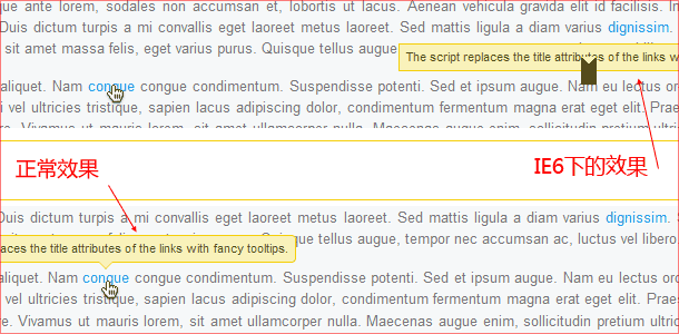
I reviewed this plug-in again today, and found that when it was working under IE6, the display was abnormal, and the tips often appeared in ridiculous positions. Another problem is that since the display effect of the tip does not use any images, it is all pure CSS, so the triangle implemented with CSS will not work under IE6, and a colored area will be displayed, which is very ugly, so I want to do it. Change it. Let’s take a comparison picture first:

There is definitely no problem with the js code. The problem lies in CSS. Colortip uses position for positioning. There may be some problems under IE6. And since IE6 does not support the border-color:transparent attribute, there is also a problem with the triangle under the tip. Let’s fix it below.
Open the colortip-1.0-jquery.css file of the plug-in and find the following code in it:
.pointyTip,.pointyTipShadow{
/* Setting a thick transparent border on a 0x0 div to create a triangle */
border:6px solid transparent;
_border: 6px solid #123456; /*Specify a special color value to prepare for using the chroma filter*/
bottom:-12px;
height:0;
left:50%;
margin -left:-6px;
position:absolute;
width:0;
font-size:0; /*Empty labels under IE will have a height. Setting font-size to 0 can clear this Height*/
_filter:chroma(color=#123456); /*Use the chroma filter for IE6 to filter color #123456 into transparent*/
}
If you do it yourself If you look at the code, you may find that the code I posted is a little different from the original one, but I have written the comments in it, so it should be understandable. Continue below:
.pointyTipShadow{
/* The shadow tip is 1px larger, so it acts as a border to the tip */
border-width:7px;
bottom:-14px;
_bottom:-15px; /*Finely adjust the position of the small triangle It will be more accurate*/
margin-left:-7px;
}
.colorTipContainer{
position:relative;
text-decoration:none !important;
_zoom:1; /*I don’t know why, but after adding zoom:1 here, I can use left:50% to get the correct position under IE6. Doesn’t the inline element have a layout? Can't express it accurately...*/
}
Okay, the correction is completed here. On my machine, the XP IE6 test using IEtester and VMware virtual machine passed. You You can also try the effect. If you have any questions, please give me feedback and I can make corrections. The code is easy to understand. If you don’t understand it, just use the plug-in.
Plug-in website | Original DEMO | Revised DEMO | Corrected plug-in download
I would like to add that the effect of the original version and the modified DEMO in advanced browsers is the same, there is no difference, but you will know after trying it with IE6. I hope that this trivial work I have done will bring convenience to friends who like this plug-in. ^_^
Regarding the pure CSS method to achieve the triangle effect, you can refer to this article by Mr. Think. It is very Detailed and very good CSS techniques: rounded background and triangle.

Hot AI Tools

Undresser.AI Undress
AI-powered app for creating realistic nude photos

AI Clothes Remover
Online AI tool for removing clothes from photos.

Undress AI Tool
Undress images for free

Clothoff.io
AI clothes remover

Video Face Swap
Swap faces in any video effortlessly with our completely free AI face swap tool!

Hot Article

Hot Tools

Notepad++7.3.1
Easy-to-use and free code editor

SublimeText3 Chinese version
Chinese version, very easy to use

Zend Studio 13.0.1
Powerful PHP integrated development environment

Dreamweaver CS6
Visual web development tools

SublimeText3 Mac version
God-level code editing software (SublimeText3)

Hot Topics
 1391
1391
 52
52
 What should I do if I encounter garbled code printing for front-end thermal paper receipts?
Apr 04, 2025 pm 02:42 PM
Frequently Asked Questions and Solutions for Front-end Thermal Paper Ticket Printing In Front-end Development, Ticket Printing is a common requirement. However, many developers are implementing...
 Who gets paid more Python or JavaScript?
Apr 04, 2025 am 12:09 AM
There is no absolute salary for Python and JavaScript developers, depending on skills and industry needs. 1. Python may be paid more in data science and machine learning. 2. JavaScript has great demand in front-end and full-stack development, and its salary is also considerable. 3. Influencing factors include experience, geographical location, company size and specific skills.
 Demystifying JavaScript: What It Does and Why It Matters
Apr 09, 2025 am 12:07 AM
JavaScript is the cornerstone of modern web development, and its main functions include event-driven programming, dynamic content generation and asynchronous programming. 1) Event-driven programming allows web pages to change dynamically according to user operations. 2) Dynamic content generation allows page content to be adjusted according to conditions. 3) Asynchronous programming ensures that the user interface is not blocked. JavaScript is widely used in web interaction, single-page application and server-side development, greatly improving the flexibility of user experience and cross-platform development.
 How to merge array elements with the same ID into one object using JavaScript?
Apr 04, 2025 pm 05:09 PM
How to merge array elements with the same ID into one object in JavaScript? When processing data, we often encounter the need to have the same ID...
 The difference in console.log output result: Why are the two calls different?
Apr 04, 2025 pm 05:12 PM
In-depth discussion of the root causes of the difference in console.log output. This article will analyze the differences in the output results of console.log function in a piece of code and explain the reasons behind it. �...
 How to achieve parallax scrolling and element animation effects, like Shiseido's official website?
or:
How can we achieve the animation effect accompanied by page scrolling like Shiseido's official website?
Apr 04, 2025 pm 05:36 PM
Discussion on the realization of parallax scrolling and element animation effects in this article will explore how to achieve similar to Shiseido official website (https://www.shiseido.co.jp/sb/wonderland/)...
 Is JavaScript hard to learn?
Apr 03, 2025 am 12:20 AM
Learning JavaScript is not difficult, but it is challenging. 1) Understand basic concepts such as variables, data types, functions, etc. 2) Master asynchronous programming and implement it through event loops. 3) Use DOM operations and Promise to handle asynchronous requests. 4) Avoid common mistakes and use debugging techniques. 5) Optimize performance and follow best practices.
 How to implement panel drag and drop adjustment function similar to VSCode in front-end development?
Apr 04, 2025 pm 02:06 PM
Explore the implementation of panel drag and drop adjustment function similar to VSCode in the front-end. In front-end development, how to implement VSCode similar to VSCode...


