Extjs Study Notes 7 Layout_extjs
Extjs3.1.0 version supports 17 types. Let’s select some important ones and briefly explain them. To see the effect, go to the link given above. I won’t post pictures anymore. The method of setting Layout for Panel is the same, which is to set the Layout configuration item of Panel.
1. AbsoluteLayout
can be laid out by determining the position of the internal components of the Panel. Specified by x,y.
Example usage:
new Ext. Panel({
layout: 'absolute',
title: 'AbsuluteLayout',
renderTo: document.body,
frame: true,
defaultType: 'textfield',
width : 400,
height:250,
items: [{
x: 0, y: 5,
xtype: 'label',
text: 'Send To:'
},
{
x: 60, y: 0,
name: 'to'
}, {
x: 0, y: 35,
xtype: 'label' ,
text: 'Subject:'
}, {
x: 60, y: 30,
name: 'subject'
},
{
x: 0 , y: 60,
xtype: 'textarea',
name: 'msg'
}]
});
2.AccordionLayout
Accordion means accordion. As the name suggests, this layout can be like an accordion, with some components opened and some closed. This effect is more useful as a sidebar.
Example usage:
new Ext. Panel({
title: 'Accordion Layout',
layout: 'accordion',
renderTo: document.body,
defaults: { // applied to each contained panel
bodyStyle: ' padding:15px'
},
layoutConfig: {
// layout-specific configs go here
titleCollapse: true,
animate: true,
activeOnTop: false
},
items: [{
title: 'Panel 1',
html: '
Panel content!
'}, {
title : 'Panel 2',
html: '
Panel content!
'}, {
title: 'Panel 3',
html: '
}]
});
});
3. AnchorLayout
This kind of Layout is very useful, especially when laying out pages containing controls such as GridView. AnchorLayout is actually similar to the default layout method of Winform's form, but It can only fix the distance (absolute pixels or relative proportion) between a certain component and the page border (right border and bottom border). Through the anchor attribute setting, the anchor attribute setting API document explains it very clearly, so it is excerpted directly:
anchor: String
This configuation option is to be applied to child items of a container managed by this layout (ie. configured withlayout:'anchor').
This value is what tells the layout how an item should be anchored to the container. items added to an AnchorLayout accept an anchoring-specific config property of anchor which is a string containing two values: the horizontal anchor value and the vertical anchor value (for example, '100% 50%'). The following types of anchor values are supported:
Percentage : Any value between 1 and 100, expressed as a percentage.
The first anchor is the percentage width that the item should take up within the container, and the second is the percentage height. For example:
// two values specified
anchor: '100% 50%' // render item complete width of the container and
// 1/2 height of the container
// one value specified
anchor: ' 100%' // the width value; the height will default to autoOffsets : Any positive or negative integer value.
This is a raw adjustment where the first anchor is the offset from the right edge of the container, and the second is the offset from the bottom edge. For example:
// two values specified
anchor: '-50 -100' // render item the complete width of the container
// minus 50 pixels and
// the complete height minus 100 pixels.
// one value specified
anchor: '-50' // anchor value is assumed to be the right offset value
// bottom offset will default to 0Sides : Valid values are 'right' (or 'r') and 'bottom' (or 'b').
Either the container must have a fixed size or an anchorSize config value defined at render time in order for these to have any effect.
Mixed :
Anchor values can also be mixed as needed. For example, to render the width offset from the container right edge by 50 pixels and 75% of the container's height use :
anchor: '-50 75%' However, it seems to have no effect when I set the anchor's first attribute, Offset, to a positive number, although the document says Offsets: Any positive or negative integer value.
Example usage:
new Ext.Panel({
layout: 'anchor',
title:'anchor',
renderTo: document.body,
items: [{
title: 'Item 1',
html: ' Content 1',
width: 800,
anchor: 'right 20%'
}, {
title: 'Item 2',
html: 'Content 2',
width: 300,
anchor: '50% 30%'
}, {
title: 'Item 3',
html: 'Content 3',
width: 600,
anchor:'-100 50%'
}]
});
4. BorderLayout
BorderLayout lays out the area by specifying the area on the page , there must be at least one center area, and then you can set the west, south, east, and north areas as auxiliary pages. It is usually suitable for the layout of large pages. The middle is the main functional area, and the two sides and bottom can be used as toolbars.
var myBorderPanel = new Ext.Panel({
renderTo: document.body,
width: 700,
height: 500,
title: 'Border Layout',
layout: 'border',
items: [{
title : 'South Region is resizable',
region: 'south', // position for region
height: 100,
split: true, // enable resizing
minSize: 75, // defaults to 50
maxSize: 150,
margins: '0 5 5 5'
}, {
// xtype: 'panel' implied by default
title: 'West Region is collapsible' ,
region: 'west',
margins: '5 0 0 5',
width: 200,
collapsible: true, // make collapsible
cmargins: '5 5 0 5 ', // adjust top margin when collapsed
id: 'west-region-container',
layout: 'fit',
unstyled: true
}, {
title: 'Center Region',
region: 'center', // center region is required, no width/height specified
xtype: 'container',
layout: 'fit',
margins: '5 5 0 0'
}]
});
5. ColumnLayout
ColumnLayout can specify the width of the panel. Width specifies the pixels, and columnWidth specifies the percentage, which must be a number between 0-1. You can also use both. When both are used, the percentage is the width of the entire page minus the remaining width of the fixed-width column.
Example usage:
var p = new Ext.Panel({
title: 'Column Layout - Mixed',
layout: 'column',
renderTo: document.body,
items: [{
title: 'Column 1',
columnWidth: .3,
html:'
}, {
title: 'Column 2',
html:'
columnWidth: .6
}, {
title: 'Column 3',
columnWidth: .1,
html:'< div>Hello
}]
});
This usage is the same as the API documentation and official examples , but the width of these columns cannot change as the browser size changes. It must be refreshed every time to adapt to the new browser width. However, in the example on the official website, the size of the internal panel can indeed change as the browser is dragged. Very strange. If anyone knows, please enlighten me.
The usage of layout is similar, so I won’t write any more. The key is to choose flexibly in practical applications.

Hot AI Tools

Undresser.AI Undress
AI-powered app for creating realistic nude photos

AI Clothes Remover
Online AI tool for removing clothes from photos.

Undress AI Tool
Undress images for free

Clothoff.io
AI clothes remover

Video Face Swap
Swap faces in any video effortlessly with our completely free AI face swap tool!

Hot Article

Hot Tools

Notepad++7.3.1
Easy-to-use and free code editor

SublimeText3 Chinese version
Chinese version, very easy to use

Zend Studio 13.0.1
Powerful PHP integrated development environment

Dreamweaver CS6
Visual web development tools

SublimeText3 Mac version
God-level code editing software (SublimeText3)

Hot Topics
 1389
1389
 52
52
 Windows 11: The easy way to import and export start layouts
Aug 22, 2023 am 10:13 AM
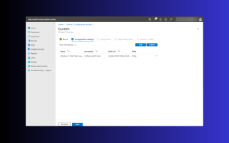
In Windows 11, the Start menu has been redesigned and features a simplified set of apps arranged in a grid of pages, unlike its predecessor, which had folders, apps, and apps on the Start menu. Group. You can customize the Start menu layout and import and export it to other Windows devices to personalize it to your liking. In this guide, we’ll discuss step-by-step instructions for importing Start Layout to customize the default layout on Windows 11. What is Import-StartLayout in Windows 11? Import Start Layout is a cmdlet used in Windows 10 and earlier versions to import customizations for the Start menu into
 How to save desktop icon position layout in Windows 11
Aug 23, 2023 pm 09:53 PM
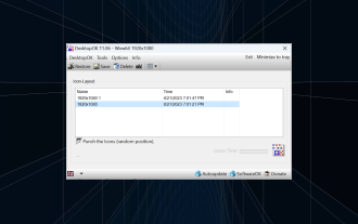
Windows 11 brings a lot to the table in terms of user experience, but the iteration isn't entirely error-proof. Users run into issues from time to time, and changes to icon positioning are common. So how to save desktop layout in Windows 11? There are built-in and third-party solutions for this task, whether it's saving the screen resolution of the current window or the arrangement of desktop icons. This becomes even more important for users who have a bunch of icons on their desktop. Read on to learn how to save desktop icon locations in Windows 11. Why doesn't Windows 11 save icon layout positions? Here are the main reasons why Windows 11 does not save desktop icon layout: Changes to display settings: Typically, when you modify display settings, the configured customizations
 Guide to solving misalignment of WordPress web pages
Mar 05, 2024 pm 01:12 PM
Guide to solving misaligned WordPress web pages In WordPress website development, sometimes we encounter web page elements that are misaligned. This may be due to screen sizes on different devices, browser compatibility, or improper CSS style settings. To solve this misalignment, we need to carefully analyze the problem, find possible causes, and debug and repair it step by step. This article will share some common WordPress web page misalignment problems and corresponding solutions, and provide specific code examples to help develop
 How to create a responsive carousel layout using HTML and CSS
Oct 20, 2023 pm 04:24 PM
How to create a responsive carousel layout using HTML and CSS Carousels are a common element in modern web design. It can attract the user's attention, display multiple contents or images, and switch automatically. In this article, we will introduce how to create a responsive carousel layout using HTML and CSS. First, we need to create a basic HTML structure and add the required CSS styles. The following is a simple HTML structure: <!DOCTYPEhtml&g
 Flexible application skills of position attribute in H5
Dec 27, 2023 pm 01:05 PM
How to flexibly use the position attribute in H5. In H5 development, the positioning and layout of elements are often involved. At this time, the CSS position property will come into play. The position attribute can control the positioning of elements on the page, including relative positioning, absolute positioning, fixed positioning and sticky positioning. This article will introduce in detail how to flexibly use the position attribute in H5 development.
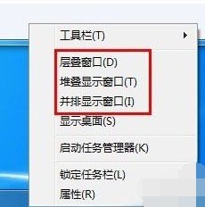 Introducing the window arrangement method in win7
Dec 26, 2023 pm 04:37 PM
When we open multiple windows at the same time, win7 has the function of arranging multiple windows in different ways and then displaying them at the same time, which allows us to view the contents of each window more clearly. So how many window arrangements are there in win7? What do they look like? Let’s take a look with the editor. There are several ways to arrange Windows 7 windows: three, namely cascading windows, stacked display windows and side-by-side display windows. When we open multiple windows, we can right-click on an empty space on the taskbar. You can see three window arrangements. 1. Cascading windows: 2. Stacked display windows: 3. Display windows side by side:
 Syntax usage scenarios of contain in CSS
Feb 21, 2024 pm 02:00 PM
Syntax usage scenarios of contain in CSS In CSS, contain is a useful attribute that specifies whether the content of an element is independent of its external style and layout. It helps developers better control page layout and optimize performance. This article will introduce the syntax usage scenarios of the contain attribute and provide specific code examples. The syntax of the contain attribute is as follows: contain:layout|paint|size|style|'none'|'stric
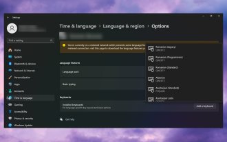 Windows 11 keeps adding keyboard layouts: 4 tested solutions
Dec 14, 2023 pm 05:49 PM
For some users, Windows 11 keeps adding new keyboard layouts even if they don't accept or confirm the changes. The WindowsReport software team has replicated this issue and knows how to prevent Windows 11 from adding a new keyboard layout to your PC. Why does Windows 11 add its own keyboard layout? This usually happens when using a non-native language and keyboard combination. For example, if you are using a US display language and a French keyboard layout, Windows 11 may also add an English keyboard. What to do if Windows 11 adds a new keyboard layout you don't want. How to prevent Windows 11 from adding a keyboard layout? 1. Delete unnecessary keyboard layouts and click "Open"


