为什么720*1280的屏幕网页却不能是720宽_html/css_WEB-ITnose
<!DOCTYPE html><html><head><meta name="viewport" content="width=device-width,initial-scale=1.0" /><meta charset="UTF-8" /><style type="text/css">*{margin:0px;}div{ width:700px; height:200px; border:solid 1px #000000;}</style></head><body><div>123</div></body></html>
回复讨论(解决方案)
刚才的回帖不知道什么原因,怎么弄没了呢。。
懒得写了
你查下:window.devicePixelRatio
http://www.cnblogs.com/qq21270/p/3785961.html
刚才的回帖不知道什么原因,怎么弄没了呢。。
懒得写了
你查下:window.devicePixelRatio
http://www.cnblogs.com/qq21270/p/3785961.html
您好。我看了那个文章。
可是我还是有疑问。
我手机是1280*720 就是说我手机宽720像素。
可是我把网页设置成720px网页却超出了屏幕范围div{width:720px;}
请问是为什么
我把div{width:360px;}网页就不超宽。请问这是怎么回事???
我总有可能给div设置宽度啊!!!
按百分比定位宽度。
刚才才发现你发了两篇,我给回复到 html5那个版里了
<!DOCTYPE html><html><head><meta name="viewport" content="width=device-width,initial-scale=1.0" /><meta charset="UTF-8" /><style type="text/css">*{margin:0px;}div{ width:700px; height:200px; border:solid 1px #000000;}</style></head><body><div>123</div></body></html> 因为你设置了 width=device-width
1280*720 的手机 应该是高清屏吧 像素点是这样 实际是 一半
meta改一下试试
content="initial-scale=1.0, maximum-scale=1.0, user-scalable=no"

Hot AI Tools

Undresser.AI Undress
AI-powered app for creating realistic nude photos

AI Clothes Remover
Online AI tool for removing clothes from photos.

Undress AI Tool
Undress images for free

Clothoff.io
AI clothes remover

AI Hentai Generator
Generate AI Hentai for free.

Hot Article

Hot Tools

Notepad++7.3.1
Easy-to-use and free code editor

SublimeText3 Chinese version
Chinese version, very easy to use

Zend Studio 13.0.1
Powerful PHP integrated development environment

Dreamweaver CS6
Visual web development tools

SublimeText3 Mac version
God-level code editing software (SublimeText3)

Hot Topics
 1376
1376
 52
52
 How to send web pages to desktop as shortcut in Edge browser?
Mar 14, 2024 pm 05:22 PM
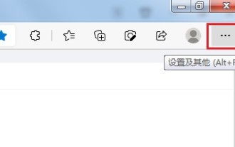
How to send web pages to the desktop as a shortcut in Edge browser? Many of our users want to display frequently used web pages on the desktop as shortcuts for the convenience of directly opening access pages, but they don’t know how to do it. In response to this problem, the editor of this issue will share the solution with the majority of users. , let’s take a look at the content shared in today’s software tutorial. The shortcut method of sending web pages to the desktop in Edge browser: 1. Open the software and click the "..." button on the page. 2. Select "Install this site as an application" in "Application" from the drop-down menu option. 3. Finally, click it in the pop-up window
 iPhone screenshots not working: How to fix it
May 03, 2024 pm 09:16 PM
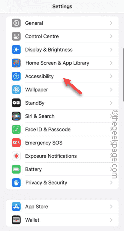
Screenshot feature not working on your iPhone? Taking a screenshot is very easy as you just need to hold down the Volume Up button and the Power button at the same time to grab your phone screen. However, there are other ways to capture frames on the device. Fix 1 – Using Assistive Touch Take a screenshot using the Assistive Touch feature. Step 1 – Go to your phone settings. Step 2 – Next, tap to open Accessibility settings. Step 3 – Open Touch settings. Step 4 – Next, open the Assistive Touch settings. Step 5 – Turn on Assistive Touch on your phone. Step 6 – Open “Customize Top Menu” to access it. Step 7 – Now you just need to link any of these functions to your screen capture. So click on the first
 Does miniled screen hurt eyes?
Feb 07, 2024 pm 03:48 PM
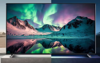
What many users are most concerned about is whether the miniLED screen will hurt the eyes. In fact, although the brightness of this screen can reach extremely high, it will not hurt the eyes and can still be used normally. Does the miniled screen hurt your eyes? Answer: It does not hurt your eyes. Although the brightness of the miniLED screen will be higher, it will not continue to maintain this brightness during daily use. It will only be displayed when the brightness needs to be increased, so it will not always maintain high brightness and hurt the eyes. This peak brightness is also for better Good presentation and expression. MiniLED screen introduction 1. MiniLED backlight display technology uses backlight, so the biggest difference from LCD is the backlight layer 2. Compared with LCD screen, the performance of miniLED will be higher.
 How to adjust the color when the screen turns black and white. Detailed introduction: How to exit black and white mode on your mobile phone.
Mar 21, 2024 pm 01:12 PM
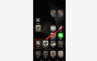
When many friends are using their mobile phones, they suddenly find that the operation interface of the mobile phone has turned into "black and white" color. They don't know what causes it or how to solve it. This article uses Android mobile phones as an example to teach you how to make it work. The color of the mobile phone's operating interface returns to normal. 1. Set up the interface of the mobile phone and find the "gear-shaped" icon in the operation interface. As shown below: Click this icon to enter the phone’s settings interface. 2. Options The operating interface of the mobile phone has changed to black and white, which is related to the "Display" setting of the mobile phone. After entering the settings interface of the mobile phone, find the "Display and Theme" option in the drop-down menu, as shown below: Then click "Display and Theme" option to enter the details page. 3. After changing the screen color and entering the "Display and Theme" option, find the "
 Possible reasons why the network connection is normal but the browser cannot access the web page
Feb 19, 2024 pm 03:45 PM
The browser cannot open the web page but the network is normal. There are many possible reasons. When this problem occurs, we need to investigate step by step to determine the specific cause and solve the problem. First, determine whether the webpage cannot be opened is limited to a specific browser or whether all browsers cannot open the webpage. If only one browser cannot open the web page, you can try to use other browsers, such as Google Chrome, Firefox, etc., for testing. If other browsers are able to open the page correctly, the problem is most likely with that specific browser, possibly
 How to Undo Delete from Home Screen in iPhone
Apr 17, 2024 pm 07:37 PM
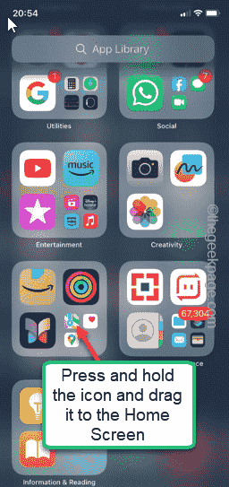
Deleted something important from your home screen and trying to get it back? You can put app icons back on the screen in a variety of ways. We have discussed all the methods you can follow and put the app icon back on the home screen. How to Undo Remove from Home Screen in iPhone As we mentioned before, there are several ways to restore this change on iPhone. Method 1 – Replace App Icon in App Library You can place an app icon on your home screen directly from the App Library. Step 1 – Swipe sideways to find all apps in the app library. Step 2 – Find the app icon you deleted earlier. Step 3 – Simply drag the app icon from the main library to the correct location on the home screen. This is the application diagram
 How to close the 'Do not cover the top of the screen' Detailed explanation: How to close the 'Do not cover the top of the screen' message that appears frequently on your phone
Mar 03, 2024 pm 01:31 PM
I believe many friends have encountered the problem that their mobile phones suddenly prompt: Do not cover the top of the screen. So why does the mobile phone suddenly appear like this? Let’s take a look together below. In fact, when this happens, something is blocking the distance sensor of the phone, so this prompt is received on the screen of the phone. So why did I suddenly receive such a prompt? In fact, it may be that you have accidentally turned on the [anti-accidental touch mode] on your phone, so this problem occurs. So how do we close it? In fact, the method is very simple. Let’s take a look at it together. Method 1: Directly follow the on-screen prompts to close using the shortcut key combination. Method 2: If the above method does not work, you can also open the phone’s [Settings]
 What should I do if the images on the webpage cannot be loaded? 6 solutions
Mar 15, 2024 am 10:30 AM
Some netizens found that when they opened the browser web page, the pictures on the web page could not be loaded for a long time. What happened? I checked that the network is normal, so where is the problem? The editor below will introduce to you six solutions to the problem that web page images cannot be loaded. Web page images cannot be loaded: 1. Internet speed problem The web page cannot display images. It may be because the computer's Internet speed is relatively slow and there are more softwares opened on the computer. And the images we access are relatively large, which may be due to loading timeout. As a result, the picture cannot be displayed. You can turn off the software that consumes more network speed. You can go to the task manager to check. 2. Too many visitors. If the webpage cannot display pictures, it may be because the webpages we visited were visited at the same time.


