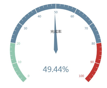
Everyone can see the dashboard at a glance in the car cockpit. Using the dashboard made with Echarts can easily display the user's data and clearly see the range of a certain indicator value. The report in the form of dashboard is used in Among various statistical systems, this article uses examples to explain the statistical application of dashboards in sales task completion rates.

Effect demonstration Source code download
HTML
First introduce Echarts, then add div#myChart where the chart needs to be placed, and add width and height attributes to it.
<script src="echarts.min.js"></script>
<div id="myChart" style="width: 600px;height:400px;"></div>
Javascript
The next step is to initialize the echarts instance, then set the options, and finally render the image.
var myChart = echarts.init(document.getElementById('myChart'));
option = {
tooltip : {
formatter: "{a} <br/>{b} : {c}%"
},
series : [
{
name:'业务指标',
type:'gauge',
detail : {formatter:'{value}%'}, //仪表盘显示数据
axisLine: { //仪表盘轴线样式
lineStyle: {
width: 20
}
},
splitLine: { //分割线样式
length: 20
},
data:[{value: 50, name: '完成率'}]
}
]
};
myChart.setOption(option); The tooltip in the option settings is a prompt box component. The default parameter show: true displays the prompt box. The formatter parameter is the content format of the prompt box floating layer. It supports two forms: string template and callback function. Generally, we use string templates. The template variables include {a}, {b}, {c}, {d}, {e}, which respectively represent the series name, data name, data value, etc. When trigger is 'axis', there will be multiple series of data. In this case, the index of the series can be represented by {a0}, {a1}, {a2} followed by an index. {a}, {b}, {c}, {d} under different chart types have different meanings. The meanings of the chart parameters for the three types of pie charts, dashboards, and funnel charts are: {a} (series name), {b} (data item name), {c} (value), {d} (percentage).
The series in the option is the series list. Each series determines its own chart type through type, which contains many parameters. The parameter name represents the series name, which is used for tooltip display and legend filtering. It is used to specify the corresponding series when setOption updates data and configuration items. The parameter type refers to the chart type, and type:'gauge' refers to the dashboard. The parameter detail refers to the details of the dashboard, which is used to display data. You can define the height and width of the data display, background color, border color, etc. In this example, it is defined that the details of the dashboard are displayed as percentages. The parameter axisLine can define dashboard axis-related configurations, such as axis line style, etc. The parameter splitLine is used to define the split line style in the dashboard, such as line length, line color, line width, etc. The data parameter is used to display data. You can set the values and names corresponding to dashboard indicators.
If it is a dynamically changing dashboard, you can use setInterval() to change the instrument value regularly, such as the following code.
clearInterval(timeTicket);
var timeTicket = setInterval(function () {
option.series[0].data[0].value = (Math.random() * 100).toFixed(2) - 0;
myChart.setOption(option, true);
},2000); The above content introduces you to the ECharts dashboard example code, I hope it will be helpful to you!


