What we are going to learn next are some components provided by Bootstrap. These components are very simple to use, can help us build a website quickly and conveniently, and can achieve a good display effect. What we need to pay attention to most is: the structure of HTML and the classes and attributes that bootstrap provides to add to the structure.
The interactive functions of these components rely on the jQuery library, so jQuery.js must also be introduced, and it must be before Bootstrap.js. If it is officially launched, just use the compressed version as follows:
<script src="../js/jquery-min-1.11.3.js"></script><script src="../js/bootstrap.min.js"></script>
Menu
Basic usage
In the official documentation, the drop-down menu component we see looks like this:
<div class="dropdown"> <button class="btn btn-default dropdown-toggle" type="button" id="dropdownMenu1" data-toggle="dropdown" aria-haspopup="true" aria-expanded="true"> 下拉菜单<span class="caret"></span> </button> <ul class="dropdown-menu" aria-labelledby="dropdownMenu1"> <li><a href="#">菜单项1</a></li> <li><a href="#">菜单项2</a></li> </ul></div>
So, which attributes are necessary to control behavior? Which part is used for modification?
Let’s simplify this code ourselves:
<div class="dropdown"> <button class="dropdown-toggle"data-toggle="dropdown">下拉菜单</button> <ul class="dropdown-menu" > <li>菜单项1</li> <li>菜单项2</li> </ul></div>
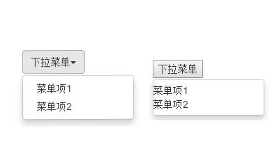
Let’s take a look at the comparison before and after simplification:

When using the drop-down menu component in the Bootstrap framework, it is very important to use the correct structure. If the structure and class name are not used correctly, it will directly affect whether the component can be used normally. After our above simplification, we can finally see that the core requirements are as follows:
Use a container named .dropdown to wrap the entire drop-down menu element. In the example:
uses a What's going on when I can't connect to the network?
 connectionresetSolution
 How to optimize a single page
 How to buy and sell Bitcoin on Huobi.com
 How to solve 500 internal server error
 press any key to restart
 How to implement jsp paging function
 Introduction to parametric modeling software
 How to execute a shell script


