Bootstrap introductory book (3) Grid system_javascript skills
Principle of implementation
The grid system is the core of Bootstrap. It is precisely because of the existence of the grid system that Bootstrap can have such a powerful responsive layout solution. The following is the explanation from the official documentation:
Bootstrap has a built-in responsive, mobile-first fluid grid system. As the screen device or viewport size increases, the system will automatically be divided into up to 12 columns. It contains easy-to-use predefined classes and powerful mixins for generating more semantic layouts.
Let’s understand this paragraph and find that the most important part is mobile device priority. So what is mobile device priority?
Bootstrap's basic CSS code starts from small screen devices (such as mobile devices, tablets) by default, and then uses media queries to expand to components and grids on large screen devices (such as laptops, desktop computers).
Has the following strategy:
Content: Decide what is most important.
Layout: Prioritize smaller widths.
Progressive enhancement: elements are added as the screen size increases.
How it works
Data rows (.row) must be contained in a container .container (fixed width) or .container-fluid (100% width) in order to be given proper alignment and padding. Such as:
<div class="container"><!-- 水平居中,两边有margin,最小屏幕时,充满父元素 -->
<div class="row"></div>
</div>
<!-- 或者 -->
<div class="container-fluid"><!-- 默认一直充满整个父元素 -->
<div class="row"></div>
</div>
Columns can be added to the data row (.row), but the sum of the number of columns cannot exceed the total number of bisected columns (when exceeded, the excess will be displayed in a new line), the default is 12. (Customized settings can be made using Less or Sass) such as:
<div class="container">
<div class="row">
<div class="col-md-2"></div>
<div class="col-md-6"></div>
<div class="col-md-4"></div>
The specific content on the page should be placed within the column (column), and only the column (column) can be used as a direct child element of the data row .row container.
Predefined grid classes, such as .row and .col-xs-4, can be used to quickly create grid layouts.
Columns in a raster system represent the range they span by specifying a value from 1 to 12. For example, three equal-width columns can be created using three .col-xs-4.
Note:
As shown in the comment section above, .container (fixed width) is a fixed-width layout method. By looking at the source code, when looking at the .container class, we will find that its width is responsive: (as follows)
.container {
padding-right: 15px;
padding-left: 15px;
margin-right: auto;margin-left: auto;
}
@media (min-width: 768px) {
.container {
width: 750px;
}
}
@media (min-width: 992px) {
.container {
width: 970px;
}
}
/*........*/As you can see from the css code above, this class defaults to the width of the entire parent element (minimum screen), but it has different widths under large screens, and the left and right margins will increase or decrease at the same time under different widths (horizontally) center).
The .container-fluid class is the same as .container by default, which is 100% width. (CSS code is the same)
Besides
From the source code, we can also find that in addition to left and right margins, we can also see that this class has left and right padding.
If we continue to view the source code, we can find that each column in the data row .row also has left and right padding, as follows:
.col-md-1, .col-lg-12 /*......*/{
position: relative;
min-height: 1px;
padding-right: 15px;
padding-left: 15px;
}Seeing this, everyone should be able to imagine what kind of situation will happen! Because of the existence of double padding in the first and last columns, the content isolation has actually reached 30px. How do we need to eliminate the impact?
Bootstrap uses the negative margin-left: -15px;margin-right: -15px; on .rows to represent the row offset of the first and last columns, which is used to offset the first The left padding of the column and the right padding of the last column.
Basic usage
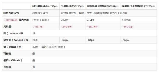
bootstrap3.x uses four grid options to form a grid system. These four options are introduced on the official website as shown below. Many people do not understand it. Here is a detailed explanation of the differences between the four grid options. , in fact, the only difference is that they are suitable for screen devices of different sizes. Let’s look at the class prefix. Let’s name these four grid options with the prefix. They are col-xs, col-sm, col-md, and col-lg. Those of us who understand English know that lg is large. Abbreviations, md is the abbreviation of mid, sm is the abbreviation of small, and xs is the abbreviation of ***. This naming reflects the different screen widths that these classes adapt to. Below we introduce the characteristics of these classes respectively.
Use the table below to see in detail how Bootstrap's grid system works on various screen devices.

It can be found through the source code, as follows:
.col-md-1/*......*/{ float: left;}/*所有的列都是默认向左浮动的*/
.col-md-1 {
width: 8.33333333%;
}
.col-md-2 {
width: 16.66666667%;
}
/*.....*/
.col-md-12 {
width: 100%;
}From these CSS codes, it is not difficult to find out the width of each column in Bootstrap, and why when the number of columns is set to exceed 12, the excess part will be displayed in a new line.
In all the examples below, the background color and border effect of each column are controlled by the following CSS code:
[class *= col-]{
background-color: #eee;
border: 1px solid #ccc;
}基础
那么我们就来看看一些示例吧,下面这种方式是最基本的用法:
<div class="container">
<div class="row">
<div class="col-md-6">.col-md-6</div>
<div class="col-md-6">.col-md-6</div>
</div>
<div class="row">
<div class="col-md-4">.col-md-4</div>
<div class="col-md-4">.col-md-4</div>
<div class="col-md-4">.col-md-4</div>
</div>
<div class="row">
<div class="col-md-2">.col-md-2</div>
<div class="col-md-6">.col-md-6</div>
<div class="col-md-4">.col-md-4</div>
</div>
</div>
实现的效果如下:

Bootstrap作为一个响应式框架当然不会只有那么简单的功能,我们继续往下走吧!
列偏移
在某些情况下,我们不希望相邻的列紧靠在一起,如果你希望不通过额外的margin或其他的手段来实现的话,Bootstrap内置为我们提供了列偏移(offset),这一系列的类来帮助我们实现想要的效果。
只需要给需要偏移的列元素上添加类名 col-md-offset-* ( 星号代表要偏移的列组合数 ),那么具有这个类名的列就会向右偏移。
这些类实际是通过使用 * 选择器为当前元素增加了左侧的边距(margin)。例如:在列元素中添加 .col-md-offset-6 类将 .col-md-6 元素向右侧偏移了6个列(column)的宽度。
现在我们的代码是这样的:
<div class="container">
<div class="row">
<div class="col-md-2 ">col-md-8 </div>
<div class="col-md-3 col-md-offset-2">col-md-4 col-md-offset-2</div>
<div class="col-md-4 col-md-offset-1">col-md-4 col-md-offset-1</div>
</div>
<p><br></p>
<div class="row">
<div class="col-md-4 ">col-md-4 </div>
<div class="col-md-3 col-md-offset-4">col-md-3 col-md-offset-4</div>
<div class="col-md-4 col-md-offset-4">col-md-4 col-md-offset-4</div>
</div>
</div>
可以实现的效果如下:

从实现的效果我们就能发现一些东西,注意 第二段的显示效果与代码 ,从那里我们可以发现:使用 col-md-offset-* 对列进行向右偏移时,要保证列与偏移列的总数不超过12,不然会致列断行显示。
其实原因也很简单:因为该类是对于列设置 margin-left ,并且我们在上面的源码展示中,也可以看有每一列都有着 float:left 的属性,从这些地方我们就不难发现在(偏移+列宽)超过12时,为何会换行显示了
列排序
列排序其实就是改变列的方向(顺序),就是改变左右浮动,并且设置浮动的距离。在Bootstrap框架的网格系统中是通过添加类名 col-md-push-* 和 col-md-pull-* (和上面一样,星号代表移动的列组合数)。
Bootstrap仅通过设置left和right来实现定位效果。通过查看源码,我们可以看到基本设置比较简单,如下:
.col-md-pull-12 {
right: 100%;
}
/*...*/
.col-md-push-1 {
left: 8.33333333%;
}
.col-md-push-0 {
left: auto;
}还是继续看看我们的实际效果吧!代码如下
<div class="container">
<div class="row">
<div class="col-md-4 col-md-push-8">.col-md-4 col-md-push-8 </div>
<div class="col-md-8 col-md-pull-4">.col-md-8 col-md-pull-4 </div>
</div>
<div class="row">
<div class="col-md-4 ">.col-md-4 默认</div>
<div class="col-md-8 ">.col-md-8 默认</div>
</div>
</div>

我们可以发现列的位置已经发生了改变
列嵌套
Bootstrap框架的网格系统还支持列的嵌套。你可以在一个列中添加一个或者多个行( .row )容器,然后在这个行容器中插入列(像前面介绍的一样使用列)。但在列容器中的行容器( .row ),宽度为100%时,就是当前外部列的宽度。(其实就是在列中嵌套多个列,下面会有实际效果展示)
注意:被嵌套的行( .row )所包含的列(column)的个数不能超过12(其实,没有要求你必须占满12列 -_- )。
我们现在有这样一个需求:
创建一个8-4列网格。(备注:以中屏md(970px)为例)。
在第一个8列网格中插入8-4列网格。
在第二个4列网格中插入9-3列网格。
效果如下:

该如何实现呢?
<div class="container">
<div class="row">
<div class="col-md-8">
我的里面嵌套了一个网格
<div class="row">
<div class="col-md-8">col-md-8</div>
<div class="col-md-4">col-md-4</div>
</div>
</div>
<div class="col-md-4">
我的里面嵌套了一个网格
<div class="row">
<div class="col-md-9">col-md-9</div>
<div class="col-md-3">col-md-3</div>
</div>
</div>
</div>
</div>
是不是很简单呢?当然为了完全实现和效果图一样的展示,我们还需要对CSS进行一些添加:
[class *= col-] [class *= col-] {
background-color: #f36;
border:1px dashed #fff;
color: #fff;
}以上所述是小编给大家分享的Bootstrap入门书籍之(三)栅格系统,希望对大家有所帮助!

Hot AI Tools

Undresser.AI Undress
AI-powered app for creating realistic nude photos

AI Clothes Remover
Online AI tool for removing clothes from photos.

Undress AI Tool
Undress images for free

Clothoff.io
AI clothes remover

AI Hentai Generator
Generate AI Hentai for free.

Hot Article

Hot Tools

Notepad++7.3.1
Easy-to-use and free code editor

SublimeText3 Chinese version
Chinese version, very easy to use

Zend Studio 13.0.1
Powerful PHP integrated development environment

Dreamweaver CS6
Visual web development tools

SublimeText3 Mac version
God-level code editing software (SublimeText3)

Hot Topics
 1377
1377
 52
52
 How do I create and publish my own JavaScript libraries?
Mar 18, 2025 pm 03:12 PM
Article discusses creating, publishing, and maintaining JavaScript libraries, focusing on planning, development, testing, documentation, and promotion strategies.
 How do I optimize JavaScript code for performance in the browser?
Mar 18, 2025 pm 03:14 PM
The article discusses strategies for optimizing JavaScript performance in browsers, focusing on reducing execution time and minimizing impact on page load speed.
 What should I do if I encounter garbled code printing for front-end thermal paper receipts?
Apr 04, 2025 pm 02:42 PM
Frequently Asked Questions and Solutions for Front-end Thermal Paper Ticket Printing In Front-end Development, Ticket Printing is a common requirement. However, many developers are implementing...
 How do I debug JavaScript code effectively using browser developer tools?
Mar 18, 2025 pm 03:16 PM
The article discusses effective JavaScript debugging using browser developer tools, focusing on setting breakpoints, using the console, and analyzing performance.
 How do I use Java's collections framework effectively?
Mar 13, 2025 pm 12:28 PM
This article explores effective use of Java's Collections Framework. It emphasizes choosing appropriate collections (List, Set, Map, Queue) based on data structure, performance needs, and thread safety. Optimizing collection usage through efficient
 How do I use source maps to debug minified JavaScript code?
Mar 18, 2025 pm 03:17 PM
The article explains how to use source maps to debug minified JavaScript by mapping it back to the original code. It discusses enabling source maps, setting breakpoints, and using tools like Chrome DevTools and Webpack.
 Getting Started With Chart.js: Pie, Doughnut, and Bubble Charts
Mar 15, 2025 am 09:19 AM
This tutorial will explain how to create pie, ring, and bubble charts using Chart.js. Previously, we have learned four chart types of Chart.js: line chart and bar chart (tutorial 2), as well as radar chart and polar region chart (tutorial 3). Create pie and ring charts Pie charts and ring charts are ideal for showing the proportions of a whole that is divided into different parts. For example, a pie chart can be used to show the percentage of male lions, female lions and young lions in a safari, or the percentage of votes that different candidates receive in the election. Pie charts are only suitable for comparing single parameters or datasets. It should be noted that the pie chart cannot draw entities with zero value because the angle of the fan in the pie chart depends on the numerical size of the data point. This means any entity with zero proportion
 TypeScript for Beginners, Part 2: Basic Data Types
Mar 19, 2025 am 09:10 AM
Once you have mastered the entry-level TypeScript tutorial, you should be able to write your own code in an IDE that supports TypeScript and compile it into JavaScript. This tutorial will dive into various data types in TypeScript. JavaScript has seven data types: Null, Undefined, Boolean, Number, String, Symbol (introduced by ES6) and Object. TypeScript defines more types on this basis, and this tutorial will cover all of them in detail. Null data type Like JavaScript, null in TypeScript


