[学习笔记]viewport定义,弹性布局,响应式布局_html/css_WEB-ITnose
一,移动端宽度设置
viewport视图窗口,,视窗宽度=设备宽度,默认缩放=1,不允许用户缩放。
二,flexbox,弹性盒子模型:
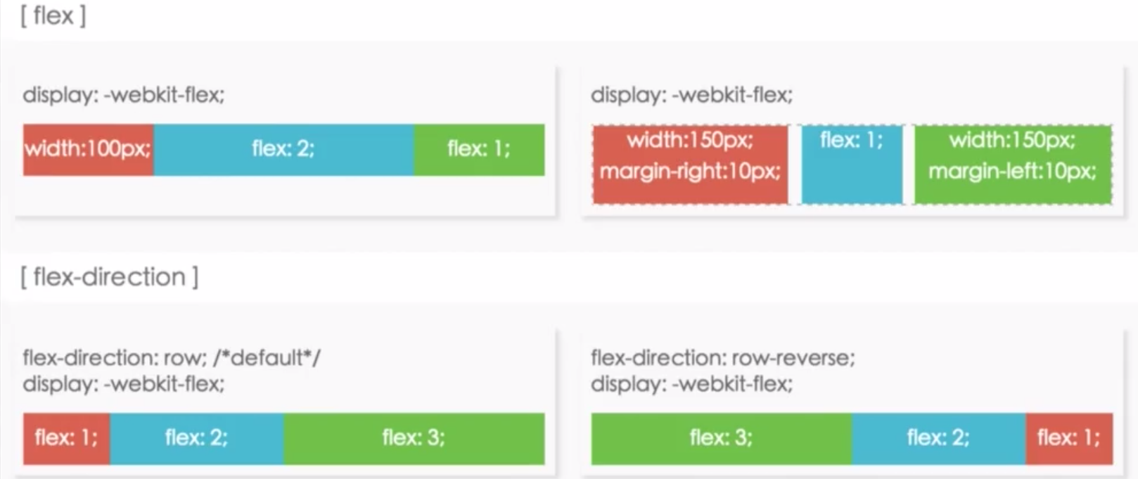
1,在元素的css中添加display:-webkit-flex就可以转换成弹性盒模型了,然后在多个子元素的CSS中添加flex:1/2/3,就可以让子元素按定义的比例1/2/3分配填满父元素。
2,混合划分:

子元素可以是固定宽度,也可以是定义flex值,灵活运用,常见于

图片采用固定宽度防止缩放失真,然后右边的文字采用弹性布局设置flex:1。
3,不定宽高的水平、垂直居中
CSS3方案:
.myoff-wrapper{
position:absolute;
top:50%;
left:50%;
z-index:3;
-webkit-transform:translate(-50%,-50%);
border-radius:6px;
background:#fff;
}更好的flexbox方案:设置父元素,让子元素水平居中
.parent{
display:-webkit-flex;
justify-content:center;//子元素水平居中
align-items:center;//子元素垂直居中
}更多应用:
三,响应式布局:在不同设备不同分辨率下都有良好的用户体验
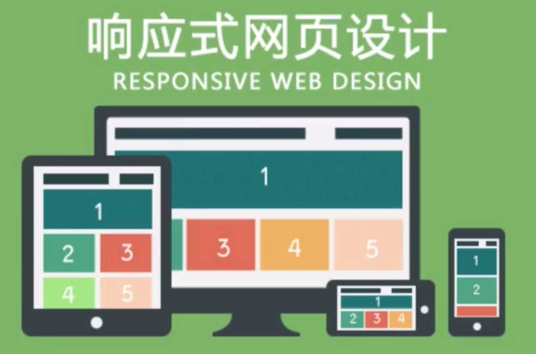
响应式布局方法是依靠媒体查询实现的:
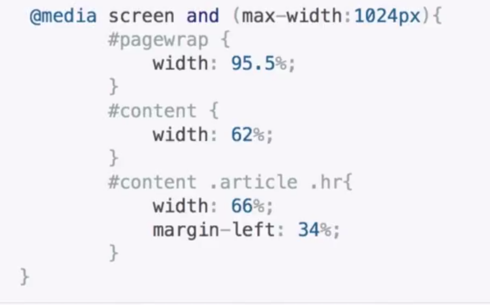
媒体查询类型:screen(屏幕)、print(打印机)、handheld(手持设备)、all(通用)
常用媒体查询参数:width,height,device-width,device-height,orientation(检查设备处于横向lanscape还是竖屏portrait)
em:根据父元素的font-size为相对单位;
rem:根据html的font-size为相对单位。
以上就是[学习笔记]viewport定义,弹性布局,响应式布局_html/css_WEB-ITnose的内容,更多相关内容请关注PHP中文网(www.php.cn)!

Hot AI Tools

Undresser.AI Undress
AI-powered app for creating realistic nude photos

AI Clothes Remover
Online AI tool for removing clothes from photos.

Undress AI Tool
Undress images for free

Clothoff.io
AI clothes remover

Video Face Swap
Swap faces in any video effortlessly with our completely free AI face swap tool!

Hot Article

Hot Tools

Notepad++7.3.1
Easy-to-use and free code editor

SublimeText3 Chinese version
Chinese version, very easy to use

Zend Studio 13.0.1
Powerful PHP integrated development environment

Dreamweaver CS6
Visual web development tools

SublimeText3 Mac version
God-level code editing software (SublimeText3)

Hot Topics
 How to center a div in html
Apr 05, 2024 am 09:00 AM
There are two ways to center a div in HTML: Use the text-align attribute (text-align: center): For simpler layouts. Use flexible layout (Flexbox): Provide more flexible layout control. The steps include: enabling Flexbox (display: flex) in the parent element. Set the div as a Flex item (flex: 1). Use the align-items and justify-content properties for vertical and horizontal centering.
 Unit Selection Guide for Responsive Layout Design
Jan 27, 2024 am 08:26 AM
With the popularity of mobile devices and the development of technology, responsive layout has become one of the essential skills for designers. Responsive layout is designed to provide the best user experience for screens of different sizes, allowing web pages to automatically adjust their layout on different devices to ensure the readability and usability of content. Choosing the right units is one of the key steps in responsive layout design. This article will introduce some commonly used units and provide suggestions for selecting units. Pixel (px): Pixel is the smallest unit on the screen. It is an absolute unit and does not automatically change as the screen size changes.
 A guide to CSS flexible layout properties: position sticky and flexbox
Oct 27, 2023 am 10:06 AM
A Guide to CSS Flexible Layout Properties: positionsticky and flexbox Flexible layout has become a very popular and useful technique in modern web design. It can help us create adaptive web page layouts so that web pages can display and respond well on different devices and screen sizes. This article will focus on two flexible layout properties: position:sticky and flexbox. We'll discuss their usage in detail, with concrete code examples
 Explore the best responsive layout frameworks: the competition is fierce!
Feb 19, 2024 pm 05:19 PM
Responsive layout framework competition: who is the best choice? With the popularity and diversification of mobile devices, responsive layout of web pages has become more and more important. In order to cater to the different devices and screen sizes of users, it is essential to adopt a responsive layout framework when designing and developing web pages. However, with so many framework options out there, we can’t help but ask: which one is the best choice? The following will be a comparative evaluation of three popular responsive layout frameworks, namely Bootstrap, Foundation and Tailwind.
 Implementation method of HTML's responsive layout design guide
Jan 27, 2024 am 08:26 AM
How to use HTML to implement responsive layout design. With the popularity of mobile devices and the rapid development of the Internet, responsive layout has become an essential skill for designers. Responsive layout allows the website to automatically adapt to different screen sizes and resolutions on different devices, allowing users to have a better browsing experience. This article will introduce how to use HTML to implement responsive layout design and provide specific code examples. Using @media query @media query is a feature in CSS3 that can be applied based on different media conditions
 Practical tips for using HTML fixed positioning in responsive layouts
Jan 20, 2024 am 09:55 AM
Application skills of HTML fixed positioning in responsive layout, specific code examples are required. With the popularity of mobile devices and the increase in user demand for responsive layout, developers have encountered more challenges in web design. One of the key issues is how to implement fixed positioning to ensure that elements can be fixed at specific locations on the page under different screen sizes. This article will introduce the application skills of HTML fixed positioning in responsive layout and provide specific code examples. Fixed positioning in HTML is through the position attribute of CSS
 What does display mean in css
Apr 28, 2024 pm 04:00 PM
The display attribute in CSS controls the layout of elements on the web page. Its meaning: inline: elements are arranged inline, flowing with the text. block: Elements are arranged at a block level, occupying an exclusive row and occupying the width. inline-block: combines the inline and block features, arranges inline but can set the size. none: hide the element. Flex: Use flexible layout to automatically adjust the size and position of elements. grid: Use grid layout to precisely control element position and size.
 How to beautify the page with css
Apr 25, 2024 pm 06:36 PM
CSS (Cascading Style Sheets) beautifies web pages by changing text, background, layout and other visual elements. Beautification techniques include: 1. Controlling text; 2. Adding backgrounds; 3. Customizing layouts; 4. Using shadows and borders; 5. Animating elements. The beautification advantages of using CSS include enhanced aesthetics, improved user experience, search engine optimization, cross-platform compatibility, and ease of maintenance.


