Nine design principles of Material Design
After Google released the new operating system "L Developer Preview", it also launched the visual language Material Design. Its design aesthetics will be integrated into all Google platforms, including Chrome OS and web pages, and it will also form a A unified look that ties all products together. With its flat design and bright colors, the appearance of Material Design is still very attractive. In addition, Google has also made corresponding adjustments to the animation effects to make the experience more fun.
In addition to publishing relevant content on Google social media, Google also sent some art printing kits to attendees, including some unique postcards, which are beautiful and show people The design principles of the new design language.
Google introduced it this way: “Design is the art of creation, and our goal is to meet different human needs. People’s needs will evolve over time, and our designs, practices, and concepts should also evolve with them. To improve. We are challenging ourselves to create a visual language for users that integrates the classic principles of good design and the innovation of science and technology. This is Material Design. 🎜>1. Material is a metaphor
Material metaphor is a unified theory of reasonable space and action systems. What Google calls "materials" is based on tactile reality, inspired by the study of paper and ink, but also adding elements of imagination and magic. 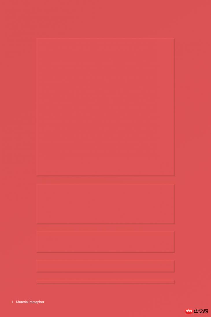
2. Surfaces are intuitive and natural
Surfaces and edges provide visual clues to real-life experiences. Using familiar tactile properties, usage situations can be intuitively felt. 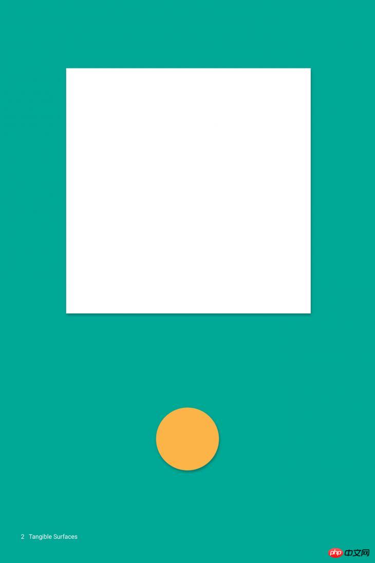
3. Dimensions provide interaction
Light, surface and movement are key factors in showing exchange. Realistic light and shadow effects show the separation of parts, delineate space and indicate which parts can be operated. 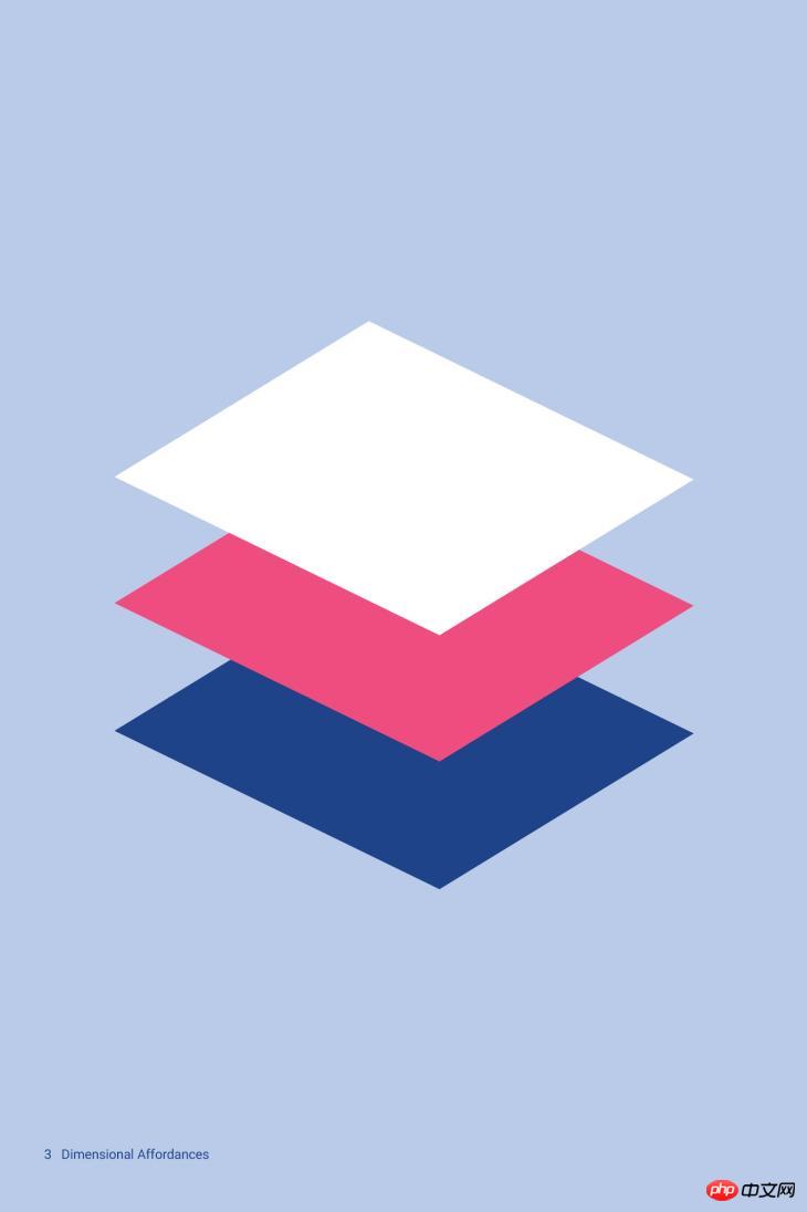
4. Adaptive design
The underlying design system includes two parts: interaction and space. Each device reflects a different facet of the same underlying system. Each device's interface will be adjusted for size and interaction. Only colors, icons, hierarchy and spatial relationships remain unchanged. 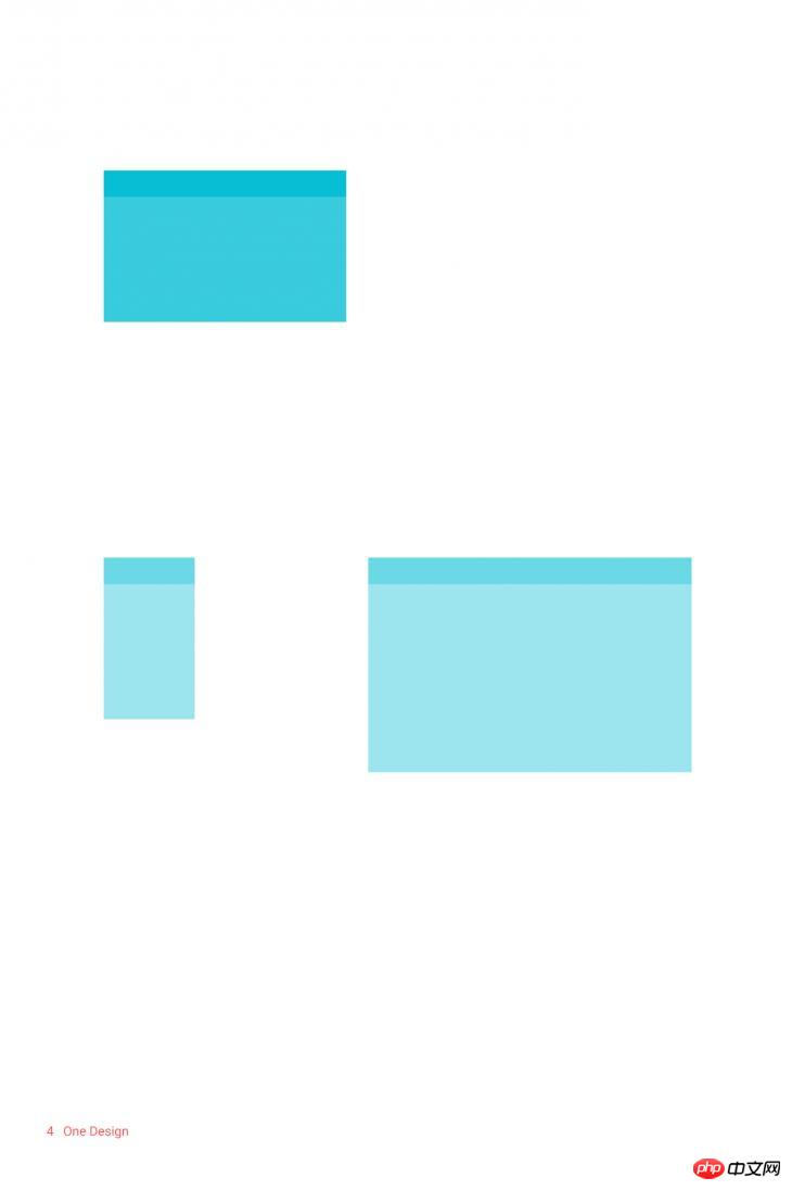
5. The catalog is designed with boldface and graphics, with intention
Boldface can highlight the level, meaning and show focus. Thoughtful color choices, layered images, large layouts and intentional white space can create a sense of immersion and clarity of expression. 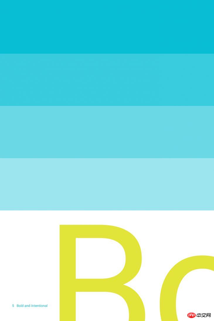
6. Colors, surfaces and icons all emphasize action effects
User behavior is the essence of experience design. Basic motion effects are turning points. They can change the entire design, make core functions more obvious, and provide "signposts" for users. 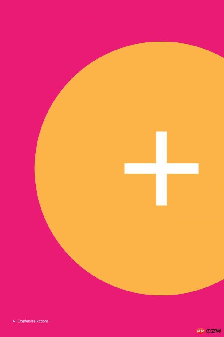
7. User-initiated changes
Changes in the operation interface come from user behavior. The effect produced by the user's touch operation should reflect and strengthen the user's action. 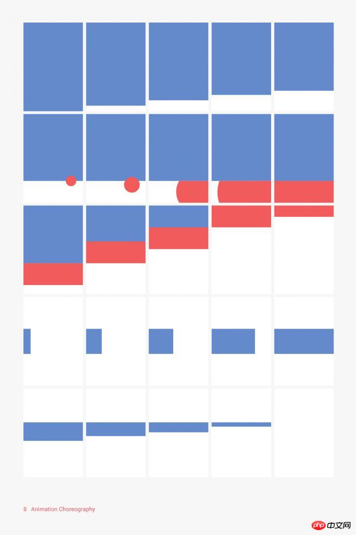
8. Animation effects should be displayed in a unified environment.
All animation effects should be displayed in a unified environment. Even if deformation or reorganization occurs, the presentation of the object cannot destroy the continuity of the user experience. 
9. Actions provide meaning
Actions are meaningful and appropriate. Actions help focus and maintain continuity. Feedback is very subtle and clear, and transitions need to be both efficient and consistent. 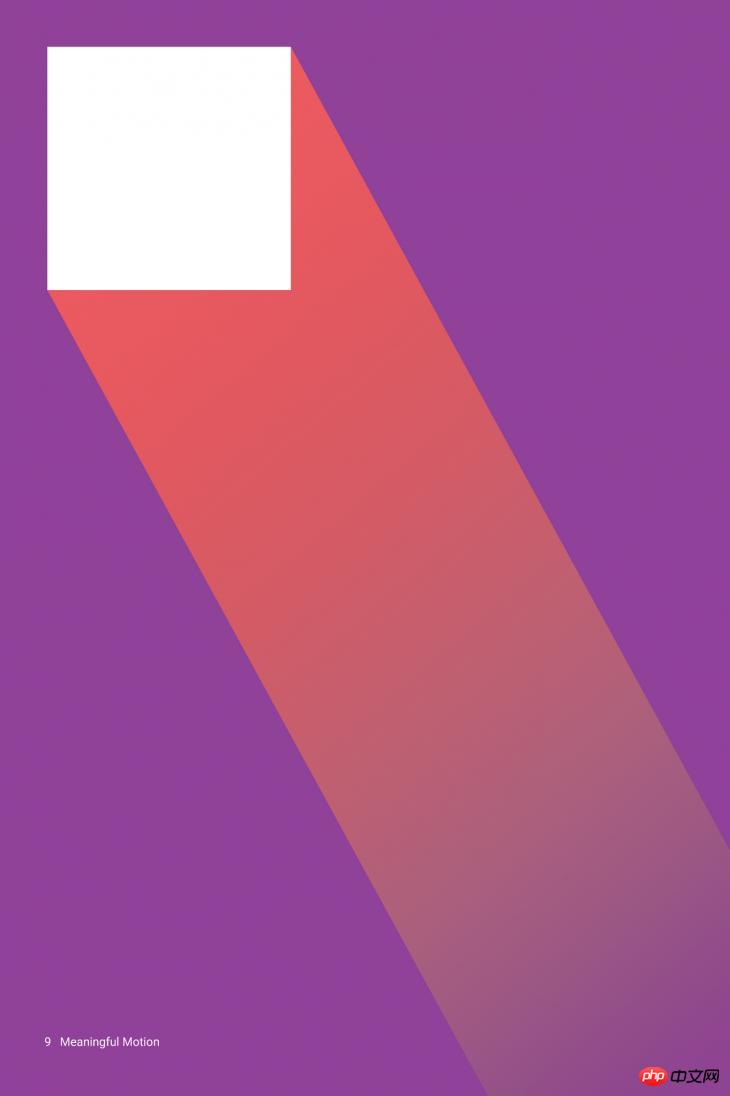

Hot AI Tools

Undresser.AI Undress
AI-powered app for creating realistic nude photos

AI Clothes Remover
Online AI tool for removing clothes from photos.

Undress AI Tool
Undress images for free

Clothoff.io
AI clothes remover

AI Hentai Generator
Generate AI Hentai for free.

Hot Article

Hot Tools

Notepad++7.3.1
Easy-to-use and free code editor

SublimeText3 Chinese version
Chinese version, very easy to use

Zend Studio 13.0.1
Powerful PHP integrated development environment

Dreamweaver CS6
Visual web development tools

SublimeText3 Mac version
God-level code editing software (SublimeText3)

Hot Topics
 1378
1378
 52
52
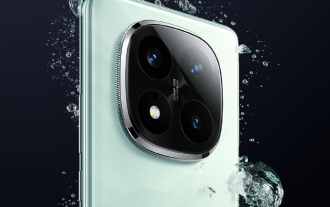 Xiaomi Redmi Note 14 Pro Plus arrives as first Qualcomm Snapdragon 7s Gen 3 smartphone with Light Hunter 800 camera
Sep 27, 2024 am 06:23 AM
The Redmi Note 14 Pro Plus is now official as a direct successor to last year'sRedmi Note 13 Pro Plus(curr. $375 on Amazon). As expected, the Redmi Note 14 Pro Plus heads up the Redmi Note 14 series alongside theRedmi Note 14and Redmi Note 14 Pro. Li
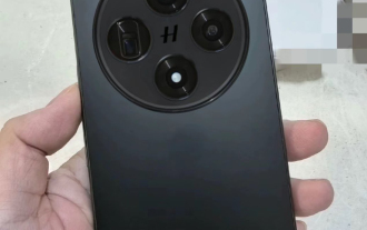 Oppo Find X8 design looks like a cross between Apple iPhone 16 Pro and OnePlus Open in early images
Sep 28, 2024 am 06:04 AM
Historically, Oppo has refreshed its flagship 'Find X' series in late winter or early spring, save for the original Find X that it announced in June 2018. To that end, the Find X7 and Find X7 Ultra are barely more than six months old at this point. H
 Break or return from Java 8 stream forEach?
Feb 07, 2025 pm 12:09 PM
Java 8 introduces the Stream API, providing a powerful and expressive way to process data collections. However, a common question when using Stream is: How to break or return from a forEach operation? Traditional loops allow for early interruption or return, but Stream's forEach method does not directly support this method. This article will explain the reasons and explore alternative methods for implementing premature termination in Stream processing systems. Further reading: Java Stream API improvements Understand Stream forEach The forEach method is a terminal operation that performs one operation on each element in the Stream. Its design intention is
 Lenovo reveals new color option for the 2024 Legion Y700 gaming tablet
Sep 29, 2024 am 06:05 AM
Lenovo is gearing up to launch the 2024 Legion Y700 on September 29 in China. This new Android gaming tablet will be going against the RedMagic Nova, and the company has already confirmed almost all the specs of the device. Now, hours before the full
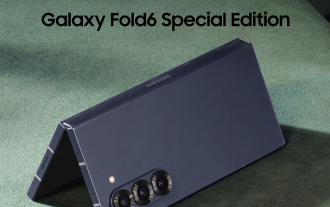 Samsung Galaxy Z Fold Special Edition revealed to land in late October as conflicting name emerges
Oct 01, 2024 am 06:21 AM
The launch of Samsung's long-awaited 'Special Edition' foldable has taken another twist. In recent weeks, rumours about the so-called Galaxy Z Fold Special Edition went rather quiet. Instead, the focus has shifted to the Galaxy S25 series, including
 Java Program to Find the Volume of Capsule
Feb 07, 2025 am 11:37 AM
Capsules are three-dimensional geometric figures, composed of a cylinder and a hemisphere at both ends. The volume of the capsule can be calculated by adding the volume of the cylinder and the volume of the hemisphere at both ends. This tutorial will discuss how to calculate the volume of a given capsule in Java using different methods. Capsule volume formula The formula for capsule volume is as follows: Capsule volume = Cylindrical volume Volume Two hemisphere volume in, r: The radius of the hemisphere. h: The height of the cylinder (excluding the hemisphere). Example 1 enter Radius = 5 units Height = 10 units Output Volume = 1570.8 cubic units explain Calculate volume using formula: Volume = π × r2 × h (4
 Create the Future: Java Programming for Absolute Beginners
Oct 13, 2024 pm 01:32 PM
Java is a popular programming language that can be learned by both beginners and experienced developers. This tutorial starts with basic concepts and progresses through advanced topics. After installing the Java Development Kit, you can practice programming by creating a simple "Hello, World!" program. After you understand the code, use the command prompt to compile and run the program, and "Hello, World!" will be output on the console. Learning Java starts your programming journey, and as your mastery deepens, you can create more complex applications.
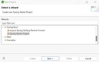 How to Run Your First Spring Boot Application in Spring Tool Suite?
Feb 07, 2025 pm 12:11 PM
Spring Boot simplifies the creation of robust, scalable, and production-ready Java applications, revolutionizing Java development. Its "convention over configuration" approach, inherent to the Spring ecosystem, minimizes manual setup, allo


