CSS3 rounded corners, shadow, transparent_html/css_WEB-ITnose
There are many ways to achieve rounded corners, shadows, and transparency in CSS. The traditional methods are more complicated. It is much more convenient to use CSS3. Although the support of CSS3 by various browsers is not very good now, CSS3 will be popular in the near future.
1. Rounded corners
There are two ways to implement rounded corners in CSS3.
The first is the background Image, traditional CSS can only have one background image for each element, but CSS3 can allow one element to have multiple background images. In this way, you can add 4 1/4 circle background images to an element, respectively located at the 4 corners. Rounded corners are achieved.
Html code
- .box {
- /* First define the 4 images to be used For the background image */
- background-image: url(/img/top-left.gif),
- > Url (/img/bottom- heft.gif),
- url (/img/bottom-right.gif); 🎜> background-repeat: no-repeat,
- 4 pictures are displayed on the 4 corners */ bottom left,
- bottom right;
- }
- The second method is simple and can be implemented directly with CSS without using images.
- Html code
- .box {
- /* Just define the radius of the fillet directly */
- border-radius: 1em;
- }
But the second method is not well supported yet. Currently, Firefox and Safari (Chrome with the same core can also be used) need to use the prefix
Html code
- .box {
- -moz-border-radius: 1em;
- -webkit -border-radius: 1em;
- border-radius: 1em;
2. Shadow
The box-shadow property of CSS3 can directly implement shadow- Html code
-
- img {
- -webkit-box-shadow: 3px 3px 6px #666;
- -moz-box-shadow: 3px 3px 6px #666;
- box-shadow: 3px 3px 6px #666;
- }
The four parameters of this attribute are: vertical offset, horizontal offset, and the width of the shadow (degree of blur), color
3. Transparency
CSS originally supports transparency. Browsers other than IE use the opacity attribute, and IE uses filter:alpha. But , this transparency has a disadvantage, that is, it will make the content of the application element also inherit it, such as a DIV,
Html code
- >
- Content
If the background of the DIV is transparent like the above, but the two characters of the content are also transparent, you can use RGBa.
Html Code
- .alert {
- rgba(0,0,0,0.8);
- }
The first three attributes of this attribute represent the colors red, green, and blue, and the fourth one is transparency. Red, green, and blue are all 0, which represents black, so rgba(0,0,0,0.8) sets the transparency of black to 0.8 .
CSS3 makes it easy to achieve effects that were originally difficult to achieve. I hope that all browsers will achieve perfect support for CSS3 as soon as possible.

Hot AI Tools

Undresser.AI Undress
AI-powered app for creating realistic nude photos

AI Clothes Remover
Online AI tool for removing clothes from photos.

Undress AI Tool
Undress images for free

Clothoff.io
AI clothes remover

AI Hentai Generator
Generate AI Hentai for free.

Hot Article

Hot Tools

Notepad++7.3.1
Easy-to-use and free code editor

SublimeText3 Chinese version
Chinese version, very easy to use

Zend Studio 13.0.1
Powerful PHP integrated development environment

Dreamweaver CS6
Visual web development tools

SublimeText3 Mac version
God-level code editing software (SublimeText3)

Hot Topics
 1377
1377
 52
52
 How to solve the black line problem of win11 transparent taskbar
Dec 22, 2023 pm 10:04 PM
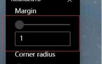
After many friends used translucenttb to set up a transparent taskbar, they found that there was a black line in the win11 transparent taskbar, which looked very uncomfortable. How should I solve it at this time? In fact, it can be solved in the software. There is a black line in the win11 transparent taskbar: Method 1: 1. According to user feedback, you can right-click translucenttb and open settings. 2. Then set the "margin" of the icon option to "1" to solve the problem. Method 2: 1. If it still doesn't work, you can right-click the blank space to open "Personalization" 2. Then select the system default theme to change it. Method three: 1. If all else fails, it is recommended that you uninstall translucenttb. 2. Then replace
 Detailed explanation of how to deal with all font shadows in Win10 computer
Jul 23, 2023 pm 11:13 PM
In the process of using the computer, some problems may occur due to improper operation and other situations. Recently, some netizens said that what to do with all the font shadows on their win10 computers, which affects viewing, and the icons on the desktop have shadows. The editor below will teach you how to clear all font shadows on your computer desktop. The specific steps are as follows: 1. First turn on the computer, enter the win+r key combination, open the run window, and enter gpedit.msc to confirm. 2. Find Enable ActiveDesktop, double-click it to open it, and disable it. 3. Next we need to open the disable ActiveDesktop button below, and then enable it. 4. Then open the system of the control panel, open its advanced system settings properties, and then enter the Properties
 How to solve the problem of a line on the taskbar transparency in Win11?
Jan 29, 2024 pm 12:12 PM
Many Win11 users will set their taskbar to be transparent when running the system, but many users will see a black line appear on the taskbar after setting it up. So what is going on? Users can use third-party software to set it up. Let this website carefully introduce to users the solution to the problem of a transparent line on the win11 taskbar. Solution to the problem of a transparent line on the win11 taskbar. Method 1: 1. According to user feedback, you can right-click translucenttb and open settings. 2. Then set the margin of the icon option to 1 to solve the problem. 2. Then select the system default theme and change it to solve the problem.
 How to set transparency in CSS
Nov 01, 2023 am 10:00 AM
CSS methods for setting transparency include opacity attribute, rgba color value, background-color attribute, using pseudo elements, etc. Detailed introduction: 1. Opacity attribute, by setting the opacity attribute of the element to achieve a transparent effect, the value range of this attribute is 0 to 1, 0 means completely transparent, 1 means completely opaque; 2. RGB color value, by setting the element's opacity The background color or text color is an rgba color value to achieve a transparent effect. The rgba color value consists of red, green, blue, transparency, etc.
 Graphical tutorial on making the win7 taskbar transparent
Jul 20, 2023 am 09:49 AM
Today, a group of users asked why their computers had no transparency effect after reinstalling Windows 7. In fact, this is caused by your computer not updating the graphics card driver in time and adjusting the Windows 7 Aero theme. You can set it up in the following ways. 1. First, you need to make sure that your computer has a new graphics card driver installed. You can use Driver Wizard or 360 Driver Master to update the graphics card driver online. . 2. Facing a blank space on the desktop, right-click, select Personalize and open. 3. Find the Aero theme here and select it. Under normal circumstances, you should be able to see the transparent glass effect. Do you understand the tutorial on how to make your win7 taskbar transparent? Students who don’t know how to do it, please do it quickly.
 How to set terminal transparency in Linux system?
Jan 07, 2024 am 10:21 AM
When Linux executes commands in the terminal, in order to make it difficult to see other help documents, such as PDFs, web pages, etc., you can set the terminal transparency. How to set it? Let’s take a look at the detailed tutorial below. . 1. Turn on window special effects 1. To set the transparency of the terminal, you need to turn on the window special effects first. First, click "Control Center" on the taskbar. 2. Click "Display" in the Control Center. 3. In "Display", make sure the "Turn on window effects" button is turned on. 4. In addition, you can also use the shortcut keys shift+win+tab to quickly open or close window effects. 2. Set transparency
 How to achieve the effect of adding shadow to element blocks in css
Sep 16, 2022 pm 05:08 PM
In CSS, you can use the box-shadow attribute to add shadow to an element block. The box-shadow attribute can realize the border shadow effect and apply the shadow to the box element. The syntax is "box-shadow: Horizontal shadow Vertical shadow Blur radius Expansion radius Shadow color Projection mode"; if the projection mode is set to "inset", inner shadow can be achieved.
 How to adjust the transparency of the Win11 taskbar
Jan 01, 2024 am 11:17 AM
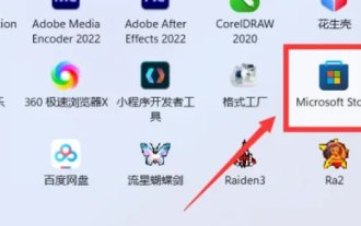
Many users like the transparent version of the page. Under the win11 system, users can also set up a transparent taskbar through some methods, so that the operation and appearance will look better. How to set the win11 taskbar to be transparent 1. Click the Start menu and then open the Microsoft Store. 2. Search for "TranslucentTB", then find the corresponding one and download it. 3. Click here to install. 4. After opening, select "desktop" and then click "clear".


