 Web Front-end
 HTML Tutorial
 Pure CSS implements the tooltip prompt box. The continuation of CSS arrows and shapes adds a border to the entire tooltip prompt box.
Pure CSS implements the tooltip prompt box. The continuation of CSS arrows and shapes adds a border to the entire tooltip prompt box.
This video introduces how to create tooltip-like tooltip boxes and arrow shapes using only CSS!
First introduce CSS: after selector
Definition and usage: (Refer to w3school:after selector)
: The after selector is inserted after the content of the selected element Content, use the content attribute to specify the content to be inserted
Example:
p:after
{
content:"台词:-";
background-color:yellow;
color:red;
font-weight:bold;
}Let’s introduce the use of: after selector to create CSS arrows and other prompt boxes: (Here will be a simple step by step The design added in each step is the extra style code content in the previous step. Pay attention to the difference! )
First, our HTML code:
<body>
<div class="demo">
</div>
</body>
Let’s set this Box style:
<style>
.demo{
background-color: lightgreen;
height: 100px;
position: relative;
width: 100px;
}</style>Screenshot:
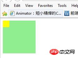
It should be noted here that we set the position attribute to relative to allow us to set our "arrow" (Not yet) Absolutely position it and keep it connected to our box!
Then we continue to insert the "arrow" (not yet appeared) basic style:
<style>
.demo{
background-color: lightgreen;
height: 100px;
position: relative;
width: 100px;
}
.demo:after{
content:'';
position:absolute;
height:20px;
width:20px;
background:yellow;
}</style>Screenshot:

You will Notice a few things, first, we only inserted a yellow square, that is the square we will design as an arrow; second, we set absolute positioning so that we can move it to the position we want!
Continue, set a border for the yellow square (the predecessor of "arrow"). The border here is the entity of the arrow, and remove the content of the yellow square (by setting the style "height:0" in demo:after ;width:0" to remove the yellow square, here we omit the height and width of the yellow square):
<style>
.demo{
background-color: lightgreen;
height: 100px;
position: relative;
width: 100px;
}
.demo:after{
content:'';
position:absolute;
//height:20px;
//width:20px;
background:yellow;
border:10px solid gray;
}</style>Screenshot:
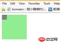
Now add The gray border square is designed in the form of an arrow:
<style>
.demo{
background-color: lightgreen;
height: 100px;
position: relative;
width: 100px;
}
.demo:after{
content:'';
position:absolute;
//height:20px;
//width:20px;
//background:yellow;
//border:10px solid gray;
border:10px solid transparent;
border-top-color:gray }
</style>Screenshot:
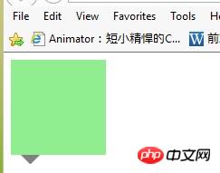
OK! We can see the arrow taking shape!
Let’s set its position as we want (in this case the arrow moves to the lower end):
<style>
.demo{
background-color: lightgreen;
height: 100px;
position: relative;
width: 100px;
}
.demo:after{
content:'';
position:absolute;
//height:20px;
//width:20px;
//background:yellow;
//border:10px solid gray;
border:10px solid transparent;
border-top-color:gray;
top:100%;
left:10px;
}</style>Screenshot:

This is basically done
The overall style design is as follows (in fact, the background color of the box is changed to be the same as the arrow color):
<style>
.demo{
background-color: gray;
height: 100px;
position: relative;
width: 100px;
}
.demo:after{
content:'';
position:absolute;
//height:20px;
//width:20px;
//background:yellow;
//border:10px solid gray;
border:10px solid transparent;
border-top-color:gray;
top:100%;
left:10px;
}</style>Screenshot:
You can set the specific style you need! For example, to move the arrow to the other three sides, you can set border-TRBL-color:gray; and TRBL (TRBL refers to toprightbottomleft)!
Of course, when you want to modify the position of the arrow on the box border, you also need to pay attention: the size of the border is not included in the size of the box itself! Therefore, you need to pay attention to the influence of margin when designing. For example, if the arrow is centered in the lower border, we consider the above and also need to add: "margin-left:-10px;" to be centered!
The conclusion comes from the comments of yy Duckweed Life (concise image~~haha~~):
The design principle of this example: Set the width and height of the pseudo-class selector box to 0, over there The area formed by the border looks like [X], and the other three sides are transparent, so a triangle is displayed!
Source of this article: https://www.cnblogs.com/xuyongsky1234/p/4152853.html

Hot AI Tools

Undresser.AI Undress
AI-powered app for creating realistic nude photos

AI Clothes Remover
Online AI tool for removing clothes from photos.

Undress AI Tool
Undress images for free

Clothoff.io
AI clothes remover

AI Hentai Generator
Generate AI Hentai for free.

Hot Article

Hot Tools

Notepad++7.3.1
Easy-to-use and free code editor

SublimeText3 Chinese version
Chinese version, very easy to use

Zend Studio 13.0.1
Powerful PHP integrated development environment

Dreamweaver CS6
Visual web development tools

SublimeText3 Mac version
God-level code editing software (SublimeText3)

Hot Topics
 1378
1378
 52
52
 What is the purpose of the <progress> element?
Mar 21, 2025 pm 12:34 PM
The article discusses the HTML <progress> element, its purpose, styling, and differences from the <meter> element. The main focus is on using <progress> for task completion and <meter> for stati
 What is the purpose of the <datalist> element?
Mar 21, 2025 pm 12:33 PM
The article discusses the HTML <datalist> element, which enhances forms by providing autocomplete suggestions, improving user experience and reducing errors.Character count: 159
 What are the best practices for cross-browser compatibility in HTML5?
Mar 17, 2025 pm 12:20 PM
Article discusses best practices for ensuring HTML5 cross-browser compatibility, focusing on feature detection, progressive enhancement, and testing methods.
 What is the purpose of the <meter> element?
Mar 21, 2025 pm 12:35 PM
The article discusses the HTML <meter> element, used for displaying scalar or fractional values within a range, and its common applications in web development. It differentiates <meter> from <progress> and ex
 How do I use HTML5 form validation attributes to validate user input?
Mar 17, 2025 pm 12:27 PM
The article discusses using HTML5 form validation attributes like required, pattern, min, max, and length limits to validate user input directly in the browser.
 What is the viewport meta tag? Why is it important for responsive design?
Mar 20, 2025 pm 05:56 PM
The article discusses the viewport meta tag, essential for responsive web design on mobile devices. It explains how proper use ensures optimal content scaling and user interaction, while misuse can lead to design and accessibility issues.
 What is the purpose of the <iframe> tag? What are the security considerations when using it?
Mar 20, 2025 pm 06:05 PM
The article discusses the <iframe> tag's purpose in embedding external content into webpages, its common uses, security risks, and alternatives like object tags and APIs.
 Gitee Pages static website deployment failed: How to troubleshoot and resolve single file 404 errors?
Apr 04, 2025 pm 11:54 PM
GiteePages static website deployment failed: 404 error troubleshooting and resolution when using Gitee...


