
 Web Front-end
HTML Tutorial
Negative margin realizes adaptive div left and right layout_html/css_WEB-ITnose
Web Front-end
HTML Tutorial
Negative margin realizes adaptive div left and right layout_html/css_WEB-ITnose
Negative margin realizes adaptive div left and right layout_html/css_WEB-ITnose

左右排版本来是可以这样实现的:两边都使用百分比,然后左右浮动。但是这样做满足不了下面这样的场景:
在一个文章页面里面,分为左边的正文区域和右边的与文章关联的其他信息区域,我想让正文区域能随着用户的显示屏宽度变化而变化,这似乎百分比就能做到,但是如果使用百分比,左右两边都必须有一个固定的比值,那样右边也会随着用户显示屏的宽度变化,如果用户的显示屏很宽,那这右边就显得似乎国语宽了,正文无论多款是无所谓的,但是侧边最好是一个固定值。
就像这种右图所示效果:
也就是说我需要一个左边自适应,而右边固定的左右布局,或者说某一边固定,另一边占据剩余部分,该如何做呢?
我找到的最好的答案是使用负margin(配合浮动),下面概括一下原理:可以500%提高开发效率的前端UI框架!
使用负margin可以使当前的div左边能容纳下面的div浮动上来,因此把右边的div摆在前面,左边的摆后面,右边的使用负margin就能让左边的浮上来,这样就遮住了右边的左半部分,只要右边再内部使用一个div,外左边距为左边的宽度就实现了左右的排版。
1、左边固定,右边自适应
(1)右边使用margin-left值为200(刚好是左边的宽度)的宽度,那么左边就刚好能浮动上来。为什么说浮动上来呢,因为如果没有这个margin: 0 0 0 -200px;由于右边的宽度是100%,因此左边肯定是排在下面的。
(2)左边虽然能浮动上来,但是右边和左边的内容是有重叠的
所以你还需要绿色部分的代码,右边再内部使用一个div,外左边距为左边的宽度
这是右边部分
这是左边部分
这个产生的效果如下图:(图片区域宽度固定的,但是文字是占据这个div的剩余部分,这里右边没有紧贴边框是因为父div有较大padding的原因没能挤满,不要受误导)。可以500%提高开发效率的前端UI框架!
提示:真正在实现的时候好像没必要左边必须写在后面,我试过,即使按从左到右书写也是可以的,但是很多大型网站都是反着写,我就按正规的来讲了。
2、右边固定,左边自适应
跟上一个最大的不同点就是,左右两个div容器的代码的前后位置换了,原因就是"float:rihgt"一定要在"float:left"前面。
.代码
-
- 这是右边部分
- 这是左边部分
3. Each of the left and right accounts for a certain percentage, this is simple, change any of the above to 200px A ratio of 20% is achieved.
.code
-
- This is the right side Section
- This is the left part
4. Add one more column to achieve a three-column layout on the left, middle and right. All we need to do is add another column, and the float is right and there are some empty spaces. Here is a proportional example
. Code
- right; margin: 0 0 0 -40%; width: 100%;">
- This is the right part
-
- This is the left part
-
- This is the middle part
5. To achieve the effect of a frame page (scroll bars can appear on the left and right respectively, and there are no scroll bars on the page): Just add position: absolute; overflow: scroll; height to the left and right divs. : 100%; Add left: 200px; to the left. That’s it. Absolute positioning is used here, so the float attribute can be eliminated. A front-end UI framework that can improve development efficiency by 500%!
.code
-
- This is the right part
-
- This is the left part
- < ;/div>

Hot AI Tools

Undresser.AI Undress
AI-powered app for creating realistic nude photos

AI Clothes Remover
Online AI tool for removing clothes from photos.

Undress AI Tool
Undress images for free

Clothoff.io
AI clothes remover

AI Hentai Generator
Generate AI Hentai for free.

Hot Article
Hot Tools

Notepad++7.3.1
Easy-to-use and free code editor

SublimeText3 Chinese version
Chinese version, very easy to use

Zend Studio 13.0.1
Powerful PHP integrated development environment

Dreamweaver CS6
Visual web development tools

SublimeText3 Mac version
God-level code editing software (SublimeText3)
Hot Topics
 1377
1377
 52
52

 What are the operating skills for excel typesetting?
Mar 20, 2024 pm 05:01 PM
What are the operating skills for excel typesetting?
Mar 20, 2024 pm 05:01 PM
In order to achieve the visual effect of the entire document, both word and excel files need to be typed. However, many novice friends do not know how to perform excel typesetting. Below, we will share some typesetting operation skills, hoping to give you some Inspiration on operational skills! 1. First, we create and open an excel form and enter some simple content to facilitate demonstration operations. 2. We find the print preview function menu in the menu bar above the file. 3. Click the print preview function, and we find that the table is asymmetrical when it is not typeset. We need to find the page setup function in the menu bar above the document. 4. Click Page Settings and find the margin function in the function menu that opens. 5. Click
 How to configure content adaptive brightness on Windows 11
Apr 14, 2023 pm 12:37 PM
How to configure content adaptive brightness on Windows 11
Apr 14, 2023 pm 12:37 PM
Adaptive brightness is a feature on Windows 11 computers that adjusts the brightness level of your screen based on the content being displayed or lighting conditions. Since some users are still getting used to Windows 11's new interface, Adaptive Brightness can't be easily found, and some even say the Adaptive Brightness feature is missing on Windows 11, so this tutorial will clear it all up. For example, if you're watching a YouTube video and the video suddenly shows a dark scene, Adaptive Brightness will make the screen brighter and increase the contrast level. This is different from auto-brightness, which is a screen setting that allows your computer, smartphone, or device to adjust brightness levels based on ambient lighting. There is a special one in the front camera
 Analysis and solutions to the causes of misaligned typography in WordPress
Mar 05, 2024 am 11:45 AM
Analysis and solutions to the causes of misaligned typography in WordPress
Mar 05, 2024 am 11:45 AM
Analysis of causes and solutions to misaligned typography in WordPress When building a website using WordPress, you may encounter misaligned typography, which will affect the overall beauty and user experience of the website. There are many reasons for typography misalignment, which may be caused by theme compatibility issues, plug-in conflicts, CSS style conflicts, etc. This article will analyze common causes of misaligned typography in WordPress and provide some solutions, including specific code examples. 1. Reason Analysis Theme Compatibility Issues: Some WordPress
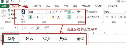 Basic operations of excel table layout
Mar 20, 2024 pm 03:50 PM
Basic operations of excel table layout
Mar 20, 2024 pm 03:50 PM
When everyone uses Excel for data processing, it is indispensable to format and beautify the data, so that it will be more beautiful when shown to others or printed out. Today I will introduce to you the basic operations of excel table formatting. I hope it will be helpful to those who have just started learning. Help for those new to Excel. 1. First select the text - click Start - typesetting the table text: Generally, the title font size is set to 14~16, black Song font, bold, and centered; the main text is generally set to 12 size, Song font, centered. Tips: If the content is small, you can set a larger font. 2. Set the appropriate row height and column width: Select the entire table - drag to uniformly adjust the row height and column width. You can also click Start - Format - Set the row height and column width - For the title row or
 How to use css to realize that a div is missing a corner
Jan 30, 2023 am 09:23 AM
How to use css to realize that a div is missing a corner
Jan 30, 2023 am 09:23 AM
CSS method to realize that a div is missing a corner: 1. Create an HTML sample file and define a div; 2. Set the width and height background color for the div; 3. Add a pseudo class to the div that needs to delete a corner, and set the pseudo class to Use the same color as the background color, then rotate it 45 degrees, and then position it to the corner that needs to be removed.
 Discuz Editor: an efficient post layout tool
Mar 10, 2024 am 09:42 AM
Discuz Editor: an efficient post layout tool
Mar 10, 2024 am 09:42 AM
Discuz Editor: An efficient post layout tool. With the development of the Internet, online forums have become an important platform for people to communicate and share information. In the forum, users can not only express their opinions and ideas, but also discuss and interact with others. When publishing a post, a clear and beautiful format can often attract more readers and convey more accurate information. In order to facilitate users to quickly type and edit posts, the Discuz editor came into being and became an efficient post typesetting tool. Discu
 CSS Positions layout method to implement responsive image layout
Sep 26, 2023 pm 01:37 PM
CSS Positions layout method to implement responsive image layout
Sep 26, 2023 pm 01:37 PM
CSSPositions layout method to implement responsive image layout In modern web development, responsive design has become an essential skill. In responsive design, image layout is one of the important considerations. This article will introduce how to use CSSPositions layout to implement responsive image layout and provide specific code examples. CSSPositions is a layout method of CSS that allows us to position elements arbitrarily in the web page as needed. In responsive image layout,
 How to build an adaptive mobile interface with Vue?
Jun 27, 2023 am 11:05 AM
How to build an adaptive mobile interface with Vue?
Jun 27, 2023 am 11:05 AM
With the popularity of mobile Internet, more and more websites and applications need to consider the mobile experience. As a popular front-end framework, Vue has responsive layout and adaptive capabilities, which can well help us build adaptive mobile interfaces. This article will introduce how to use Vue to build an adaptive mobile interface. Using rem instead of px as the unit and using px as the unit in the mobile interface may result in inconsistent display effects on different devices. Therefore, it is recommended to use rem instead of px as the unit. rem is relative
