
 Web Front-end
HTML Tutorial
A stunning animated back-painting special effect implemented in pure CSS3_html/css_WEB-ITnose
Web Front-end
HTML Tutorial
A stunning animated back-painting special effect implemented in pure CSS3_html/css_WEB-ITnose
A stunning animated back-painting special effect implemented in pure CSS3_html/css_WEB-ITnose

I have introduced to you many special effects implemented by pure CSS3 before. Today I’m going to bring you another stunning animated back-painting special effect implemented purely in CSS3. The code is very simple and does not reference any other js code. There is not much css code either. The effect is very cool. Let’s take a look at the renderings:
Online preview Source code download
Implemented code.
html code:
<div class='fake-gif'> <span class='stripe'></span><span class='stripe'></span><span class='stripe'></span> <span class='stripe'></span><span class='stripe'></span><span class='stripe'></span> <span class='stripe'></span><span class='stripe'></span><span class='stripe'></span> <span class='stripe'></span><span class='stripe'></span><span class='stripe'></span> <span class='stripe'></span><span class='stripe'></span><span class='stripe'></span> <span class='stripe'></span><span class='stripe'></span><span class='stripe'></span> <span class='stripe'></span><span class='stripe'></span><span class='stripe'></span> <span class='stripe'></span><span class='stripe'></span><span class='stripe'></span> <span class='stripe'></span><span class='stripe'></span> </div>
css3 code:
body{ background: #000; -webkit-perspective:35px; -moz-perspective:35px; -ms-perspective:35px; -o-perspective:35px; perspective:35px; -webkit-transform-style:preserve-3d; -moz-transform-style:preserve-3d; -ms-transform-style:preserve-3d; -o-transform-style:preserve-3d; transform-style:preserve-3d; -webkit-transform: rotateX(45deg) rotateY(0deg) rotateZ(45deg); -moz-transform:rotateX(45deg) rotateY(0deg) rotateZ(45deg); -ms-transform:rotateX(45deg) rotateY(0deg) rotateZ(45deg); -o-transform:rotateX(45deg) rotateY(0deg) rotateZ(45deg); transform:rotateX(45deg) rotateY(0deg) rotateZ(45deg); } .fake-gif { position: relative; margin: 10rem auto 0 auto; width: 20rem; height: 20rem; }.fake-gif .stripe { position: absolute; border-radius: 50%; -webkit-box-shadow: 2px 2px 0 rgba(0, 0, 0, 0.3); box-shadow: 2px 2px 0 rgba(0, 0, 0, 0.3); -webkit-transform: translate3d(0px, 0px, 0px); transform: translate3d(0px, 0px, 0px);}.fake-gif .stripe:nth-child(odd) { left: 0; width: 100%; height: 5%;background-color: rgba(109, 60, 209, 0.5);box-shadow: 0px 6px 40px #5800FF, inset 0px 2px 5px #DF00FF;}.fake-gif .stripe:nth-child(even) { top: 0; width: 5%; height: 100%; background-color: rgba(0, 240, 40, 0.5);box-shadow: 0px 6px 40px #007D35, inset 0px 2px 5px #7CFFB5;}.fake-gif .stripe:nth-child(4n+1) { z-index: 3;}.fake-gif .stripe:nth-child(4n+2) { z-index: 4;}.fake-gif .stripe:nth-child(4n+3) { z-index: 1;}.fake-gif .stripe:nth-child(4n) { z-index: 2;}.fake-gif .stripe:nth-child(2) { left: 4.7%; -webkit-animation: move-y 2.7s 0.2s infinite; animation: move-y 2.7s 0.2s infinite;}.fake-gif .stripe:nth-child(4) { left: 11.9%; -webkit-animation: move-y 2.7s 0.4s infinite; animation: move-y 2.7s 0.4s infinite;}.fake-gif .stripe:nth-child(6) { left: 19.1%; -webkit-animation: move-y 2.7s 0.6s infinite; animation: move-y 2.7s 0.6s infinite;}.fake-gif .stripe:nth-child(8) { left: 26.3%; -webkit-animation: move-y 2.7s 0.8s infinite; animation: move-y 2.7s 0.8s infinite;}.fake-gif .stripe:nth-child(10) { left: 33.5%; -webkit-animation: move-y 2.7s 1s infinite; animation: move-y 2.7s 1s infinite;}.fake-gif .stripe:nth-child(12) { left: 40.7%; -webkit-animation: move-y 2.7s 1.2s infinite; animation: move-y 2.7s 1.2s infinite;}.fake-gif .stripe:nth-child(14) { left: 47.9%; -webkit-animation: move-y 2.7s 1.4s infinite; animation: move-y 2.7s 1.4s infinite;}.fake-gif .stripe:nth-child(16) { left: 55.1%; -webkit-animation: move-y 2.7s 1.6s infinite; animation: move-y 2.7s 1.6s infinite;}.fake-gif .stripe:nth-child(18) { left: 62.3%; -webkit-animation: move-y 2.7s 1.8s infinite; animation: move-y 2.7s 1.8s infinite;}.fake-gif .stripe:nth-child(20) { left: 69.5%; -webkit-animation: move-y 2.7s 2s infinite; animation: move-y 2.7s 2s infinite;}.fake-gif .stripe:nth-child(22) { left: 76.7%; -webkit-animation: move-y 2.7s 2.2s infinite; animation: move-y 2.7s 2.2s infinite;}.fake-gif .stripe:nth-child(24) { left: 83.9%; -webkit-animation: move-y 2.7s 2.4s infinite; animation: move-y 2.7s 2.4s infinite;}.fake-gif .stripe:nth-child(26) { left: 91.1%; -webkit-animation: move-y 2.7s 2.6s infinite; animation: move-y 2.7s 2.6s infinite;}.fake-gif .stripe:nth-child(1) { top: 3.6%; -webkit-animation: move-x 2.7s 0.1s infinite; animation: move-x 2.7s 0.1s infinite;}.fake-gif .stripe:nth-child(3) { top: 10.8%; -webkit-animation: move-x 2.7s 0.3s infinite; animation: move-x 2.7s 0.3s infinite;}.fake-gif .stripe:nth-child(5) { top: 18%; -webkit-animation: move-x 2.7s 0.5s infinite; animation: move-x 2.7s 0.5s infinite;}.fake-gif .stripe:nth-child(7) { top: 25.2%; -webkit-animation: move-x 2.7s 0.7s infinite; animation: move-x 2.7s 0.7s infinite;}.fake-gif .stripe:nth-child(9) { top: 32.4%; -webkit-animation: move-x 2.7s 0.9s infinite; animation: move-x 2.7s 0.9s infinite;}.fake-gif .stripe:nth-child(11) { top: 39.6%; -webkit-animation: move-x 2.7s 1.1s infinite; animation: move-x 2.7s 1.1s infinite;}.fake-gif .stripe:nth-child(13) { top: 46.8%; -webkit-animation: move-x 2.7s 1.3s infinite; animation: move-x 2.7s 1.3s infinite;}.fake-gif .stripe:nth-child(15) { top: 54%; -webkit-animation: move-x 2.7s 1.5s infinite; animation: move-x 2.7s 1.5s infinite;}.fake-gif .stripe:nth-child(17) { top: 61.2%; -webkit-animation: move-x 2.7s 1.7s infinite; animation: move-x 2.7s 1.7s infinite;}.fake-gif .stripe:nth-child(19) { top: 68.4%; -webkit-animation: move-x 2.7s 1.9s infinite; animation: move-x 2.7s 1.9s infinite;}.fake-gif .stripe:nth-child(21) { top: 75.6%; -webkit-animation: move-x 2.7s 2.1s infinite; animation: move-x 2.7s 2.1s infinite;}.fake-gif .stripe:nth-child(23) { top: 82.8%; -webkit-animation: move-x 2.7s 2.3s infinite; animation: move-x 2.7s 2.3s infinite;}.fake-gif .stripe:nth-child(25) { top: 90%; -webkit-animation: move-x 2.7s 2.5s infinite; animation: move-x 2.7s 2.5s infinite;}@-webkit-keyframes move-y { 0%, 100% { -webkit-transform: translateZ(-25px); transform: translateZ(-25px); } 50% { -webkit-transform: translateZ(25px); transform: translateZ(25px); }}@-webkit-keyframes move { 0%, 100% { -webkit-transform: rotateX(-25deg) rotateY(-25deg); transform: rotateX(-25deg) rotateY(-25deg); } 50% { -webkit-transform: rotateX(25px) rotateY(25deg); transform: rotateX(25px) rotateY(25deg); }}@keyframes move-y { 0%, 100% { -webkit-transform: translateY(-25%); transform: translateY(-25%); } 50% { -webkit-transform: translateY(25%); transform: translateY(25%); }}@-webkit-keyframes move-x { 0%, 100% { -webkit-transform: translateZ(-25px); transform: translateZ(-25px); } 50% { -webkit-transform: translateZ(25px); transform: translateZ(25px); }}@keyframes move-x { 0%, 100% { -webkit-transform: translateX(-25%); transform: translateX(-25%); } 50% { -webkit-transform: translateX(25%); transform: translateX(25%); }}

Hot AI Tools

Undresser.AI Undress
AI-powered app for creating realistic nude photos

AI Clothes Remover
Online AI tool for removing clothes from photos.

Undress AI Tool
Undress images for free

Clothoff.io
AI clothes remover

AI Hentai Generator
Generate AI Hentai for free.

Hot Article
Hot Tools

Notepad++7.3.1
Easy-to-use and free code editor

SublimeText3 Chinese version
Chinese version, very easy to use

Zend Studio 13.0.1
Powerful PHP integrated development environment

Dreamweaver CS6
Visual web development tools

SublimeText3 Mac version
God-level code editing software (SublimeText3)
Hot Topics
 1374
1374
 52
52

 CSS Animation: How to Achieve the Flash Effect of Elements
Nov 21, 2023 am 10:56 AM
CSS Animation: How to Achieve the Flash Effect of Elements
Nov 21, 2023 am 10:56 AM
CSS animation: How to achieve the flash effect of elements, specific code examples are needed. In web design, animation effects can sometimes bring a good user experience to the page. The glitter effect is a common animation effect that can make elements more eye-catching. The following will introduce how to use CSS to achieve the flash effect of elements. 1. Basic implementation of flash First, we need to use the animation property of CSS to achieve the flash effect. The value of the animation attribute needs to specify the animation name, animation execution time, and animation delay time
![Animation not working in PowerPoint [Fixed]](https://img.php.cn/upload/article/000/887/227/170831232982910.jpg?x-oss-process=image/resize,m_fill,h_207,w_330) Animation not working in PowerPoint [Fixed]
Feb 19, 2024 am 11:12 AM
Animation not working in PowerPoint [Fixed]
Feb 19, 2024 am 11:12 AM
Are you trying to create a presentation but can't add animation? If animations are not working in PowerPoint on your Windows PC, then this article will help you. This is a common problem that many people complain about. For example, animations may stop working during presentations in Microsoft Teams or during screen recordings. In this guide, we will explore various troubleshooting techniques to help you fix animations not working in PowerPoint on Windows. Why aren't my PowerPoint animations working? We have noticed that some possible reasons that may cause the animation in PowerPoint not working issue on Windows are as follows: Due to personal
 How to use Vue to implement pop-up window effects
Sep 22, 2023 am 09:40 AM
How to use Vue to implement pop-up window effects
Sep 22, 2023 am 09:40 AM
How to use Vue to implement pop-up window effects requires specific code examples. In recent years, with the development of web applications, pop-up window effects have become one of the commonly used interaction methods among developers. As a popular JavaScript framework, Vue provides rich functions and ease of use, and is very suitable for implementing pop-up window effects. This article will introduce how to use Vue to implement pop-up window effects and provide specific code examples. First, we need to create a new Vue project using Vue's CLI tool. open end
 How to set up ppt animation to enter first and then exit
Mar 20, 2024 am 09:30 AM
How to set up ppt animation to enter first and then exit
Mar 20, 2024 am 09:30 AM
We often use ppt in our daily work, so are you familiar with every operating function in ppt? For example: How to set animation effects in ppt, how to set switching effects, and what is the effect duration of each animation? Can each slide play automatically, enter and then exit the ppt animation, etc. In this issue, I will first share with you the specific steps of entering and then exiting the ppt animation. It is below. Friends, come and take a look. Look! 1. First, we open ppt on the computer, click outside the text box to select the text box (as shown in the red circle in the figure below). 2. Then, click [Animation] in the menu bar and select the [Erase] effect (as shown in the red circle in the figure). 3. Next, click [
 How to use Vue to implement full-screen mask effects
Sep 19, 2023 pm 04:14 PM
How to use Vue to implement full-screen mask effects
Sep 19, 2023 pm 04:14 PM
How to use Vue to implement full-screen masking effects. In web development, we often encounter scenarios that require full-screen masking, such as displaying a masking layer when loading data to prevent users from performing other operations, or in some special scenarios. Use a mask layer to highlight an element. Vue is a popular JavaScript framework that provides convenient tools and components to achieve various effects. In this article, I will introduce how to use Vue to achieve the effect of full-screen masking, and provide some specific code examples. At first, we
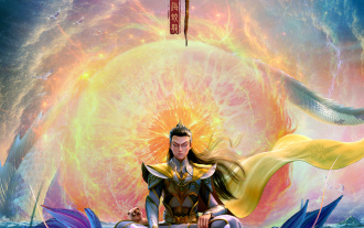 After a two-year delay, the domestic 3D animated film 'Er Lang Shen: The Deep Sea Dragon' is scheduled to be released on July 13
Jan 26, 2024 am 09:42 AM
After a two-year delay, the domestic 3D animated film 'Er Lang Shen: The Deep Sea Dragon' is scheduled to be released on July 13
Jan 26, 2024 am 09:42 AM
This website reported on January 26 that the domestic 3D animated film "Er Lang Shen: The Deep Sea Dragon" released a set of latest stills and officially announced that it will be released on July 13. It is understood that "Er Lang Shen: The Deep Sea Dragon" is produced by Mihuxing (Beijing) Animation Co., Ltd., Horgos Zhonghe Qiancheng Film Co., Ltd., Zhejiang Hengdian Film Co., Ltd., Zhejiang Gongying Film Co., Ltd., Chengdu The animated film produced by Tianhuo Technology Co., Ltd. and Huawen Image (Beijing) Film Co., Ltd. and directed by Wang Jun was originally scheduled to be released in mainland China on July 22, 2022. Synopsis of the plot of this site: After the Battle of the Conferred Gods, Jiang Ziya took the "Conferred Gods List" to divide the gods, and then the Conferred Gods List was sealed by the Heavenly Court under the deep sea of Kyushu Secret Realm. In fact, in addition to conferring divine positions, there are also many powerful evil spirits sealed in the Conferred Gods List.
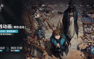 The final PV of the main animation 'Arknights: Winter Hidden Return' has been announced and will be launched on October 7
Sep 23, 2023 am 11:37 AM
The final PV of the main animation 'Arknights: Winter Hidden Return' has been announced and will be launched on October 7
Sep 23, 2023 am 11:37 AM
The content that needs to be rewritten on this site is: 9 The content that needs to be rewritten is: Month The content that needs to be rewritten is: 23 The content that needs to be rewritten is: Daily News, the main line drama of the second season of the animated series "Arknights" "Arknights: Winter Hidden Return" has announced its final release. The content that needs to be rewritten is: PV. The content that needs to be rewritten is: 10. The content that needs to be rewritten is: 7. The content that needs to be rewritten is: 7 The content is: The content that needs to be rewritten is: 00:23 The content that needs to be rewritten is: Officially launched, click here to enter the official website of the theme. The content that needs to be re-written is: This site has noticed that "Arknights: Winter Hidden Return" is the sequel to "Arknights: Prelude to Dawn". The plot summary is as follows: In order to prevent the infected, a group of
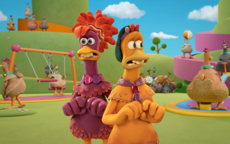 The final trailer for Netflix's claymation film 'Chicken Run 2” has been announced and will be released on December 15
Nov 20, 2023 pm 01:21 PM
The final trailer for Netflix's claymation film 'Chicken Run 2” has been announced and will be released on December 15
Nov 20, 2023 pm 01:21 PM
The final trailer for Netflix's claymation film "Chicken Run 2" has been released. The film is expected to be released on December 15. This site noticed that the trailer for "Chicken Run 2" shows Chicken Loki and King Kong. Jay launches an operation to find his daughter Molly. Molly is taken away by a truck at FunLand Farm, and Rocky and Ginger risk their lives to retrieve their daughter. The film is directed by Sam Fehr and stars Sandy Way Newton, Zachary Levi, Bella Ramsey, Imelda Staunton and David Bradley. It is understood that "Chicken Run 2" is the sequel to "Chicken Run" after more than 20 years. The first work was released in China on January 2, 2001. It tells the story of a group of chickens who face the fate of being turned into chicken pies in a chicken factory.
