 Web Front-end
 HTML Tutorial
 CSS3 image 3D flip effect (webpage effect updated daily)_html/css_WEB-ITnose
CSS3 image 3D flip effect (webpage effect updated daily)_html/css_WEB-ITnose
Today, we are bringing you a pure CSS3 effect - 3D flipping of images.
Please see the effect: http://localhost:63342/webfront/PC/rotate.html
This effect mainly uses the transform attribute of CSS3, which is different from the previous effect. , this time it is not an animation, so the animation attribute is not used, but the transition attribute is used. This attribute will switch the element between two effects and produce a transition effect. See the code for details.
HTML structure:
1 <div id="content"> 2 <div class="list"> 3 <img src="../Images/1.jpg"> 4 <div class="text"> 5 这是小狗哦!! 6 </div> 7 </div> 8 <div class="list"> 9 <img src="../Images/2.jpg">10 <div class="text">11 这是小狗哦!!12 </div>13 </div>14 </div>
CSS style:
1 <style type="text/css"> 2 *{margin:0px;padding:0px;} 3 #content{ 4 width:500px; 5 margin:30px auto; 6 } 7 .list{ 8 width:200px; 9 margin:25px;10 float:left;11 position:relative;12 }13 .list img{14 width:200px;15 height:200px;16 transform:perspective(200px) rotateY(0deg);17 opacity:1;18 transition:transform 600ms ease,opacity 600ms ease;19 -webkit-transition:transform 600ms ease,opacity 600ms ease;20 }21 .text{22 height:200px;23 width:200px;24 line-height:200px;25 background:#000;26 color:#fff;27 opacity:0;28 position:absolute;29 text-align:center;30 font-weight:bold;31 top:0px;32 left:0px;33 transform:perspective(200px) rotateY(-180deg);34 transition:transform 600ms ease,opacity 600ms ease;35 -webkit-transition:transform 600ms ease,opacity 600ms ease;36 }37 .list:hover img{38 transform:perspective(200px) rotateY(180deg);39 opacity:0;40 transition:transform 600ms ease,opacity 600ms ease;41 -webkit-transition:transform 600ms ease,opacity 600ms ease;42 }43 .list:hover .text{44 transform:perspective(200px) rotateY(0deg);45 opacity:1;46 transition:transform 600ms ease,opacity 600ms ease;47 -webkit-transition:transform 600ms ease,opacity 600ms ease;48 }49 </style>The code is easy to understand, start with the picture Set an initial rotation angle, since it is displayed first, so the angle is 180deg and the transparency is 1. As the mouse rolls over, change the angle and opacity to make it flip. And the words behind it are also true.
Enjoy the code, enjoy life, web page effects, updated daily.

Hot AI Tools

Undresser.AI Undress
AI-powered app for creating realistic nude photos

AI Clothes Remover
Online AI tool for removing clothes from photos.

Undress AI Tool
Undress images for free

Clothoff.io
AI clothes remover

Video Face Swap
Swap faces in any video effortlessly with our completely free AI face swap tool!

Hot Article

Hot Tools

Notepad++7.3.1
Easy-to-use and free code editor

SublimeText3 Chinese version
Chinese version, very easy to use

Zend Studio 13.0.1
Powerful PHP integrated development environment

Dreamweaver CS6
Visual web development tools

SublimeText3 Mac version
God-level code editing software (SublimeText3)

Hot Topics
 1386
1386
 52
52
 Users encounter rare glitches: Samsung Watch smartwatches suddenly experience white screen issues
Apr 03, 2024 am 08:13 AM
You may have encountered the problem of green lines appearing on the screen of your smartphone. Even if you have never seen it, you must have seen related pictures on the Internet. So, have you ever encountered a situation where the smart watch screen turns white? On April 2, CNMO learned from foreign media that a Reddit user shared a picture on the social platform, showing the screen of the Samsung Watch series smart watches turning white. The user wrote: "I was charging when I left, and when I came back, it was like this. I tried to restart, but the screen was still like this during the restart process." Samsung Watch smart watch screen turned white. The Reddit user did not specify the smart watch. Specific model. However, judging from the picture, it should be Samsung Watch5. Previously, another Reddit user also reported
 How to send web pages to desktop as shortcut in Edge browser?
Mar 14, 2024 pm 05:22 PM
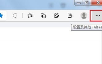
How to send web pages to the desktop as a shortcut in Edge browser? Many of our users want to display frequently used web pages on the desktop as shortcuts for the convenience of directly opening access pages, but they don’t know how to do it. In response to this problem, the editor of this issue will share the solution with the majority of users. , let’s take a look at the content shared in today’s software tutorial. The shortcut method of sending web pages to the desktop in Edge browser: 1. Open the software and click the "..." button on the page. 2. Select "Install this site as an application" in "Application" from the drop-down menu option. 3. Finally, click it in the pop-up window
 What should I do if the images on the webpage cannot be loaded? 6 solutions
Mar 15, 2024 am 10:30 AM
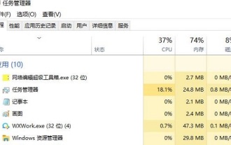
Some netizens found that when they opened the browser web page, the pictures on the web page could not be loaded for a long time. What happened? I checked that the network is normal, so where is the problem? The editor below will introduce to you six solutions to the problem that web page images cannot be loaded. Web page images cannot be loaded: 1. Internet speed problem The web page cannot display images. It may be because the computer's Internet speed is relatively slow and there are more softwares opened on the computer. And the images we access are relatively large, which may be due to loading timeout. As a result, the picture cannot be displayed. You can turn off the software that consumes more network speed. You can go to the task manager to check. 2. Too many visitors. If the webpage cannot display pictures, it may be because the webpages we visited were visited at the same time.
 Possible reasons why the network connection is normal but the browser cannot access the web page
Feb 19, 2024 pm 03:45 PM
The browser cannot open the web page but the network is normal. There are many possible reasons. When this problem occurs, we need to investigate step by step to determine the specific cause and solve the problem. First, determine whether the webpage cannot be opened is limited to a specific browser or whether all browsers cannot open the webpage. If only one browser cannot open the web page, you can try to use other browsers, such as Google Chrome, Firefox, etc., for testing. If other browsers are able to open the page correctly, the problem is most likely with that specific browser, possibly
 CLIP-BEVFormer: Explicitly supervise the BEVFormer structure to improve long-tail detection performance
Mar 26, 2024 pm 12:41 PM
Written above & the author’s personal understanding: At present, in the entire autonomous driving system, the perception module plays a vital role. The autonomous vehicle driving on the road can only obtain accurate perception results through the perception module. The downstream regulation and control module in the autonomous driving system makes timely and correct judgments and behavioral decisions. Currently, cars with autonomous driving functions are usually equipped with a variety of data information sensors including surround-view camera sensors, lidar sensors, and millimeter-wave radar sensors to collect information in different modalities to achieve accurate perception tasks. The BEV perception algorithm based on pure vision is favored by the industry because of its low hardware cost and easy deployment, and its output results can be easily applied to various downstream tasks.
 Kyushu Fengshen Assassin 4S Radiator Review Air-cooled 'Assassin Master' Style
Mar 28, 2024 am 11:11 AM
Speaking of ASSASSIN, I believe players will definitely think of the master assassins in "Assassin's Creed". They are not only skilled, but also have the creed of "devoting themselves to the darkness and serving the light". The ASSASSIN series of flagship air-cooled radiators from the appliance brand DeepCool coincide with each other. Recently, the latest product of this series, ASSASSIN4S, has been launched. "Assassin in Suit, Advanced" brings a new air-cooling experience to advanced players. The appearance is full of details. The Assassin 4S radiator adopts a double tower structure + a single fan built-in design. The outside is covered with a cube-shaped fairing, which has a strong overall sense. It is available in white and black colors to meet different colors. Tie
 What to do if the webpage cannot be opened
Feb 21, 2024 am 10:24 AM
How to solve the problem of web pages not opening With the rapid development of the Internet, people increasingly rely on the Internet to obtain information, communicate and entertain. However, sometimes we encounter the problem that the web page cannot be opened, which brings us a lot of trouble. This article will introduce you to some common methods to help solve the problem of web pages not opening. First, we need to determine why the web page cannot be opened. Possible reasons include network problems, server problems, browser settings problems, etc. Here are some solutions: Check network connection: First, we need
 The latest from Oxford University! Mickey: 2D image matching in 3D SOTA! (CVPR\'24)
Apr 23, 2024 pm 01:20 PM
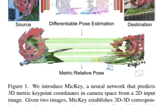
Project link written in front: https://nianticlabs.github.io/mickey/ Given two pictures, the camera pose between them can be estimated by establishing the correspondence between the pictures. Typically, these correspondences are 2D to 2D, and our estimated poses are scale-indeterminate. Some applications, such as instant augmented reality anytime, anywhere, require pose estimation of scale metrics, so they rely on external depth estimators to recover scale. This paper proposes MicKey, a keypoint matching process capable of predicting metric correspondences in 3D camera space. By learning 3D coordinate matching across images, we are able to infer metric relative


