
 Web Front-end
HTML Tutorial
Blooming flowers of CSS3 (webpage effects are updated daily)_html/css_WEB-ITnose
Web Front-end
HTML Tutorial
Blooming flowers of CSS3 (webpage effects are updated daily)_html/css_WEB-ITnose
Blooming flowers of CSS3 (webpage effects are updated daily)_html/css_WEB-ITnose

Today, we bring you an effect created purely with CSS3 - blooming flowers.
Let’s take a look at the effect first: http://webfront.verynet.cc/pc/flower.html
This is the effect created by pure CSS3 style. The key is The animation attribute and transform attribute are used. Please see the code below for details.
HTML structure:
1 <div class="div1"></div>2 <div class="div2"></div>3 <div class="div3"></div>4 <div class="div4"></div>5 <div class="div5"></div>6 <div class="div6"></div>7 <div class="div7"></div>8 <div class="div8"></div>9 <div class="div9"></div>
CSS style:
1 <style type="text/css"> 2 .div1{ 3 position:absolute; 4 top:300px;left:500px; 5 background:pink;opacity:0.6;width:300px;height:300px; 6 z-index: 1; 7 border-radius:300px 0px;; 8 -webkit-transform-origin: 0px 300px; 9 -webkit-transform: rotate(-45deg); 10 -webkit-animation:wa1 10s ease 2s infinite alternate; 11 transform-origin: 0px 300px; 12 transform: rotate(-45deg); 13 animation:a1 10s ease 2s infinite alternate; 14 } 15 .div2{ 16 position:absolute; 17 top:300px;left:500px; 18 background:pink;opacity:0.6;width:300px;height:300px; 19 z-index: 2; 20 border-radius:300px 0px;; 21 -webkit-transform-origin: 0px 300px; 22 -webkit-transform: rotate(-45deg); 23 -webkit-animation:wa2 10s ease 2s infinite alternate; 24 transform-origin: 0px 300px; 25 transform: rotate(-45deg); 26 animation:a2 10s ease 2s infinite alternate; 27 28 } 29 .div3{ 30 position:absolute; 31 top:300px;left:500px; 32 background:pink;opacity:0.6;width:300px;height:300px; 33 z-index: 3; 34 border-radius:300px 0px;; 35 -webkit-transform-origin: 0px 300px; 36 -webkit-transform: rotate(-45deg); 37 -webkit-animation:wa3 10s ease 2s infinite alternate; 38 transform-origin: 0px 300px; 39 transform: rotate(-45deg); 40 animation:a3 10s ease 2s infinite alternate; 41 } 42 .div4{ 43 position:absolute; 44 top:300px;left:500px; 45 background:pink;opacity:0.6;width:300px;height:300px; 46 z-index: 4; 47 border-radius:300px 0px;; 48 -webkit-transform-origin: 0px 300px; 49 -webkit-transform: rotate(-45deg); 50 -webkit-animation:wa4 10s ease 2s infinite alternate; 51 transform-origin: 0px 300px; 52 transform: rotate(-45deg); 53 animation:a4 10s ease 2s infinite alternate; 54 } 55 .div5{ 56 position:absolute; 57 top:300px;left:500px; 58 background:pink;opacity:0.6;width:300px;height:300px; 59 z-index: 5; 60 border-radius:300px 0px;; 61 -webkit-transform-origin: 0px 300px; 62 -webkit-transform: rotate(-45deg); 63 -webkit-animation:wa5 10s ease 2s infinite alternate; 64 transform-origin: 0px 300px; 65 transform: rotate(-45deg); 66 animation:a5 10s ease 2s infinite alternate; 67 } 68 .div6{ 69 position:absolute; 70 top:300px;left:500px; 71 background:pink;opacity:0.6;width:300px;height:300px; 72 z-index: 6; 73 border-radius:300px 0px;; 74 -webkit-transform-origin: 0px 300px; 75 -webkit-transform: rotate(-45deg); 76 -webkit-animation:wa6 10s ease 2s infinite alternate; 77 transform-origin: 0px 300px; 78 transform: rotate(-45deg); 79 animation:a6 10s ease 2s infinite alternate; 80 } 81 .div7{ 82 position:absolute; 83 top:300px;left:500px; 84 background:pink;opacity:0.6;width:300px;height:300px; 85 z-index: 7; 86 border-radius:300px 0px;; 87 -webkit-transform-origin: 0px 300px; 88 -webkit-transform: rotate(-45deg); 89 -webkit-animation:wa7 10s ease 2s infinite alternate; 90 transform-origin: 0px 300px; 91 transform: rotate(-45deg); 92 animation:a7 10s ease 2s infinite alternate; 93 } 94 .div8{ 95 position:absolute; 96 top:300px;left:500px; 97 background:pink;opacity:0.6;width:300px;height:300px; 98 z-index: 8; 99 border-radius:300px 0px;;100 -webkit-transform-origin: 0px 300px;101 -webkit-transform: rotate(-45deg);102 -webkit-animation:wa8 10s ease 2s infinite alternate;103 transform-origin: 0px 300px;104 transform: rotate(-45deg);105 animation:a8 10s ease 2s infinite alternate;106 }107 .div9{108 position:absolute;109 top:300px;left:500px;110 background:pink;opacity:0.6;width:300px;height:300px;111 z-index: 9;112 border-radius:300px 0px;;113 -webkit-transform-origin: 0px 300px;114 -webkit-transform: rotate(-45deg);115 transform-origin: 0px 300px;116 transform: rotate(-45deg);117 }118 @-webkit-keyframes wa1{119 from{-webkit-transform: rotate(-45deg);}120 to{-webkit-transform: rotate(-125deg);}121 }122 @keyframes a1{123 from{transform: rotate(-45deg);}124 to{transform: rotate(-125deg);}125 }126 @-webkit-keyframes wa2{127 from{-webkit-transform: rotate(-45deg);}128 to{-webkit-transform: rotate(-105deg);}129 }130 @keyframes a2{131 from{transform: rotate(-45deg);}132 to{transform: rotate(-105deg);}133 }134 @-webkit-keyframes wa3{135 from{-webkit-transform: rotate(-45deg);}136 to{-webkit-transform: rotate(-85deg);}137 }138 @keyframes a3{139 from{transform: rotate(-45deg);}140 to{transform: rotate(-85deg);}141 }142 @-webkit-keyframes wa7{143 from{-webkit-transform: rotate(-45deg);}144 to{-webkit-transform: rotate(-65deg);}145 }146 @keyframes a7{147 from{transform: rotate(-45deg);}148 to{transform: rotate(-65deg);}149 }150 @-webkit-keyframes wa4{151 from{-webkit-transform: rotate(-45deg);}152 to{-webkit-transform: rotate(35deg);}153 }154 @keyframes a4{155 from{transform: rotate(-45deg);}156 to{transform: rotate(35deg);}157 }158 @-webkit-keyframes wa5{159 from{-webkit-transform: rotate(-45deg);}160 to{-webkit-transform: rotate(15deg);}161 }162 @keyframes a5{163 from{transform: rotate(-45deg);}164 to{transform: rotate(15deg);}165 }166 @-webkit-keyframes wa6{167 from{-webkit-transform: rotate(-45deg);}168 to{-webkit-transform: rotate(-5deg);}169 }170 @keyframes a6{171 from{transform: rotate(-45deg);}172 to{transform: rotate(-5deg);}173 }174 @-webkit-keyframes wa8{175 from{-webkit-transform: rotate(-45deg);}176 to{-webkit-transform: rotate(-25deg);}177 }178 @keyframes a8{179 from{transform: rotate(-45deg);}180 to{transform: rotate(-25deg);}181 }182 </style>First, place a square box , control the rounded border through the border-radius attribute to show the effect of petals. Because the apex of the adjusted petal is at the upper right corner, we need to rotate it counterclockwise 45 degrees to make it vertical. Then, you need to define the animation effect. This example only configures webkit-based browsers and standard browsers. If you need to set compatibility with other browsers, you can change the animation effect, @keyfarmes, to -o-keyframes (Opera browser), @-moz- keyframes (FireFox browser), @-webkit-keyframes (Safari and Chrome browser). Once the animation is defined, it can be called. Just use animation: animation name. Here, the meaning of its parameters will not be introduced in detail. The editor feels that it should be left to the readers to understand on their own in order to be impressed.
Note: Among them, attributes such as transform attribute and transform-origin will cause compatibility issues for different browsers. Just add the corresponding browser private header, as above.
Enjoy the code, enjoy life, web page effects, updated daily.

Hot AI Tools

Undresser.AI Undress
AI-powered app for creating realistic nude photos

AI Clothes Remover
Online AI tool for removing clothes from photos.

Undress AI Tool
Undress images for free

Clothoff.io
AI clothes remover

AI Hentai Generator
Generate AI Hentai for free.

Hot Article
Hot Tools

Notepad++7.3.1
Easy-to-use and free code editor

SublimeText3 Chinese version
Chinese version, very easy to use

Zend Studio 13.0.1
Powerful PHP integrated development environment

Dreamweaver CS6
Visual web development tools

SublimeText3 Mac version
God-level code editing software (SublimeText3)
Hot Topics
 1378
1378
 52
52

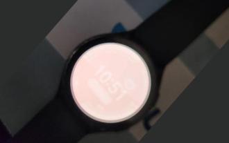 Users encounter rare glitches: Samsung Watch smartwatches suddenly experience white screen issues
Apr 03, 2024 am 08:13 AM
Users encounter rare glitches: Samsung Watch smartwatches suddenly experience white screen issues
Apr 03, 2024 am 08:13 AM
You may have encountered the problem of green lines appearing on the screen of your smartphone. Even if you have never seen it, you must have seen related pictures on the Internet. So, have you ever encountered a situation where the smart watch screen turns white? On April 2, CNMO learned from foreign media that a Reddit user shared a picture on the social platform, showing the screen of the Samsung Watch series smart watches turning white. The user wrote: "I was charging when I left, and when I came back, it was like this. I tried to restart, but the screen was still like this during the restart process." Samsung Watch smart watch screen turned white. The Reddit user did not specify the smart watch. Specific model. However, judging from the picture, it should be Samsung Watch5. Previously, another Reddit user also reported
 How to send web pages to desktop as shortcut in Edge browser?
Mar 14, 2024 pm 05:22 PM
How to send web pages to desktop as shortcut in Edge browser?
Mar 14, 2024 pm 05:22 PM
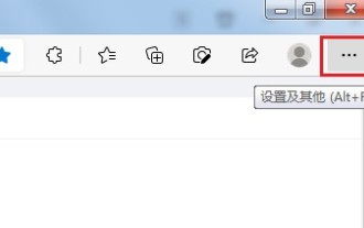
How to send web pages to the desktop as a shortcut in Edge browser? Many of our users want to display frequently used web pages on the desktop as shortcuts for the convenience of directly opening access pages, but they don’t know how to do it. In response to this problem, the editor of this issue will share the solution with the majority of users. , let’s take a look at the content shared in today’s software tutorial. The shortcut method of sending web pages to the desktop in Edge browser: 1. Open the software and click the "..." button on the page. 2. Select "Install this site as an application" in "Application" from the drop-down menu option. 3. Finally, click it in the pop-up window
 Possible reasons why the network connection is normal but the browser cannot access the web page
Feb 19, 2024 pm 03:45 PM
Possible reasons why the network connection is normal but the browser cannot access the web page
Feb 19, 2024 pm 03:45 PM
The browser cannot open the web page but the network is normal. There are many possible reasons. When this problem occurs, we need to investigate step by step to determine the specific cause and solve the problem. First, determine whether the webpage cannot be opened is limited to a specific browser or whether all browsers cannot open the webpage. If only one browser cannot open the web page, you can try to use other browsers, such as Google Chrome, Firefox, etc., for testing. If other browsers are able to open the page correctly, the problem is most likely with that specific browser, possibly
 What should I do if the images on the webpage cannot be loaded? 6 solutions
Mar 15, 2024 am 10:30 AM
What should I do if the images on the webpage cannot be loaded? 6 solutions
Mar 15, 2024 am 10:30 AM
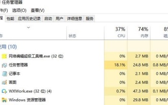
Some netizens found that when they opened the browser web page, the pictures on the web page could not be loaded for a long time. What happened? I checked that the network is normal, so where is the problem? The editor below will introduce to you six solutions to the problem that web page images cannot be loaded. Web page images cannot be loaded: 1. Internet speed problem The web page cannot display images. It may be because the computer's Internet speed is relatively slow and there are more softwares opened on the computer. And the images we access are relatively large, which may be due to loading timeout. As a result, the picture cannot be displayed. You can turn off the software that consumes more network speed. You can go to the task manager to check. 2. Too many visitors. If the webpage cannot display pictures, it may be because the webpages we visited were visited at the same time.
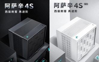 Kyushu Fengshen Assassin 4S Radiator Review Air-cooled 'Assassin Master' Style
Mar 28, 2024 am 11:11 AM
Kyushu Fengshen Assassin 4S Radiator Review Air-cooled 'Assassin Master' Style
Mar 28, 2024 am 11:11 AM
Speaking of ASSASSIN, I believe players will definitely think of the master assassins in "Assassin's Creed". They are not only skilled, but also have the creed of "devoting themselves to the darkness and serving the light". The ASSASSIN series of flagship air-cooled radiators from the appliance brand DeepCool coincide with each other. Recently, the latest product of this series, ASSASSIN4S, has been launched. "Assassin in Suit, Advanced" brings a new air-cooling experience to advanced players. The appearance is full of details. The Assassin 4S radiator adopts a double tower structure + a single fan built-in design. The outside is covered with a cube-shaped fairing, which has a strong overall sense. It is available in white and black colors to meet different colors. Tie
 What to do if the webpage cannot be opened
Feb 21, 2024 am 10:24 AM
What to do if the webpage cannot be opened
Feb 21, 2024 am 10:24 AM
How to solve the problem of web pages not opening With the rapid development of the Internet, people increasingly rely on the Internet to obtain information, communicate and entertain. However, sometimes we encounter the problem that the web page cannot be opened, which brings us a lot of trouble. This article will introduce you to some common methods to help solve the problem of web pages not opening. First, we need to determine why the web page cannot be opened. Possible reasons include network problems, server problems, browser settings problems, etc. Here are some solutions: Check network connection: First, we need
 Exquisite light and shadow art in spring, Haqu H2 is the cost-effective choice
Apr 17, 2024 pm 05:07 PM
Exquisite light and shadow art in spring, Haqu H2 is the cost-effective choice
Apr 17, 2024 pm 05:07 PM
With the arrival of spring, everything revives and everything is full of vitality and vitality. In this beautiful season, how to add a touch of color to your home life? Haqu H2 projector, with its exquisite design and super cost-effectiveness, has become an indispensable beauty in this spring. This H2 projector is compact yet stylish. Whether placed on the TV cabinet in the living room or next to the bedside table in the bedroom, it can become a beautiful landscape. Its body is made of milky white matte texture. This design not only makes the projector look more advanced, but also increases the comfort of the touch. The beige leather-like material adds a touch of warmth and elegance to the overall appearance. This combination of colors and materials not only conforms to the aesthetic trend of modern homes, but also can be integrated into
 Huntkey MX750P full module power supply review: 750W of concentrated platinum strength
Mar 28, 2024 pm 03:20 PM
Huntkey MX750P full module power supply review: 750W of concentrated platinum strength
Mar 28, 2024 pm 03:20 PM
With its compact size, the ITX platform has attracted many players who pursue the ultimate and unique beauty. With the improvement of manufacturing processes and technological advancements, both Intel's 14th generation Core and RTX40 series graphics cards can exert their strength on the ITX platform, and gamers also There are higher requirements for SFX power supply. Game enthusiast Huntkey has launched a new MX series power supply. In the ITX platform that meets high-performance requirements, the MX750P full-module power supply has a rated power of up to 750W and has passed 80PLUS platinum level certification. Below we bring the evaluation of this power supply. Huntkey MX750P full-module power supply adopts a simple and fashionable design concept. There are two black and white models for players to choose from. Both use matte surface treatment and have a good texture with silver gray and red fonts.
