 Web Front-end
 HTML Tutorial
 Use Bootstrap 3 to develop responsive website practice 06, use ListGroup and Thumbnails to display content_html/css_WEB-ITnose
Use Bootstrap 3 to develop responsive website practice 06, use ListGroup and Thumbnails to display content_html/css_WEB-ITnose
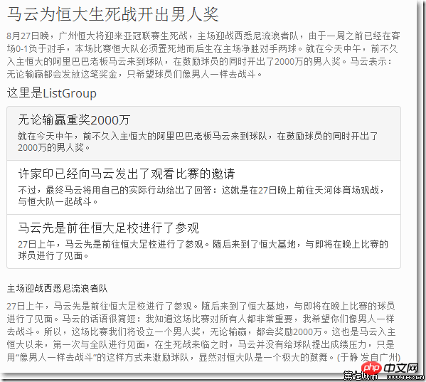
When you want to display the same type of content in lists and blocks, ListGroup is a good choice.
<div class="col-sm-6"> <h3 id="马云为恒大生死战开出男人奖-nbsp">马云为恒大生死战开出男人奖 </h3> <p> 8月27日晚,广州恒大将迎来亚冠联赛生死战,主场迎战西悉尼流浪者队,由于一周之前已经在客场0-1负于对手,本场比赛恒大队必须置死地而后生在主场净胜对手两球。就在今天中午,前不久入主恒大的阿里巴巴老板马云来到球队,在鼓励球员的同时开出了2000万的男人奖。马云表示:无论输赢都会发放这笔奖金,只希望球员们像男人一样去战斗。 </p> <h4 id="这里是ListGroup">这里是ListGroup</h4> <div class="list-group"> <a href="#" class="list-group-item"> <h4 id="无论输赢重奖-万">无论输赢重奖2000万</h4> <p class="list-group-item-text"> 就在今天中午,前不久入主恒大的阿里巴巴老板马云来到球队,在鼓励球员的同时开出了2000万的男人奖。 </p> </a> <a href="#" class="list-group-item"> <h4 id="许家印已经向马云发出了观看比赛的邀请">许家印已经向马云发出了观看比赛的邀请</h4> <p class="list-group-item-text"> 不过,最终马云将用自己的实际行动给出了回答:这就是在27日晚上前往天河体育场观战,与恒大队一起战斗。 </p> </a> <a href="#" class="list-group-item"> <h4 id="马云先是前往恒大足校进行了参观">马云先是前往恒大足校进行了参观</h4> <p class="list-group-item-text"> 27日上午,马云先是前往恒大足校进行了参观。随后来到了恒大基地,与即将在晚上比赛的球员进行了见面。 </p> </a> </div> <h5 id="主场迎战西悉尼流浪者队">主场迎战西悉尼流浪者队</h5> <p> 27日上午,马云先是前往恒大足校进行了参观。随后来到了恒大基地,与即将在晚上比赛的球员进行了见面。马云的话语很简短:我知道这场比赛对所有人都非常重要,我希望你们像男人一样去战斗。所以,这场比赛我们将设立一个男人奖,无论输赢,都会奖励2000万。这也是马云入主恒大以来,第一次与全队进行见面,在生死战来临之时,马云并没有给球队提出成绩压力,只是用“像男人一样去战斗”的这样方式来激励球队,显然对恒大队是一个极大的鼓舞。(于静 发自广州) </p> </div><!--右半边结束-->

○ The list content has been manipulated in
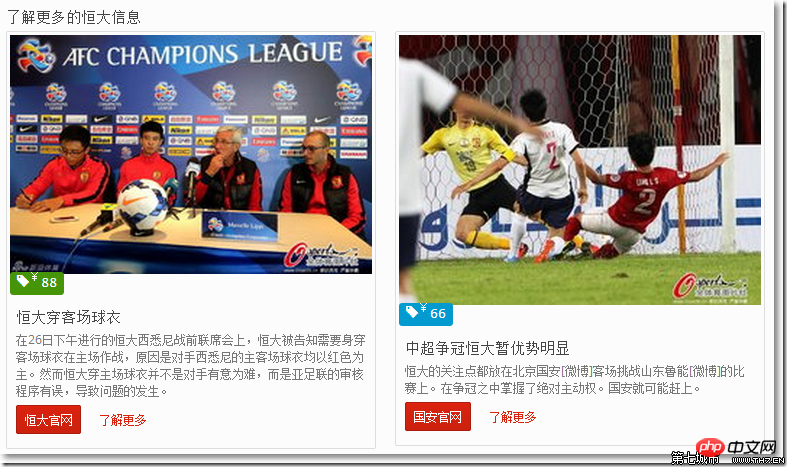
○ The list items are allAt the Evergrande Western Sydney pre-war joint meeting held on the afternoon of the 26th, Evergrande was told that it needed to wear away jerseys to play at home because the opponent Western Sydney’s home and away jerseys were all red. host. However, Evergrande's wearing of home jersey was not because the opponent deliberately caused trouble, but because the AFC's review procedures were incorrect, which caused the problem. Evergrande’s focus is on Beijing Guoan [Weibo]’s away game against Shandong Luneng [Weibo]. He took the absolute initiative in the competition for the championship. Guoan may catch up.
<div class="row" id="moreProducts"> <div class="col-md-12"> <h3 id="了解更多的恒大信息">了解更多的恒大信息</h3> <div class="thumbnails row"> <div class="col-md-6"> <div class="thumbnail"> <img src="/static/imghw/default1.png" data-src="images/21.jpg" class="lazy" style="max-width:90%"/ alt="Use Bootstrap 3 to develop responsive website practice 06, use ListGroup and Thumbnails to display content_html/css_WEB-ITnose" > <div class="label label-success price"><span class="glyphicon glyphicon-tag"><sup>¥</sup>88</span></div> <div class="caption"> <h3 id="恒大穿客场球衣">恒大穿客场球衣</h3> <p>
</p> <p> <a href="#" class="btn btn-primary btn-small" target="_blank">恒大官网</a> <a href="#" class="btn btn-small btn-link">了解更多</a> </p> </div> </div> </div> <div class="col-md-6"> <div class="thumbnail"> <img src="/static/imghw/default1.png" data-src="images/22.jpg" class="lazy" style="max-width:90%"/ alt="Use Bootstrap 3 to develop responsive website practice 06, use ListGroup and Thumbnails to display content_html/css_WEB-ITnose" > <div class="label label-info price"><span class="glyphicon glyphicon-tag"><sup>¥</sup>66</span></div> <div class="caption"> <h3 id="中超争冠恒大暂优势明显">中超争冠恒大暂优势明显</h3> <p>
All thumbnails are wrapped in
 </p>                                <p>                                    <a href="#" class="btn btn-primary btn-small" target="_blank">国安官网</a>                                                                         <a href="#" class="btn btn-small btn-link">了解更多</a>                                </p>                            </div>                        </div>                    </div>                </div>            </div>        </div>
 <!--更多产品区域结束-->

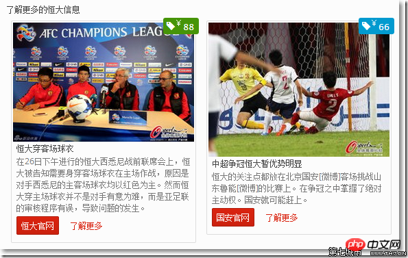
and then adjust the position of the label to the upper right of the picture.
Since we have considered the CSS settings in smartphones, when the page width becomes smaller, the font of the price label will also become smaller accordingly, so that it will not be inconspicuous. coordination.
/*---------------------------------------- Thumbnail 价格标签 ------------------------------------*/.thumbnails { margin: 20px 0;}.thumbnail { position: relative;}.thumbnail h3 { font-size: 16px; margin: 0 0 10px; line-height: 20px;}.thumbnail .price { font-size: 22px; position: absolute; top: -10px; right: -10px; padding: 10px;}.thumbnail .price sup { font-weight: normal; font-size: 12px;}.thumbnail span.glyphicon { margin-right: 5px;}/*---------------------------------------- 智能手机 ------------------------------------*/@media (max-width: 480px) { .thumbnail .price { font-size: 14px; } .thumbnail .price sup { font-size: 10px; }}/*---------------------------------------- 平板 ------------------------------------*/@media (max-width: 768px) { #myCarousel .item{ height: 310px;}}

Hot AI Tools

Undresser.AI Undress
AI-powered app for creating realistic nude photos

AI Clothes Remover
Online AI tool for removing clothes from photos.

Undress AI Tool
Undress images for free

Clothoff.io
AI clothes remover

AI Hentai Generator
Generate AI Hentai for free.

Hot Article

Hot Tools

Notepad++7.3.1
Easy-to-use and free code editor

SublimeText3 Chinese version
Chinese version, very easy to use

Zend Studio 13.0.1
Powerful PHP integrated development environment

Dreamweaver CS6
Visual web development tools

SublimeText3 Mac version
God-level code editing software (SublimeText3)

Hot Topics
 1377
1377
 52
52
 How to get the bootstrap search bar
Apr 07, 2025 pm 03:33 PM
How to use Bootstrap to get the value of the search bar: Determines the ID or name of the search bar. Use JavaScript to get DOM elements. Gets the value of the element. Perform the required actions.
 How to do vertical centering of bootstrap
Apr 07, 2025 pm 03:21 PM
Use Bootstrap to implement vertical centering: flexbox method: Use the d-flex, justify-content-center, and align-items-center classes to place elements in the flexbox container. align-items-center class method: For browsers that do not support flexbox, use the align-items-center class, provided that the parent element has a defined height.
 How to resize bootstrap
Apr 07, 2025 pm 03:18 PM
To adjust the size of elements in Bootstrap, you can use the dimension class, which includes: adjusting width: .col-, .w-, .mw-adjust height: .h-, .min-h-, .max-h-
 How to insert pictures on bootstrap
Apr 07, 2025 pm 03:30 PM
There are several ways to insert images in Bootstrap: insert images directly, using the HTML img tag. With the Bootstrap image component, you can provide responsive images and more styles. Set the image size, use the img-fluid class to make the image adaptable. Set the border, using the img-bordered class. Set the rounded corners and use the img-rounded class. Set the shadow, use the shadow class. Resize and position the image, using CSS style. Using the background image, use the background-image CSS property.
 How to use bootstrap button
Apr 07, 2025 pm 03:09 PM
How to use the Bootstrap button? Introduce Bootstrap CSS to create button elements and add Bootstrap button class to add button text
 How to set up the framework for bootstrap
Apr 07, 2025 pm 03:27 PM
To set up the Bootstrap framework, you need to follow these steps: 1. Reference the Bootstrap file via CDN; 2. Download and host the file on your own server; 3. Include the Bootstrap file in HTML; 4. Compile Sass/Less as needed; 5. Import a custom file (optional). Once setup is complete, you can use Bootstrap's grid systems, components, and styles to create responsive websites and applications.
 How to write split lines on bootstrap
Apr 07, 2025 pm 03:12 PM
There are two ways to create a Bootstrap split line: using the tag, which creates a horizontal split line. Use the CSS border property to create custom style split lines.
 How to view the date of bootstrap
Apr 07, 2025 pm 03:03 PM
Answer: You can use the date picker component of Bootstrap to view dates in the page. Steps: Introduce the Bootstrap framework. Create a date selector input box in HTML. Bootstrap will automatically add styles to the selector. Use JavaScript to get the selected date.


