
 Backend Development
PHP Tutorial
Menu writing example of DrawerLayout drawer effect in Android App_php skills
Backend Development
PHP Tutorial
Menu writing example of DrawerLayout drawer effect in Android App_php skills
Menu writing example of DrawerLayout drawer effect in Android App_php skills

Navigation menu with drawer effect
After looking at many applications, I think this side-sliding drawer effect menu is very good.

There is no need to switch to another page or press the hardware button of the menu. Just click a button on the interface and the menu will slide out, and it feels like it can hold a lot of things.
Library reference:
First of all, the DrawerLayout class is in the Support Library, and the android-support-v4.jar package needs to be added.
Then import android.support.v4.widget.DrawerLayout;
If you cannot find this class, first use the SDK Manager to update the Android Support Library, then find android-support-v4.jar in the Android SDKextrasandroidsupportv4 path, copy it to the libs path of the project, and add it to Build Path.
Code 1
Layout:
1 2 3 4 5 6 7 8 9 10 11 12 13 14 15 16 17 18 19 20 21 22 23 24 25 26 27 28 29 30 31 32 33 |
|
The first child element of DrawerLayout is the main content, that is, the layout displayed when the drawer is not opened. A FrameLayout is used here, with nothing in it.
The second child element of DrawerLayout is the content in the drawer, that is, the drawer layout. A ListView is used here.
Main Activity (taken from official examples):
1 2 3 4 5 6 7 8 9 10 11 12 13 14 15 16 17 18 19 20 21 22 23 24 25 26 27 28 29 30 31 32 33 34 35 36 37 38 39 40 41 42 43 44 45 46 47 48 49 50 51 52 53 54 55 56 57 58 59 60 61 62 63 64 65 66 67 68 69 70 71 72 73 74 75 76 77 78 79 80 81 82 83 84 85 86 87 88 89 90 91 92 93 94 95 96 97 98 99 100 101 102 103 104 105 106 107 108 109 110 111 112 113 114 115 116 117 118 119 120 121 122 123 124 125 126 |
|
What is more confusing is the use of an API of Level 11, so the minSdkVersion is limited and cannot be too low.
Picture resources are available for download from the sample on the Android official website.
The effect after running the program is as follows:
Before drawer opening:

After the drawer is opened:

Code 2
Today I took another look at the DrawerLayout class and found that there are many methods that can be used directly.
I tried it again. In fact, it doesn’t have to be as troublesome as the above. You can just define a button to control the opening of the drawer:
Layout:
1 2 3 4 5 6 7 8 9 10 11 12 13 14 15 16 17 18 19 20 21 22 23 24 25 26 27 28 29 30 31 32 33 34 35 36 37 38 39 40 41 42 43 44 |
|
Main code:
1 2 3 4 5 6 7 8 9 10 11 12 13 14 15 16 17 18 19 20 21 22 23 24 25 26 27 28 29 30 31 32 33 34 35 36 37 |
|
Use Toolbar DrawerLayout to quickly realize high-end menu sliding
If you are paying attention to some applications that follow the latest Material Design design specifications (if not, assuming you are!), you may find that many use side-sliding menu animation effects that look very comfortable and elegant. , the example is as follows (via reference 2):

Today, let’s use the official support library to quickly achieve this type of effect. You need to use Toolbar and DrawerLayout. The detailed steps are as follows: (If you don’t know these two Widgets, Google them first~)
First you need to add appcompat-v7 support:
If the project is created on Android Studio 1.0 RC4, appcompat-v7 support has been added by default. If it is not the latest version of AS, you need to add the following code to build.gradle:
1 2 3 4 |
|
After adding, you need to synchronize gradle
Add Toolbar:
Since Toolbar inherits from View, you can add Toolbar directly to the main layout file like other standard controls. However, in order to improve the reuse efficiency of Toolbar, you can create a custom_toolbar.xml code in the layout as follows:
1 2 3 4 5 6 7 8 9 10 11 |
|
Description:
android.support.v7.widget.Toolbar - Of course, if you only use Toolbar in Lollipop, you can use the Toolbar directly without adding v7 support
xmlns:app - Customized xml naming control, res-auto can be specified directly in AS without using the full package name
Both android:background and android:minHeight can be declared in styles.xml
Add DrawerLayout:
Similar to Toolbar, in order to improve code reuse efficiency, you can create a custom_drawerlayout.xml code in the layout as follows:
1 2 3 4 5 6 7 8 9 10 11 12 13 14 15 16 17 18 19 20 21 22 23 24 25 26 27 28 |
|
There are two child nodes in the Drawerlayout tag, one is the left menu and the other is the main layout. In addition, the starting position of the left menu needs to be set to android:layout_gravity="start"
Implement activity_main.xml:
1 2 3 4 5 6 7 8 9 10 11 |
|
Use the include tag directly, concise and clear
Improve Java code:
1 2 3 4 5 6 7 8 9 10 11 12 13 14 15 16 17 18 19 20 21 22 23 24 25 26 27 28 29 30 31 32 33 34 35 36 37 38 39 40 41 42 43 44 45 46 47 48 49 |
|
Of course the more important ones are styles.xml and colors.xml, the details are as follows:
1 2 3 4 5 6 7 8 9 10 11 12 13 14 15 16 17 18 19 |
|
At this point, the side-sliding menu on Gaodao has been realized, and the final effect is as follows (Note: It seems that directly recording the mobile phone screen does not work on Yosemite, and the animation cannot be real-time due to the frame rate, so let’s watch it like this first~)


Hot AI Tools

Undresser.AI Undress
AI-powered app for creating realistic nude photos

AI Clothes Remover
Online AI tool for removing clothes from photos.

Undress AI Tool
Undress images for free

Clothoff.io
AI clothes remover

Video Face Swap
Swap faces in any video effortlessly with our completely free AI face swap tool!
Hot Article
Hot Tools

Notepad++7.3.1
Easy-to-use and free code editor

SublimeText3 Chinese version
Chinese version, very easy to use

Zend Studio 13.0.1
Powerful PHP integrated development environment

Dreamweaver CS6
Visual web development tools

SublimeText3 Mac version
God-level code editing software (SublimeText3)
Hot Topics
 1386
1386
 52
52

 New report delivers damning assessment of rumoured Samsung Galaxy S25, Galaxy S25 Plus and Galaxy S25 Ultra camera upgrades
Sep 12, 2024 pm 12:23 PM
New report delivers damning assessment of rumoured Samsung Galaxy S25, Galaxy S25 Plus and Galaxy S25 Ultra camera upgrades
Sep 12, 2024 pm 12:23 PM
In recent days, Ice Universe has been steadily revealing details about the Galaxy S25 Ultra, which is widely believed to be Samsung's next flagship smartphone. Among other things, the leaker claimed that Samsung only plans to bring one camera upgrade
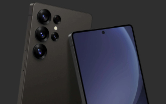 Samsung Galaxy S25 Ultra leaks in first render images with rumoured design changes revealed
Sep 11, 2024 am 06:37 AM
Samsung Galaxy S25 Ultra leaks in first render images with rumoured design changes revealed
Sep 11, 2024 am 06:37 AM
OnLeaks has now partnered with Android Headlines to provide a first look at the Galaxy S25 Ultra, a few days after a failed attempt to generate upwards of $4,000 from his X (formerly Twitter) followers. For context, the render images embedded below h
 IFA 2024 | TCL\'s NXTPAPER 14 won\'t match the Galaxy Tab S10 Ultra in performance, but it nearly matches it in size
Sep 07, 2024 am 06:35 AM
IFA 2024 | TCL\'s NXTPAPER 14 won\'t match the Galaxy Tab S10 Ultra in performance, but it nearly matches it in size
Sep 07, 2024 am 06:35 AM
Alongside announcing two new smartphones, TCL has also announced a new Android tablet called the NXTPAPER 14, and its massive screen size is one of its selling points. The NXTPAPER 14 features version 3.0 of TCL's signature brand of matte LCD panels
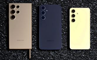
 Vivo Y300 Pro packs 6,500 mAh battery in a slim 7.69 mm body
Sep 07, 2024 am 06:39 AM
Vivo Y300 Pro packs 6,500 mAh battery in a slim 7.69 mm body
Sep 07, 2024 am 06:39 AM
The Vivo Y300 Pro just got fully revealed, and it's one of the slimmest mid-range Android phones with a large battery. To be exact, the smartphone is only 7.69 mm thick but features a 6,500 mAh battery. This is the same capacity as the recently launc
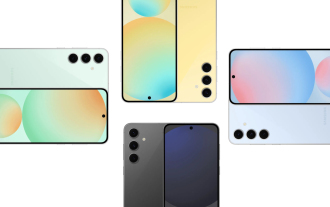 Samsung Galaxy S24 FE billed to launch for less than expected in four colours and two memory options
Sep 12, 2024 pm 09:21 PM
Samsung Galaxy S24 FE billed to launch for less than expected in four colours and two memory options
Sep 12, 2024 pm 09:21 PM
Samsung has not offered any hints yet about when it will update its Fan Edition (FE) smartphone series. As it stands, the Galaxy S23 FE remains the company's most recent edition, having been presented at the start of October 2023. However, plenty of
 New report delivers damning assessment of rumoured Samsung Galaxy S25, Galaxy S25 Plus and Galaxy S25 Ultra camera upgrades
Sep 12, 2024 pm 12:22 PM
New report delivers damning assessment of rumoured Samsung Galaxy S25, Galaxy S25 Plus and Galaxy S25 Ultra camera upgrades
Sep 12, 2024 pm 12:22 PM
In recent days, Ice Universe has been steadily revealing details about the Galaxy S25 Ultra, which is widely believed to be Samsung's next flagship smartphone. Among other things, the leaker claimed that Samsung only plans to bring one camera upgrade
 Xiaomi Redmi Note 14 Pro Plus arrives as first Qualcomm Snapdragon 7s Gen 3 smartphone with Light Hunter 800 camera
Sep 27, 2024 am 06:23 AM
Xiaomi Redmi Note 14 Pro Plus arrives as first Qualcomm Snapdragon 7s Gen 3 smartphone with Light Hunter 800 camera
Sep 27, 2024 am 06:23 AM
The Redmi Note 14 Pro Plus is now official as a direct successor to last year'sRedmi Note 13 Pro Plus(curr. $375 on Amazon). As expected, the Redmi Note 14 Pro Plus heads up the Redmi Note 14 series alongside theRedmi Note 14and Redmi Note 14 Pro. Li
 iQOO Z9 Turbo Plus: Reservations begin for the potentially beefed-up series flagship
Sep 10, 2024 am 06:45 AM
iQOO Z9 Turbo Plus: Reservations begin for the potentially beefed-up series flagship
Sep 10, 2024 am 06:45 AM
OnePlus'sister brand iQOO has a 2023-4 product cycle that might be nearlyover; nevertheless, the brand has declared that it is not done with itsZ9series just yet. Its final, and possibly highest-end,Turbo+variant has just beenannouncedas predicted. T
