 Web Front-end
 HTML Tutorial
 praise! Stunning page switching animation effect [with source code download]_html/css_WEB-ITnose
praise! Stunning page switching animation effect [with source code download]_html/css_WEB-ITnose
The following example lists a set of animations that can be applied to the page switching process to create an interesting navigation effect. Although some effects are very simple, just simple sliding movements, others use perspective and 3D Transforms to create some three-dimensional dynamic effects.
Download Now Online Demo
Warm reminder: To ensure the best results, please use IE10, Chrome, Browse in modern browsers such as Firefox and Safari.
CSS animations are divided into different groups based on the effects they implement. To show the page transition effect, we use the following structure:
<div id="pt-main" class="pt-perspective"> <div class="pt-page pt-page-1"> <h1><span>A collection of</span><strong>Page</strong> Transitions</h1> </div> <div class="pt-page pt-page-2"><!-- ... --></div> <!-- ... --></div>
The position of the perspective container is relative, and we increase the perspective by 1200 pixels. All animation effects require the following styles:
.pt-perspective { position: relative; width: 100%; height: 100%; perspective: 1200px; transform-style: preserve-3d;} .pt-page { width: 100%; height: 100%; position: absolute; top: 0; left: 0; visibility: hidden; overflow: hidden; backface-visibility: hidden; transform: translate3d(0, 0, 0);} .pt-page-current,.no-js .pt-page { visibility: visible;} .no-js body { overflow: auto;} .pt-page-ontop { z-index: 999;}The above .pt-page-ontop style is used for some page transition effects, that is, we need to leave one page on another The top of a page. Here is a code example that shows animation classes and keyframe animation, scaling the web page in different directions and fading in and out:
/* scale and fade */ .pt-page-scaleDown { animation: scaleDown .7s ease both;} .pt-page-scaleUp { animation: scaleUp .7s ease both;} .pt-page-scaleUpDown { animation: scaleUpDown .5s ease both;} .pt-page-scaleDownUp { animation: scaleDownUp .5s ease both;} .pt-page-scaleDownCenter { animation: scaleDownCenter .4s ease-in both;} .pt-page-scaleUpCenter { animation: scaleUpCenter .4s ease-out both;} /************ keyframes ************/ /* scale and fade */ @keyframes scaleDown { to { opacity: 0; transform: scale(.8); }} @keyframes scaleUp { from { opacity: 0; transform: scale(.8); }} @keyframes scaleUpDown { from { opacity: 0; transform: scale(1.2); }} @keyframes scaleDownUp { to { opacity: 0; transform: scale(1.2); }} @keyframes scaleDownCenter { to { opacity: 0; transform: scale(.7); }} @keyframes scaleUpCenter { from { opacity: 0; transform: scale(.7); }}For the purposes of this demonstration, we use The corresponding animation class is applied to the current page and the page that will be switched in, for example:
//... case 17: outClass = 'pt-page-scaleDown'; inClass = 'pt-page-moveFromRight pt-page-ontop'; break;case 18: outClass = 'pt-page-scaleDown'; inClass = 'pt-page-moveFromLeft pt-page-ontop'; break;case 19: outClass = 'pt-page-scaleDown'; inClass = 'pt-page-moveFromBottom pt-page-ontop'; break; // ...
To view the demo, you can browse a complete set of pages by clicking the first button To toggle effects, you can also choose to preview a specific effect from the drop-down menu.
I hope you enjoy this and get inspired to create something even more exciting!
Download Now Online Demo

Hot AI Tools

Undresser.AI Undress
AI-powered app for creating realistic nude photos

AI Clothes Remover
Online AI tool for removing clothes from photos.

Undress AI Tool
Undress images for free

Clothoff.io
AI clothes remover

AI Hentai Generator
Generate AI Hentai for free.

Hot Article

Hot Tools

Notepad++7.3.1
Easy-to-use and free code editor

SublimeText3 Chinese version
Chinese version, very easy to use

Zend Studio 13.0.1
Powerful PHP integrated development environment

Dreamweaver CS6
Visual web development tools

SublimeText3 Mac version
God-level code editing software (SublimeText3)

Hot Topics
 1378
1378
 52
52
 Users encounter rare glitches: Samsung Watch smartwatches suddenly experience white screen issues
Apr 03, 2024 am 08:13 AM
You may have encountered the problem of green lines appearing on the screen of your smartphone. Even if you have never seen it, you must have seen related pictures on the Internet. So, have you ever encountered a situation where the smart watch screen turns white? On April 2, CNMO learned from foreign media that a Reddit user shared a picture on the social platform, showing the screen of the Samsung Watch series smart watches turning white. The user wrote: "I was charging when I left, and when I came back, it was like this. I tried to restart, but the screen was still like this during the restart process." Samsung Watch smart watch screen turned white. The Reddit user did not specify the smart watch. Specific model. However, judging from the picture, it should be Samsung Watch5. Previously, another Reddit user also reported
 What should I do if I download other people's wallpapers after logging into another account on wallpaperengine?
Mar 19, 2024 pm 02:00 PM
When you log in to someone else's steam account on your computer, and that other person's account happens to have wallpaper software, steam will automatically download the wallpapers subscribed to the other person's account after switching back to your own account. Users can solve this problem by turning off steam cloud synchronization. What to do if wallpaperengine downloads other people's wallpapers after logging into another account 1. Log in to your own steam account, find cloud synchronization in settings, and turn off steam cloud synchronization. 2. Log in to someone else's Steam account you logged in before, open the Wallpaper Creative Workshop, find the subscription content, and then cancel all subscriptions. (In case you cannot find the wallpaper in the future, you can collect it first and then cancel the subscription) 3. Switch back to your own steam
 How to download links starting with 115://? Download method introduction
Mar 14, 2024 am 11:58 AM
Recently, many users have been asking the editor, how to download links starting with 115://? If you want to download links starting with 115://, you need to use the 115 browser. After you download the 115 browser, let's take a look at the download tutorial compiled by the editor below. Introduction to how to download links starting with 115:// 1. Log in to 115.com, download and install the 115 browser. 2. Enter: chrome://extensions/ in the 115 browser address bar, enter the extension center, search for Tampermonkey, and install the corresponding plug-in. 3. Enter in the address bar of 115 browser: Grease Monkey Script: https://greasyfork.org/en/
 Introduction to how to download and install the superpeople game
Mar 30, 2024 pm 04:01 PM
The superpeople game can be downloaded through the steam client. The size of this game is about 28G. It usually takes one and a half hours to download and install. Here is a specific download and installation tutorial for you! New method to apply for global closed testing 1) Search for "SUPERPEOPLE" in the Steam store (steam client download) 2) Click "Request access to SUPERPEOPLE closed testing" at the bottom of the "SUPERPEOPLE" store page 3) After clicking the request access button, The "SUPERPEOPLECBT" game can be confirmed in the Steam library 4) Click the install button in "SUPERPEOPLECBT" and download
 How to download foobar2000? -How to use foobar2000
Mar 18, 2024 am 10:58 AM
foobar2000 is a software that can listen to music resources at any time. It brings you all kinds of music with lossless sound quality. The enhanced version of the music player allows you to get a more comprehensive and comfortable music experience. Its design concept is to play the advanced audio on the computer The device is transplanted to mobile phones to provide a more convenient and efficient music playback experience. The interface design is simple, clear and easy to use. It adopts a minimalist design style without too many decorations and cumbersome operations to get started quickly. It also supports a variety of skins and Theme, personalize settings according to your own preferences, and create an exclusive music player that supports the playback of multiple audio formats. It also supports the audio gain function to adjust the volume according to your own hearing conditions to avoid hearing damage caused by excessive volume. Next, let me help you
 Where to download files from Quark Network Disk_How to download Quark Network Disk to local area and share
Mar 21, 2024 pm 03:57 PM
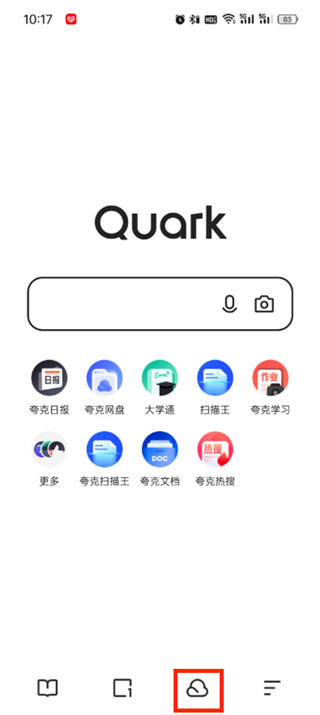
As a convenient and practical network disk tool, Quark can help users easily obtain their favorite resources. What if you want to download a file locally? Let the editor tell you now, let’s learn it together! How to download Quark Network Disk to local sharing method 1. First open the Quark software, enter the homepage, and click the [Cloud Icon] on the lower right; 2. Then on the Quark Network Disk page, we click the [Document] function; 3. Then go to the document page, select the file you want to download, and click the [three-dot icon]; 4. After the final click, we click [Download] in the pop-up dialog box;
 How to download Beilehu children's songs
Mar 28, 2024 am 11:10 AM
As an indispensable accompaniment to children's growth, Beilehu's children's songs have won the love of countless parents and children with their cheerful melody, vivid pictures and entertaining and educational content. In order to allow babies to enjoy the joy brought by children's songs anytime and anywhere, many parents hope to download Beilehu's children's songs to their mobile phones or tablets so that they can listen to their children at any time, but how to save Beilehu's children's songs? On your mobile phone, this tutorial will bring you a detailed introduction. Users who don’t understand it yet can come and read along with this article to learn more. Beilehu Nursery Rhymes Download Children's Songs Multi-Picture Tutorial: Open the software and select a children's song you want to download. The editor takes "Classic Children's Songs" as an example. 2. Click the "Download" button below the children's song star.
 Operation tutorial for switching from win11 home version to professional version_Operation tutorial for switching from win11 home version to professional version
Mar 20, 2024 pm 01:58 PM
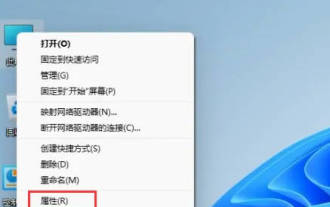
How to convert Win11 Home Edition to Win11 Professional Edition? In Win11 system, it is divided into Home Edition, Professional Edition, Enterprise Edition, etc., and most Win11 notebooks are pre-installed with Win11 Home Edition system. Today, the editor will show you the steps to switch from win11 home version to professional version! 1. First, right-click on this computer on the win11 desktop and properties. 2. Click Change Product Key or Upgrade Windows. 3. Then click Change Product Key after entering. 4. Enter the activation key: 8G7XN-V7YWC-W8RPC-V73KB-YWRDB and select Next. 5. Then it will prompt success, so you can upgrade win11 home version to win11 professional version.


