 Web Front-end
 HTML Tutorial
 [Detailed explanation of div css web page layout]_html/css_WEB-ITnose
[Detailed explanation of div css web page layout]_html/css_WEB-ITnose
Foreword:
Web page layout is the first and most important step in making a web page. Today, let’s talk in detail about how to use div css layout.
There are two ways to write web pages with dw, one is the graphical interface, and the other is the code. If you are a beginner, you can use the graphical interface. When you are almost done, you can use the code to improve efficiency. .
Because there are major changes in css3 and css2 before, let’s start with css2.
(The author uses Dreamweaver cs6, download address for cracked version: http://www.aa25.cn/download/954.shtml)
1. Single column LayoutA web page writer must first build a framework, as shown below:
Simply divide the web page into 4 parts, header title part, nav navigation part, article body, footer footer
This is a single column layout.
Create these 4 structures through div, then layout with css and add styles
Use dw to quickly create divs as shown below:
In the past, divs were used to create this structure directly, and the div was found by id for layout,
Click the new button on the right side of the picture to create a css style. Pay attention to the select Type in the middle and the rules for selecting styles. This is selected directly through the id. The id is like an ID card. Each one is different. Of course, it depends on the situation
You can also choose css class selectors, pseudo-class selectors, etc.
Set the css style in the pop-up page:
We add color to the layout just now and set a fixed size width and height. The result is as follows:
I found that there are two white edges on the top and left. This problem is also easy for novices to wonder. In fact, this is the default value of css. There are many similar to this,
So generally when writing a web page, some properties should be initialized first. Written like this: body { margin:0 auto; font-size:12px; font-family:Verdana; line-height:1.5;}
ul,dl,dd,h1,h2,h3,h4,h5, h6,form,p { padding:0; margin:0;}
To cancel the white margin here, just write: body { margin:0}
All codes are as follows:
<span style="font-size:18px;color:#006600;"><strong><!doctype html><html><head><meta charset="utf-8"><title>Untitled Document</title><style type="text/css">#header { background-color: #0F9; height: 100px; width: 500px;}#nav { background-color: #F00; height: 50px; width: 500px;}#article { background-color: #93C; height: 300px; width: 500px;}#footer { background-color: #F99; height: 50px; width: 500px;}</style></head><body><div id="header">header</div><div id="nav">nav</div><div id="article">article</div><div id="footer">footer</div></body></html></strong></span>The attribute that centers the div: The margin attribute is changed to auto
The above is how to write html4 and css2.
In HTML5, due to the addition of new structural tags, many places do not need to write the block-level structure of div, but directly use tags such as
<span style="font-size:18px;color:#006600;"><strong><header>header</header><nav>nav</nav><article>article</article><footer>footer</footer></strong></span>
to display the following effect:
Code:
<span style="font-size:18px;color:#006600;"><strong><!doctype html><html><head><meta charset="utf-8"><title>Untitled Document</title><style type="text/css">#left { background-color: #3FC; float: left; height: 400px; width: 100px;}#center { background-color: #9C0; float: left; height: 400px; width: 100px;}#right { background-color: #F9F; height: 400px; width: 100px; float: left;}</style></head><body><div id="left">header</div><div id="center">nav</div><div id="right">article</div></body></html></strong></span>Set the float attribute in the box to left
float: left;
This method has a disadvantage: for example, if you post an article and divide the article into 3 columns using float, after you add content to any column, this column will be longer than the other columns, so It will be very troublesome to modify it.
The newly added multi-column layout and box layout in css3 perfectly solve this problem.
First use the box layout to look at the code. The effect is the same as the picture above. You can implement it yourself:
<span style="font-size:18px;color:#006600;"><strong><!doctype html><html><head> <meta charset="utf-8"> <title>Untitled Document</title> <style type="text/css"> #layout{ display: -moz-box; display: -webkit-box; } #left { background-color: #3FC; height: 400px; width: 100px; } #center { background-color: #9C0; height: 400px; width: 100px; } #right { background-color: #F9F; height: 400px; width: 100px; } #left,#center,#right{ -moz-box-sizing:border-box; -wdbkit-box-sizing:border-box; } </style></head><body> <div id="layout"> <div id="left">header</div> <div id="center">nav</div> <div id="right">article</div> </div></body></html></strong></span>
The above box layout can achieve the same effect as the float position layout in CSS2, and can automatically realize alignment without the problem of float.
Let’s take a look at the implementation of multi-column layout:
Just like in the example The implementation is the same. The multi-column layout is mainly suitable for articles and can be modified at will without changing the appearance of the web page. Of course, this layout also has limitations: each column has the same width.
And you have to write the total width of the columns, and then how many columns are needed it will be automatically distributed evenly.
The code is as follows:
<span style="font-size:18px;color:#006600;"><strong><!doctype html><html><head> <meta charset="utf-8"> <title>Untitled Document</title> <style type="text/css"> #article{ width:800px; -moz-column-count:3; -webkit-column-count:3; } </style></head><body> <div id="article"> (节省篇幅,文章内容略) </div></body></html></strong></span>Okay, I talked about the single column layout and multi-column layout of div css Column layout and layout are basically the same, because divs can be nested, so if you subdivide a div, you still can't break away from these two.

Hot AI Tools

Undresser.AI Undress
AI-powered app for creating realistic nude photos

AI Clothes Remover
Online AI tool for removing clothes from photos.

Undress AI Tool
Undress images for free

Clothoff.io
AI clothes remover

Video Face Swap
Swap faces in any video effortlessly with our completely free AI face swap tool!

Hot Article

Hot Tools

Notepad++7.3.1
Easy-to-use and free code editor

SublimeText3 Chinese version
Chinese version, very easy to use

Zend Studio 13.0.1
Powerful PHP integrated development environment

Dreamweaver CS6
Visual web development tools

SublimeText3 Mac version
God-level code editing software (SublimeText3)

Hot Topics
 1386
1386
 52
52
 How to send web pages to desktop as shortcut in Edge browser?
Mar 14, 2024 pm 05:22 PM
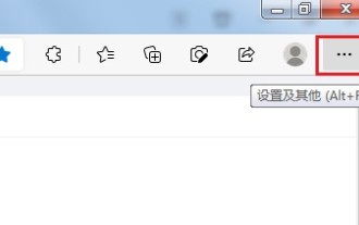
How to send web pages to the desktop as a shortcut in Edge browser? Many of our users want to display frequently used web pages on the desktop as shortcuts for the convenience of directly opening access pages, but they don’t know how to do it. In response to this problem, the editor of this issue will share the solution with the majority of users. , let’s take a look at the content shared in today’s software tutorial. The shortcut method of sending web pages to the desktop in Edge browser: 1. Open the software and click the "..." button on the page. 2. Select "Install this site as an application" in "Application" from the drop-down menu option. 3. Finally, click it in the pop-up window
 What should I do if the images on the webpage cannot be loaded? 6 solutions
Mar 15, 2024 am 10:30 AM
Some netizens found that when they opened the browser web page, the pictures on the web page could not be loaded for a long time. What happened? I checked that the network is normal, so where is the problem? The editor below will introduce to you six solutions to the problem that web page images cannot be loaded. Web page images cannot be loaded: 1. Internet speed problem The web page cannot display images. It may be because the computer's Internet speed is relatively slow and there are more softwares opened on the computer. And the images we access are relatively large, which may be due to loading timeout. As a result, the picture cannot be displayed. You can turn off the software that consumes more network speed. You can go to the task manager to check. 2. Too many visitors. If the webpage cannot display pictures, it may be because the webpages we visited were visited at the same time.
 Possible reasons why the network connection is normal but the browser cannot access the web page
Feb 19, 2024 pm 03:45 PM
The browser cannot open the web page but the network is normal. There are many possible reasons. When this problem occurs, we need to investigate step by step to determine the specific cause and solve the problem. First, determine whether the webpage cannot be opened is limited to a specific browser or whether all browsers cannot open the webpage. If only one browser cannot open the web page, you can try to use other browsers, such as Google Chrome, Firefox, etc., for testing. If other browsers are able to open the page correctly, the problem is most likely with that specific browser, possibly
 Detailed explanation of obtaining administrator rights in Win11
Mar 08, 2024 pm 03:06 PM
Windows operating system is one of the most popular operating systems in the world, and its new version Win11 has attracted much attention. In the Win11 system, obtaining administrator rights is an important operation. Administrator rights allow users to perform more operations and settings on the system. This article will introduce in detail how to obtain administrator permissions in Win11 system and how to effectively manage permissions. In the Win11 system, administrator rights are divided into two types: local administrator and domain administrator. A local administrator has full administrative rights to the local computer
 Detailed explanation of division operation in Oracle SQL
Mar 10, 2024 am 09:51 AM
Detailed explanation of division operation in OracleSQL In OracleSQL, division operation is a common and important mathematical operation, used to calculate the result of dividing two numbers. Division is often used in database queries, so understanding the division operation and its usage in OracleSQL is one of the essential skills for database developers. This article will discuss the relevant knowledge of division operations in OracleSQL in detail and provide specific code examples for readers' reference. 1. Division operation in OracleSQL
 What to do if the webpage cannot be opened
Feb 21, 2024 am 10:24 AM
How to solve the problem of web pages not opening With the rapid development of the Internet, people increasingly rely on the Internet to obtain information, communicate and entertain. However, sometimes we encounter the problem that the web page cannot be opened, which brings us a lot of trouble. This article will introduce you to some common methods to help solve the problem of web pages not opening. First, we need to determine why the web page cannot be opened. Possible reasons include network problems, server problems, browser settings problems, etc. Here are some solutions: Check network connection: First, we need
 How to open php on the web page
Mar 22, 2024 pm 03:20 PM
Executing PHP code in a web page requires ensuring that the web server supports PHP and is properly configured. PHP can be opened in three ways: * **Server environment:** Place the PHP file in the server root directory and access it through the browser. * **Integrated Development Environment: **Place PHP files in the specified web root directory and access them through the browser. * **Remote Server:** Access PHP files hosted on a remote server via the URL address provided by the server.
 Guide to solving misalignment of WordPress web pages
Mar 05, 2024 pm 01:12 PM
Guide to solving misaligned WordPress web pages In WordPress website development, sometimes we encounter web page elements that are misaligned. This may be due to screen sizes on different devices, browser compatibility, or improper CSS style settings. To solve this misalignment, we need to carefully analyze the problem, find possible causes, and debug and repair it step by step. This article will share some common WordPress web page misalignment problems and corresponding solutions, and provide specific code examples to help develop


