
 Web Front-end
HTML Tutorial
Use CSS3 to achieve stunning Loading animation effects_html/css_WEB-ITnose
Web Front-end
HTML Tutorial
Use CSS3 to achieve stunning Loading animation effects_html/css_WEB-ITnose
Use CSS3 to achieve stunning Loading animation effects_html/css_WEB-ITnose

SpinKit 是一套网页动画效果,包含8种基于 CSS3 实现的很炫的加载动画。借助 CSS3 Animation 的强大功能来创建平滑,易于定制的动画。SpinKit 的目标不是提供一个每个浏览器都兼容的解决方案,而是给现代浏览器提供更优的技术实现方案和更佳的使用体验。(为保证最佳的效果,请在 Chrome、Firefox 和 Safari 等现代浏览器中浏览)
Loading 动画效果一
HTML 代码:
1
2
3
4
5
6
7
CSS code:
1
2
3
4
5
6
7
8
9
10
11
12
13
14
15
16
17
18
19
20
21
22
23
24
25
26
27
28
29
30
31
32
33
34
35
36
37
38
39
40
41
42
43
44
45
46
47
48
49
50
51
52
.spinner {
margin : 100px auto ;
width : 50px ;
height : 60px ;
text-align : center ;
font-size: 10px; height : 100% ;
width : 6px ;
display : inline- block ;
-webkit-animation: stretchdelay 1.2 s infinite ease- in-out;
animation: stretchdelay 1.2 s infinite ease-in-out;
}
.spinner .rect 2 {
-webkit-animation-delay: -1.1 s;
animation-delay: -1.1 s;
}
.spinner. rect 3 {
-webkit-animation-delay: -1.0 s;
animation-delay: -1.0 s;
}
.spinner .rect 4 {
-webkit-animation-delay: -0.9 s;
animation-delay: -0.9 s;
}
.spinner .rect 5 {
-webkit-animation-delay: -0.8 s;
animation-delay: -0.8 s;
}
@-webkit-keyframes stretchdelay {
0% , 40% , 100% { -webkit-transform: scaleY( 0.4 ) }
20% { -webkit-transform: scaleY( 1.0 ) }
}
@keyframes stretchdelay {
0% , 40% , 100% {
transform: scaleY( 0.4 );
-webkit-transform: scaleY( 0.4 );
} 20% {
transform: scaleY( 1.0 );
-webkit-transform: scaleY( 1.0 );
}
}
Loading 动画效果二
HTML 代码:
1
CSS 代码:
1
2
3
4
5
6
7
8
9
10
11
12
13
14
15
16
17
18
19
20
21
22
23
24
25
26
27
28
.spinner {
width : 60px ;
height : 60px ;
background-color : #67CF22 ;
margin : 100px auto ;
-webkit-animation: rotateplane 1.2 s infinite ease-in-out;
animation: rotateplane 1.2 s infinite ease-in-out;
}
@-webkit-keyframes rotateplane {
0% { -webkit-transform: perspective( 120px ) }
50% { -webkit-transform: perspective( 120px ) rotateY( 180 deg) }
100% { -webkit-transform: perspective( 120px ) rotateY( 180 deg) rotateX( 180 deg) }
}
@keyframes rotateplane {
0% {
transform: perspective( 120px ) rotateX( 0 deg) rotateY( 0 deg);
-webkit-transform: perspective( 120px ) rotateX( 0 deg) rotateY( 0 deg)
} 50% {
transform: perspective( 120px ) rotateX( -180.1 deg) rotateY( 0 deg);
-webkit-transform: perspective( 120px ) rotateX( -180.1 deg) rotateY( 0 deg)
} 100% {
transform: perspective( 120px ) rotateX( -180 deg) rotateY( -179.9 deg);
-webkit-transform: perspective( 120px ) rotateX( -180 deg) rotateY( -179.9 deg);
}
}
Loading 动画效果三
HTML 代码:
1
2
3
4
CSS code:
1
2
3
4
5
6
7
8
9
10
11
12
13
14
15
16
17
18
19
20
21
22
23
24
25
26
27
28
29
30
31
32
33
34
35
36
37
38
39
40
41
.spinner {
width : 60px ;
height : 60px ;
position : relative ;
margin : 100px auto ;
}
.double-bounce 1 , .double-bounce 2 {
width : 100% ;
height : 100% ;
border-radius: 50% ;
background-color : #67CF22;
opacity: 0.6;
position: absolute;
top: 0;
left: 0;
-webkit-animation: bounce 2.0 s infinite ease-in-out;
animation: bounce 2.0 s infinite ease-in-out;
}
.double-bounce 2 {
-webkit-animation-delay: -1.0 s;
animation-delay: -1.0 s;
}
@-webkit-keyframes bounce {
0% , 100% { -webkit-transform: scale( 0.0 ) }
50% { -webkit -transform: scale( 1.0 ) }
}
@keyframes bounce {
0% , 100% {
transform : scale( 0.0 );
-webkit-transform: scale( 0.0 ); > -webkit-transform: scale( 1.0 );
}
}
Loading animation effect four
HTML code:
CSS code:
1
2
3
4
5
6
7
8
9
10
11
12
13
14
15
16
17
18
19
20
21
22
23
24
25
26
27
28
29
30
31
32
33
34
35
36
37
38
39
40
41
42
43
44
45
46
47
48
49
.spinner {
margin : 100px auto ;
width : 32px ;
height : 32px ;
position : relative ;
}
.cube 1 , .cube 2 {
background-color : #67CF22 ;
width : 30px ;
height : 30px ;
position : absolute ;
top : 0 ;
left : 0 ;
-webkit-animation: cubemove 1.8 s infinite ease-in-out;
animation: cubemove 1.8 s infinite ease-in-out;
}
.cube 2 {
-webkit-animation-delay: -0.9 s;
animation-delay: -0.9 s;
}
@-webkit-keyframes cubemove {
25% { -webkit-transform: translateX( 42px ) rotate( -90 deg) scale( 0.5 ) }
50% { -webkit-transform: translateX( 42px ) translateY( 42px ) rotate( -180 deg) }
75% { -webkit-transform: translateX( 0px ) translateY( 42px ) rotate( -270 deg) scale( 0.5 ) }
100% { -webkit-transform: rotate( -360 deg) }
}
@keyframes cubemove {
25% {
transform: translateX( 42px ) rotate( -90 deg) scale( 0.5 );
-webkit-transform: translateX( 42px ) rotate( -90 deg) scale( 0.5 );
} 50% {
transform: translateX( 42px ) translateY( 42px ) rotate( -179 deg);
-webkit-transform: translateX( 42px ) translateY( 42px ) rotate( -179 deg);
} 50.1% {
transform: translateX( 42px ) translateY( 42px ) rotate( -180 deg);
-webkit-transform: translateX( 42px ) translateY( 42px ) rotate( -180 deg);
} 75% {
transform: translateX( 0px ) translateY( 42px ) rotate( -270 deg) scale( 0.5 );
-webkit-transform: translateX( 0px ) translateY( 42px ) rotate( -270 deg) scale( 0.5 );
} 100% {
transform: rotate( -360 deg);
-webkit-transform: rotate( -360 deg);
}
}
Loading animation effect five
HTML code:
CSS code:
1
2
3
4
5
6
7
8
9
10
11
12
13
14
15
16
17
18
19
20
21
22
23
24
25
26
27
28
29
30
31
32
33
34
35
36
37
38
39
40
41
42
43
44
45
46
47
48
.spinner {
margin : 100px auto ;
width : 90px ;
height : 90px;
position : relative ;
text-align : center ;
-webkit-animation: rotate 2.0 s infinite linear;
animation: rotate 2.0 s infinite;
}
.dot 1 , .dot 2 {
width : 60%;
height: 60%;
display: inline-block;
position: absolute;
top: 0;
background-color: #67CF22 ;
border-radius: 100% ;
-webkit-animation: bounce 2.0 s infinite ease-in-out;
animation : bounce 2.0 s infinite ease-in-out;
}
.dot 2 {
top : auto ;
bottom : 0px ;
-webkit-animation-delay: -1.0 s;
animation-delay: -1.0 s;
}
@-webkit-keyframes rotate { 100% { -webkit-transform: rotate( 360 deg) }}
@keyframes rotate { 100% { transform: rotate( 360 deg); -webkit- transform: rotate( 360 deg) }}
@-webkit-keyframes bounce {
0% , 100% { -webkit-transform: scale( 0.0 ) }
50% { -webkit-transform: scale( 1.0 ) }
}
@keyframes bounce {
0% , 100% {
transform: scale( 0.0 );
-webkit-transform: scale( 0.0 );
} 50% {
transform: scale( 1.0 );
-webkit-transform: scale( 1.0 );
}
}
Loading 动画效果六
HTML 代码:
1
2
3
4
5
CSS code:
1
2
3
4
5
6
7
8
9
10
11
12
13
14
15
16
17
18
19
20
21
22
23
24
25
26
27
28
29
30
31
32
33
34
35
36
37
38
39
40
41
42
43
44
.spinner {
margin : 100px auto 0 ;
width : 150px ;
text-align : center ;
}
.spinner > div {
width : 30px ;
height : 30px ;
background-color : #67CF22 ;
border -radius: 100%;
display: inline-block;
-webkit-animation: bouncedelay 1.4 s infinite ease-in-out;
animation: bouncedelay 1.4 s infinite ease-in-out;
/* Prevent first frame from flickering when animation starts */
-webkit-animation-fill-mode: both ;
animation- fill-mode: both ;
}
.spinner .bounce 1 {
-webkit-animation-delay: -0.32 s;
animation-delay: -0.32 s;
}
.spinner .bounce 2 {
-webkit-animation-delay: -0.16 s;
animation-delay: -0.16 s;
}
@-webkit-keyframes bouncedelay {
0% , 80% , 100% { -webkit-transform: scale( 0.0 ) }
40% { -webkit-transform: scale( 1.0 ) }
}
@keyframes bouncedelay {
0% , 80% , 100% {
transform: scale( 0.0 );
-webkit-transform: scale( 0.0 );
} 40% {
transform: scale( 1.0 );
-webkit-transform: scale( 1.0 );
}
}
Loading animation effect seven
HTML code:
1
CSS 代码:
1
2
3
4
5
6
7
8
9
10
11
12
13
14
15
16
17
18
19
20
21
22
23
24
25
26
27
28
29
.spinner {
width : 40px ;
height : 40px ;
margin : 100px auto ;
background-color : #333 ;
border-radius: 100% ;
-webkit-animation: scaleout 1.0 s infinite ease-in-out;
animation: scaleout 1.0 s infinite ease-in-out;
}
@-webkit-keyframes scaleout {
0% { -webkit-transform: scale( 0.0 ) }
100% {
-webkit-transform: scale( 1.0 );
opacity: 0 ;
}
}
@keyframes scaleout {
0% {
transform: scale( 0.0 );
-webkit-transform: scale( 0.0 );
} 100% {
transform: scale( 1.0 );
-webkit-transform: scale( 1.0 );
opacity: 0 ;
}
}
Loading 动画效果八
HTML 代码:
1
2
3
4
5
6
7
8
9
10
11
12
13
14
15
16
17
18
19
20
CSS code:
1
2
3
4
5
6
7
8
9
10
11
12
13
14
15
16
17
18
19
20
21
22
23
24
25
26
27
28
29
30
31
32
33
34
35
36
37
38
39
40
41
42
43
44
45
46
47
48
49
50
51
52
53
54
55
56
57
58
59
60
61
62
63
64
65
66
67
68
69
70
71
72
73
74
75
76
77
78
79
80
81
82
83
84
85
86
87
88
89
90
91
92
93
94
95
96
97
98
99
100
101
102
103
104
105
106
107
108
109
110
.spinner {
margin : 100px auto ;
width : 20px ;
height : 20px ;
position : relative ;
}
.container 1 > div, .container 2 > div, .container 3 > div {
width : 6px ;
height : 6px ;
background-color : #333 ;
border-radius: 100% ;
position : absolute ;
-webkit-animation: bouncedelay 1.2 s infinite ease-in-out;
animation: bouncedelay 1.2 s infinite ease-in-out;
-webkit-animation-fill-mode: both ;
animation-fill-mode: both ;
}
.spinner .spinner-container {
position : absolute ;
width : 100% ;
height : 100% ;
}
.container 2 {
-webkit-transform: rotateZ( 45 deg);
transform: rotateZ( 45 deg);
}
.container 3 {
-webkit-transform: rotateZ( 90 deg);
transform: rotateZ( 90 deg);
}
.circle 1 { top : 0 ; left : 0 ; }
.circle 2 { top : 0 ; right : 0 ; }
.circle 3 { right : 0 ; bottom : 0 ; }
.circle 4 { left : 0 ; bottom : 0 ; }
.container 2 .circle 1 {
-webkit-animation-delay: -1.1 s;
animation-delay: -1.1 s;
}
.container 3 .circle 1 {
-webkit-animation-delay: -1.0 s;
animation-delay: -1.0 s;
}
.container 1 .circle 2 {
-webkit-animation-delay: -0.9 s;
animation-delay: -0.9 s;
}
.container 2 .circle 2 {
-webkit-animation-delay: -0.8 s;
animation-delay: -0.8 s;
}
.container 3 .circle 2 {
-webkit-animation-delay: -0.7 s;
animation-delay: -0.7 s;
}
.container 1 .circle 3 {
-webkit-animation-delay: -0.6 s;
animation-delay: -0.6 s;
}
.container 2 .circle 3 {
-webkit-animation-delay: -0.5 s;
animation-delay: -0.5 s;
}
.container 3 .circle 3 {
-webkit-animation-delay: -0.4 s;
animation-delay: -0.4 s;
}
.container 1 .circle 4 {
-webkit-animation-delay: -0.3 s;
animation-delay: -0.3 s;
}
.container 2 .circle 4 {
-webkit-animation-delay: -0.2 s;
animation-delay: -0.2 s;
}
.container 3 .circle 4 {
-webkit-animation-delay: -0.1 s;
animation-delay: -0.1 s;
}
@-webkit-keyframes bouncedelay {
0% , 80% , 100% { -webkit-transform: scale( 0.0 ) }
40% { -webkit-transform: scale( 1.0 ) }
}
@keyframes bouncedelay {
0% , 80% , 100% {
transform: scale( 0.0 );
-webkit-transform: scale( 0.0 );
} 40% {
transform: scale( 1.0 );
-webkit-transform: scale( 1.0 );
}
}
完整源码下载

Hot AI Tools

Undresser.AI Undress
AI-powered app for creating realistic nude photos

AI Clothes Remover
Online AI tool for removing clothes from photos.

Undress AI Tool
Undress images for free

Clothoff.io
AI clothes remover

Video Face Swap
Swap faces in any video effortlessly with our completely free AI face swap tool!

Hot Article
Hot Tools

Notepad++7.3.1
Easy-to-use and free code editor

SublimeText3 Chinese version
Chinese version, very easy to use

Zend Studio 13.0.1
Powerful PHP integrated development environment

Dreamweaver CS6
Visual web development tools

SublimeText3 Mac version
God-level code editing software (SublimeText3)
Hot Topics
 1387
1387
 52
52

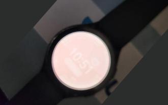 Users encounter rare glitches: Samsung Watch smartwatches suddenly experience white screen issues
Apr 03, 2024 am 08:13 AM
Users encounter rare glitches: Samsung Watch smartwatches suddenly experience white screen issues
Apr 03, 2024 am 08:13 AM
You may have encountered the problem of green lines appearing on the screen of your smartphone. Even if you have never seen it, you must have seen related pictures on the Internet. So, have you ever encountered a situation where the smart watch screen turns white? On April 2, CNMO learned from foreign media that a Reddit user shared a picture on the social platform, showing the screen of the Samsung Watch series smart watches turning white. The user wrote: "I was charging when I left, and when I came back, it was like this. I tried to restart, but the screen was still like this during the restart process." Samsung Watch smart watch screen turned white. The Reddit user did not specify the smart watch. Specific model. However, judging from the picture, it should be Samsung Watch5. Previously, another Reddit user also reported
![Animation not working in PowerPoint [Fixed]](https://img.php.cn/upload/article/000/887/227/170831232982910.jpg?x-oss-process=image/resize,m_fill,h_207,w_330) Animation not working in PowerPoint [Fixed]
Feb 19, 2024 am 11:12 AM
Animation not working in PowerPoint [Fixed]
Feb 19, 2024 am 11:12 AM
Are you trying to create a presentation but can't add animation? If animations are not working in PowerPoint on your Windows PC, then this article will help you. This is a common problem that many people complain about. For example, animations may stop working during presentations in Microsoft Teams or during screen recordings. In this guide, we will explore various troubleshooting techniques to help you fix animations not working in PowerPoint on Windows. Why aren't my PowerPoint animations working? We have noticed that some possible reasons that may cause the animation in PowerPoint not working issue on Windows are as follows: Due to personal
![Error loading plugin in Illustrator [Fixed]](https://img.php.cn/upload/article/000/465/014/170831522770626.jpg?x-oss-process=image/resize,m_fill,h_207,w_330) Error loading plugin in Illustrator [Fixed]
Feb 19, 2024 pm 12:00 PM
Error loading plugin in Illustrator [Fixed]
Feb 19, 2024 pm 12:00 PM
When launching Adobe Illustrator, does a message about an error loading the plug-in pop up? Some Illustrator users have encountered this error when opening the application. The message is followed by a list of problematic plugins. This error message indicates that there is a problem with the installed plug-in, but it may also be caused by other reasons such as a damaged Visual C++ DLL file or a damaged preference file. If you encounter this error, we will guide you in this article to fix the problem, so continue reading below. Error loading plug-in in Illustrator If you receive an "Error loading plug-in" error message when trying to launch Adobe Illustrator, you can use the following: As an administrator
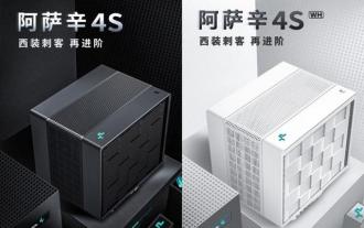 Kyushu Fengshen Assassin 4S Radiator Review Air-cooled 'Assassin Master' Style
Mar 28, 2024 am 11:11 AM
Kyushu Fengshen Assassin 4S Radiator Review Air-cooled 'Assassin Master' Style
Mar 28, 2024 am 11:11 AM
Speaking of ASSASSIN, I believe players will definitely think of the master assassins in "Assassin's Creed". They are not only skilled, but also have the creed of "devoting themselves to the darkness and serving the light". The ASSASSIN series of flagship air-cooled radiators from the appliance brand DeepCool coincide with each other. Recently, the latest product of this series, ASSASSIN4S, has been launched. "Assassin in Suit, Advanced" brings a new air-cooling experience to advanced players. The appearance is full of details. The Assassin 4S radiator adopts a double tower structure + a single fan built-in design. The outside is covered with a cube-shaped fairing, which has a strong overall sense. It is available in white and black colors to meet different colors. Tie
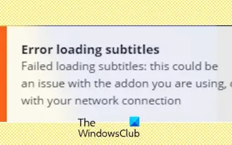 Stremio subtitles not working; error loading subtitles
Feb 24, 2024 am 09:50 AM
Stremio subtitles not working; error loading subtitles
Feb 24, 2024 am 09:50 AM
Subtitles not working on Stremio on your Windows PC? Some Stremio users reported that subtitles were not displayed in the videos. Many users reported encountering an error message that said "Error loading subtitles." Here is the full error message that appears with this error: An error occurred while loading subtitles Failed to load subtitles: This could be a problem with the plugin you are using or your network. As the error message says, it could be your internet connection that is causing the error. So please check your network connection and make sure your internet is working properly. Apart from this, there could be other reasons behind this error, including conflicting subtitles add-on, unsupported subtitles for specific video content, and outdated Stremio app. like
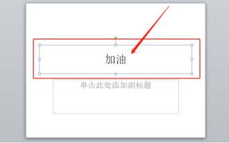 How to set up ppt animation to enter first and then exit
Mar 20, 2024 am 09:30 AM
How to set up ppt animation to enter first and then exit
Mar 20, 2024 am 09:30 AM
We often use ppt in our daily work, so are you familiar with every operating function in ppt? For example: How to set animation effects in ppt, how to set switching effects, and what is the effect duration of each animation? Can each slide play automatically, enter and then exit the ppt animation, etc. In this issue, I will first share with you the specific steps of entering and then exiting the ppt animation. It is below. Friends, come and take a look. Look! 1. First, we open ppt on the computer, click outside the text box to select the text box (as shown in the red circle in the figure below). 2. Then, click [Animation] in the menu bar and select the [Erase] effect (as shown in the red circle in the figure). 3. Next, click [
 After a two-year delay, the domestic 3D animated film 'Er Lang Shen: The Deep Sea Dragon' is scheduled to be released on July 13
Jan 26, 2024 am 09:42 AM
After a two-year delay, the domestic 3D animated film 'Er Lang Shen: The Deep Sea Dragon' is scheduled to be released on July 13
Jan 26, 2024 am 09:42 AM
This website reported on January 26 that the domestic 3D animated film "Er Lang Shen: The Deep Sea Dragon" released a set of latest stills and officially announced that it will be released on July 13. It is understood that "Er Lang Shen: The Deep Sea Dragon" is produced by Mihuxing (Beijing) Animation Co., Ltd., Horgos Zhonghe Qiancheng Film Co., Ltd., Zhejiang Hengdian Film Co., Ltd., Zhejiang Gongying Film Co., Ltd., Chengdu The animated film produced by Tianhuo Technology Co., Ltd. and Huawen Image (Beijing) Film Co., Ltd. and directed by Wang Jun was originally scheduled to be released in mainland China on July 22, 2022. Synopsis of the plot of this site: After the Battle of the Conferred Gods, Jiang Ziya took the "Conferred Gods List" to divide the gods, and then the Conferred Gods List was sealed by the Heavenly Court under the deep sea of Kyushu Secret Realm. In fact, in addition to conferring divine positions, there are also many powerful evil spirits sealed in the Conferred Gods List.
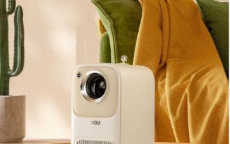 Exquisite light and shadow art in spring, Haqu H2 is the cost-effective choice
Apr 17, 2024 pm 05:07 PM
Exquisite light and shadow art in spring, Haqu H2 is the cost-effective choice
Apr 17, 2024 pm 05:07 PM
With the arrival of spring, everything revives and everything is full of vitality and vitality. In this beautiful season, how to add a touch of color to your home life? Haqu H2 projector, with its exquisite design and super cost-effectiveness, has become an indispensable beauty in this spring. This H2 projector is compact yet stylish. Whether placed on the TV cabinet in the living room or next to the bedside table in the bedroom, it can become a beautiful landscape. Its body is made of milky white matte texture. This design not only makes the projector look more advanced, but also increases the comfort of the touch. The beige leather-like material adds a touch of warmth and elegance to the overall appearance. This combination of colors and materials not only conforms to the aesthetic trend of modern homes, but also can be integrated into
