
 Web Front-end
JS Tutorial
JS component Form form validation artifact BootstrapValidator_javascript skills
Web Front-end
JS Tutorial
JS component Form form validation artifact BootstrapValidator_javascript skills
JS component Form form validation artifact BootstrapValidator_javascript skills

This article shares the JS component Form form validation artifact BootstrapValidator for your reference. The specific content is as follows
1. Elementary usage
Look at the description of bootstrapvalidator: A jQuery form validator for Bootstrap 3. From the description, we can know that it requires at least jQuery and bootstrap support. We first introduce the required js components:
 <script src="~/Scripts/jquery-1.10.2.js"></script>

  <script src="~/Content/bootstrap/js/bootstrap.min.js"></script>
  <link href="~/Content/bootstrap/css/bootstrap.min.css" rel="stylesheet" />

  <script src="~/Content/bootstrapValidator/js/bootstrapValidator.min.js"></script>
  <link href="~/Content/bootstrapValidator/css/bootstrapValidator.min.css" rel="stylesheet" />
We know that since it is form verification, we must have a Form in the cshtml page, and we know that the elements in the Form are obtained through the name attribute, so the elements in the form must have a The attribute value of name.
 <form>
      <div class="form-group">
        <label>Username</label>
        <input type="text" class="form-control" name="username" />
      </div>
      <div class="form-group">
        <label>Email address</label>
        <input type="text" class="form-control" name="email" />
      </div>
      <div class="form-group">
        <button type="submit" name="submit" class="btn btn-primary">Submit</button>
      </div>
    </form>
After we have the form element, it’s time to initialize our js.
  $(function () {
    $('form').bootstrapValidator({
        message: 'This value is not valid',
       feedbackIcons: {
                valid: 'glyphicon glyphicon-ok',
                invalid: 'glyphicon glyphicon-remove',
                validating: 'glyphicon glyphicon-refresh'
                },
      fields: {
        username: {
          message: '用户名验证失败',
          validators: {
            notEmpty: {
              message: '用户名不能为空'
            }
          }
        },
        email: {
          validators: {
            notEmpty: {
              message: '邮箱地址不能为空'
            }
          }
        }
      }
    });
  });
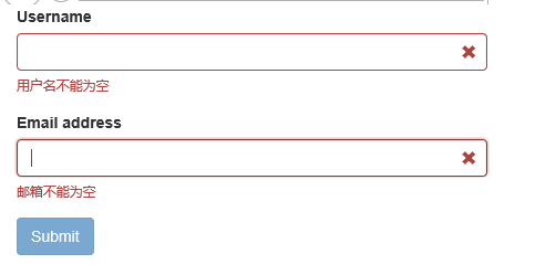
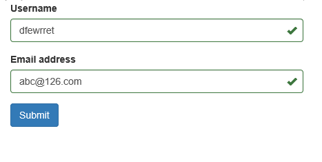
The content should be easy to understand. Let’s see the effect:
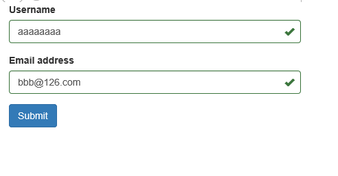
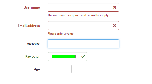
The verification failed, the submit button is grayed out and cannot be clicked
Verification passed, submit button restored
See the effect and feel it first. The biggest advantages: easy to use and friendly interface. Next let’s take a look at overlapping validation.
2. Intermediate usage
Above we know how to write non-empty verification, there must be other verification methods besides this. Don't worry, we'll take our time. The cshtml part of the above code remains unchanged, we will slightly modify the js part:
 $(function () {
    $('form').bootstrapValidator({
      message: 'This value is not valid',
      feedbackIcons: {
        valid: 'glyphicon glyphicon-ok',
        invalid: 'glyphicon glyphicon-remove',
        validating: 'glyphicon glyphicon-refresh'
      },
      fields: {
        username: {
          message: '用户名验证失败',
          validators: {
            notEmpty: {
              message: '用户名不能为空'
            },
            stringLength: {
              min: 6,
              max: 18,
              message: '用户名长度必须在6到18位之间'
            },
            regexp: {
              regexp: /^[a-zA-Z0-9_]+$/,
              message: '用户名只能包含大写、小写、数字和下划线'
            }
          }
        },
        email: {
          validators: {
            notEmpty: {
              message: '邮箱不能为空'
            },
            emailAddress: {
              message: '邮箱地址格式有误'
            }
          }
        }
      }
    });
  });
After adding overlapping verification, let’s see the effect:
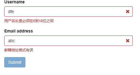
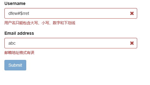
As can be seen from the above code, the validators attribute corresponds to a Json object, which can contain multiple verification types:
- notEmpty: non-empty verification;
- stringLength: string length verification;
- regexp: regular expression verification;
- emailAddress: Email address verification (we don’t need to write the regular email address~~)
In addition, in the document we see that it has a total of 46 verification types. Let’s take a look at a few common ones:
- base64: 64-bit encoding verification;
- between: Verify that the input value must be within a certain range, such as greater than 10 and less than 100;
- creditCard: ID card verification;
- date: date verification;
- ip: IP address verification;
- numeric: numerical verification;
- phone: phone number verification;
- uri: url verification;
Another commonly used attribute is the submitHandler attribute, which corresponds to the event method of the submit button. Use as follows:
$(function () {
    $('form').bootstrapValidator({
      message: 'This value is not valid',
      feedbackIcons: {
        valid: 'glyphicon glyphicon-ok',
        invalid: 'glyphicon glyphicon-remove',
        validating: 'glyphicon glyphicon-refresh'
      },
      fields: {
        username: {
          message: '用户名验证失败',
          validators: {
            notEmpty: {
              message: '用户名不能为空'
            },
            stringLength: {
              min: 6,
              max: 18,
              message: '用户名长度必须在6到18位之间'
            },
            regexp: {
              regexp: /^[a-zA-Z0-9_]+$/,
              message: '用户名只能包含大写、小写、数字和下划线'
            }
          }
        },
        email: {
          validators: {
            notEmpty: {
              message: '邮箱不能为空'
            },
            emailAddress: {
              message: '邮箱地址格式有误'
            }
          }
        }
      },
      submitHandler: function (validator, form, submitButton) {
        alert("submit");
      }
    });
  });
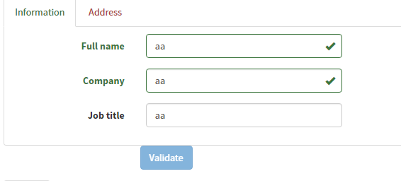
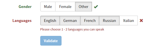
It introduces many verification examples in its Demo. Let’s briefly take a look at its effect. As for the implementation code, it is actually very simple. If you are interested, you can directly look at the API.
Color Verification
Tab page form verification
Button Verification
The above is the entire content of this article, I hope it will be helpful to everyone’s study.

Hot AI Tools

Undresser.AI Undress
AI-powered app for creating realistic nude photos

AI Clothes Remover
Online AI tool for removing clothes from photos.

Undress AI Tool
Undress images for free

Clothoff.io
AI clothes remover

Video Face Swap
Swap faces in any video effortlessly with our completely free AI face swap tool!

Hot Article
Hot Tools

Notepad++7.3.1
Easy-to-use and free code editor

SublimeText3 Chinese version
Chinese version, very easy to use

Zend Studio 13.0.1
Powerful PHP integrated development environment

Dreamweaver CS6
Visual web development tools

SublimeText3 Mac version
God-level code editing software (SublimeText3)
Hot Topics
 1386
1386
 52
52

 How to get the bootstrap search bar
Apr 07, 2025 pm 03:33 PM
How to get the bootstrap search bar
Apr 07, 2025 pm 03:33 PM
How to use Bootstrap to get the value of the search bar: Determines the ID or name of the search bar. Use JavaScript to get DOM elements. Gets the value of the element. Perform the required actions.
 How to use bootstrap in vue
Apr 07, 2025 pm 11:33 PM
How to use bootstrap in vue
Apr 07, 2025 pm 11:33 PM
Using Bootstrap in Vue.js is divided into five steps: Install Bootstrap. Import Bootstrap in main.js. Use the Bootstrap component directly in the template. Optional: Custom style. Optional: Use plug-ins.
 How to write split lines on bootstrap
Apr 07, 2025 pm 03:12 PM
How to write split lines on bootstrap
Apr 07, 2025 pm 03:12 PM
There are two ways to create a Bootstrap split line: using the tag, which creates a horizontal split line. Use the CSS border property to create custom style split lines.
 How to do vertical centering of bootstrap
Apr 07, 2025 pm 03:21 PM
How to do vertical centering of bootstrap
Apr 07, 2025 pm 03:21 PM
Use Bootstrap to implement vertical centering: flexbox method: Use the d-flex, justify-content-center, and align-items-center classes to place elements in the flexbox container. align-items-center class method: For browsers that do not support flexbox, use the align-items-center class, provided that the parent element has a defined height.
 How to insert pictures on bootstrap
Apr 07, 2025 pm 03:30 PM
How to insert pictures on bootstrap
Apr 07, 2025 pm 03:30 PM
There are several ways to insert images in Bootstrap: insert images directly, using the HTML img tag. With the Bootstrap image component, you can provide responsive images and more styles. Set the image size, use the img-fluid class to make the image adaptable. Set the border, using the img-bordered class. Set the rounded corners and use the img-rounded class. Set the shadow, use the shadow class. Resize and position the image, using CSS style. Using the background image, use the background-image CSS property.
 How to set up the framework for bootstrap
Apr 07, 2025 pm 03:27 PM
How to set up the framework for bootstrap
Apr 07, 2025 pm 03:27 PM
To set up the Bootstrap framework, you need to follow these steps: 1. Reference the Bootstrap file via CDN; 2. Download and host the file on your own server; 3. Include the Bootstrap file in HTML; 4. Compile Sass/Less as needed; 5. Import a custom file (optional). Once setup is complete, you can use Bootstrap's grid systems, components, and styles to create responsive websites and applications.
 How to use bootstrap button
Apr 07, 2025 pm 03:09 PM
How to use bootstrap button
Apr 07, 2025 pm 03:09 PM
How to use the Bootstrap button? Introduce Bootstrap CSS to create button elements and add Bootstrap button class to add button text
 How to resize bootstrap
Apr 07, 2025 pm 03:18 PM
How to resize bootstrap
Apr 07, 2025 pm 03:18 PM
To adjust the size of elements in Bootstrap, you can use the dimension class, which includes: adjusting width: .col-, .w-, .mw-adjust height: .h-, .min-h-, .max-h-
