 Backend Development
 PHP Tutorial
 Product Manager Tutorial: User Experience Elements and Product Design Steps
Product Manager Tutorial: User Experience Elements and Product Design Steps
|
A word that product developers often talk about now is "user experience". Nowadays, everyone is paying more and more attention to user experience, and it is also a key factor that is most easily ignored. So how should we design products that satisfy user experience? Let’s take a look at some user experience elements that need to be paid attention to when designing products (http://www.maiziedu.com/course/pm/115-1118/). If these points are met, then user experience design (http:/ /www.maiziedu.com/course/pm/) you can make a good decision.
Elements of user experience
Everything experienced by users should be a decision made after careful consideration and argumentation for you.
Consider the user experience, break it down into its constituent elements, and understand it from different perspectives—only then can you ensure you control the full consequences of your decisions.
Presentation layer: In the presentation layer (surface), what you see is a series of web pages, composed of pictures and text;
Framework layer: below the presentation layer is the skeleton layer (skeleton) of the website: buttons, controls , the location of photos and text areas;
Structural layer: Compared with the frame layer, the structure layer is more abstract. The frame is the specific expression of the structure. The framework layer determines the location of interactive elements on the checkout page; the structure layer is used to design how users arrive at a page and where they can go after they are done;
Scope layer: The structure layer determines various aspects of the website The most appropriate combination of features and functions, and these features and functions constitute the scope of the website;
Strategic layer: The scope of the website is basically determined by the website strategy. These strategies include not only what the operator wants to get from the website, but also what users want to get from the website.
Each level is determined by the level below it.
Let’s look at the design of Nokia and iPhone from the settings of the phone’s on/off keys.
Nokia’s strategic layer is implemented around the phone, the scope layer is modeled after the design of a traditional phone, the structural layer is the numeric keyboard and screen, and the frame layer is the layout of the buttons, including the on and off keys for the phone. set together. The presentation layer is the pattern, touch feel and shutdown screen of the hang-up button. All designs are implemented with a "works like a phone" strategy.
The strategic layer of the iPhone is developed around the "handheld computer", the scope layer is modeled after the "PDA" (newton experimented by Mr. Joe) and computers, and the structural layer is the power button and touch screen (capacitive screen, with Click directly with your hand), the frame layer is her on/off key, press once to turn off the screen, press and hold to access the shutdown menu, confirm and shut down. The presentation layer is the tactile feeling of pressing the button, the time interval for closing the screen (within the user's expected range, if it is too short, it is easy to press it by mistake, and if it is too long, the user will interrupt and try again and again), and the screen of sliding to shut down. All designs are implemented with a "cool works like a handheld computer" strategy.
General steps of product design
User research
We can divide a large number of user needs into several manageable parts, which will complete usability and user research through user segmentation. To figure out what users want, we first have to know who they are. The field of user research is devoted to gathering the necessary information to reach consensus.
By creating personas—sometimes called personas or user profiles—you can make your users more real. Personas are fictional characters that represent the needs of real users as a whole.
Task Analysis
Task analysis is a method of carefully breaking down the precise steps a user takes to complete a task. This task decomposition can be done through user interviews, allowing users to tell their stories and speak out about their experiences, or it can be done through on-site surveys, where users' behaviors are studied directly in their "everyday life environment."
For information-driven products, card sorting is used to explore how users categorize or organize various information elements. Give users a stack of index cards, each with the name and description of an information element, an image, or a type of content. Users then arrange the cards in a way that feels most natural to them, based on groups or categories. Analyzing the card arrangement results of several users can help us understand users’ views on product information.
Functional Specifications
A functional specification does not need to contain every detail of the product—it only needs to include definitions of features that may cause confusion during the design or development process. Functional specifications also don't need to envision an idealized future state of the product—they just need to document the decisions that were made when creating the product.
Interaction Design
Both interaction design () and information architecture emphasize one key point: determining the "patterns" and "sequences" of each element that will be presented to the user. Interaction design focuses on the elements that will influence users to perform and complete tasks. Information architecture focuses on the elements that convey information to users.
Information Architecture
Information architecture studies the process of how people perceive information. For products, information architecture focuses on whether the information presented to users is reasonable and meaningful.
Nodes are placed according to the organizing principle in the information architecture. Literally speaking, organizing principles are basically the criteria by which we decide which nodes should be grouped together and which nodes should remain independent.
These properties are called “facets” in library science parlance, and they provide a simple, flexible set of organizing principles and metadata for almost any content.
A controlled dictionary is a standard set of languages used by websites. This is an important area of user research. Talking to users and understanding how they communicate is the most effective way to develop a system of naming principles that feels natural to users
Interface Design
Successful interface designs are those that allow users to see “what’s most important” at a glance "Interface design. Unimportant things, on the other hand, shouldn't be noticed—sometimes because they're not even there.
In websites, signage usually involves navigation design and information design. A website's navigation system must not only provide access to different areas of the website, it must also clearly communicate these options.
Wireframes
Wireframes are a necessary first step in the process of formally establishing the visual design of a website, but almost everyone involved in the development process will use it at other points in the task. Designers responsible for the strategy, scope, and structure levels can use wireframes to ensure that the final product meets their expectations. The people actually building the website use wireframes to answer questions about how the website should work.
Smell and Taste
In the entire design process, this is the final stop in providing an experience for our users: deciding how our design will ultimately be felt by the human sense organs.
Contrast and Consistency
When an element stands out in a design, users will notice. Use a "unified brand identity" to reinforce the "consistency across media" of the product presented to your users (customers, potential customers, management, employees or other visitors). This consistency of brand identity should be presented Design at every level of your product, from navigation elements that appear on every screen to ordinary buttons that only appear once.
Design Composition and Style Guide
The authoritative document that carries these design decisions is the style guide. This summary document identifies every aspect of the visual design, ranging from the largest to the smallest elements.
|

Hot AI Tools

Undresser.AI Undress
AI-powered app for creating realistic nude photos

AI Clothes Remover
Online AI tool for removing clothes from photos.

Undress AI Tool
Undress images for free

Clothoff.io
AI clothes remover

AI Hentai Generator
Generate AI Hentai for free.

Hot Article

Hot Tools

Notepad++7.3.1
Easy-to-use and free code editor

SublimeText3 Chinese version
Chinese version, very easy to use

Zend Studio 13.0.1
Powerful PHP integrated development environment

Dreamweaver CS6
Visual web development tools

SublimeText3 Mac version
God-level code editing software (SublimeText3)

Hot Topics
 1376
1376
 52
52
 Working with Flash Session Data in Laravel
Mar 12, 2025 pm 05:08 PM
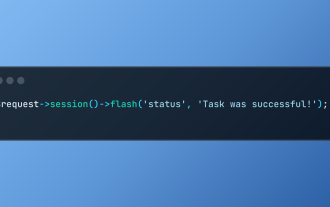
Laravel simplifies handling temporary session data using its intuitive flash methods. This is perfect for displaying brief messages, alerts, or notifications within your application. Data persists only for the subsequent request by default: $request-
 cURL in PHP: How to Use the PHP cURL Extension in REST APIs
Mar 14, 2025 am 11:42 AM
The PHP Client URL (cURL) extension is a powerful tool for developers, enabling seamless interaction with remote servers and REST APIs. By leveraging libcurl, a well-respected multi-protocol file transfer library, PHP cURL facilitates efficient execution of various network protocols, including HTTP, HTTPS, and FTP. This extension offers granular control over HTTP requests, supports multiple concurrent operations, and provides built-in security features.
 Alipay PHP SDK transfer error: How to solve the problem of 'Cannot declare class SignData'?
Apr 01, 2025 am 07:21 AM
Alipay PHP...
 Simplified HTTP Response Mocking in Laravel Tests
Mar 12, 2025 pm 05:09 PM
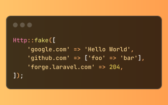
Laravel provides concise HTTP response simulation syntax, simplifying HTTP interaction testing. This approach significantly reduces code redundancy while making your test simulation more intuitive. The basic implementation provides a variety of response type shortcuts: use Illuminate\Support\Facades\Http; Http::fake([ 'google.com' => 'Hello World', 'github.com' => ['foo' => 'bar'], 'forge.laravel.com' =>
 12 Best PHP Chat Scripts on CodeCanyon
Mar 13, 2025 pm 12:08 PM
Do you want to provide real-time, instant solutions to your customers' most pressing problems? Live chat lets you have real-time conversations with customers and resolve their problems instantly. It allows you to provide faster service to your custom
 Explain the concept of late static binding in PHP.
Mar 21, 2025 pm 01:33 PM
Article discusses late static binding (LSB) in PHP, introduced in PHP 5.3, allowing runtime resolution of static method calls for more flexible inheritance.Main issue: LSB vs. traditional polymorphism; LSB's practical applications and potential perfo
 Customizing/Extending Frameworks: How to add custom functionality.
Mar 28, 2025 pm 05:12 PM
The article discusses adding custom functionality to frameworks, focusing on understanding architecture, identifying extension points, and best practices for integration and debugging.
 How to send a POST request containing JSON data using PHP's cURL library?
Apr 01, 2025 pm 03:12 PM
Sending JSON data using PHP's cURL library In PHP development, it is often necessary to interact with external APIs. One of the common ways is to use cURL library to send POST�...


