11 Best PHP URL Shortener Scripts (Free and Premium)
Mar 03, 2025 am 10:49 AM
11 Best PHP URL Shortener Scripts (Free and Premium)
Mar 03, 2025 am 10:49 AM
Long URLs, often cluttered with keywords and tracking parameters, can deter visitors. A URL shortening script offers a solution, creating concise links ideal for social media and other platforms. These scripts are valuable for individual websites a
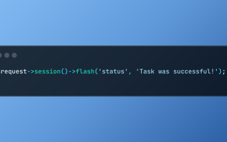
Working with Flash Session Data in Laravel
Mar 12, 2025 pm 05:08 PM
Laravel simplifies handling temporary session data using its intuitive flash methods. This is perfect for displaying brief messages, alerts, or notifications within your application.
Data persists only for the subsequent request by default:
$request-
Build a React App With a Laravel Back End: Part 2, React
Mar 04, 2025 am 09:33 AM
This is the second and final part of the series on building a React application with a Laravel back-end. In the first part of the series, we created a RESTful API using Laravel for a basic product-listing application. In this tutorial, we will be dev
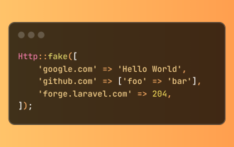
Simplified HTTP Response Mocking in Laravel Tests
Mar 12, 2025 pm 05:09 PM
Laravel provides concise HTTP response simulation syntax, simplifying HTTP interaction testing. This approach significantly reduces code redundancy while making your test simulation more intuitive.
The basic implementation provides a variety of response type shortcuts:
use Illuminate\Support\Facades\Http;
Http::fake([
'google.com' => 'Hello World',
'github.com' => ['foo' => 'bar'],
'forge.laravel.com' =>
cURL in PHP: How to Use the PHP cURL Extension in REST APIs
Mar 14, 2025 am 11:42 AM
The PHP Client URL (cURL) extension is a powerful tool for developers, enabling seamless interaction with remote servers and REST APIs. By leveraging libcurl, a well-respected multi-protocol file transfer library, PHP cURL facilitates efficient execution of various network protocols, including HTTP, HTTPS, and FTP. This extension offers granular control over HTTP requests, supports multiple concurrent operations, and provides built-in security features.
12 Best PHP Chat Scripts on CodeCanyon
Mar 13, 2025 pm 12:08 PM
Do you want to provide real-time, instant solutions to your customers' most pressing problems? Live chat lets you have real-time conversations with customers and resolve their problems instantly. It allows you to provide faster service to your custom
Announcement of 2025 PHP Situation Survey
Mar 03, 2025 pm 04:20 PM
The 2025 PHP Landscape Survey investigates current PHP development trends. It explores framework usage, deployment methods, and challenges, aiming to provide insights for developers and businesses. The survey anticipates growth in modern PHP versio
Notifications in Laravel
Mar 04, 2025 am 09:22 AM
In this article, we're going to explore the notification system in the Laravel web framework. The notification system in Laravel allows you to send notifications to users over different channels. Today, we'll discuss how you can send notifications ov